ralf | January 17, 2013 | community, Maps of the Month, user maps
I’m a bit late – due to the holidays and the release of the new Annual – but I don’t want to keep December’s beautiful new creations of the Profantasy user community from you.
Moskva very slightly missed the November round-up, so the first draft at his nice Hurland Country Map didn’t make it last time. This is kinda fortunate, because you can now see it in full detail!
Continue reading »
1 Comment
Simon Rogers | January 8, 2013 | user tutorials
[This map was created by forum user anomiecoalition.]
After a rather lengthy hiatus from the world of fantasy and roleplaying, I recently convinced a few friends to give it a try and set about constructing a world that would keep their interest. Along the way, I stumbled upon Campaign Cartographer 3 and was amazed at the maps that people were producing with it and the possibility that it provides to even the artistically challenged (like myself). After a short couple of week tinkering with the program and learning a great deal from the tutorials available I constructed Brightstone Keep.
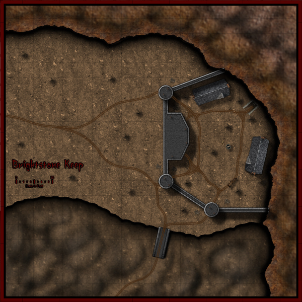
The map and its back story are loosely based on a free adventure provided by Wizards of the Coast. The keep protects a mining operation that has been overrun by a variety of nefarious creatures. The symbols utilized can be obtained from the CSUAC.
The first step in creating this map was to establish the basic layout. I depicted a mountain wall running from the top left to bottom right corner for which I used three separate sheets and shapes. Then I added cliff running left to right towards the bottom of the map on another sheet.
Adding the Mountain
I began by drawing a rough outline of the mountain wall and filled it with a dirt texture. I learned that it is a good idea to draw beyond the map border on these shapes to ensure that if I applied any edge-fade effects, they wouldn’t appear on the border side of the map. Using effects I then applied a slight blur and two black outer glow effects – one with strength of 0 above another with strength of 1. I then created two more shapes and sheets to go above this mountain wall and utilized different dirt textures. To these sheets, I applied a slight blur and an edge-fade-inner effect.
Adding the Cliff
Depicting the cliff was a bit simpler – here I just reused the dirt texture from the background but constructed a separate shape on a separate sheet and applied a similar setting as that use on the first mountain wall sheet (but with an inner glow). The final step was to add some hill overlay transparencies to add some character to the terrain. I applied these symbols on a separate sheet and varied the size/orientation to achieve the desired effect.
Adding the Keep
In constructing the walls of the keep, I created four sets of sheets and shapes. I began by drawing some solid gray lines (width of 6 – adjust to scale) to create the outer wall. I then applied a texture sheet effect (stone texture of your choosing, Intensity 1, size 15); on top of that a black outer glow (strength 1, blur 2); a wall shadow (length 15, opacity 65, blur 5); and finally a bevel (length 1.5, strength 35, and fade 1). I next wanted to create a walkway for that wall. I copied the image to a new sheet and reduced the width to 3. I then applied a texture sheet effect (with a different stone texture but same settings) and an inner black glow (strength 1, blur 2). I followed the same procedure to construct the towers/ramp and placed those shapes and sheets on top of the wall. (The ramp actually required that I draw in a black shadow on the right side to give it some dimensionality.)
The Road and the Rest
The last step was to draw in some roads and tracks. I laid down a road (added a texture, blur, and edge-fade-inner sheet effect) and then drew in the tracks according to the instructions provided in the Jon Roberts Special Issue of the Annual. From there it was just a matter of placing some vegetation, rocks, buildings, and text to complete my map.
I had a great time making this map and was amazed at how easy it was once I familiarized myself with the program (the video tutorials and assorted blog entries are invaluable.) I just hope my friends enjoy playing with this map as much as I enjoyed making it.
*I plan on posting more of my maps on my new blog
Comments Off on Brightstone Keep
ralf | December 30, 2012 |
Mark Wolnik, a fresh member of the ProFantasy community offered to write a few sentences about his initial experience with the Campaign Cartographer 3 and we gladly accepted. Here are his words. Thanks, Mark!
Since my youth, one of my favorite parts of reading fantasy books and playing fantasy games over the decades, has been poring over the maps that add that extra amazing amount of immersion. I would marvel at the skills needed to draw something in a manner that looked like a gifted and patient elven hand was at work here.
On Xmas Eve I treated myself with buying CC3, the SS1 Overland Fantasy Symbol set, and the Tome of Ultimate Knowledge. With my rudimentary skills, I set out to create a map for my guild.
By watching the tutorial videos, and following selected parts of the manual, CC3’s powerful mapmaking system features became easily understandable and useable. Within 3 days I had my first finished map, that although was far from perfect, I felt was reasonably presentable – I was hooked!
The next day (Dec 28th), wanting to improve my map making abilities, I decided to buy the Annuals package. There was a glitch from my end with Paypal, and accidentally 2 orders were placed – I was a little aghast since it being between Xmas and New Years, and my prior experiences with online merchants and financial transactions have been dubious at best, I thought it would be several weeks at least, before I could hope to see a return of the additional $249.00 accidentally billed.
Much to my surprise, and delight, my email to Ralf was answered that day (it was around 8pm his local time) with reassurances that all will be made good – and indeed the additional transaction was credited back immediately.
My experience with ProFantasy has been nothing short of excellent on every level – be it the high quality of CC3 itself, the explicit and helpful manner in which the tutorials are created, and the commitment and service in looking after their customers.
Thank you so much!
Mark Wolnik
And as a special treat, here is the very first map that Mark created with CC3:
2 Comments
ralf | November 29, 2012 | Maps of the Month, user maps
It’s time to take another look at the beautiful user maps posted on the Profantasy forum. The numbers have risen again, and it’s possible I may accidentally skip the occasional map. Check out the Show and Tell category on the forum to see them all!
Henrie61 created this map of the Flow Country in Djekspek’s overland style from the Annual 2012

Continue reading »
1 Comment
ralf | November 9, 2012 | battle map, CSUAC, dd3, Deadlands, ss2, wild west
For my own ongoing Deadlands Reloaded campaign, I’ve created this battle map of a run-down home out in the Weird West. It’s based on the DD3 Battle Map template from the Annual Vol 2 and uses textures and symbols from DD3, Symbol Set 2 and the CSUAC. The roof texture on the upper level is from City Designer 3.
Click on the images below to load the full-size A3 pdfs.


You can download the CC3+ version of the maps (FCW format) here, but be aware that you need all the afore-mentioned products to view them properly in CC3+.
1 Comment
ralf | October 15, 2012 | retrospective
Six years ago we began the Cartographer’s Annual, a monthly series of style, maps, and other cartogrpahic contents for CC3 and we thought it was about time for a little retrospective. The Annual has brought an immense wealth of style options to the ProFantasy community and we have been thrilled by all the beautiful maps our users have created. What better way than to highlight the the full scope of the Annuals than with some of these works of art?
2007 – Volume 1
 When we set out with the new concept of a subscription for Campaign Cartographer 3 users, we were really feeling our way around for what content was most popular. It quickly became apparent that new overland styles were the most popular type of Annual entry – but far from being the only thing people were looking for. We decided to strike a balance between generally popular topics like overland styles and more specific ones as seen in the “Parchment & Paper” June issue of 2007. The inaugural issue – the Mercator Historical style as shown on the right – represents the type of popular overland style that we strive to include in every volume of the Annual. The depicted map is by forum user Rogdor and was posted as a work-in-progress on the ProFantasy forum in March 2010, and there is another complete one here.
 Another very popular and beautiful style from the first Annual is the John Speed City style, a black and white style emulating the city maps of famed British cartographer John Speed. Take a look at the map created by community member Modric.
Other highlights of the Annual 2007 include the multi-level floorplan of the “Tendril’s Oak Inn” complete with description and adventure ideas, an overland style based on the artwork of Sarah Wroot ( a user map here), and a tutorial on how to create your own drawing styles from scratch.
 2008 – Volume 2
We received very positive feedback on the Annual 2007 – users were enthusiastic – which made the decision to continue the subscription model an easy one. And we were able to start the second year with a real bang as we got permission from one of the rpg industry’s cartography legends to emulate him: Pete Fenlon of Middle-earth roleplaying fame allowed us to recreate the style he used for those beautiful maps of Middle-earth.
The map here was created in the Pete Fenlon style (again by Modric) just recently, proving that the old style from the early days of the Annual are still used to great effect.
 As a second overland style for 2008 we produced a black and white vector style which also proved very popular. So popular in fact, that we added a simiular – but distinct – b&w style to Campaign Cartographer 3 as a free download.
The sample map on the left shows ever-prolific Modric using the style with a parchment filter to create a beautiful in-game artifact.
As a special highlight the 2008 Annual saw the first video tutorials for CC3 produced by Joseph Sweeney. His videos have become a staple of introducing new users to CC3 and by now he has created a whole range of them for various products and add-ons.
 2009 – Volume 3
2009 started with a style created by Master Mapper Allyn Bowker. The Fantasy Realms style captures the look used in some Forgotten Realms maps and still produces pangs of sweet nostalgia in many people who see it. Originally the style was produced for CC2, but the lack of drawing tool functionality made it hard to use by anyone a little less meticulous (and may I say “brilliant”) than Allyn. CC3 allowed Allyn to make the look easier to use and, with sheet effects, more attractive. Here you can see forum user Henrie61 applying the style to a custom world.
 The 2009 Annual also saw another artist contributing his first style to the subscription: Pär Lindström. His beautiful world map caught our eye and although he did not use CC3 at the time, we came up with a way to transfer bitmap-based art into a CC3 drawing style. The artist supplies us with layered Photoshop files of his work and we extract the symbols and textures and convert them to assets in CC3.
The Fantasy Worlds style proved extremely easy to work with, so that first time users of CC3 managed to create very beautiful maps. The example here was done by Neilander as a first map!
 2010 – Volume 4
As we had learned from the black and white overland style in 2008, monochrome maps where quite popular (in part certainly because they print easily), so we decided to add dungeon and city styles in b&w to the 2010 Annual. Especially the city style became a fan favorite. The example shown on the right was created by community member bearclaw and shows the beautiful layout of a riverside town.
 Another option for quick and easy maps that’s popular with role-players is the hex-based map. Back with Cosmographer Pro hex map functionality was introduced to Campaign Cartographer, and with the Annual 2010 we added a new style for old-school fantasy overland maps. Here you can see forum member Skycast using the style to create the map of a wooded peninsula.
 2011 – Volume 5
2011 was undoubtedly the year of fantasy cartographer Jonathan Roberts. We can across his beautiful work on the web and asked him whether he’d be willing to produce a couple of styles for us. He obliged and the Annual 2011 could boast both an overland and a dungeon style created by him. We even made the dungeon style available for free at the end of the year.
 Community member Koth produced the gorgeous map called Kern’s End shown here, by exporting a coastline he liked from Fractal Terrains 3 and then build upon with the Jon Roberts Overland style.
Pär Lindström (who writes on this blog) used the matching dungeon style to create this little encounter map for a role-playing session with his children.
 2012 – Volume 6
As 2011 was the year of Jon Roberts, 2012 will prove the year of another great fantasy cartographer: Herwin Wielink. His overland style (going by his DeviantArt handle “Djekspek”) was the single most popular style every created for the Annual, measured by the amount of maps shown on the forums. So popular in fact, we will be publishing an extension of the style with more symbols and textures in November. And his isometric dungeon style is just extremely clever and beautiful. We are thrilled that all new artwork from Herwin will also be included in the upcoming Perspectives 3.
 The user map in Djekspek’s Overland style was done by Modric, and the isometric dungeon here by forum member Tommek, who even commissioned custom symbols for his map from another artist. There are other amazing maps in this style.
Conclusion
When we started with the Annual back in 2007 we hardly imagined that we would be able to fill six years of subscription with material and keep everyone’s interest. But now the Annual is still going strong and the new and amazing talent within and without the ProFantasy community means we can rely on a steady influx of new ideas for upcoming issues. We’ll keep it coming.
The Annuals website is here, and you can see the full range of styles and other content on the gallery pages.
1 Comment
ralf | October 9, 2012 | Maps of the Month, user maps
I’m not sure I can handle the flood of beautiful new user maps posted on the Profantasy forum. I may have to go weekly instead of monthly in the future. I certainly hope I didn’t miss anything.
Anomiecoalition awed everybody with this beautiful floorplan of an Al-Quadim style temple. Check out the forum thread for the second floor!

Continue reading »
1 Comment
ralf | September 11, 2012 | Maps of the Month, user maps
More and more beautiful user maps are appearing on the Profantasy forum, if you’re not regularly following the posts there, here is an overview:
Grimur Fjeldsted has updated his Naturns city map, done in the Jon Roberts Cities style.

Forum member HadrianIV has created this beautiful regional map “Sea of Tears” in the Herwin Wielink overland style.

Community member soldyne created this map of the “World River” as his very first map in CC3.

Henrie61 drew this “quick and dirty” town map to try our the Jon Roberts Cities style and was impressed how quickly you can create a beautiful map this way.

The Jon Roberts Cities style seems very popular as shown by the “Yellowmire” map created by Dargurd. The unusual, swampy location of the city comes acress very well.

In a change of pace Modric created this black and white map of “Avern” and added a great parchment style filter for a great player handout. The style used is from the Cartographer’s Annual Vol 2.

And last but not least, forum member anomiecoalition drew this neat little Al Quadim-flavoured dungeon, using resources from DD3, the CSUAC art collection and Dundjinni forums.

Kudos to all the great maps our users have been creating!
Comments Off on New User Maps Roundup
ralf | August 7, 2012 | battlemats, encounters
There’s been another rush of beautiful new user maps posted over on the Profantasy forum.
Using symbols found in the recently re-posted CSUAC user art collection, user anomiecoalition created these beautiful encounter maps for Al-Quadim locations (an oasis and a desert obelisk):


Look for an upcoming blog entry on this Brightstone Keep maps in this place!
Equally beautiful and generally extremely useful are henrie61’s floorplans of a small roadside inn and a town or city library. They were created using Jon Robert’s Dungeon Style (mixed with some DD3 symbols):


Thanks for sharing and keep up the good work folks!
1 Comment
ralf | August 2, 2012 | bitmaps, CSUAC, symbols
 Several years ago user-created bitmap artwork from around the web (specifically the Dundjinni forums) was collected into one awesome resource package – called the CSUAC – and made available for the users of several graphics programs, among them CC3. Unfortunately this resource was lost to CC3 users a while ago, and license restrictions did not allow us to make it available again.
But fortunately we’ve now found a way to make the resource available to CC3 users while honoring the license, and Gerri Broman (Shessar on the Profantasy forum) and Mark Oliva from the Vintyri project put it into practice. Here are Gerri’s instructions from the Profantasy forum:
CSUAC for CC3 Installation Instructions
Before I get into the installation procedure for the package, I want to first point out that if you already have the CSUAC there is no need to reinstall since there are no new symbols. However, the directory structure is different from prior versions, so the two are not compatible. What this means is that any maps using symbols from prior versions will show red X’s for the symbols (the reverse is true as well). This is because the new CC3 version of the CSUAC is using the file structure and files from the Fractal Mapper 8 version of the package.
Also, please note that these symbols are not full fledged CC3/DD3/CD3 symbols. That is, they are not smart symbols, nor do they use random transformations, shading, collections, etc. They are simply the PNG files and associated CC3 catalogs.
STEP 1: Downloading all necessary files
1. Download the file CSUAC_for_CC3_v3.zip and save it to your hard drive.
2. Download all of the CSUAC FM8 files from the www.vintyri.org website and save to your hard drive.
 The files needed are:
- BL_FM8_Fills.zip
- BL1_FM8.zip
- BL2_FM8.zip
- BL3_FM8.zip
- BL4_FM8.zip
- BL5Pt1_FM8.zip
- BL5Pt2_FM8.zip
- BL6_FM8.zip
- BL8Pt1_FM8.zip
- BL8Pt2_FM8.zip
NOTE: There is no BL7_FM8.zip file
STEP 2: Extract Files
1. Unzip the CSUAC_forCC3_v3.zip file into your root CC3 Folder (normally C:\Progam Files (x86)\Profantasy\CC3). This will create several new folders:
CC3\Bitmaps\CSUAC Fills
CC3\Symbols\CSUAC
CC3\Menu\csuac_menu
2. Extract the file BL_FM8_Fills.zip into the CC3\Bitmaps\CSUAC Fills folder.
3. Extract the files BL1_FM8.zip through BL8Pt2_FM8.zip into the CC3\Symbols\CSUAC folder.
 STEP 3: Adding Menu Buttons for the CSUAC
1. Navigate to your root CC3 folder
*If you don’t have a fcw32.imn file in this directory
Copy the fcw32.imn file from CC3\Menu\csuac_menu into your root CC3 folder.
* If you do have the file fcw32.imn in the root CC3 directory
Navigate to the folder CC3\Menu\csuac_menu
Open the fcw32.imn file using Notepad.
Append (copy/paste) the contents of this file to your existing fcw32.imn file in the CC3 root directory.
Make sure you don’t leave any empty lines inside the file, but do make sure there is a line break after the last line of content, or CC3 will crash on startup.
2. Start CC3. Click the screen tools button (Hammer icon at the bottom of the screen), and turn on “Custom icon bar 3”. I have mine placed to the left.
3. If the new toolbar shows up blank, just restart CC3 or click on one of the “Add-on” buttons in the toobar. This will reload the menu.
The symbols are now ready for use.
18 Comments