Author Nat Russo posted the following great article on “A Writer’s Journey” and graciously allowed us to repost it here. Enjoy his excellent advice and check out his book “Necromancer Awakening“.
Continue reading »
From Tolkien’s seminal Lord of the Rings, to Lord Foul’s Bane and Game of Thrones, blockbusting fantasy novels need maps you can flick back to when following the journeys of the protagonists. The Fantasy Reader blog provides an index with wide selection of examples.
Campaign Cartographer has been used to illustrate novels such as Shades of Gray by Lisanne Norman, Le Temple Des Eaux-Mortes by Eric Ferris, and Johannes Cabal the Detective by Jonathan L. Howard, and writer David Brown discusses his experience with CC3 here.
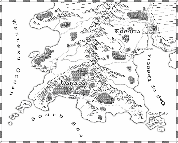
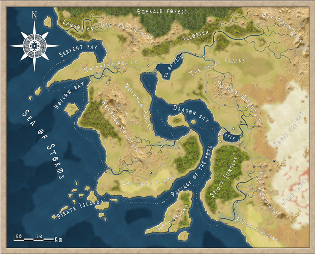
So, which are the best CC3 styles to use to sketch a world for your frontispiece? Most likely it’s black and white line are, though greyscale might work. Here are some suitable suggestions for overland maps.
This prosaically named Overland B&W style is a perfect example of a simple style with which you can create a first fantasy map, It’s very straightforward to use.
Continue reading »
It’s time for the monthly parade of user maps posted to the ProFantasy forum – again we have some lovely work to show off, thanks to the community!
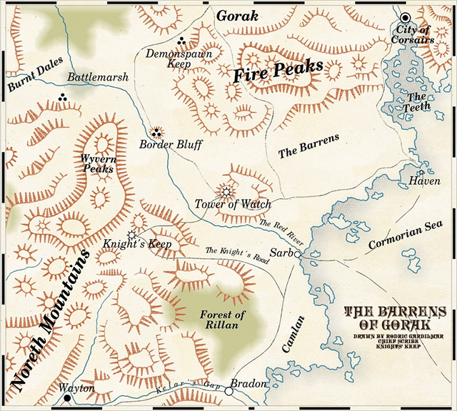
As described elsewhere, TolrendorDM finished off his 2013 Annual Challenge with this map of the “Barrens of Gorak” in the 1930’s travel guide style.
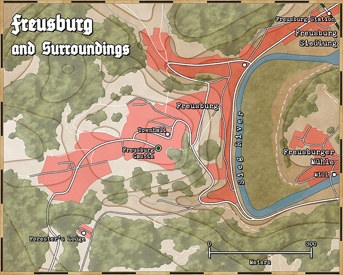
It might have slipped by silently due to the holidays, but the first issue of the Annual 2014 stalwartly appeared on January first. It’s a beautiful area map style by Michal Cross, as seen in the Achtung! Cthulhu adventures by Modiphius Entertainment.
You can subscribe to the Cartographer’s Annual 2014 here.
The accompanying mapping guide also takes you through the steps to take a real-world map from an online map service and convert it to a WW2-era style map in CC3. Here is an example:
The Kobold Guide to Worldbuilding is out, and we have a special discount code for the ProFantasy community: go to the Kobold Store and use the code CC1PFWB0 at checkout to get 25% off any of the following titles:
- Kobold Guide to Worldbuilding (Print+PDF)
- Complete Kobold Guide to Game Design (Print+PDF)
- Complete Kobold Guide to Game Design (PDF only)
- Kobold Guide to Board Game Design (Print+PDF)
- Kobold Guide to Board Game Design (PDF only)
Below is an excerpt from the Kobold Guide to Worldbuilding: Wolfgang Baur’s essay “How Real is Your World? History and Fantasy as a Spectrum of Design Options.”
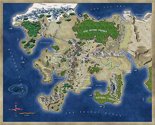 Real Worldbuilding
There are at least two clear traditions in fantasy worldbuilding: the real worlds and the pure fantasies. Fans of the two approaches are usually split and sometimes react violently to the wrong flavor. As with all matters of art and creative endeavor, this is a matter of subjective judgments and personal preferences. The quality of the execution carries a great deal of weight as well.
To put it simply, the competing traditions are these: some fantasy worlds are built more closely on real European legends (such as Conan’s Hyborea, or an Arthurian variant, or Golarion’s many Earthlike cultures), while others are built more clearly on a premise or a conceit (Barsoom or Dark Sun or Spelljammer). A few fall somewhere in between, but let’s pretend for a moment that these are entirely different schools of thought with respect to worldbuilding.
Hard Historical Fantasy
For the historical fantasy settings, I’m thinking of things like Jonathan Tweet’s Ars Magica, Clark Ashton Smith’s Averoigne, Chad Bowser’s Cthulhu Invictus, Sandy Peterson’s Pendragon, Lovecraft’s Cthulhu Mythos and the related RPG, White Wolf ’s World of Darkness, and Scott Bennie’s Testament. These are excellent fantasy worlds, with a specific character, a specific time period, and are built on the firmest ground of realism you can imagine for something that is still clearly a fantasy setting.
This approach is a powerful shortcut to familiarity. It makes these worlds easy to explain to players, and Hollywood uses this formula often as well (“It’s the Wild West—but with UFOs!”). This makes it easy to get buy-in from players or readers, and it simplifies your workload and enriches your storehouse of reference material.
But the style also creates its own limits. Once you are committed to King Arthur and the Round Table, it’s tough to work in Cthulhu (though hardly impossible—Mordred and Morgan Le Fey were clearly cultists!). Once you are discussing wizards and medieval Europe, it’s hard to suddenly bring in wuxia martial arts. A known setting can be bent pretty far, but must never violate the mysterious line where disbelief creeps in. The approach often taken for this sort of design is to declare that the history of the world is well known—but that there is also a secret history, known only to vampires, or Templars, or wizards.
Because this clarity of focus makes the game easy to explain to others (“It’s
the Crusades with magic” or “It’s the Chinese Three Kingdoms with secret Lotus monks”), know in advance that your audience may be small but intensely loyal and likely includes many experts in the period in question.
“Real Fantasy”
Which brings us to the world that is clearly full of the echoes of history and reality, but divorced from it to a greater or lesser degree by its fantasy conceits. It’s one step more fantastical, if you will; its magic is bigger and brighter and its history and sense of earnestness about itself is one step less, while still respecting the roots and traditions of fantasy. There’s more Cthulhu, more fireballs, more giant robots, bigger bets on dragons and monsters and the fantastical coming into the open, rather than the Secret History approach.
To quote particular examples, I’m thinking of settings like Robert E. Howard’s Hyborea, Jeff Grubb’s Al-Qadim, Suleiman, Kenson, and Marmell’s Hamunapta, my own Midgard campaign setting, Bruce Heard’s Mystara, David “Zeb” Cook’s Kara Tur/Oriental Adventures, Tracy Hickman’s Ravenloft, John Wick’s 7th Sea, Games Workshop’s Warhammer RPG, and Greg Gorden’s TORG. Some of these lean more heavily on the real and some more on the fantasy, but in each case, the designer clearly has a shelf full of real-world reference books. Others, like Roger Zelazny’s Chronicles of Amber, Richard Baker’s Birthright, and Paizo’s Golarion, all lean fairly heavily on Earth and its cultures, so they seem to belong here as well.
Each of these owes a great or lesser debt to the real world’s cultures and societies, and the usual points of departure include the world’s great mythologies and legends, such as the Egyptian mythos, the Norse sagas, the 1001 Arabian Nights, the tales of Stoker and the stories of Atlantis and the Song of Roland, Grimm’s Fairy Tales, pirate tales, the tales of Baron Munchhausen, and the Holy Roman Empire. They’re all built on the assumption that the real world is worth embellishing, and that fantasy is a matter of making real places or real legends more exciting. If dragons were real . . . life would be more exciting.
In each case above, it’s impossible to imagine that fantasy setting without the body of lore that undergirds it. As the designer of such a setting, you must understand what makes that mythology tick, and why it appeals to a modern audience. Once you understand it, your work is to make it both accessible and playable by lifting the best parts of it and making them irresistible to gamers. The more of the obscure points you know, the better off you are.
At the same time, it’s very easy to get trapped in excessive research that players won’t care about, and your prose and descriptive detail can become dry and academic. In a historical fantasy, that’s more acceptable than in a real fantasy, where the goal is not so much “simulation plus a little fantasy” as it is “experience an improved version of the tales.”
That’s right: your goal is to do a better job on the Arabian Nights, to improve on the Brothers Grimm, and to swipe the best bits of ancient Egyptian lore from 5,000 years ago, and make it compelling reading for teenagers, college kids, adults of all ages in the 21st century.
No one said it was easy.
It’s time again to admire all the user maps that have popped up in the ProFantasy forum during the last four weeks.
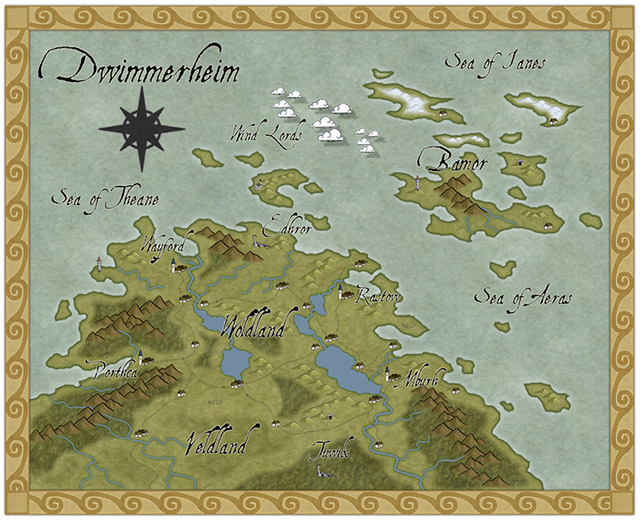
Taking up a recent Annual issue (Pär Lindström’s regional style), Modric created this beauty of the Dwimmerheim region.
Continue reading »
We’re a bit earlier this time around, so I don’t have a full month of user maps to round up. The tally is still very impressive, as well as the skill and imagination of our users.
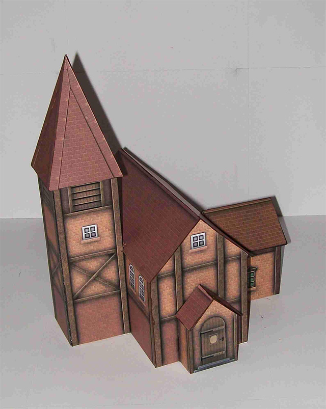
Krom continued his series of Diorama buildings created from DD3 resources, with this beautiful village temple.
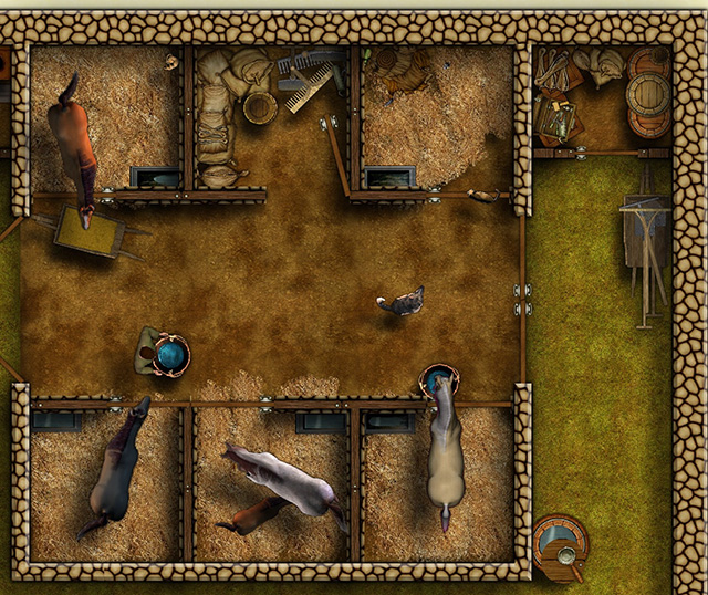
KenG drew this beautiful floor plan of some manor house stables, including artwork from DD3, the CSUAC and the Dundjinni forums.
Continue reading »
[Ed’s Note: Let us know if you like this style, and with Flavio’s permission, we’ll create an Annual from it]
My fiancée recently asked me if it would be OK to make a Viking character for my Al-Qadim campaign. I thought about the role playing possibilities for a moment: Viking gets lost at sea en route to pillage and plunder; Viking gets shipwrecked in hostile desert environment; Viking PC makes for a very interest game indeed. I then thought about where such a Viking would come from in my world and set about creating a map of his home.
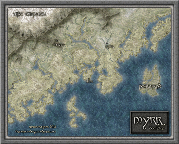
Myrr is a semi-arctic region largely inspired by Scandinavia, Iceland, and Alaska. I spent a great deal of time looking over maps of their fjords and river systems in the hope that I could create something similar and believable in my own map. After an hour or two tinkering around with the fractal line tool (adding a river here, indenting land mass there, etc), I finally had a landmass and set of islands I could be happy with.
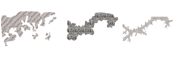
The next step was to create the mountain range. I first drew the main ridge of the mountain and all the little ridges that branch off of it with the smooth poly tool. This is what the looked like without effects on.
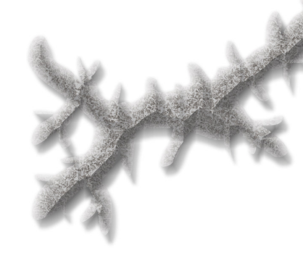
I gave it a rather long and dark wall shadow, a deep edge fade inner (with 75% inner opacity), and a large lighted bevel effect (so that the two sides of the bevel met in the center of the polygon). I then added a Mountain Hills sheet that encircled the range with a smaller edge fade inner and lighted bevel effect. Next, I added a Mountain Base sheet that encircled the Mountain Hills (also with a smaller edge fade inner and lighted bevel effect.) Because I wasn’t thoroughly happy with the colors that were coming out, I finalized it with a Mountain Cover sheet. This shows the details of the effects:
And this is the final mountain range:

As you can see, I also used the Mountain Base sheet to layout my hills. I further added a Hills Base sheet that encircle these hills and had a deep edge fade inner to give the illusion of height. From there I added some forests (very subtle), rivers, text, (about a dozen assorted sheets to get the ocean, landmass and desert looking right) and called it a day. All of the textures came from Herwin Wielink annual and CGtextures.com.
This map was a great deal of fun to make and I learned a new technique for mountains in the process. Of course, the best part is now crafting a history about this region to help fill in the gaps of my fiancée’s character’s back-story. Although I’m far from done, you can check what I have so far (along with a full resolution version of the map) at my blog.
 Downloads from ProFantasy make great gifts. As the buyer, you don’t have to do the actual download yourself. Instead, you can give the recipient some simple download details that are included in your online receipt. These details allow the one receiving the gift to download the software and documentation themselves, at anytime and anywhere.
The download details are available to you as soon as you complete your order, with no waiting around or having to be in for deliveries. They don’t include pricing and you can send them by email or print them out for a card or to put in a gift box. You can make a wrapped present out of a download!
Download delivery has no media to worry about losing or damaging and we keep orders safe on our systems so that you can retrieve them whenever you need. We use Amazon’s Web Services infrastructure to make sure our software downloads are very reliably available worldwide at high speed.
Step by step, this is how you can give downloads as a gift
- Choose your items and place your order.
We offer some great starter bundles for users new to our software. At the checkout, choose delivery by either download or download + shipped media. - As you complete your order, our website sends you a confirmation email and a link to your online payment receipt.
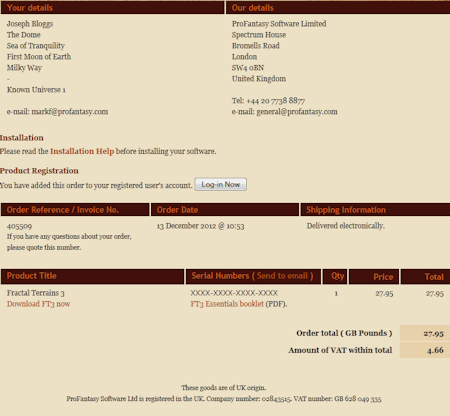
- Looking at the receipt, next to Serial Numbers, click Send to email.
- Moments later you’ll receive a second email that includes the download details for your purchase. These are the details your recipient needs. You can forward the email, print it out or simply copy the key details into a card.
In the payment receipt there’s a very tempting Register button. Don’t click it! As this is a gift, leave registration for your recipient.
The Annual 2012 is our fastest selling annual since we started producing Annuals in 2007. We’ve had amazing user maps created and proudly displayed on our forum. Why? Well, I think the maps and comments speak for themselves. Here are my favourite styles for this year.
 Herwin Wielink‘s overland style was the single most popular style every created for the Annual, measured by the amount of maps shown on the forums. So popular in fact, that we published an extension of the style with more symbols and textures. Use Elothan said here “It is a dream to work with i must say, I originally got it for the isometric dungeons, but this style is good at it is almost worth the price of the annual alone”
Herwin also created another of my favourites – his isometric dungeon style is just extremely clever and beautiful. I used a map created in this style for my annual mammoth D&D session.
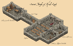 The user map in Herwin’s Overland style was done by Modric, and the isometric dungeon here by forum member Tommek, who even commissioned custom symbols for his map from another artist. There are other amazing maps in this style.
On top of this we have the 13th Age style – a look I didn’t think even Ralf could reproduce, but he surely did, and Clercon here shows us how to use it.
And these are just three of the many styles available from the 2012 Annual.
