Simon Rogers | September 19, 2012 | Newsletter
The latest articles and news from ProFantasy from September.
News
Resources
Map-making articles
3 Comments
Simon Rogers | September 19, 2012 |
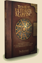
The Tome of Ultimate Mapping and Symbol Set 3 are on sale at a lower price until 21st September. Get them at this price while you can!
- The monstrous 600-page Tome is still priced at $13.95 / £8.95, increasing to $19.95 / £10.95 on Friday.
- Symbol Set 3 with over 1000 extra symbols is currently $21.95 / £12.95 going up to $24.95 / £14.95
Tome of Ultimate Mapping
 The Tome of Ultimate Mapping has been updated by Remy Monsen (the author of the CC3 Full Manual) to cover Campaign Cartographer 3 and all version 3 products up to Fractal Terrains 3 (Dungeon Designer 3, City Designer 3, Symbols Sets 1 and 2, Cosmographer 3 and Fractal Terrains 3). The chapters on the other add-ons will be updated after their new versions are released. Symbol Set 3 is obviously the next on the list. You can see half a dozen example pages of the Tome here.
Symbol Set 3
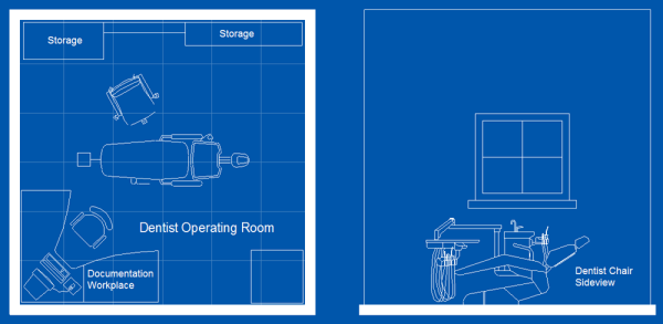
Symbol Set 3 – Modern comes with two completely new bitmap drawing styles for floorplans, with about 500 symbols each. One was created by Jon Roberts, the other by Michael Tumey. There is also a snazzy new blueprint-style for realistic looking player handouts, a Modern political overland style, and the old vector style has been updated to work with CC3’s sheet effects and drawing tools.

1 Comment
Simon Rogers | September 19, 2012 | support desk
Once a month or so someone emails us having bought a second-hand copy of CC3, or more usually, older versions of Campaign Cartographer. Usually, these purchases do not include a serial number. Such purchases are worthless. Occasionally this is deliberate, but more often it’s a mail order copy – these don’t include the serials, just the media and documentation. Ebay is a very typical source of unlicensed copies.
Now, in common with most software, when you spend money on Campaign Cartographer, you are buying a license to use the software – so the important thing is the unique serial number. You can transfer our license to another person, as long as you let us know and the transfer includes all versions of CC3 that the original licensee has purchased. This prevents mutiple individuals buying an upgrade for a product. We’d be happy to email any potential seller confirmation that they have a legitimate copy, and arrange for a license transfer.
So, if you are in any doubt, or even if you’ve been stung, we’d be happy to help. Just email the support desk.
2 Comments
Simon Rogers | September 19, 2012 | development
Down in the code pit, the nuts and bolts of the CC3 engine are being disassembled and reassembled for future proofing – glue routines are being replaced and code recompiled with the latest compiler. We are as prepared for Windows 8 as we can be.
Character Artist 3
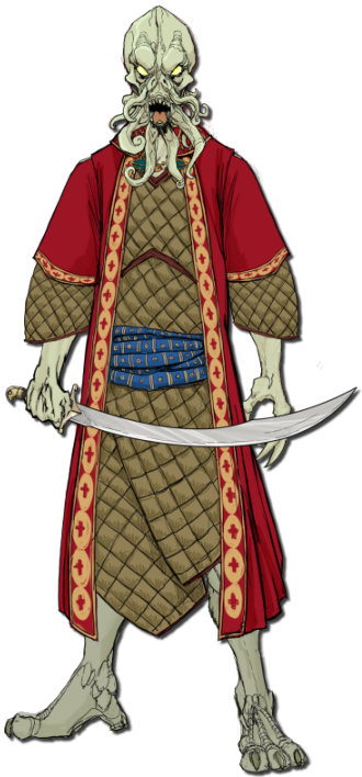
Our development work affects the order in which we release products, so we’ve moved Character Artist 3 to the top of the production line. The changes to Character Artist are primarily art – the interface is already straightforward and doesn’t need much work.
The art work is nearly finished – the squid faced gentleman is an example, but we’d like your input in deciding where to concentrate our final art efforts. Please vote here.
Random City Generator
L. Lee Saunders has been working with our beta testers to get the RCG ready for public consumption, and now here it is – ready for your feedback.!
Perspectives 3
Perspectives has been rescheduled because we want to include a surprise additional style in it. Existing Annual fans might be able to guess who it’s by!
Source Maps 3
For the Source Maps series, we want to update the maps in new styles and create new maps, which will require additional cartographers. These will then be available as modestly priced updates to the existing Source Maps series.
Dioramas 3
The main work here, once more, is art; newer, better art. CC3’s art capabilities combined with the work of professional artists and cartographers have transformed the quality maps which users create, and we intend to repeat this with Dioramas, too. The main additional feature will be angled fill styles, enabling us to create nets with, say, a raster brick pattern in all directions.
2 Comments
Clercon | September 18, 2012 |

This month’s annual (September ’12) for Campaign cartographer 3 from Profantasy offered a very good looking style based on the world map of the upcoming role-playing game the “13th Age” by Rob Heinsoo and Jonathan Tweet.
I always like to try out new styles so I thought I should give this one a try too. Usually when I make maps I try to make a story around it. If you let the map visualize your story it is often easier to make it more unique and the details will kind of come more naturally. The drawback of working in that way is that it takes much more energy from you making a map, so this time I decided to just make a map without weaving a story around it.
The style itself was very easy and quick to work with. Most of the terrain is made up from seamless bitmap files so making mountains and other types of terrain goes really quick. The mountains however gave me some problems. Sometimes it was hard to get the high peaks in the places where you wanted them. But luckily enough the style also includes single mountains you can add to the mountain texture, which made the process easier.
If you look at the map included in this post I guess it took around three hours to do it, and then I probably spent as much time on labeling as I did on the actual map.
One thing I didn’t like though was that when you added the sheet effects to the map the seas didn’t get any effect added to them. When I made the map I had two larger seas, the sea of pain and little sea, that where close to the oceans. When those seas didn’t get any effect they looked strange compared to the nearby oceans. I tried to add some effects to the sea layer but because the ocean layer lies below the land layer and the seas are on top of the land layer it was hard to get an effect that looked exactly the same.
Apart from that I liked the style and if you want a map in a more stylish satellite style I can really recommend it.
Originally posted on mappingworlds.wordpress.com
2 Comments
Mark Fulford | September 17, 2012 |
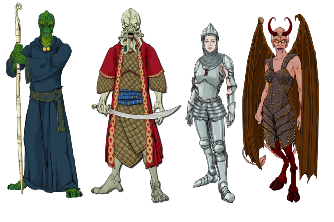
The original Character Artist Pro artwork is looking a little long in the tooth so, for Character Artist 3, we’ve comissioned artwork by Rich Longmore. We have an art budget and we’d like to use it as wisely as possible, so we have to make some tricky choices. This image shows some of the variety of clothes, accessories and humanoid monsters we already have.

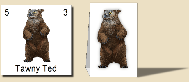
Character Artist 3 lets you create humanoid monsters such as the Dread Pirate Squid above, but in CA Pro we also included some front-on symbols for a variety of monsters for use on counters or standees. I asked Rich to produce a sample image, and this is what he came up with. Cute fella, isn’t he?

This leaves us with a question – how much do you want news monster and treasure tokens in CA3 compared with some extra clothing, accessories, expressions and humanoid monster parts? Please let us know in this poll.
[iframe_loader width=100% height=650 frameborder=0 margin=20 marginwidth=0 scrolling=no src=http://www.profantasy.com/poll/caintro.asp]
7 Comments
Clercon | September 10, 2012 |
I really wish I had more time to do dungeon maps. But for some reason it seems that I always end up doing overland or city maps. Don’t take me wrong, I really love doing those maps but i just wish I had more time for dungeons as well.
Mostly when I make dungeon maps I use Dungeon designer 3 (DD3) from Profantasy. The advantage of the program is that it let you create a map very quickly. You can of course spend millions of hours on details in the maps but if you just need a quick map for an evenings game DD3 will let you make that.
Whenever I make a dungeon I usually try to make a quick sketch on paper. This will make it easier when you start working on the map in DD3. In DD3 I usually start with putting out the floors for the rooms, when those are in place I start to make all the floors for the corridors. If you don’t have a sketch to use as a blueprint this work will be much harder.
When all the floors are in place it is time to place all the walls. You might wonder why I don’t use the room tools in the program, where you place floor and walls at the same time? Well the problem with that approach is that you have to do a lot of cutting in the walls to get all the doors in, or just to open up for the corridors. When I started to use DD3 this was the approach I used but after a couple of maps I changed the working process to first place the floors. And in my opinion that works much better.
When all rooms and floors are done it is time to add in some details. I always start with doors, then I place tabels, traps, torches, blood stains etc. This last step can take everything from an hour to four, five hours. It all depends on what you need the map for, an evenings game with some fiends or to publish in an adventure.
The map below, Catacombs of evil, was a test map I made when I first purchased DD3. It is made in Jon Roberts great style, that is free to download from here. When I made the map i pictured an evil cult hiding in the catacombs under a temple where they worshiped some demon. The adventurers mission would be to find the cult, free the prisoners and kill the demon.
The map is completely made in DD3, apart from labeling and the red light effects in room 8 that are made in Photoshop.

Originally posted on mappingworlds.wordpress.com
1 Comment
Clercon | August 14, 2012 | overland, Par lindstrom, Tutorial
This is the second part in my overland mapping tutorial. If you want to read the first part before continuing you can find it here. As usual this is my view of mapping and you might agree to it all or just parts of it. The important thing to remember is that this is one view of mapping, and not the only one.
Ok back to the map. We have some landmass, islands and seas so what’s next. At this stage I always try to place mountains and hills. If you desire you can try to work out where you would have tectonic plates and from that information decide where to put the mountains. I never do that, I’m more going for the “if it looks good it looks correct” path here.
First of all I often try to use my mountains to divide the landmass into different areas. It is an easy way of making natural borders in the map that you later can use when it is time to decide where to put the borders between different countries.
Secondly I try to make my mountain chains curved. If you make them straight the map will, in my opinion, look a bit stiff, which will give you a less good looking end result. When I say curved I don’t mean that they should look like circles. Curved mountain chains will give more life to the map, it will get more fun to look at.
Also try to break up the mountain chains at some points. It will give you some interesting valleys and passes that can trigger the beholders imagination in a good way. Is there really a more interesting place for a campaign then a mountain valley full of orcs or strange creatures, maybe a deserted watch tower or an old haunted burial ground.

Around the mountains I place some hills to make the transition from mountain to field look more natural. A good idea might also be to put some hills between two mountain areas that are quite close to each other. It will connect them in a nice way.
When you’re done with your mountains it is time to start on the rivers. The basics when it comes to rivers are that they flow from high ground downwards, they don’t split downwards, but they can have more than one starting point. Usually they also try to get to the sea the shortest downhill way. If you try to follow those two rules the rivers will look more naturally.
Another thing to think of is that the straighter the river is the faster the flow of the river will be. Most rivers tend to be straighter and faster in the beginning and closer to the sea they usually will slow down, which means more curves. When I put rivers in my maps I tend to do them quite curvy. It will usually look better, straight rivers just don’t get the right feeling, at least that’s my opinion.
Originally posted on mappingworlds.wordpress.com
1 Comment
ralf | August 6, 2012 | GenCon
 GenCon Indy is drawing near and it’s almost time to pack the suitcase for the trip to Indianapolis.
You’ll find ProFantasy Software at booth #1427 in the exhibitors hall. Checkout the exhibitors’ hall map here. We will have the new Symbol Set 3 – Modern for sale, as well as the new Tome of Ultimate Mapping (as a pdf) and last year’s Annual collection (Volume 5). You can also get a glimpse at the artwork for the upcoming Perspectives 3 and Character Artist 3.
We are looking forward to the show and hope to see as many users as possible!
Comments Off on ProFantasy at GenCon – Booth #1427
Simon Rogers | August 2, 2012 | Newsletter
The latest articles and news from ProFantasy
News
Resources
Map-making articles
Comments Off on August Newsletter
