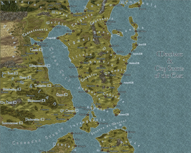
ralf | April 15, 2013 | Annual, Jon Roberts, kobold press, midgard, overland
We have released the April issue of the Cartographer’s Annual 2013: The Midgard World overland style. Created in cooperation with Kobold Press and Jonathan Roberts, this style recreates the maps published in the Midgard fantasy campaign setting and the accompanying iPad atlas. You can now add your own regional maps for this setting, or recreate another world in the same mapping style.

Even better, the Midgard World style is compatible with the Jon Roberts overland style from the Annual Vol 5. They can be combined for a greatly enlarged variety of symbols and fill styles.
Comments Off on Cartographer’s Annual: the Midgard World style
ralf | March 19, 2013 | community, Maps of the Month, user maps
It’s time again to admire all the user maps that have popped up in the ProFantasy forum during the last four weeks.
Taking up a recent Annual issue (Pär Lindström’s regional style), Modric created this beauty of the Dwimmerheim region.
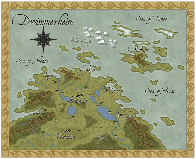
Continue reading »
1 Comment
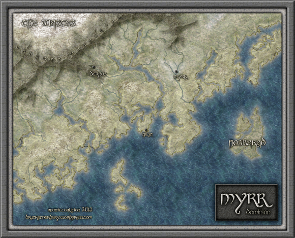
ralf | March 1, 2013 | Annual, overland, user maps
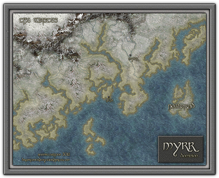
We’ve just released the March Annual issue: Flavio’s Myrr Overland style is now available as a download for the Annual subscribers.
His beautiful and unique overland style is based on intricate bitmap texture and shaded contours, as you can see from this sample:
You can subscribe to the current Annual here.
Comments Off on Cartographer’s Annual: Myrr Overland style released
Simon Rogers | February 19, 2013 |
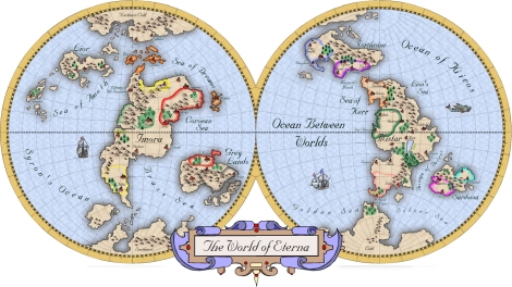
[Ed: This is a map created by Rigtje Schootstra, Leviathus on the forum]
Hello everyone!
It’s world map time! These maps are from my project Lion Head. The world is called Eterna.
Below the first map, made with Campaign Cartographer 3 (using the Mercator Style), which is based on my hand drawn map (see below this map). The position of the continents is a bit different than my original drawing, but I had to fit them in the two spheres without shrinking the map too much. Most of the place names and political borders are still placeholders.
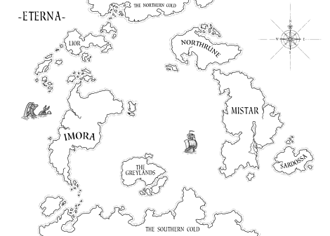
The map I drew in Photoshop. Here you can see the names of the continents more clearly.
Enjoy guys.
~Cheers! (Original post here)
Comments Off on Mercator Map
Simon Rogers | January 30, 2013 | effects, overland, Tutorial
[Ed’s Note: Let us know if you like this style, and with Flavio’s permission, we’ll create an Annual from it]
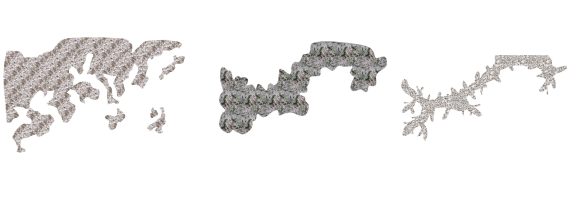
My fiancée recently asked me if it would be OK to make a Viking character for my Al-Qadim campaign. I thought about the role playing possibilities for a moment: Viking gets lost at sea en route to pillage and plunder; Viking gets shipwrecked in hostile desert environment; Viking PC makes for a very interest game indeed. I then thought about where such a Viking would come from in my world and set about creating a map of his home.
Myrr is a semi-arctic region largely inspired by Scandinavia, Iceland, and Alaska. I spent a great deal of time looking over maps of their fjords and river systems in the hope that I could create something similar and believable in my own map. After an hour or two tinkering around with the fractal line tool (adding a river here, indenting land mass there, etc), I finally had a landmass and set of islands I could be happy with.
The next step was to create the mountain range. I first drew the main ridge of the mountain and all the little ridges that branch off of it with the smooth poly tool. This is what the looked like without effects on.
I gave it a rather long and dark wall shadow, a deep edge fade inner (with 75% inner opacity), and a large lighted bevel effect (so that the two sides of the bevel met in the center of the polygon). I then added a Mountain Hills sheet that encircled the range with a smaller edge fade inner and lighted bevel effect. Next, I added a Mountain Base sheet that encircled the Mountain Hills (also with a smaller edge fade inner and lighted bevel effect.) Because I wasn’t thoroughly happy with the colors that were coming out, I finalized it with a Mountain Cover sheet. This shows the details of the effects:
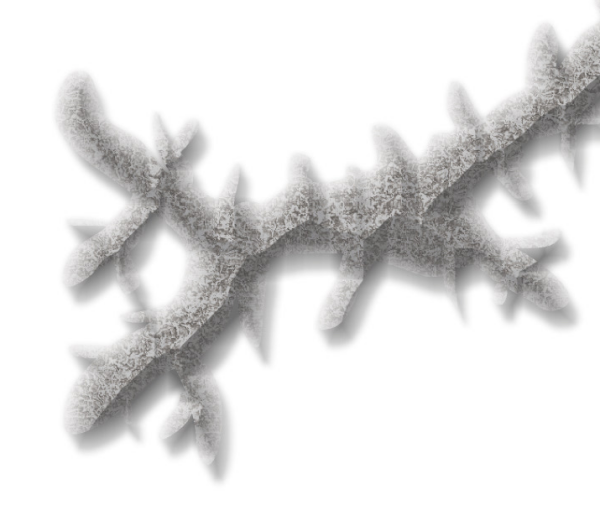
And this is the final mountain range:

As you can see, I also used the Mountain Base sheet to layout my hills. I further added a Hills Base sheet that encircle these hills and had a deep edge fade inner to give the illusion of height. From there I added some forests (very subtle), rivers, text, (about a dozen assorted sheets to get the ocean, landmass and desert looking right) and called it a day. All of the textures came from Herwin Wielink annual and CGtextures.com.
This map was a great deal of fun to make and I learned a new technique for mountains in the process. Of course, the best part is now crafting a history about this region to help fill in the gaps of my fiancée’s character’s back-story. Although I’m far from done, you can check what I have so far (along with a full resolution version of the map) at my blog.
9 Comments
ralf | January 30, 2013 | community, Maps of the Month, user maps
We’ve gone into 2013 and our community shows no sign of letting up with the barrage of wonderful user maps. Here’s the roundup for January!
KenG was inspired by KROM’s wonderful close-up maps/paintings done in the Herwin Wielink overland style. The result is this beautiful local map.
Continue reading »
1 Comment
ralf | January 24, 2013 | battle map, Deadlands
After a hiatus around Christmas and New Year, our Deadlands Reloaded campaign is back in full swing. For the latest session I created this little battle map of an underground lab/hideout. It didn’t get used yet, but it’s generic enough to be used in almost any environment and campaign. It uses Dungeon Designer 3 artwork, as well as pieces from the Annual Vol 5 February issue (created by Joachim de Ravenbel).

Click the image above to download a pdf version of the map, scaled and tiled to print on two pieces of A4 oder US Letter size paper.
1 Comment
ralf | January 17, 2013 | community, Maps of the Month, user maps
I’m a bit late – due to the holidays and the release of the new Annual – but I don’t want to keep December’s beautiful new creations of the Profantasy user community from you.
Moskva very slightly missed the November round-up, so the first draft at his nice Hurland Country Map didn’t make it last time. This is kinda fortunate, because you can now see it in full detail!
Continue reading »
1 Comment
Simon Rogers | January 8, 2013 | user tutorials
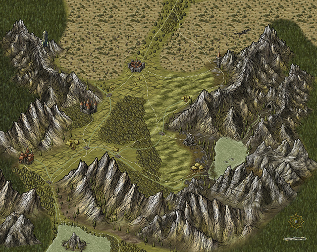
[This map was created by forum user anomiecoalition.]
After a rather lengthy hiatus from the world of fantasy and roleplaying, I recently convinced a few friends to give it a try and set about constructing a world that would keep their interest. Along the way, I stumbled upon Campaign Cartographer 3 and was amazed at the maps that people were producing with it and the possibility that it provides to even the artistically challenged (like myself). After a short couple of week tinkering with the program and learning a great deal from the tutorials available I constructed Brightstone Keep.
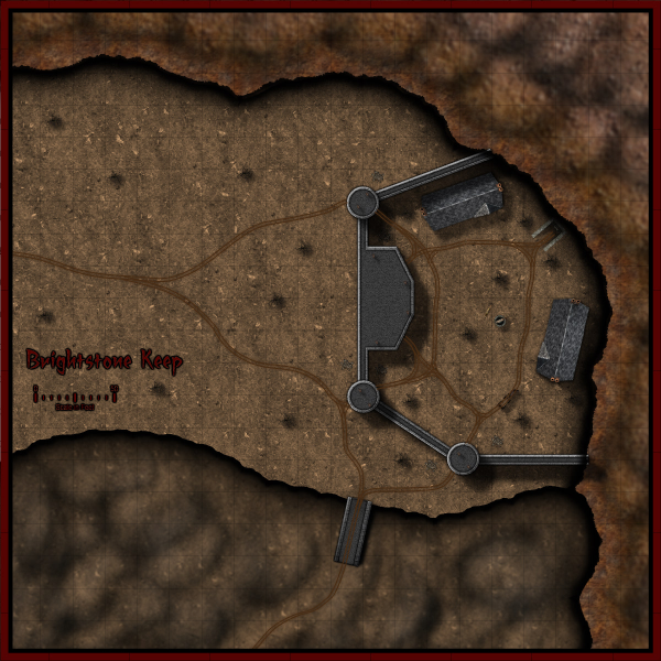
The map and its back story are loosely based on a free adventure provided by Wizards of the Coast. The keep protects a mining operation that has been overrun by a variety of nefarious creatures. The symbols utilized can be obtained from the CSUAC.
The first step in creating this map was to establish the basic layout. I depicted a mountain wall running from the top left to bottom right corner for which I used three separate sheets and shapes. Then I added cliff running left to right towards the bottom of the map on another sheet.
Adding the Mountain
I began by drawing a rough outline of the mountain wall and filled it with a dirt texture. I learned that it is a good idea to draw beyond the map border on these shapes to ensure that if I applied any edge-fade effects, they wouldn’t appear on the border side of the map. Using effects I then applied a slight blur and two black outer glow effects – one with strength of 0 above another with strength of 1. I then created two more shapes and sheets to go above this mountain wall and utilized different dirt textures. To these sheets, I applied a slight blur and an edge-fade-inner effect.
Adding the Cliff
Depicting the cliff was a bit simpler – here I just reused the dirt texture from the background but constructed a separate shape on a separate sheet and applied a similar setting as that use on the first mountain wall sheet (but with an inner glow). The final step was to add some hill overlay transparencies to add some character to the terrain. I applied these symbols on a separate sheet and varied the size/orientation to achieve the desired effect.
Adding the Keep
In constructing the walls of the keep, I created four sets of sheets and shapes. I began by drawing some solid gray lines (width of 6 – adjust to scale) to create the outer wall. I then applied a texture sheet effect (stone texture of your choosing, Intensity 1, size 15); on top of that a black outer glow (strength 1, blur 2); a wall shadow (length 15, opacity 65, blur 5); and finally a bevel (length 1.5, strength 35, and fade 1). I next wanted to create a walkway for that wall. I copied the image to a new sheet and reduced the width to 3. I then applied a texture sheet effect (with a different stone texture but same settings) and an inner black glow (strength 1, blur 2). I followed the same procedure to construct the towers/ramp and placed those shapes and sheets on top of the wall. (The ramp actually required that I draw in a black shadow on the right side to give it some dimensionality.)
The Road and the Rest
The last step was to draw in some roads and tracks. I laid down a road (added a texture, blur, and edge-fade-inner sheet effect) and then drew in the tracks according to the instructions provided in the Jon Roberts Special Issue of the Annual. From there it was just a matter of placing some vegetation, rocks, buildings, and text to complete my map.
I had a great time making this map and was amazed at how easy it was once I familiarized myself with the program (the video tutorials and assorted blog entries are invaluable.) I just hope my friends enjoy playing with this map as much as I enjoyed making it.
*I plan on posting more of my maps on my new blog
Comments Off on Brightstone Keep
ralf | January 2, 2013 | Annual, Cthulhu, handouts
The January issue of the Annual 2013, entitled “Investigation Props”, is now available. Be it your classic Cthulhu campaign set in 1920s and 30s, games set in even more recent times like Night’s Black Agents and Delta Green, or sci-fi settings like Ashen Stars – the January issue contains the tools to create handouts, charts and other props for any of these.
You can subscribe to the Annual 2013 here.
1 Comment


