Simon Rogers | April 30, 2012 | overland
[Editor’s note: Forum member Mateus Buffone posts about his excellent Panorica map]
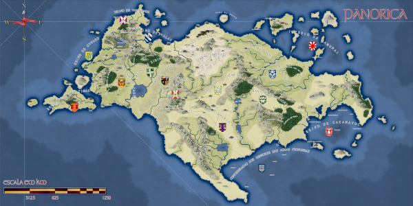 Some days ago Simon Rogers asked me if he could use my map as “The Map of The Month”. When I read it, I could not believe it. I started the hobby last year and I am still learning the tricks of the trade, so it’s an honor to have a map that I made posted.
This map is named Continent of Panorica and I did the first version of it in less than an hour for a RPG game that I would begin on the next day. The first thing that I neded was a style that would fit well in a continet map and that have a “fantasy” feel, as what I wanted was a fast and “cliché” map for a fast and “cliché” world. So I choosed the CA51 Jon Roberts Overland Style that is part of the 2011 Annual.
I generated landmasses in Fractal Terrians 3 until I saw one that would fit my needs. Than I exported it to CC3 and fractalized a little more. After that I used the Land Default tool from the style and drew the islands, then used Fractalize on them to achieve a nmore natural feel. The next step was to place the mountains ranges. I was not concerned very much with realistic geology but I did not want to explain all my world with “magic!”, so I placed them first near the coast where I thought others continents would exist if I some day did the whole world. Then I placed the central chains as I needed a desert for my game. For the first version I only needed the central region so I placed some of the major rivers of the continent and dotted some settlements near the desert to form a pseudo-Arabian/tuareg region and called it a day.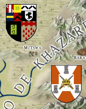
But at that point I was in love with the project and wanted to transform it in my fixed fantasy map for the kind of game that I was running (a GURPS Dungeon Fantasy campaign). So I needed other regions and more details. So I begin to really think about the whole image: what cultures lived there, their society and political organizations. I decided to made the banners of the diferent kingdoms and others political organizations. For it I used the CA15 “Heraldry” from Annual 2008 and exported then as FCW entities to my continent map. I used some symbols found on the Map & Catalog Library in the ProFantasy home page. First I had a lot of dificults to implement the shields because messing with sheets is not very easy, but when you learned what to put where they are a big time saver! For the desert, florest, farmland and scrubland terrain to work on this map I had to rescale then for just 50% of their original size (this tip was gave to me by Simon himself).
[To rescale a bitmap fill style:
1. Click on the Fill Styles Indicator, the Bitmap Fills tab, and find the texture on the Fill Style Name pulldown.
2. Reduce the Scale Width and Height (maybe to 50%) and OK.
3. Try again until it looks right.]
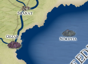 Another point of interest was the underwater setlements (Forte do Sino inside Terras Alagadas and the whole southeast region). I spend a big time with then and in the final I only neded of an Transparency effect. And I think that this is one of the most import aspects of CC3. When you find good effects and know how to create and manage sheets for each of your maps you can achieve very good results.
I hope that you like my map and if have any suggestion talk with me on the community.
6 Comments
ralf | April 1, 2012 | Annual, herwin wielink, overland
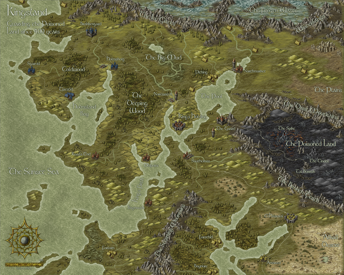
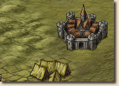 We’ve just made the April issue of the Cartographer’s Annual 2012 available. Enjoy a beautiful new overland style created by Herwin Wielink. It’s the first time you see his art in the Annual, but it won’t be the last!
If you haven’t subscribed to the Annual 2012 yet, check out more information on this issue on the Annual website.
1 Comment
ralf | March 30, 2012 | Annual, artists, overland, wielink
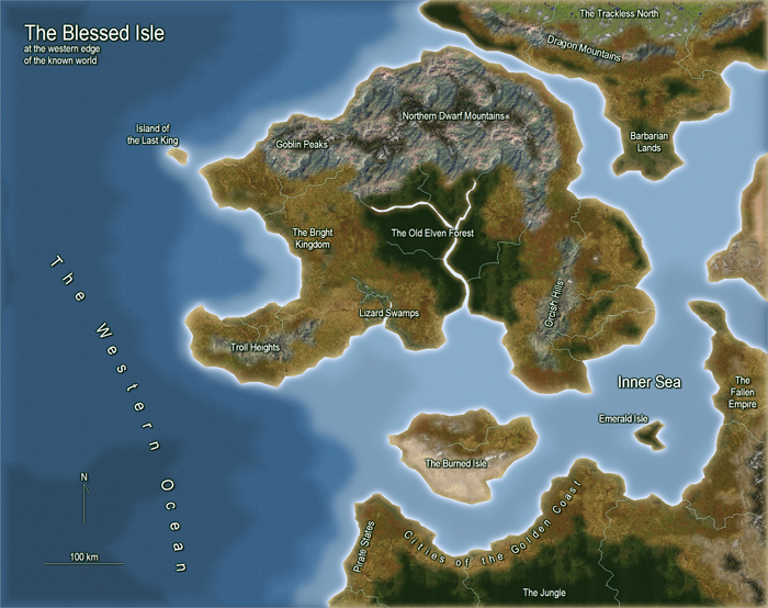
Here’s a preview for Sunday’s upcoming Annual issue. Herwin Wielink‘s beautiful overland style:

2 Comments
ralf | February 22, 2012 | Annual, city, overland, sneak peek
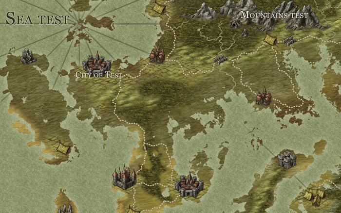
A little peek at the work-in-progress on one example map for the March Annual:

Also, a little sneak peek at the April issue:

2 Comments
ralf | January 31, 2012 | Annual, overland
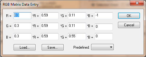
While creating an example pdf for the February Annual issue, I accidentally printed it in grayscale. I thought the result has quite a charm of its own:

2 Comments
ralf | January 31, 2012 | Annual, Cosmographer, overland
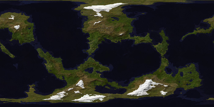
The February issue of the Annual 2012 elaborates on a style introduced in Cosmographer 3: The satellite view overland map. This large-scale, straight overhead style evokes the view a satellite might have on the landscape below. Seamlessly-tiling textures are smoothed together through sheet effects to create the image of an unbroken, natural landscape.

The source for the textures is taken from public domain images made available by NASA through their Visible Earth website. The texture are carefully crafted from these originals and made into CC3 bitmap fill styles.
While it served as an inspiration, Cosmographer 3 is not required to make full use of this style. See the Annual 2012 site for more information on this style.
Check out this large-scale (A2) example map created in the Annual Overland Satellite style.
The February issue is available for subscribers now!
2 Comments
ralf | December 16, 2011 | Campaign Cartographer, Fractal Terrains, overland
The final Annual issue for 2011 is here: A combined texture pack for Fractal Terrains 3 and Campaign Cartographer 3. Give your FT world a new look with the textured climate shader or draw climate maps of your regions in CC3.

Stay tuned for the Cartographer’s Annual 2012!
Comments Off on Final Annual – Climate Textures
ralf | October 1, 2011 | Annual, handouts, military maps, Modern, overland, treasure maps

October 2011: Treasure Maps
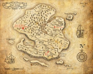
We’ve just released the October Annual for subscribers to download: A beautiful map style inspired by classic fiction treasure maps. It allows users to easily create handouts for their game and set their players on the trail of that elusive treasure hoard.

September 2011: Military Operations
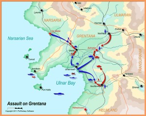
Due to after-GenCon demands and vacation times, we didn’t get around to posting about the September Annual when it was released. Here is sneak peek at the military operations type maps that can be created with its included style.
Comments Off on September and October Annuals
Simon Rogers | June 10, 2011 | overland, Pete Fenlon
Our Annuals are designed to give value year after year – as an example, I give this flashback to May 2008 from my livejournal…
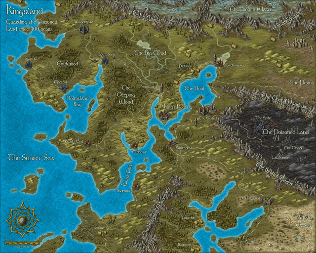
Many of us remember, and were inspired by Pete Fenlon’s wonderful maps for the Middle Earth Roleplaying Game. Today, Pete is Chairman and Studio Director at Mayfair Games. In January 2008, with Pete’s permission we released a style pack for making maps in his style as part of the Cartographer’s Annual 2008.
Steve Townshend produced this beautiful map in the Pete Fenlon style.

It uses only specially designed vector symbols combined with CC3’s effects to get the right look.
Style packs are preconfigured so that if you select a tool (for example, rivers, roads and terrain), it looks right for the map style. To create a forest, you just select the forest draw tool, click points for the border, and it does this, adding random tree tops and edge trees.

You building up mountain ranges by selecting a symbol, then placing. They are selected randomly from a collection of symbols. So this was one click per mountain, and the mess at the bottom is a mountain cursor. You can tab through random styles if you don’t like the current mountain at the cursor.

The distinctive ridges are also built up of symbols. On the left, with CC3 effects off, on the right, with them on.


Although the styles definitely make it easier to create maps such as these, Steve Townshend demonstrates that the human touch is still required to get an aesthetically pleasing map – style packs just make it easier to get the desired effect.
You can download the map in CC3 format here.
4 Comments


 Another point of interest was the underwater setlements (Forte do Sino inside Terras Alagadas and the whole southeast region). I spend a big time with then and in the final I only neded of an Transparency effect. And I think that this is one of the most import aspects of CC3. When you find good effects and know how to create and manage sheets for each of your maps you can achieve very good results.
 We’ve just made the