ralf | June 20, 2018 | guest article, mapping, Mike Schley, narrative
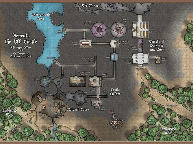
 What is a map and how can it tell a story? To explore the question, let’s begin by defining our terms. According to the Oxford English Dictionary, cartography is “the science or practice of drawing maps”. So what is it then that we’re creating in this process and how do we know if we’re achieving our goals? Furthermore, how can we tell that our efforts are making the most of the medium we’ve chosen to communicate with our audience? Returning to the Oxford English Dictionary for another clarification of terms might help here. A map, used as a noun, indicates “a diagrammatic representation of an area of land or sea showing physical features, cities, roads, etc.”. In addition, it can also refer to a representation of the position of objects in outer space, or more generally, the arrangement of any collection of information with regard to its distribution over an area or sequence in a progression. In a nutshell, a map is a selective re-presentation of facts as they relate to one another in space or time. When used as a verb, mapping speaks to the act of organizing or defining those relationships with the aim of creating a depiction that can be used for either internal reference or communication with others. With this in mind, the choices that we make in the process of building a map inform not only its technical function and visual flavor but also its ability to serve as a non-linear narrative ripe for expansion.
 In my mind, the difference between a simple diagram and a cartographic masterpiece lies in the manner in which the work engages its audience. Some of the best maps I can think of remind me of sandboxes filled with intriguing story seeds. Wherever you look there is enough detail to lose yourself in but there also exists ample room for the imagination to build and expand on what’s given. A great map presents itself as more than simple data. The rabbit holes within a truly engaging map are as varied as its viewers and as numerous as each moment an eye traces a path across its surface. With this in mind, how we choose what is important enough to include and what should be omitted defines the true character of our creation. It’s this judgment and practice that makes all the difference.
Now that we know the basic framework of the activity we’re engaged in, let’s look at some specifics concerning how to move forward. The scope of our interest here is presumably limited to the crafting of fantasy maps, particularly that sort defined by the needs of role-playing game masters looking to visualize sites for exploration, encounter settings, or storytelling. Since we aren’t necessarily worried about maintaining fidelity to a real-world location, then the focus of our overall aim shifts and we are allowed to build the world with more of a free hand. As a result, the initial design and layout steps serve a more essential function since the location is built from the ground up.
 With this leeway, the inherent narrative nature of a map becomes that much more apparent. You’re telling the story, or setting the stage for a multitude of stories, by how you develop your picture. That being said, logical issues of physics, geomorphology, and tendencies of habitation are extremely important to consider since an environment that doesn’t make sense sets up roadblocks to storytelling that at their worst can become glaring holes in the plot. Even in the most fantastical world, if your river is running uphill then there better be a mighty good reason for it as well as an accompanying basin for all that water to drain into. Magic and otherworldly influences can drastically affect the underlying rules of the game but the response to those peculiarities needs to be logical. If your world is built on the back of an enormous turtle, then make sure to spend some time thinking about its implications and build the map accordingly. To expand on this, can nuances of your map speak to larger issues outside its boundaries? How can those unique details lead the reader or player to ask questions that spur them on to further adventures? The river that suddenly jumps its banks to cascade into the sky is a perfectly weird device that can set the stage for an excellent beginning to an adventure.
 All maps present some form of constructed narrative such that in order for them to function as representations of something else, or worlds unto themselves, they are utterly reliant on decisions made by their creator. These choices are an outgrowth of the cartographer’s point of view and are a function of the creative process. In other words, if a patch of ground were simply duplicated to the last detail it would be a copy rather than a description and it’s in the description that we can find our voices as artists and authors. These determinations give identity to a map and define the purpose it serves. Something as simple as the manner in which a hierarchy of information is organized speaks volumes about the interests and drives of the artist. Allowing these choices to inform and reflect the character of your work makes for a richly compelling creation that feels much more alive than one whose features might seem overabundant, meager, or capricious.
Selecting what to reveal and what to omit is as vital to the process of drawing a map as it is to writing a story. Show your viewers what you’d like to tell them and let their imagination play with those details. What you choose to include will provide game masters and players alike the story landmarks they may respond to while the components you omit can potentially indicate a mystery or leave room for later editorial changes and expansion down the road. This organic living nature is a vitally important aspect of any captivating image whether it takes the form of a fog-of-war mechanic or the inclusion of a mysterious cave entrance in a traditional paper map. Leave something to be explored. This is particularly true of regional maps where the words ‘Terra Incognita’ serve like a beacon into the great unknown.
 When designing the overall look and feel of your image, also consider how much is too much. The last thing a map should be is confusing, unless that’s a plot device you’re specifically aiming for. There is a balance that needs to be kept in mind in order to avoid the all too common cluttered look that occurs when a map becomes practically illegible due to the overabundance of information. If everything is included without respect to what really needs to be shown, the resulting visual noise can potentially drown out what’s actually important. Leave some room to breathe in the image and vary your object sizes, areas of contrast, visual density etc to avoid monotony. The fundamentals of design are just as important here as they would be in painting a landscape, since in a manner, that’s what we’re doing. Typically it’s a top-down landscape, but it’s still a landscape nonetheless. Luckily for us, we have the good fortune of being able to employ a wealth of tools that the traditional landscape painter might lack access to such as symbols, text, and multifaceted media.
 Finally, I can’t emphasize enough the fact that any map you create is only a starting point presenting your view of the world being shown. It’s a beginning so make sure to set the stage for the coming adventures embarked upon by your audience. Give it some life and don’t shy away from suggesting potential storylines that might be ripe for development. Visual narratives don’t need to be linear or even complete but they do require thought in their employment. Give the audience little nuggets of gold and they’ll dig into and expand on your creation by mining the depths of their own imagination. It’s not only your tale that’s being told here, especially where role-playing maps are concerned. It’s a partnership, a collaborative adventure embarked upon in the minds of each person huddled around your map.
Mike Schley
“As an illustrator and cartographer I’ve created a large number of pieces for publishers such as Wizards of the Coast, HarperCollins Publishing, and Inkle Studios. Of these, I’m most recognized for my development of environmental artwork and maps for the fantastical worlds of Dungeons & Dragons.”
Comments Off on Mapping Narratives by Mike Schley
ralf | March 7, 2018 | guest article, Jon C Munson II, Mike Schley, Symbol Set 4, symbols, Tutorial
Jon C. Munson II
Background
 The mapping style of Mike Schley is, simply put, beautiful. It is no wonder that Wizards of the Coast sought him out for many of the maps used in their products. His use of line, shading, and slightly muted color do a fantastic job of creating the illusion of a truly hand drawn map with dimensional objects. And, well, for the most part that is exactly what they are – hand drawn, albeit done using programs like Adobe Photoshop and/or others. If you haven’t seen his maps, you really owe it to yourself to take a look at them.
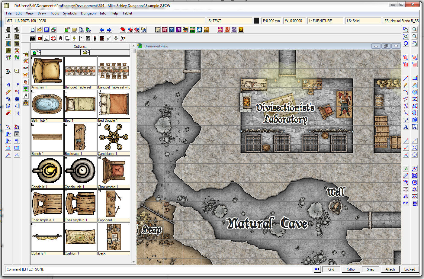
I had always liked Schley’s maps, and wanted to produce a few maps for a module I had in mind for the Dungeons & Dragons group that I run. Knowing how many hours it would take to hand-draw the maps, I looked for a way to cut down some of the time required. Enter ProFantasy’s Campaign Cartographer 3+ (“CC3+”). The program uses a number of Schley’s symbol packs (for example Symbol Set 4 – Dungeons of Schley), and that was perfect for me. Well, almost – I needed further symbols to suit my module. Now I had to figure out how to both create symbols and emulate Schley’s style to produce the symbols I needed. And, I also had to figure out how to get those into CC3+. It turns out it isn’t a hard job, but, it is a bit tricky, and most of the effort is in creating the symbols themselves. Schley’s style seems to be fairly involved, and that complexity is what makes them so appealing.
Personally, I have no idea how Mike Schley goes about making his symbols or drawing his maps. I have, however, studied his symbols and maps to try and figure out how he makes his creations. Despite many hours, I’m still uncertain of his exact process, but I think I have at least a little idea. I discerned enough to be able to put together symbols that are “close enough” to Schley’s style to be good compliments (at least I think so). Frankly, my goal in trying to figure out his methods wasn’t to be a forger, but, rather, to emulate – I had no desire to be “Mike Schley,” though he is an excellent talent to learn from!
Equipment Needed
Though it is entirely possible to use a mouse to create symbols, I strongly suggest obtaining a graphics tablet. I use a Wacom myself, and highly recommend their tablets. I know of others who use Asian variants with success (depends upon which ones though), so you might be able to get a less-expensive tablet to start.
You’ll also need both raster & vector editing software. While I have Adobe CC, there are other alternatives out there such as Gimp and Inkscape. I have briefly used those in the past, however, as I use Photoshop and Illustrator, I’ll be discussing things from the point of those tools. Most of that discussion should translate to another tool, and you may have to improvise with those other tools.
One thing I cannot get into in this article are the components that make up each symbol – you’ll have to experiment and decide what elements make up your objects. A bit of mechanical drawing is quite helpful, and understanding perspective will come in very handy too. Everything is made up of either, or any number of, rectangles, circles, lines, arcs, etc. Do experiment, and use the Internet to find samples, etc.
Image Sizing
CC3+ symbols have four sizes – Very High, High, Low and Very Low. You want to create symbols at the Very High resolution, and CC3+ will take care of the other sizes when you import them. See the CC3+ documentation for details. In fact, reading through the CC3+ documentation, and consulting the forum, concerning creating symbols is definitely in your interest as well.
Analysis
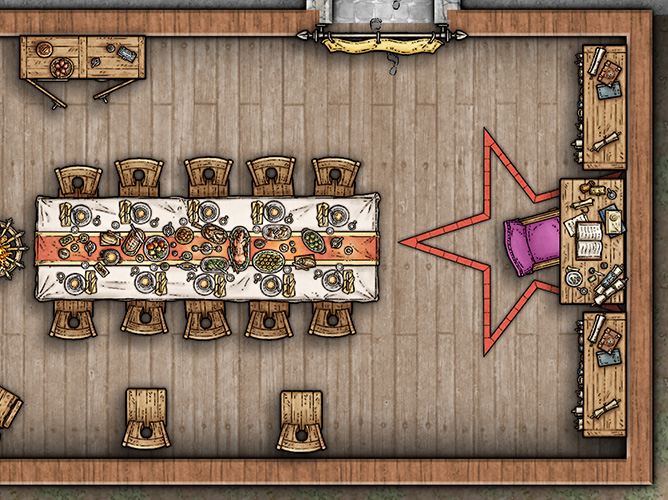
Let’s take a look at a simple chair:

There are several things to note about its construction. First, note that the linework of the object forms the description of the object, and the value variations within the object gives a 3D impression. Many of Schley’s symbols don’t include the value, thus producing the “ink” symbols. Second, note the border around the object, and sometimes an inner border around other objects (like a book on a table), is a little thicker than the detail linework. Third, note that the detail linework, when there is value applied, is usually surrounded by a slightly darker value of the “main” value of the object.
Fourth, note that the object itself has variations in value (mimicking “wood” in this case), as well as descriptive value to indicate 3D depth. Finally, note the color – intentionally set to mimic watercolor, the colors are a bit desaturated (wood also has a desaturated tone by virtue). This does not, however, detract from the richness of the symbols, but rather forms a complimentary feel to the heavier linework. The effect is, in essence, a watercolor wash, and is an important element in Schley’s style.
The linework here is really something to be admired – quite a lot of variation in thickness and style. This gives the hand-drawn look to the symbols and is important in order to be able to produce symbols that would compliment Schley’s style.
Now that we have an idea of how Schley creates his symbols in terms of components, we can proceed with creating our own.
Making Our Own
Creating symbols that emulate Schley is actually not a trivial task. There is quite a lot involved, depending upon the complexity of the object, and does require a little artistic flair – not that one must be an artist to create symbols of course. With a bit of effort, you can get pretty close! The real trick is rendering a 3D feel – perspective is something that really “sells” these symbols. The beauty of working on the computer is you can simply delete or undo as much as you like and try again. You may also find that sketching on a piece of paper to be useful practice too. I did just that with a few symbols I made as I found that easier.
The first thing to do is to on the object to be drawn. I will start with an object I created for my symbol set – a cabinet. This symbol doesn’t involve perspective, so is much easier to create.

After a few experiments with creating these symbols (remember, I’m not attempting to “be” Schley), I decided that I would start with vector outlines for my symbols, and that was more easily accomplished in Illustrator (or a vector program of your choice). Illustrator also has a method by which variation in line can be achieved (through a little deformation) that does a good-enough job of giving us a hand-drawn result.
Now, as with any object, we have to draw out the components. If you look at the cabinet carefully, you can see that it can be broken down into a few rectangles, some circles, and some lines. Draw out the components of the cabinet, don’t worry about making it “look like” the symbol I’ve created – just concentrate on the basic shapes. For the sake of learning, you could just create a simple rectangle for now. Be mindful of the width of the stroke – you don’t want anything too wide, nor anything too narrow. The size of your object will dictate the width of the border strokes. Use Schley’s symbol as a guide for border line thickness ratio.
Once you have the shape(s) defined, the next step is to change the line shape from obviously vector to something a little more hand-drawn in appearance. For that, we’ll use the Effect->Distort & Transform->Roughen. In the next dialog, you’ll first want to check the Preview box so you can see what effect changing the command’s parameters has on your object. The Size slider dictates the amount of “wobble” in the line – go ahead, play with it, can’t hurt anything right now. I use a value between 2 and 4 pixels. The Detail slider dictates the frequency that the Size slider occurs. Again, experimentation is key here. The last option, Points, needs to be set to Smooth. You might, on occasion, use the Corner option, but in this case we want Smooth.
As you can see from the preview, your object looks a lot more hand-drawn. If you like your changes, click OK, and move on to the next step.
Once you’ve gotten your basic outlines created and your object defined, export that out as a PSD and open the file in Photoshop. You should then have a “Layer 1” group that is your vector artwork (now rasterized). If your line work is not grouped, create a new group from those layers (you can name it anything you like of course).
In the case of the cabinet, I wanted to make it appear to be made from wood – you could choose other materials, like various kinds of stone, or clay, etc. Creating the subtle impression of wood grain could be a daunting task – there’d be lots of hand-painting to do. However, there is an easier route – using a color fill and a texture to produce the illusion. So, I first used a Color Fill, choosing a wood-like value. Be careful here, wood is not highly saturated, so stay on the desaturated side of the color picker – less saturation is more. Set the blend mode to Multiply, and set the layer as a Clipping Mask on top of the linework layer. This color will help re-value the texture and give a little more room for experimentation. Then I used a free wood texture set to Multiply (there are loads of these on the Internet). You might notice this will make your image a little darker, etc. Using both Levels and Hue/Saturation, I adjusted things to taste. You do not have to use a Color Fill as I did, you could just as easily re-color the texture using adjustments. How you follow what I’ve done is completely up to you.
After that, I added a new layer on which to create the interior linework. Using the standard round brush, keeping my brush size smaller than my border with (about 1/2 or so, adjust to your needs), I drew in the planks and interior borders of the cabinet. This is where studying Schley’s artwork comes in handy. Notice how he created his lines – where it is long, short, dots, etc. Pay attention to how he demarcates curves, grades, slopes, etc. You want to approach that same style to be in keeping with his overall look. Take your time, and feel free to clear the layer and start over. When you want straight strokes, use the Shift key. Otherwise, feel free to “freehand” the line – we are creating hand-drawn symbols after all.
Once you have your linework completed, add an Outer Glow effect set to Multiply, and choose a color that is close to the wood color you are using. Experiment with how strong you want that by changing the Opacity slider. Use Schley’s symbols as a guide, and, of course, these are your symbols, so make them as you wish.
Your interior linework layer should almost always be your top layer – you don’t want to hide those lines beneath other opaque layers, so most of your work from here will go below that layer in the stack. The reason for this will become apparent as you work, however, what will happen is the painting you do will subtly change the linework appearance in ways that are not desirable. Opaque layers and Screen layers will overwrite/lighten your linework. The linework provides a guide for the shading and highlights, that’s why the layer needs to be near topmost in the stack and the other layers lay below.
If you feel you need more shading in places, create another layer, set its Blend Mode to Multiply, and using a more desaturated color, fill in your shading. You should use the Soft Round brush for this to get a feathering effect.
After that, the next step is to add selective highlights. You want to add subtle “high spots” to various portions of the symbol. Create a new layer and set its Blend Mode to Screen. Using the Soft Round brush again, create those highlights. If you are using a tablet, you may wish to set the brush size to pressure to help create variable line widths.
Now, as the vector linework comes in as a group of vector outputs, you want to make a Copy Merged copy of the vector linework to place on top of the interior linework you completed. This way all of your linework will be topmost – ensuring any painting below does not unduly affect it. If the layer is filled with white, just set the Blend Mode to Multiply (Multiply ignores white).
The last thing I added, and you won’t do this to all symbols, is a little bit of drop shadow. Sometimes this is helpful, but can interfere with CC3+ shading algorithm, so be careful how much you apply. A little drop shadow can help “bed” the symbol in your drawings, so they appear to be a part of the map instead of just a “sticker” upon it.
Once done, you’ll save out your symbol as a PNG file (otherwise you won’t get transparency). The next step from there is to import your symbol into CC3+, and that’s beyond the scope of this article – consult the CC3+ documentation for that, and/or search the forum for assistance.
What I’m Doing With My Maps
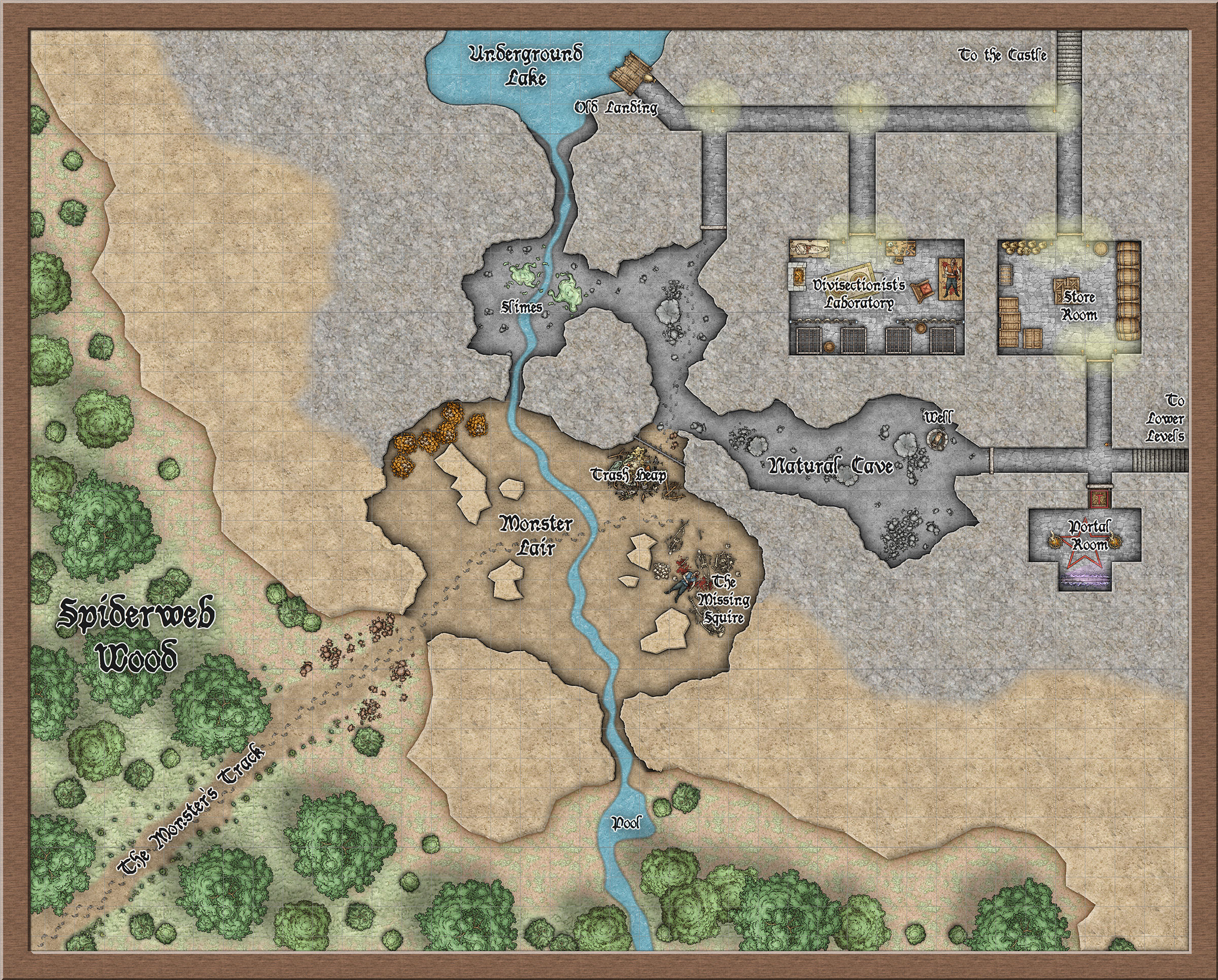
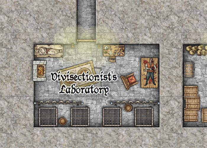
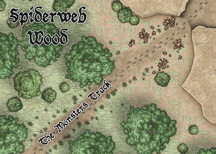
The module I’ve created was born from a Wizards of the Coast campaign upon which I started my group. There was a nice hook within for a personal offshoot, so I ran with it and created a 4-map, 80+ page dungeon that my players are still trawling (and thoroughly enjoying). The “Munson’s Mines” symbol set was born from this module.
While I don’t have Fantasy Grounds, or a fancy in-table monitor to display my maps to the players, they do receive a copy of the level once they’ve completed it (and explored enough that I don’t mind if a few areas are “uncovered” as a result). I do rather prefer they do things the old-fashioned way and map their way by hand – provides more immersion factor I think. After they’ve explored everything, I don’t mind handing them a “player copy.” They get to see just where they got confused with directions, and how accurately they rendered the location. They have really enjoyed the module, and really like the maps. I should probably print them larger, as much of the details I’ve put in get lost on an 8.5×11 (A4) sheet.
CC3+ is a fantastic CAD program for mapping our fantasy worlds as it is feature- and, most importantly, symbol-rich, and I hope this article inspires you to create your own symbols to add to it.
4 Comments
Simon Rogers | January 14, 2014 | cartographers, CC3, CC3 Plus, development, history, Mike Schley
CC3+ incorporates a new complete symbol set from expert cartographer Mike Schley. We’ve worked with a number of professional cartographers to create Campaign Cartographer styles, and the process is now pretty slick. We are either adapting an existing style (as with our recent World War 2 annual issue) or creating one from scratch. This is the process:
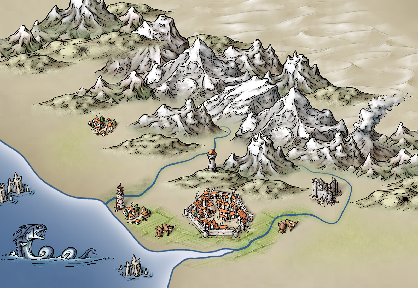
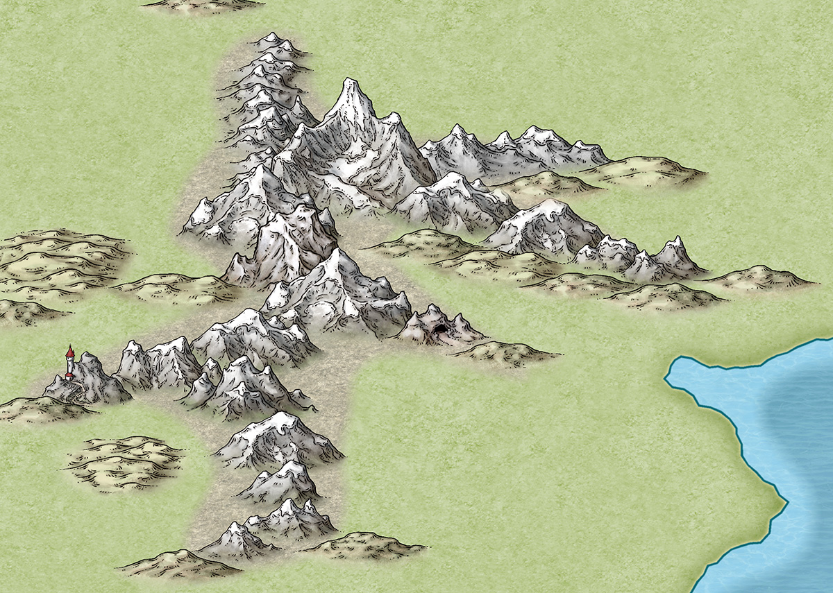
1. We take a cartographer’s existing map, or the cartographer develops a new map style, always by creating a small map sample. Here is an early one Mike Schley produced for the new CC3+ overland style.
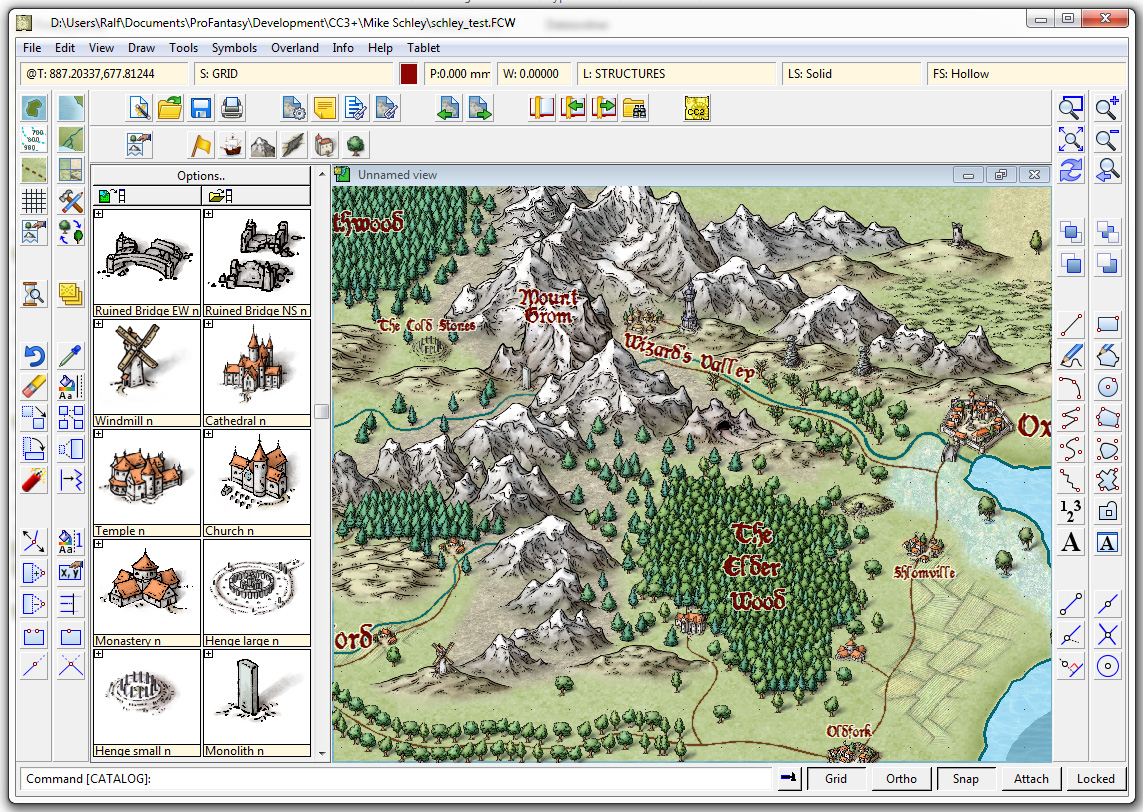
2. Once we’ve approved this, the cartographer adds more symbols and tools to the example map, and then does more as stand alone files. For a full ad–on or symbol set, this is a very big job. Usually the cartographer works in Photoshop, with layers on, so we can easily extract elements to create CC symbols and drawing tools.
3. Once the map-maker has finished, Ralf duplicates the style in CC, developing the set of drawing tools and adding effects to match the original.
4. Ralf creates the full set of symbol catalogs in all resolutions, with varicolour areas.
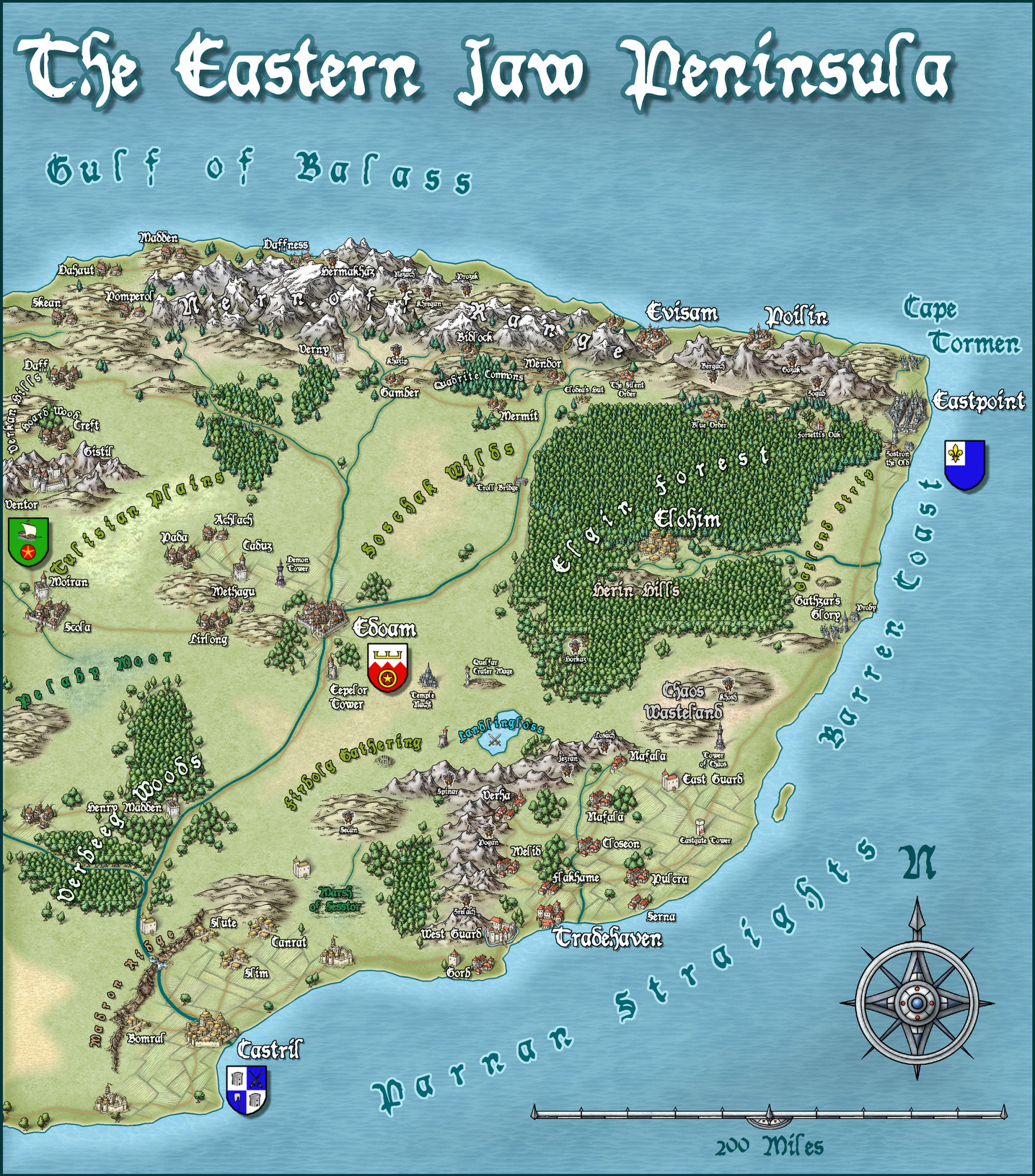
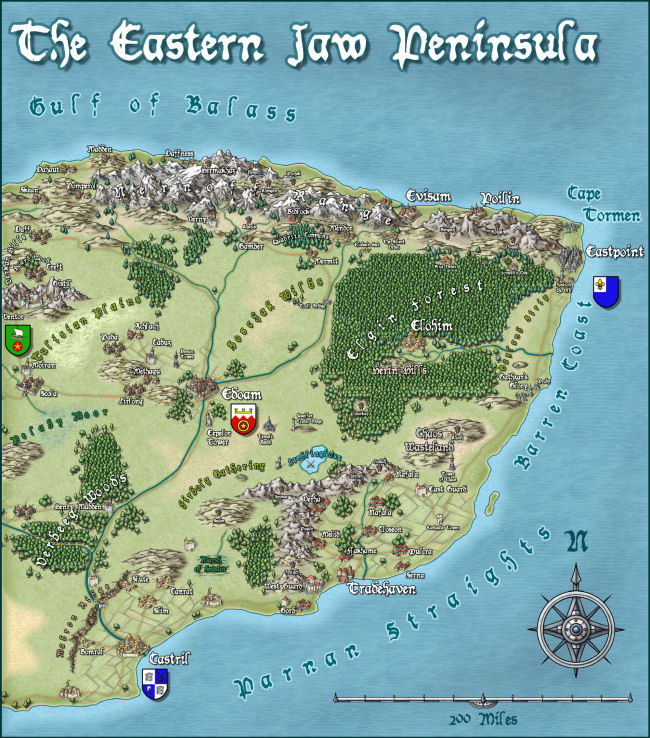
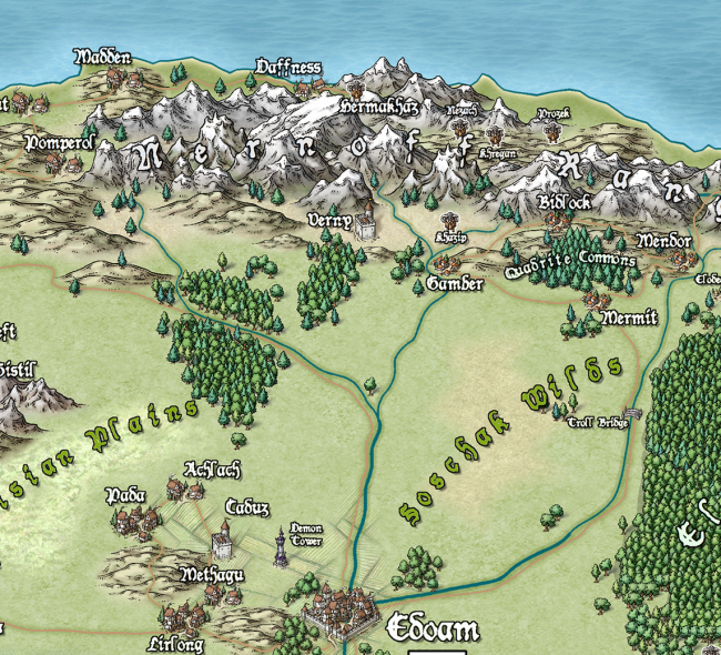
The very first example map we did with Campaign Cartographer was of my campaign setting, the Jaw Peninsula, and we intend to continue this tradition with CC3+. You can see the history of the map here and Ralf has rendered the eastern section of the map in his new style. Click the image for the full high-resolution map.
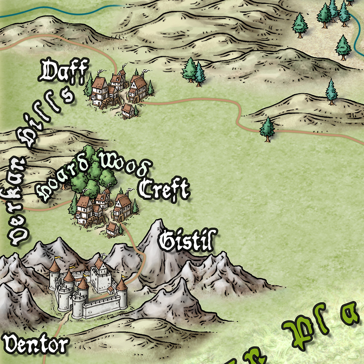
And here is a close up
And just to give you an idea of how detailed the symbols are – little works of art – here is a close up. Click for extreme close up.
2 Comments
 For the token treasury, Rich Longmore keeps sending over his finished monster portraits for approval, and it’s a rare piece that we have to ask him a few adjustments for. For example see the Barghest here. The original version (left) looks great – but it felt a little too natural for, a wolverine came to my mind instead of a supernatural monster. So I asked Rich to make the face a little more unnatural (bony face, fiery eyes) and he produced the second version (right) in no time at all.
 I know you are all eagerly waiting for the new Symbol Set “Cities of Schley” by Mike. You’ll be happy to hear that Mike has finished all the ink outlines of the buildings and is now working on the coloring. You can see just a tiny section of his preview here. To get an idea how detailed his work is just let me tell you that the original of this graphic is 9000 pixel across!