Remy Monsen | February 7, 2022 | development, dungeon, XP
 Our Dynamic Dungeon project is moving along, and for this installment of the series, I am going to address several interesting concepts and techniques.
- Creating custom entities so we can store our settings with the map.
- Creating dialogs to change settings. Here I also show how we can use owner-drawn lists to draw comboboxes with previews of the fill from the map. We’ll also create macro versions of the settings commands.
- Accessing the drawing InfoBlock to find fills.
- Making sure our tool stop at the map border, the same way that CC3+’s drawing tools does.
I am including the interesting bits of code right here in the article, but I have made minor changes all over the code from the previous articles to accommodate some of the new features from this article, so don’t forget to download the complete project from the link at the end of this article.
To be able to follow this article series, you should have read my earlier articles in the series.
As with the previous installments, here is a short video showing our results so far.
Comments Off on Developing Add-Ons for CC3+ – Part 7: Dynamic Dungeon Tools 3
Remy Monsen | October 13, 2020 | C++, CC3 Plus, development, XP Development
 This is the fourth article in my series about XP development. To understand this article properly, you should be familiar with the contents of the previous articles.
In this article, I’ll be taking a closer look at how to interface with some of CC3+’s own functionality, in this case how to set CC3+ variables and how to call native CC3+ commands from an XP. I’ll be showing you how to use the SetVar and ExecScriptCopy API calls.
Continue reading »
Comments Off on Developing Add-Ons for CC3+ – Part 4: Interacting with CC3
Remy Monsen | October 30, 2019 | C++, CC3 Plus, development, XP Development
 This is the third article in my series about XP development. To understand this article properly, you should be familiar with the contents of the previous articles.
When writing commands for CC3+, we frequently need to communicate with the user. This is often in the form of requesting some data from the user, such as where to place a node or which color to use, or we want to provide information to the user, such as instructions on the command line or the information the user requested. In this article, I’ll talk about the Text Formatting & Output Service (FormSt) used to prepare data to display to the user, and the data request format (ReqData). We have been touching both of these briefly in the two prior articles, but it is time to discuss these a bit more in depth.
Continue reading »
Comments Off on Developing Add-Ons for CC3+ – Part 3: Communicating with the User
ralf | June 22, 2018 | development, dioramas
 As mentioned before on this blog, I am currently working on the full new version of our paper-miniature building add-on – Dioramas 3. I am pleased to report that we have a completed alpha version and release of the beta version is not far off. All the new assets are in place, and have been arranged in multiple drawing styles: two different bitmap styles and one vector style, recreating the old Pro-version style with some sheet effects added.
Next up is updating the Essentials Guide to take all the new stuff into account and producing a nice, big new example Diorama set. Checking on the Facebook community group people seem to be mostly looking for some common village buildings, so it’ll be a inn and tavern I’ll be creating – I’m looking at you, Tendril’s Oak Inn.
This will probably also mean breaking out my paper cutter, ruler and glue and getting my hands sticky to actually build the thing. It’s been a while since I’ve done that and I’m looking forward to it!
Here is the very first Dioramas building I ever designed and built, updated with the new bitmaps of Dioramas 3. It’s a rough recreation of the Sage’s Tower symbol from the “Fantasy Colors” set included in Symbol Set 1. The actual model I built has long gone the tragic way of all paper models: crumbled up and vanished into the recycling bin. But hey, now it can reincarnate as a new and prettier one.

1 Comment
ralf | March 20, 2018 | battle maps, development, Monsters, Rich Longmore, Token Treasury
 We are happy to give you a first little glimpse of a new product line we are considering and working on: the Token Treasury. Rich Longmore – the artist behind Character Artist 3 – is working on a set of monster tokens that can be used in virtual tabletops like Roll20 or Fantasy Grounds, as paper tokens on your own battle maps, or as symbols on any floorplan created with CC3+ and its add-ons.
The first TT pack will contain about 50 different monsters covering the “typical” range of enemies a group of fantasy heroes might face, from lowly kobolds and goblins via trolls and ogres to giants and dragons. Each will come in multiple varicolor varieties, allowing you to easily identify different types or individuals of the same kind of monsters. It is tentatively scheduled for release in July.
 The monster tokens will combine with a set of “ring” symbols, that add can another layer of information, like facing, wound status, conditions and so on.
Depending on our users’ interests and wishes, we plan to produce more Token Treasury packs with rarer and more obscure monster types, heroes and their allies, and possibly even more exotic options. We’d be happy to hear your ideas and wishes for the Token Treasury!
18 Comments
Simon Rogers | May 20, 2015 | development, icons
Most of the development work we’ve been doing since release involves fixing bugs behind the scenes, many of which arise from the interaction with new versions of Windows 8. It’s not as much fun as adding new features, but we are working on those, two.
Somewhere in the middle are changes we make in response to technological advances. One such advance is the gradual introduction of super-high-resolution monitors, the most recent being 4K. On such monitors, our new 24×24 toolbar icons look a little small, so we’ve been working on 32×32 and 48×48 sizes. This will take a while, but I thought you might like to see a preview.

1 Comment
Simon Rogers | November 21, 2014 | Campaign Cartographer, CC3, development
The next version of Campaign Cartographer, CC3+, is in late beta. We were hoping for a release this year, but that’s looking less likely. You can read about the new version here. 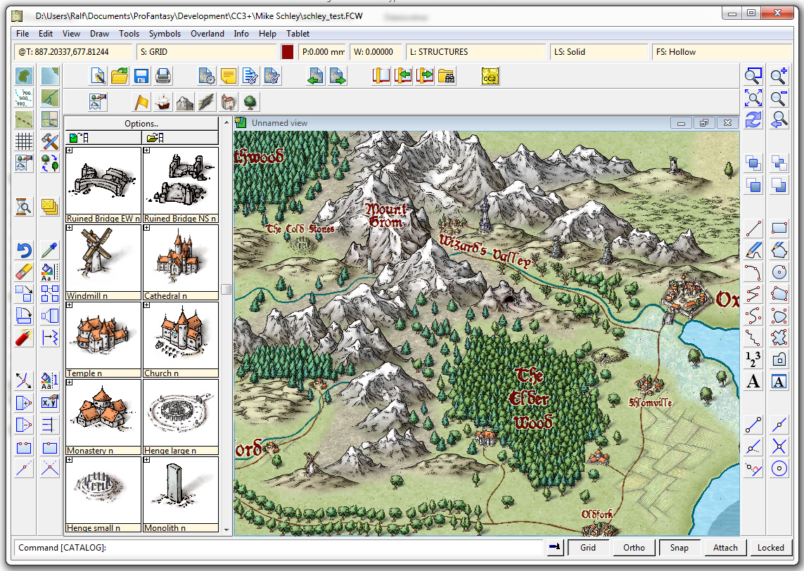
We’ve got two show-stopping bugs to deal with before we release the CC3+ beta to a wider audience.
Who is this audience?
We released Character Artist 3 this time last year, and until 1st January 2014 offered free CC3+ upgrade protection to purchasers. Character Artist 3 users will be able to download the beta version and give us feedback as soon as our two big bugs are dealt with. It’s impossible for us to tell when that will be, but I hope it’s in the next couple of weeks. If you are in this category, we’ll send you an email, and update your registration page with the new version. When the new version is finished, you’ll get a new update.
When this wider beta test is completed, we’ll release the upgrade, but we absolutely don’t want to release it until we are sure it’s solid on all operating systems.
15 Comments
Simon Rogers | July 3, 2014 | CC3 Plus, development
Our estimate for the release of CC3+ was “in the first half of the year,” which, like many software deadlines, whizzed past at an unedifying speed. So, time for an update. We aim to release CC+ in mid August, at GenCon. Character Artist 3 purchasers entitled to a free upgrade will get an alpha version to download (optionally) before then.

First, technical stuff – the main reasons for the delay.
We want to make CC3+ as future proof as possible, and we have to keep an eye on Microsoft operating systems and development environments. In addition, Mike Riddle (the developer of the CC CAD engine) became available for a few weeks’ work. This was an umissable opportunity. So, he’s massaged the assembly code, worked around bugs in Visual Studio 2013, and even persuaded the Microsoft team to include bug fixes. It now compiles with vs2013. This doesn’t guarantee functionality with future versions of Windows, but makes it much easier to fix if there are issues. This gives Joe Slayton more tools and compilation enhancements, too.
We are moving all resources away from the program files folder and into the Windows-specified location, which is a quite a knotty problem. We are also switching from registry entries to human readable files where possible, and finalising changes to the effects architecture. We can’t update all the templates until the effects are nailed down.
The main improvements are listed here, with notes from me as to what this really means.
Speed: CC3+ runs twice as fast as CC3. A combination of hardware optimisation and eldritch programming sorcery means more map-making, less waiting – simple as that. [The main benefit is that you can work with effects on on most machines, most of the time. so WYSIWYG]
Style: Award-winning cartographer Mike Schley provides you with a complete new attractive map-making style. Nothing new to learn, just better looking maps. [nothing new to learn, just nicer looking maps]
Effects: You asked for PhotoShop-style effects, now you have them, with faster, better, streamlined and consistent filters your maps will look better than ever before. You can test your effects on the drawing before applying them. And, again, CC3+ is doing the work. [we’ve been inspired by map-makers such as Par Lindstrom who have created maps in CC3 then done more work in Photoshop]
Ease: A context-sensitive floating cursor lets you know what CC3+ is thinking. [I thought this would be annoying, but now it’s indispensible.]The Print Wizard makes it easy to export your maps at any scale, tiled across paper [I use this mainly with a PDF printer]. CC3+ also gives you better and cleverer editing, clearer icons, and you can drag and drop images from the internet.
Integration: CC3+ puts roads, rivers, symbols and other map-making tools up front and center right where you need them. Whatever map making style you choose, the tools you need will appear, visually, and ready to go. [We’ve added the drawing tools to the symbol catalog window, in an order which reflects your process flow. This is more intutive and speeds up map creation. It’s also easier for new map makers.]
Clarity: We’ve fixed bugs, plugged holes and cleaned up the interface. CC3+ is Windows 8 able, and it’s cleaner on the inside and outside. [CC3+ also gives us a platform to improve all the add-ons, too and release Perspectives and Dioramas, too]
24 Comments
Simon Rogers | January 14, 2014 | cartographers, CC3, CC3 Plus, development, history, Mike Schley
CC3+ incorporates a new complete symbol set from expert cartographer Mike Schley. We’ve worked with a number of professional cartographers to create Campaign Cartographer styles, and the process is now pretty slick. We are either adapting an existing style (as with our recent World War 2 annual issue) or creating one from scratch. This is the process:
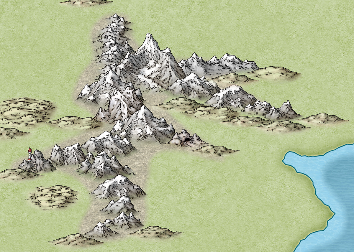
1. We take a cartographer’s existing map, or the cartographer develops a new map style, always by creating a small map sample. Here is an early one Mike Schley produced for the new CC3+ overland style.

2. Once we’ve approved this, the cartographer adds more symbols and tools to the example map, and then does more as stand alone files. For a full ad–on or symbol set, this is a very big job. Usually the cartographer works in Photoshop, with layers on, so we can easily extract elements to create CC symbols and drawing tools.
3. Once the map-maker has finished, Ralf duplicates the style in CC, developing the set of drawing tools and adding effects to match the original.


4. Ralf creates the full set of symbol catalogs in all resolutions, with varicolour areas.

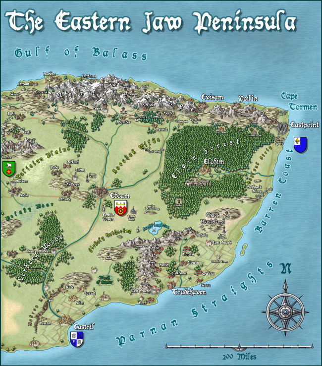
The very first example map we did with Campaign Cartographer was of my campaign setting, the Jaw Peninsula, and we intend to continue this tradition with CC3+. You can see the history of the map here and Ralf has rendered the eastern section of the map in his new style. Click the image for the full high-resolution map.

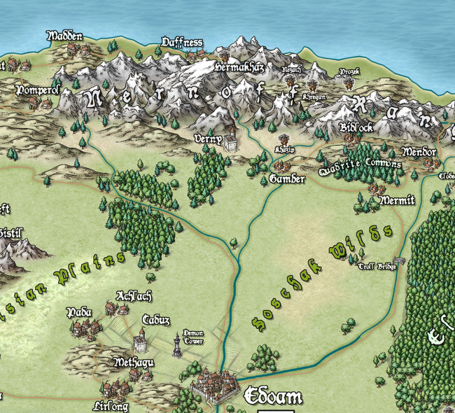
And here is a close up

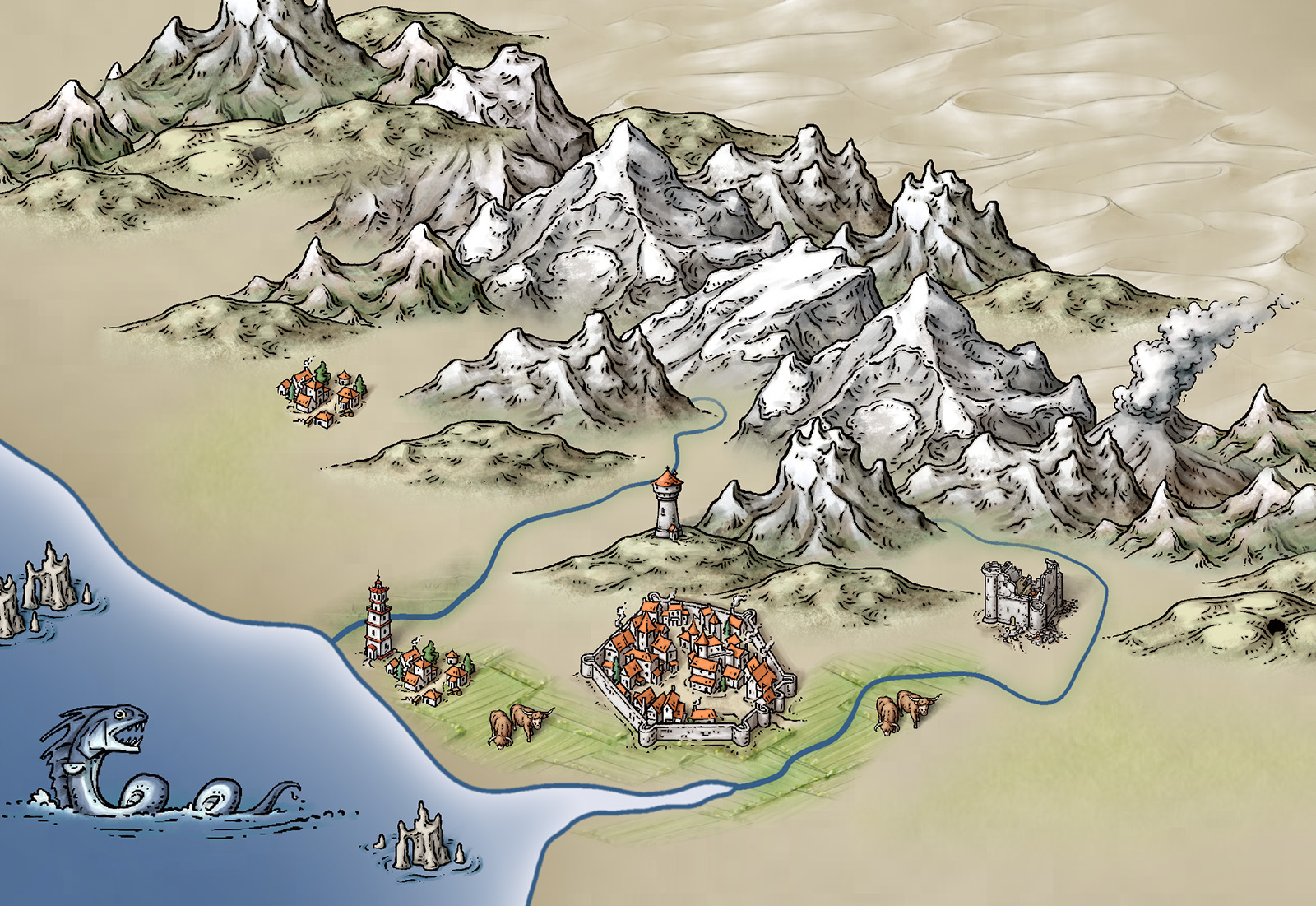
And just to give you an idea of how detailed the symbols are – little works of art – here is a close up. Click for extreme close up.

2 Comments
Simon Rogers | May 1, 2013 | development, icons
The 16 x 16 icons for CC3+ are completed. My poor eyes!
1 Comment
 Our Dynamic Dungeon project is moving along, and for this installment of the series, I am going to address several interesting concepts and techniques.


