ralf | March 2, 2015 | Annual, McAlea, Science Fiction, scifi
 It’s time for some futuristic maps with the March Annual issue that has just been released. Steph McAlea created a set of symbols and textures that makes drawing planetary star ports a snap. Grab the style pack “SciFi Downports” from your registration page.
If you haven’t subscribed to the Annual 2015 yet, you can do so here.
Comments Off on Cartographer’s Annual: March issue
ralf | February 2, 2015 | Maps of the Month, user maps
We’ve been pretty busy with the CC3+ release, but so have been our users and so it’s time to showcase the user maps from the ProFantasy community forum again. We are especially delighted that we can already include some gorgeous maps created with CC3+, some of them first time efforts with our software!
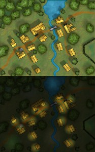
For example, this is FerCanale‘s first map, the nicely frigid-looking White Wolves Island.

Continue reading »
2 Comments
ralf | February 2, 2015 | CC3, Tutorial, user tutorials
 CC3+ is only a few days out and we already have the first user tutorial on the community forum. Malmo3000 modified the new Mike Schley Overland style to create his Skalderand map depicted on the right, and explains his process in this tutorial. Here’s what he has to say:
I recently started drawing with CC3/CC3+. Despite other comments I've read in multiple forums the learning curve wasn't a big deal for me as beginner. In my opinion the most challenging part is to find a way of mapping and thus creating a "own" style that suits you the best. As some of you noticed already in my thread called "Skalderand [CC3+]" I've found my personal "style" of mapping. So I wrote a little step-to-step tutorial for myself to produce multiple maps within CC3+ with a consistent look. In here I use mostly basic stuff and nothing fancy so with the help of the manual you shouldn't have any trouble of following. I really hope this will help other beginners to CC3+ when coming up with their personal style.
Download Malmo3000’s Campaign Cartographer 3+ Tutorial
Comments Off on First User Tutorial for CC3+
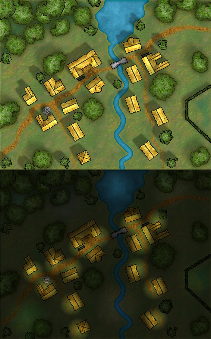
ralf | February 2, 2015 | Annual, Lighting, Tutorial
 It’s easy to overlook the small things, with the big release of CC3+ last week, but we should not forget it’s a new month and a new Annual issue is available: The Tutorial Pack – Day and Night. If you are a subscriber, you can download it from your registration page.
This tutorial takes an in-depth look at creating differently lighted environments, for example if you want to show a combat encounter area in both daytime and nighttime conditions.
If you haven’t subscribed to the Annual 2015 yet, you can do so here.
Note on CC3+: For now this Annual issue is done for CC3, as the CD3 and DD3 add-ons are not updated for use in CC3+ yet. Starting next month, we’ll make the Annual issues available in both CC3 and CC3+ versions.
Comments Off on Cartographer’s Annual 2015: February Issue
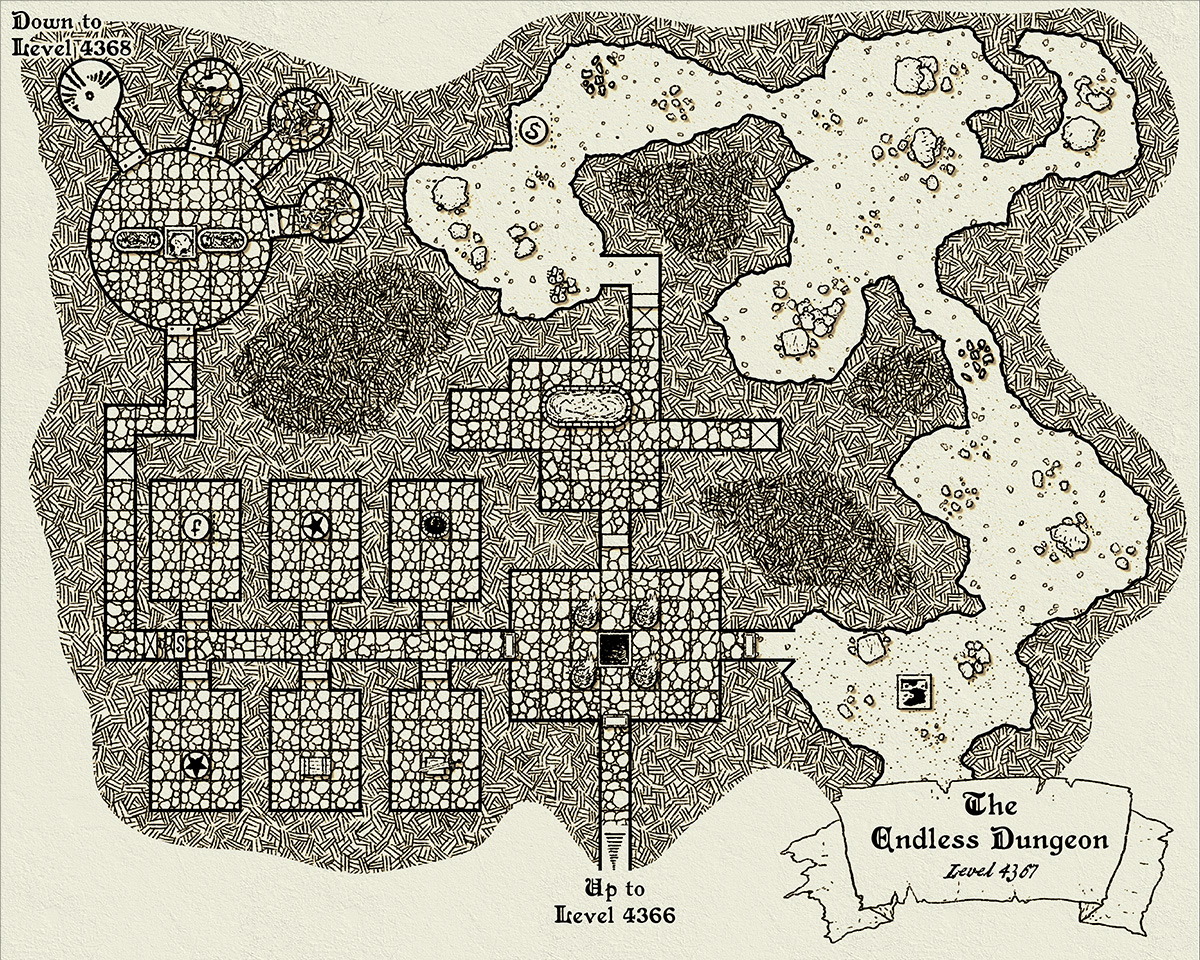
ralf | January 2, 2015 | dungeon, Vandel
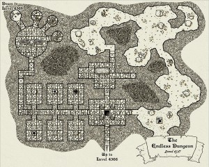 It’s 2015 and we start out with the 9th iteration of the Annual. TJ Vandel created this beautiful style that captures inked old-school dungeon maps with cross-hatching for filling in the walls.
If you have subscribed already, the download of the January issue is available from your registration page. If not, you can subscribe to the new Annual subscription from here.
Comments Off on Cartographer’s Annual 2015: January issue
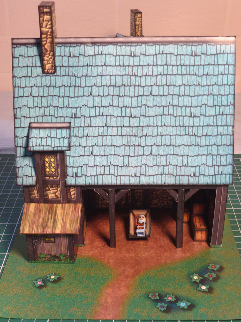
ralf | December 19, 2014 |
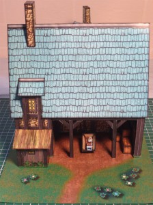 We have a little bonus issue available for the Annual 2014, freely downloadable for anyone. Joachim de Ravenbel created this beautiful village barn model with the resources of the December issue.
The model works great as an extension to December’s Krom Village set or can be used – if you are so inclined – as a wonderful setting for a nativity scene.
Download the free bonus issue from the Annual page.
Comments Off on Cartographer’s Annual: Holiday Bonus
Simon Rogers | November 25, 2014 | Pelgrane
Pelgrane Press, ProFantasy Software‘s sister company makes tabletop RPGs, and as such has a burning need for cartographic resources, so of course we take advantage of the connection. We’ve collaborated on a number of projects in a number of styles – styles we’ve then bought to our users. The latest such colloboration will be The Dracula Dossier – a Kickstarted project featuring spies versus the greatest vampire of the them all, for which Ralf will be creating maps. Back it here.
So, here are some of the other projects we’ve worked on together.
Created by Pär Lindström and designed for the the Pelgrane Trail of Cthulhu adventure collection Mythos Expedition the style lets you depict the itinerary and visited locations for journeys or expeditions as would be found in horror or pulp adventures.
“>
The September issue of the Annual 2012 contains a new overland style based on the gorgeous world map of the upcoming role-playing game 13th Age by Rob Heinsoo and Jonathan Tweet. The style was developed by Lee Moyer.
“>
The December Annual 2011 brings you a companion style to April’s 1930s floorplans: city maps in the same Baedeker travel guide style for your modern horror and pulp-style games. Pelgrane Press used this in Arkham Detective Tales Extended Edition.“>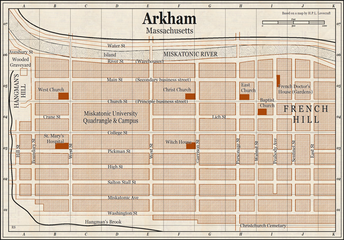
Ralf Schemmann recreated the 13th Age map in the Mike Schley overland style included with the forthcoming cc3+.
Pär Lindström created a city map and floorplans for the 13th Age city adventure Shadows of Eldolan using CC3, City Designer 3 and the Symbol Set 4: Dungeons of Schley style. He did some post work on the city map in Photoshop
Comments Off on Pelgrane, meet ProFantasy
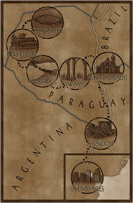
ralf | November 24, 2014 | books, Descovich, novel
[Cross-posted from the author’s blog. Benjamin contacted us about writing an article on using CC3 and creating a map for his book “Dragon Choir”. We are more than happy to share it here for your enjoyment.]
A Special Kind of Art
Maps are a special kind of art. Their beauty is often passed over for their function, but every map possesses a rare kind of potential, something magical.
Whoa there! Magical?
You must think I’m just a typical fantasy writer, banging on about magic again. Well that might be part of it, but let me explain the rest.
Jingle Bells
Ever since I was a kid, looking at a map would send jingling bells up my spine. From mud maps on a scrap of paper to detailed foldouts in National Geographic, I couldn’t resist them. My desk drawer was stuffed with piles of hand-sketched maps, documenting secret hideouts, traps and treasure. I even had a map of my hometown sticky-taped to my wall with annotations showing the locations of my friends’ houses.
My favourite fantasy books all began with a map and followed with a story that delivered the promise hidden in the landscape. Dungeons and Dragons lured me in to play the magic upon the map, and with the digital age came an evolving boon of sci-fi and fantasy computer games. Even today, at the bleeding edge of gaming, the most immersive and well-loved games revolve around a map. The map is our foundation; it is the lynchpin that connects us to the magic of possibility.
Mental Stretch
No matter how large or detailed the map, I examine the edges and wonder what exists outside its jurisdiction. Maps trigger a mental stretching that teases out the possible from the known. There is always more to a map than what you see; change the scale, change the perspective, and change your world.
Sticks and Sand
I contend that maps are a link to our deepest psychological urges of curiosity and territory. They are an embodiment of demarcation, inherently political in how they are depicted and interpreted. Once our primal drive involved patrolling the clan patch and scent marking trees as we went (I know some people who still do), wondering what lay on the other side of a river or ravine. We evolved from sticks drawing lines in the sand, to quill and ink, charting ever further across oceans to exotic lands, always pushing the boundaries of existing maps (often to the detriment of those in discovered territories). Today the great unknowns of nautical and geographic exploration expand further still with astronomical pioneers.
Maps are Magic
The humble map is the device that mentally transports us and inserts us in a physical terrain tinted with cultural heritage, lined with political borders and soaked in context. Maps weave a world and compress it into an image.
That, for me, is something magical.
Political Correctness and Cartography
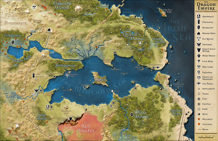
For my debut novel, Dragon Choir, I wanted to create a map that spoke with the politics of the fictional mapmaker. My map establishes the bigoted perspective of a colonising power. Maps throughout history have been tools of propaganda, yet I have noticed that the majority of maps for fantasy fiction are devoid of political or cultural imprints. Fantasy maps can add extra punch to a narrative if they have a contextual point of view. Why be politically neutral if the plot of your book is politically contentious? Political borders are as fluid as the opinion of the powers that commission the maps.
Below is the map I created using ProFantasy software, Campaign Cartographer 3 (CC3). Why did I use this software? The simple answer is that it is the best mapmaking software on the market. The ProFantasy website and community is jam full of support and ideas. The CAD software is powerful and upgradable, allowing an amateur cartographer like me to produce a professional looking map like this.
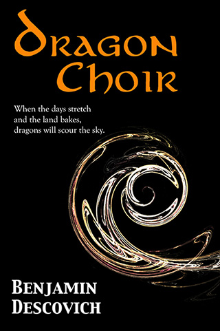 When the days stretch and the land bakes, the dragons will again scour the sky. A city of bones and a city of gold plot against each other while the rebellion gathers strength. A young man is caught in a tempest of intrigue that will forge a new era of freedom, or forever scar the land. He must discover the secret of the Dragon Choir to save his father and end the stranglehold of an unforgiven nation.
Comments Off on I Love Maps – by Benjamin Descovich
ralf | November 21, 2014 | user maps
It’s been a while since we posted a round up of user maps, mostly because we are very busy with CC3+ and had the summer’s convention schedule to take care of. But that doesn’t mean there haven’t been great maps posted to the forum – quite to the contrary as you can see below.
You can always rely on Grimur to take everyone’s breath away with his gorgeous maps, like this one using the Herwin Wielink overland style.
Continue reading »
2 Comments
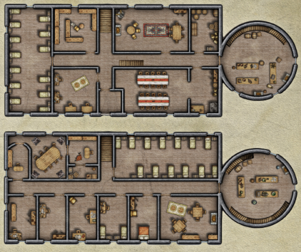
ralf | November 17, 2014 | Dungeons, overland maps, Tutorial, Video
We’ve started a new series of short video tutorials for Campaign Cartographer 3 and its add-ons. These are meant to be small tidbits of useful information we (or anyone else for that matter) can point to when asked about the tool or method in question. Check out the first two:
Drawing a semi-circular room in Dungeon Designer 3:
DD3 Semi-circular Room from ProFantasy Software on Vimeo.
Editing a landmass drawn with the default CC3 tool:
CC3 Editing Landmasses from ProFantasy Software on Vimeo.
As this is a new series for us, we’d like your feedback and your suggestions on what topics to cover. Post them here in the comments or over on the community forum.
You can subscribe to us on Vimeo or use our YouTube channel to follow these videos.
1 Comment
 It’s time for some futuristic maps with the March Annual issue that has just been released. Steph McAlea created a set of symbols and textures that makes drawing planetary star ports a snap. Grab the style pack “SciFi Downports” from your registration page.