Remy Monsen | June 3, 2018 | Campaign Cartographer, styles
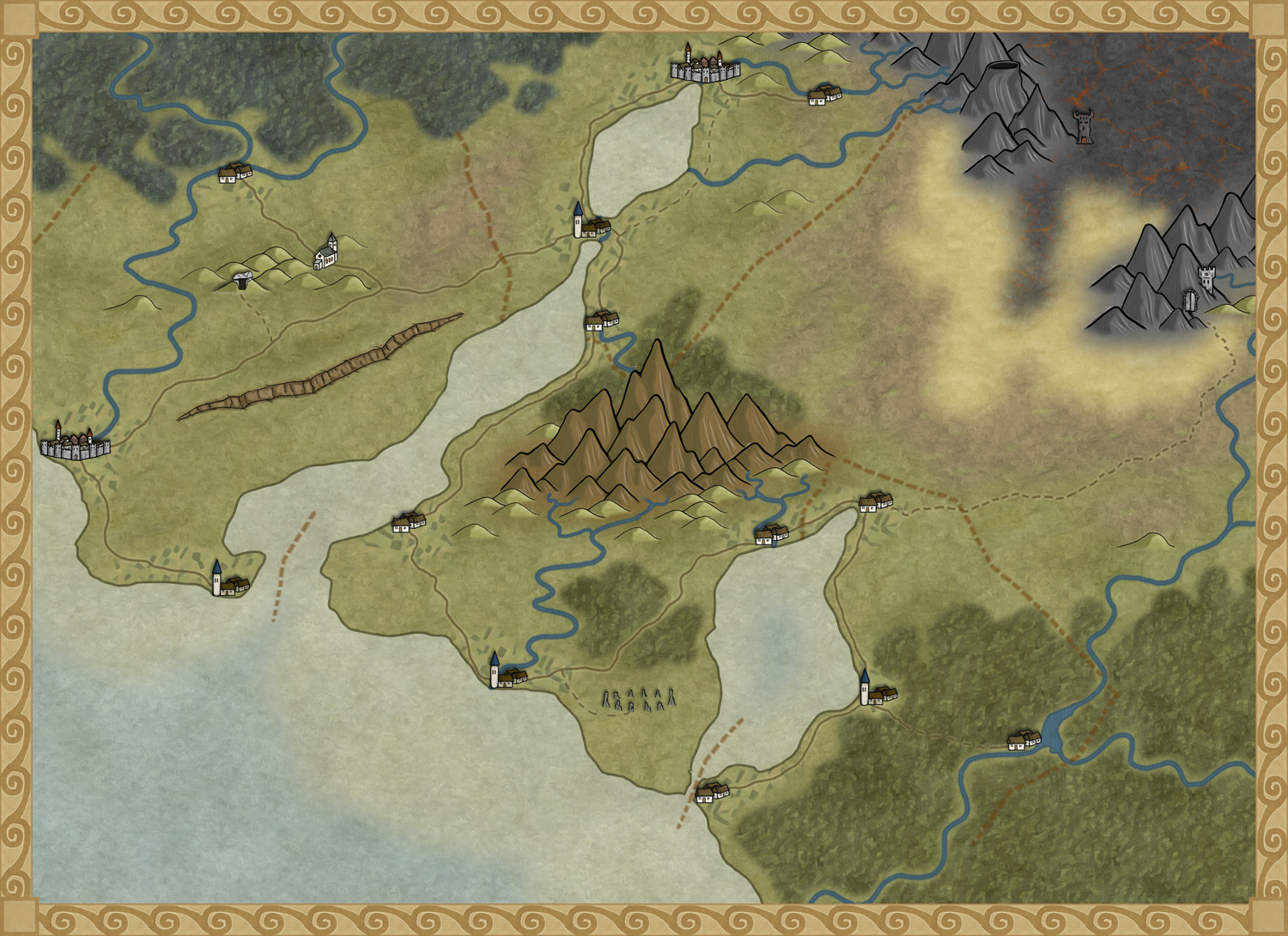
 In CC3+, you can make maps in many styles. Out of the box, CC3+ comes with at least 6 different overland styles, as well as a simple dungeon and city style. Depending on what style you choose, your map will look very different visually.
You’ve probably already learned that some styles are just better for some types of maps, and that is indeed one of the points with the different styles, to provide good options for many different kind of maps, but also to provide variety.
Of course, even if CC3+ comes with many styles, and many more are added if you own the various add-ons, symbol sets and annuals, part of the great flexibility of CC3+ is the ability to customize it to your needs, and one of the things you can do in that regard is to create new styles or customize existing ones to fit your needs. So, let us have a look at what a style really is, and what elements make up a style.
This article will provide a detailed overview of the process of creating your own style, but it does assume some familiarity with some of the processes
Elements of a style
Each style is made up from the following elements, all of which should be familiar to you already.
- Bitmap Fills: Almost all styles need fills, and unless you are designing a vector style, these will be bitmap fills. Fills are a very prominent part of any style and are a major factor in setting the visual look of the style.
- Symbols: While you can make a map without using symbols, most maps do use them. Symbols are usually designed to match the fills of the style.
- Drawing Tools: These tools are set up to draw various shapes, such as landmasses and terrain, using the fill styles defined for the style.
- Effects: All styles have their own unique set of effects, tailored to that style of map.
- Template: The template is the glue that brings all these elements together. Bitmap fills are referenced from the template, macros load the correct symbol settings, the correct set of drawing tools is set as a property in the template, and effects are embedded in the template, ready to activate.
Note that almost all styles have all the elements above, but they can be shared among several styles. For example, both the bitmap styles in SS3 uses the same bitmap fills, but they have their own unique set of symbols. You can also make a style that collects multiple styles into one.
Let us dig into these elements and see how to make them
Continue reading »
5 Comments
Clercon | October 23, 2012 | Annual, overland, Par lindstrom
The deadline for my December Annual style is closing in and luckily enough the style is slowly coming to a more or less finished state. A lot of things, small and big have changed since my last blog post about the style. The city icons have been remade and some of the terrain I’ve gone over a second time to make sure they are good enough.
One interesting thing I’ve learned from making this style is that the end result has a tendency to change a bit while you work. The Truscian peninsula map, that is the original map for this style, is a regional map that still is quite zoomed out. The finished style will be suited for a more zoomed in regional map. Not that you won’t be able to do the zoomed out version but I think that it is in the more zoomed in version that the style will really shine.
There are still some things left to do on the style, I might try to add in some more icons and I’m thinking of adding in one or two mountain ranges that you can use as the base while creating your mountains. Just to make it easier for you to make a quick map.
The map below is the latest test map of the style. I hope you like it.
Originally posted on mappingworlds.wordpress.com
4 Comments
Simon Rogers | July 26, 2012 | Annual, Par lindstrom
I’ve subscribed to the Profantasy Annuals since the beginning and I must say that it has been a great investment. I’ve learned a lot from the included PDF’s that comes with the monthly style and most of the styles are really great. But then sometimes there is a month when you think “when will I ever use that style!”. But you should never say never, suddenly you might have use for a style you thought you’d never touch.
This happened to me when it comes to the 2010 Annual May edition, Abstract maps. When I received it I first thought it was a real waste of space on my hard drive. When would I ever use that, but that was before I went to London with my son.
When my son was eight I took him on a trip to London. They had just started to learn English in school and I thought that going to England would be a great way to motivate him to learn the language. Of course we could also have a great time visiting museums and interesting landmarks like Big Ben and the London eye.
As it turned out he got really hooked on the Underground. We don’t have one where we live and for a child it is fascinating to go on a train far below the surface. We ended up doing a lot of travelling with the underground and we even bought a London underground game that we’ve played while coming home again.
After returning to Sweden my son thought it was fun to play that he was travelling with the underground, pretending that different rooms in the house where stations. I suddenly remembered that I had a style for CC3 where you could make underground maps. Quickly I started the program and made a map for him where all rooms where stations and different lines went to different parts of the house. I even added some lines that continued out in the garden.
So you should never rule out a style, who knows in the end you might have a use for them all.

Republished from Mapping Worlds.
Comments Off on I’m never going to use that style!
Simon Rogers | September 12, 2011 | boardgames
Mapping Esirien and Nurkott
Simon from the profantasy Blog asked me if I could make a small article about the making of these two maps, so here it is.
(All images ©Flatlined games unless otherwise specified – all rights reserved.)
When I secured the rights to republish Dragon rage from Lewis Pulsipher (Best known as the author of Britannia), I knew I would need art for the game board.
The game was long out of print after the demise of Dwarfstar Heritage, the original publisher, and the original 1982 map artist, David Helber, could not be contacted.
I investigated several options, and eventually grew confident that Campaign Cartographer would allow me to generate the required map art with professional print quality and much more control over the details than if I commissioned an artist for the job.
Of course the licensing scheme from Profantasy Software was an important part of the decision, as I needed to be able to commercially use the resulting work.
I had never used Campaign Cartographer before I started work on these two map, and I learned along the way. Of course the learning curve was steep and required a full commitment on my part, but the results largely paid for the effort.
Mapping Esirien
To start, I assessed the various products on offer, and decided on using Campaign Cartographer 3, City Designer 3, and the Symbol Sets 1 and 2. The base software and City Designer were no-brainers as they are specifically designed for this kind of work. The symbol sets had some interesting styles, reminiscent of the art used in the original Dragon rage board map.

Original board map extract (© David Helber)
The smaller buildings style match the standard vector buildings from City designer 3, and the bigger building style match the buildings used in the Symbol Sets.
I started by fooling around with the software in order to get used to the basic functions such as objects, layers, rendering effects, creating grids, etc. Taking the time to learn your new tools beforehand usually pays off big time when you need to do real work.
The first step was to set up the grid, sea/river, and the board limits using tree symbols.
I placed an image of the original map in a background layer, and used it as a guide during the whole work. My goal was not to produce an exact copy of the original map, but I was careful to stay very close to the original to avoid any unwanted effects on gameplay. (Of course the final map was carefully playtested afterwards).

Initial grid and borders

Detail
After that, I added the background layer, the walls and the roads.
The vegetation, walls, and houses are placed on different layers. This makes it easy to have them cast shadows of different length, for a better depth feeling : walls cast a bigger shadows than trees, and thus seem higher.

Adding the background, roads and walls
Some tweaking was required to get good results with the roads, water, and walls.
Until late in the map development, I used straight lines for the towers and walls, and only later did I experiment with dashes to get a better looking wall effect.
The towers are simple cylinders, and the wall simple lines using the built-in textures.

Detail
Next was the addition of some grass patches, and of all the houses in the city. Small houses use the CD3 vector house tool, and the bigger houses are bitmaps from the Symbol Set.
The bridges and wharfs are also bitmap symbols, and the walls tops have been converted to dashes.
Wall and tower doors have been added, from the Symbol Set too.
Last but not least, a text layer has been added to place the point value of the key buildings (in blue).
The hex grid was ‘exploded’ and manually tweaked around the western and eastern walls to match the original board grid. This is the kind of small features that save you hours of touch-up work and allow you great flexibility in your designs.
")
Adding the houses, bridges and wharfs (without fx)
With FX rendering turned on, the map really is taking shape : Glows give the water edges a dramatic effect, and are used to differentiate gates and doors in the wall and towers (blue/red) as this is an important information in game play.
All buildings have the same shadow size, to emphasize the walls height.

Now with fx
The last step was to tweak the hex grid colour (it is actually slightly transparent), add the building names and tweak the text layer’s appearance (using a light glow to improve legibility). The bridge images were changed in order to better differentiate stone and wooden bridges, and a lot of minor details were taken care of.
I then rendered the whole map, and cropped parts of that rendering to create the map legend using Inkscape and the Gimp (We’re a linux shop, with a windows box just for mapping). I also added the turn order track, logo and copyright attribution at this stage.

The Final Map : Esirien in all its glory
Mapping Nurkott
Most boardgame boards have only one side, and the other side is black of has a pattern on it. Production-wise, it costs the same to put another image on the back than a black sheet.
I immediately realized this was a good opportunity to provide more value to our customers : two boards instead of one, two games for the price of one!
I have played lots of tactical and skirmish games, and had a gut feeling of what could and couldn’t work for a second map. I investigated a few possibilities, then decided to make an ork oppidum. It would have lots of rivers and roads, allowing for interesting tactical options.
I’d use wooden palisades made of loosely jointed planks instead of stone walls, and make use of the terrain features to the residents’ advantage.
The first step was to make a rough draft of the map :

The first Nurkott rough
That rough image was imported in CD3 and quickly converted in a basic map using the same procedure as for Esirien : first the general map outline, then roads and water, background, and walls. All using different layers in order to be able to use different effects on each kind of objects.

First step : the basic terrain features
Then, I added the housings and vegetation. Here again, a mix of vector houses from CD3 and bitmap symbols from the Symbol Sets were used.

Step 2 : houses
Some minor tweaking was required for the water borders, to better integrate the map with the hex grid. I wanted to keep the original grid shape intact, contrary to the Esirien map.

Step 3 : tweaking the map to the hex grid
The same techniques were used for the text layer. It’s quite amazing to see the level of detail you can get by zooming on the maps. Most of it is lost at print resolution as there is more details than can be printed, but every detail contributes to the overall results.

Island detail
That map was then playtested, and sent to lewis for further playtesting and approval.
I experimented with the background textures for the grass, the glows for the roads and river edges, and lots of little details such as changing the wooden bridge by a stone one after playtesting. Of course such changes would have been much more complex using an artist to draw the map. The legend was generated using the same method as above, as were the logo, turn order track and copyright credits.

The final Nurkott map
Overall, using Profantasy Software proved a good business decision, and allowed me to put a quality product on the market.
You can learn more about Dragon Rage on our website : www.flatlinedgames.com
Eric Hanuise
Flatlined Games
2 Comments
Remy Monsen | October 31, 2021 | CC3 Plus, dungeo, XP Development
 In this article in the development series, I’ll start putting the things we have learned into some proper useful commands for CC3+. I’ll be going for designing a set of dynamic dungeon tools that focuses on making the drawing of a dungeon quick and easy. In particular, I am aiming at making a set of tools that lets you draw the floorplan in a more fluid manner, and easily do things like changing the shape of a room by adding a small alcove or similar, without manually manipulating the entities. I am also making sure that the floor will always be merged to a single polygon so we avoid breaks in the fill pattern.
This will be a series of several articles, so in this first article we will be getting started with the basics. We will start by writing the code for drawing polygons, and we will see how we can merge them automatically to a larger polygon. This should give us a great starting point, which we will build upon in future articles. This short YouTube video shows a demo of what the code below achieves in CC3+.
To be able to follow this article series, you should have read my earlier articles in the series.
Continue reading »
Comments Off on Developing Add-Ons for CC3+ – Part 5: Dynamic Dungeon Tools 1
Remy Monsen | January 5, 2020 | cc3plus, symbols
 In my previous installment of this series, I talked about, among other things, composite symbols made up from multiple raster images. This is cool and all, but it raises one interesting question; what about effects? When you place a symbol, all parts of that symbol is grouped together into one entity, which lives on a single sheet.
If you make a symbol that contains a small cottage, with a tree and a few bushes outside, you’ll probably want different shadow lengths on each of these components. But, to do that, you need different sheets, right?
This is where multi-sheet symbols come in. Basically, a multi-sheet symbol is a symbol that gets split into multiple symbols when you place it, thereby putting each component of the symbol on the appropriate sheet. This may sound a bit like exploding a symbol, but with multi-sheet symbols, it is the designer of the symbol that decides which sheet each part should go on without any manual intervention from the symbol user.
2 Comments
Remy Monsen | December 24, 2018 | Campaign Cartographer, CC3 Plus, drawing tools, macros
 In CC3+, drawing tools are great timesavers. The basic functionality of a drawing tool is that it works as a preset that contains all the various settings required, such as line style, fill style, line width, color, sheet and layer so that when you draw using a drawing tool you don’t have to go around setting all of these manually like we did in the good old days. Drawing tools also have some built-in nice features like being able to draw two separate entities at once, being able to stay within the map border, and the option to easily edit an existing shape.
However, there is another very important feature that exists for drawing tools, and that is to attach macros to them. A drawing tool can contain an embedded macro which follow the tool and isn’t dependent on your main CC3+ macro file and can contain macros that work in tandem with what you draw using the tool, or even functionality that isn’t connected to drawing at all. Today, we’ll look at how to create these tools and have a brief look at how they can make things easier for us.
Drawing with Macros
If you have been making overland maps, you’ll probably familiar with the forest drawing tools. If you pay attention when you use them, you’ll note that they ask you to draw a smooth shape, and then fills this shape with trees after you are done drawing it. This is a macro drawing tool at work. What happens is that the tool itself is only set up to draw that forest background, but it also contain a macro that gets called when you are done drawing that calls the Fill With Symbols command to fill the area you just drew with trees. Let us make a similar macro that uses the Symbols in Area command instead. I won’t go into detail about Symbols in Area here, since this is about making a macro tool that uses the command, rather than explain the command itself, but if you need a refresher for the command, you can look at this article.
Continue reading »
1 Comment


")


 In my previous two installments of this series, I’ve looked at the
  When you make your own symbol catalogs, either from new symbols, or just to create a re-mix of existing symbols, one of the main issues is how to make them easily accessible. Sure, you can always click the open symbol catalog button and browse for it, but that means you need to remember where it is, and it is more complicated than just clicking one of the symbol catalog buttons in the top toolbar.
