Mapping Esirien and Nurkott
Simon from the profantasy Blog asked me if I could make a small article about the making of these two maps, so here it is.
(All images ©Flatlined games unless otherwise specified – all rights reserved.)
When I secured the rights to republish Dragon rage from Lewis Pulsipher (Best known as the author of Britannia), I knew I would need art for the game board.
The game was long out of print after the demise of Dwarfstar Heritage, the original publisher, and the original 1982 map artist, David Helber, could not be contacted.
I investigated several options, and eventually grew confident that Campaign Cartographer would allow me to generate the required map art with professional print quality and much more control over the details than if I commissioned an artist for the job.
Of course the licensing scheme from Profantasy Software was an important part of the decision, as I needed to be able to commercially use the resulting work.
I had never used Campaign Cartographer before I started work on these two map, and I learned along the way. Of course the learning curve was steep and required a full commitment on my part, but the results largely paid for the effort.
Mapping Esirien
To start, I assessed the various products on offer, and decided on using Campaign Cartographer 3, City Designer 3, and the Symbol Sets 1 and 2. The base software and City Designer were no-brainers as they are specifically designed for this kind of work. The symbol sets had some interesting styles, reminiscent of the art used in the original Dragon rage board map.
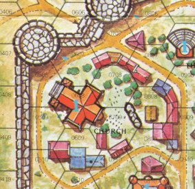
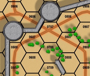
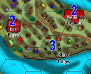
Original board map extract (© David Helber)
The smaller buildings style match the standard vector buildings from City designer 3, and the bigger building style match the buildings used in the Symbol Sets.
I started by fooling around with the software in order to get used to the basic functions such as objects, layers, rendering effects, creating grids, etc. Taking the time to learn your new tools beforehand usually pays off big time when you need to do real work.
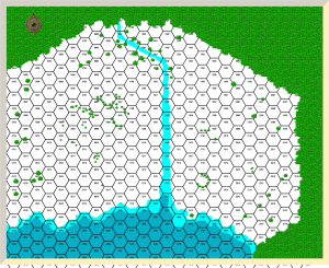
The first step was to set up the grid, sea/river, and the board limits using tree symbols.
I placed an image of the original map in a background layer, and used it as a guide during the whole work. My goal was not to produce an exact copy of the original map, but I was careful to stay very close to the original to avoid any unwanted effects on gameplay. (Of course the final map was carefully playtested afterwards).
After that, I added the background layer, the walls and the roads.
The vegetation, walls, and houses are placed on different layers. This makes it easy to have them cast shadows of different length, for a better depth feeling : walls cast a bigger shadows than trees, and thus seem higher.
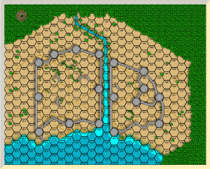
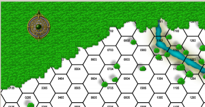
Adding the background, roads and walls
Some tweaking was required to get good results with the roads, water, and walls.
Until late in the map development, I used straight lines for the towers and walls, and only later did I experiment with dashes to get a better looking wall effect.
The towers are simple cylinders, and the wall simple lines using the built-in textures.
Next was the addition of some grass patches, and of all the houses in the city. Small houses use the CD3 vector house tool, and the bigger houses are bitmaps from the Symbol Set.
The bridges and wharfs are also bitmap symbols, and the walls tops have been converted to dashes.
Wall and tower doors have been added, from the Symbol Set too.
Last but not least, a text layer has been added to place the point value of the key buildings (in blue).
The hex grid was ‘exploded’ and manually tweaked around the western and eastern walls to match the original board grid. This is the kind of small features that save you hours of touch-up work and allow you great flexibility in your designs.
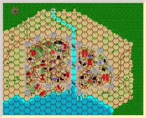
Adding the houses, bridges and wharfs (without fx)
With FX rendering turned on, the map really is taking shape : Glows give the water edges a dramatic effect, and are used to differentiate gates and doors in the wall and towers (blue/red) as this is an important information in game play.
All buildings have the same shadow size, to emphasize the walls height.
The last step was to tweak the hex grid colour (it is actually slightly transparent), add the building names and tweak the text layer’s appearance (using a light glow to improve legibility). The bridge images were changed in order to better differentiate stone and wooden bridges, and a lot of minor details were taken care of.
I then rendered the whole map, and cropped parts of that rendering to create the map legend using Inkscape and the Gimp (We’re a linux shop, with a windows box just for mapping). I also added the turn order track, logo and copyright attribution at this stage.
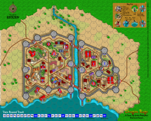
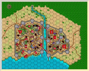
The Final Map : Esirien in all its glory
Mapping Nurkott
Most boardgame boards have only one side, and the other side is black of has a pattern on it. Production-wise, it costs the same to put another image on the back than a black sheet.
I immediately realized this was a good opportunity to provide more value to our customers : two boards instead of one, two games for the price of one!
I have played lots of tactical and skirmish games, and had a gut feeling of what could and couldn’t work for a second map. I investigated a few possibilities, then decided to make an ork oppidum. It would have lots of rivers and roads, allowing for interesting tactical options.
I’d use wooden palisades made of loosely jointed planks instead of stone walls, and make use of the terrain features to the residents’ advantage.
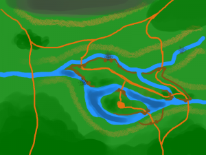
The first step was to make a rough draft of the map :
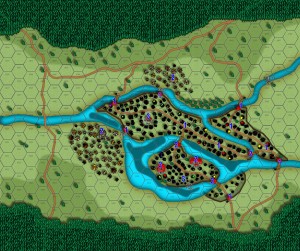
That rough image was imported in CD3 and quickly converted in a basic map using the same procedure as for Esirien : first the general map outline, then roads and water, background, and walls. All using different layers in order to be able to use different effects on each kind of objects.
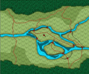
First step : the basic terrain features
Then, I added the housings and vegetation. Here again, a mix of vector houses from CD3 and bitmap symbols from the Symbol Sets were used.
Some minor tweaking was required for the water borders, to better integrate the map with the hex grid. I wanted to keep the original grid shape intact, contrary to the Esirien map.
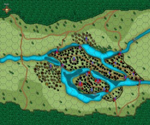
Step 3 : tweaking the map to the hex grid
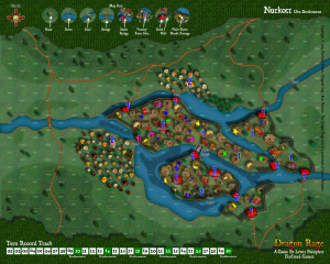
The same techniques were used for the text layer. It’s quite amazing to see the level of detail you can get by zooming on the maps. Most of it is lost at print resolution as there is more details than can be printed, but every detail contributes to the overall results.
That map was then playtested, and sent to lewis for further playtesting and approval.
I experimented with the background textures for the grass, the glows for the roads and river edges, and lots of little details such as changing the wooden bridge by a stone one after playtesting. Of course such changes would have been much more complex using an artist to draw the map. The legend was generated using the same method as above, as were the logo, turn order track and copyright credits.
Overall, using Profantasy Software proved a good business decision, and allowed me to put a quality product on the market.
You can learn more about Dragon Rage on our website : www.flatlinedgames.com
Eric Hanuise
Flatlined Games
