ralf | December 2, 2012 | Annual, overland, Par lindstrom
We’ve just released the final issue of the Annual 2012, and a fine one it is! Pär Lindström – creator of our popular Fantasy Worlds style – has created a beautiful mapping style for regional maps.
We’ll be releasing information on next year’s Annual soon!
Comments Off on Cartographer’s Annual – December Issue released
Clercon | November 19, 2012 | Annual, CD3, city, Par lindstrom

As you might have noticed I really like to make city maps. I don’t know why but I just love to see how a blank paper slowly turns into crawling streets and vast parks. It makes my imagination really spin.
Most of my city maps I make in the program City designer 3 (CD3) from profantasy. It is a great program with a huge toolbox you can use to make the creation of your cities a much smoother experience. To make the maps more unique I also like to edit them a bit in Photoshop afterwards.
When I bought CD3 my first impression of the program however was quite different. You can easily describe it in one word, overwhelmed. Just the sheer number of tools and objects made me fear for my mental health. The first time I started the program I think I just closed it immediately.
So how did I go from there to where I am now? Well the answer can actually be divided in three parts. First of all practice. I started out quite small with a little village and first after a couple of small practice maps I went for the bigger cities or towns. Secondly I looked up some tutorials, especially Gandwarfs tutorials over at the cartographer’s guild where extremely helpful. Thirdly there was a black and white city style released in the 2010 annual from Profantasy.
So what was so great with the black and white city style? First of all you get a very nice tutorial in every edition of the Annual, this makes it very easy to learn a new style, you can just follow the steps described. For me this meant a lot when it came to learning CD3, because I could in this way quickly pick up the different tools to use.
Secondly the amount of objects decreased quite a lot in the black and white city style compared to the coloured styles that were included in the actual program. This might sound a bit odd but the good thing here was that suddenly the program didn’t feel as overwhelming as before. When the choices in objects decreased, it kind of made it easier to grasp the program and find what you were looking for.
The map included in this post is a map that I made while trying to learn CD3. It was one of my first experiments to make a really large city map. I especially experimented a lot with the random street tool in this one. The random street tool is really a great help when you quickly need to fill and area with many houses.
When I was done in CD3 I opened the file in Photoshop and added some cliffs on the northwest side of the city. I also draw my own arena object to add to the city, I really missed that object in the style. As a finishing touch I made the map sepia coloured and placed the map on a paper background.
Well after that I just continued doing city maps and slowly the interface started to make sense and nowadays I rather feel that the there are too few objects in the program then too many 
Originally posted on mappingworlds.wordpress.com
1 Comment
ralf | November 1, 2012 | Annual, herwin wielink, overland
The November issue of the Cartographer’s Annual 2012 is out now. In response to popular demand we’ve expanded upon Herwin Wielink’s extremely popular overland style (released in April), adding 150 new symbols, a dozen new bitmap fills and 30 drawing tools. To bring it all together there’s a 2 page guide listing the new material. Together with the original material from April this makes a 6-page guide to mapping with this wonderfully attractive style.

The new material integrates seamlessly into the existing style, and can be added to both new and existing maps.
2 Comments
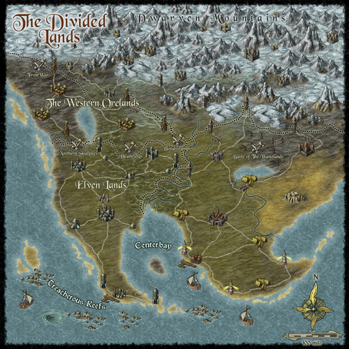
Clercon | October 23, 2012 | Annual, overland, Par lindstrom
The deadline for my December Annual style is closing in and luckily enough the style is slowly coming to a more or less finished state. A lot of things, small and big have changed since my last blog post about the style. The city icons have been remade and some of the terrain I’ve gone over a second time to make sure they are good enough.
One interesting thing I’ve learned from making this style is that the end result has a tendency to change a bit while you work. The Truscian peninsula map, that is the original map for this style, is a regional map that still is quite zoomed out. The finished style will be suited for a more zoomed in regional map. Not that you won’t be able to do the zoomed out version but I think that it is in the more zoomed in version that the style will really shine.
There are still some things left to do on the style, I might try to add in some more icons and I’m thinking of adding in one or two mountain ranges that you can use as the base while creating your mountains. Just to make it easier for you to make a quick map.
The map below is the latest test map of the style. I hope you like it.
Originally posted on mappingworlds.wordpress.com
4 Comments
ralf | October 15, 2012 | Annual, free resource, offer
We’ve decided to release six free issues of our Cartographer’s Annual to give non-subscribers a taste of what they are missing. Three of these issues were previously released free, the others – only subscribers have seen them to date.
You can download the installation here.
All ProFantasy customers who haven’t opted out will have received a voucher valid until the end of the month with a discount from any single Annual purchase. If you haven’t received yours, email us.
Free Issues

April 2007
The style pack Sarah Wroot Overland gives you all the tools to create maps similar to the work of master illustrator and cartographer Sarah Wroot.
Mapping Guide: Sarah Wroot Style

September 2008
The map pack “Battle Maps” contains several examples, templates and instructions on how to create your own miniatures map for your gaming table.
Mapping Guide: Battle Maps

December 2009
The December special issue contains a tutorial pack on creating quick and easy geomorphic Battles Tiles, complete with video tutorials by Joseph Sweeney.
Watch Joseph Sweeney Online Tutorials on YouTube.

July 2010
The style pack Overland Hex Maps gives you the winning entry of the 2010 user suggestions vote.
Mapping Guide: Hex Overland Maps

June 2011
The style pack Jon Roberts’ Dungeons contains a new drawing style for dungeon floorplans and battlemaps.
Mapping Guide: Jon Roberts’ Dungeon

July 2012
The symbol and texture pack High Space SciFi Tiles contains hundreds of new textures and symbol, accompanied by video tutorials by Joseph Sweeney.
Watch Joseph Sweeney Online Tutorials on YouTube.
1 Comment
ralf | October 15, 2012 | retrospective
Six years ago we began the Cartographer’s Annual, a monthly series of style, maps, and other cartogrpahic contents for CC3 and we thought it was about time for a little retrospective. The Annual has brought an immense wealth of style options to the ProFantasy community and we have been thrilled by all the beautiful maps our users have created. What better way than to highlight the the full scope of the Annuals than with some of these works of art?
2007 – Volume 1
 When we set out with the new concept of a subscription for Campaign Cartographer 3 users, we were really feeling our way around for what content was most popular. It quickly became apparent that new overland styles were the most popular type of Annual entry – but far from being the only thing people were looking for. We decided to strike a balance between generally popular topics like overland styles and more specific ones as seen in the “Parchment & Paper” June issue of 2007. The inaugural issue – the Mercator Historical style as shown on the right – represents the type of popular overland style that we strive to include in every volume of the Annual. The depicted map is by forum user Rogdor and was posted as a work-in-progress on the ProFantasy forum in March 2010, and there is another complete one here.
 Another very popular and beautiful style from the first Annual is the John Speed City style, a black and white style emulating the city maps of famed British cartographer John Speed. Take a look at the map created by community member Modric.
Other highlights of the Annual 2007 include the multi-level floorplan of the “Tendril’s Oak Inn” complete with description and adventure ideas, an overland style based on the artwork of Sarah Wroot ( a user map here), and a tutorial on how to create your own drawing styles from scratch.
 2008 – Volume 2
We received very positive feedback on the Annual 2007 – users were enthusiastic – which made the decision to continue the subscription model an easy one. And we were able to start the second year with a real bang as we got permission from one of the rpg industry’s cartography legends to emulate him: Pete Fenlon of Middle-earth roleplaying fame allowed us to recreate the style he used for those beautiful maps of Middle-earth.
The map here was created in the Pete Fenlon style (again by Modric) just recently, proving that the old style from the early days of the Annual are still used to great effect.
 As a second overland style for 2008 we produced a black and white vector style which also proved very popular. So popular in fact, that we added a simiular – but distinct – b&w style to Campaign Cartographer 3 as a free download.
The sample map on the left shows ever-prolific Modric using the style with a parchment filter to create a beautiful in-game artifact.
As a special highlight the 2008 Annual saw the first video tutorials for CC3 produced by Joseph Sweeney. His videos have become a staple of introducing new users to CC3 and by now he has created a whole range of them for various products and add-ons.
 2009 – Volume 3
2009 started with a style created by Master Mapper Allyn Bowker. The Fantasy Realms style captures the look used in some Forgotten Realms maps and still produces pangs of sweet nostalgia in many people who see it. Originally the style was produced for CC2, but the lack of drawing tool functionality made it hard to use by anyone a little less meticulous (and may I say “brilliant”) than Allyn. CC3 allowed Allyn to make the look easier to use and, with sheet effects, more attractive. Here you can see forum user Henrie61 applying the style to a custom world.
 The 2009 Annual also saw another artist contributing his first style to the subscription: Pär Lindström. His beautiful world map caught our eye and although he did not use CC3 at the time, we came up with a way to transfer bitmap-based art into a CC3 drawing style. The artist supplies us with layered Photoshop files of his work and we extract the symbols and textures and convert them to assets in CC3.
The Fantasy Worlds style proved extremely easy to work with, so that first time users of CC3 managed to create very beautiful maps. The example here was done by Neilander as a first map!
 2010 – Volume 4
As we had learned from the black and white overland style in 2008, monochrome maps where quite popular (in part certainly because they print easily), so we decided to add dungeon and city styles in b&w to the 2010 Annual. Especially the city style became a fan favorite. The example shown on the right was created by community member bearclaw and shows the beautiful layout of a riverside town.
 Another option for quick and easy maps that’s popular with role-players is the hex-based map. Back with Cosmographer Pro hex map functionality was introduced to Campaign Cartographer, and with the Annual 2010 we added a new style for old-school fantasy overland maps. Here you can see forum member Skycast using the style to create the map of a wooded peninsula.
 2011 – Volume 5
2011 was undoubtedly the year of fantasy cartographer Jonathan Roberts. We can across his beautiful work on the web and asked him whether he’d be willing to produce a couple of styles for us. He obliged and the Annual 2011 could boast both an overland and a dungeon style created by him. We even made the dungeon style available for free at the end of the year.
 Community member Koth produced the gorgeous map called Kern’s End shown here, by exporting a coastline he liked from Fractal Terrains 3 and then build upon with the Jon Roberts Overland style.
Pär Lindström (who writes on this blog) used the matching dungeon style to create this little encounter map for a role-playing session with his children.
 2012 – Volume 6
As 2011 was the year of Jon Roberts, 2012 will prove the year of another great fantasy cartographer: Herwin Wielink. His overland style (going by his DeviantArt handle “Djekspek”) was the single most popular style every created for the Annual, measured by the amount of maps shown on the forums. So popular in fact, we will be publishing an extension of the style with more symbols and textures in November. And his isometric dungeon style is just extremely clever and beautiful. We are thrilled that all new artwork from Herwin will also be included in the upcoming Perspectives 3.
 The user map in Djekspek’s Overland style was done by Modric, and the isometric dungeon here by forum member Tommek, who even commissioned custom symbols for his map from another artist. There are other amazing maps in this style.
Conclusion
When we started with the Annual back in 2007 we hardly imagined that we would be able to fill six years of subscription with material and keep everyone’s interest. But now the Annual is still going strong and the new and amazing talent within and without the ProFantasy community means we can rely on a steady influx of new ideas for upcoming issues. We’ll keep it coming.
The Annuals website is here, and you can see the full range of styles and other content on the gallery pages.
1 Comment
Clercon | October 15, 2012 | styles
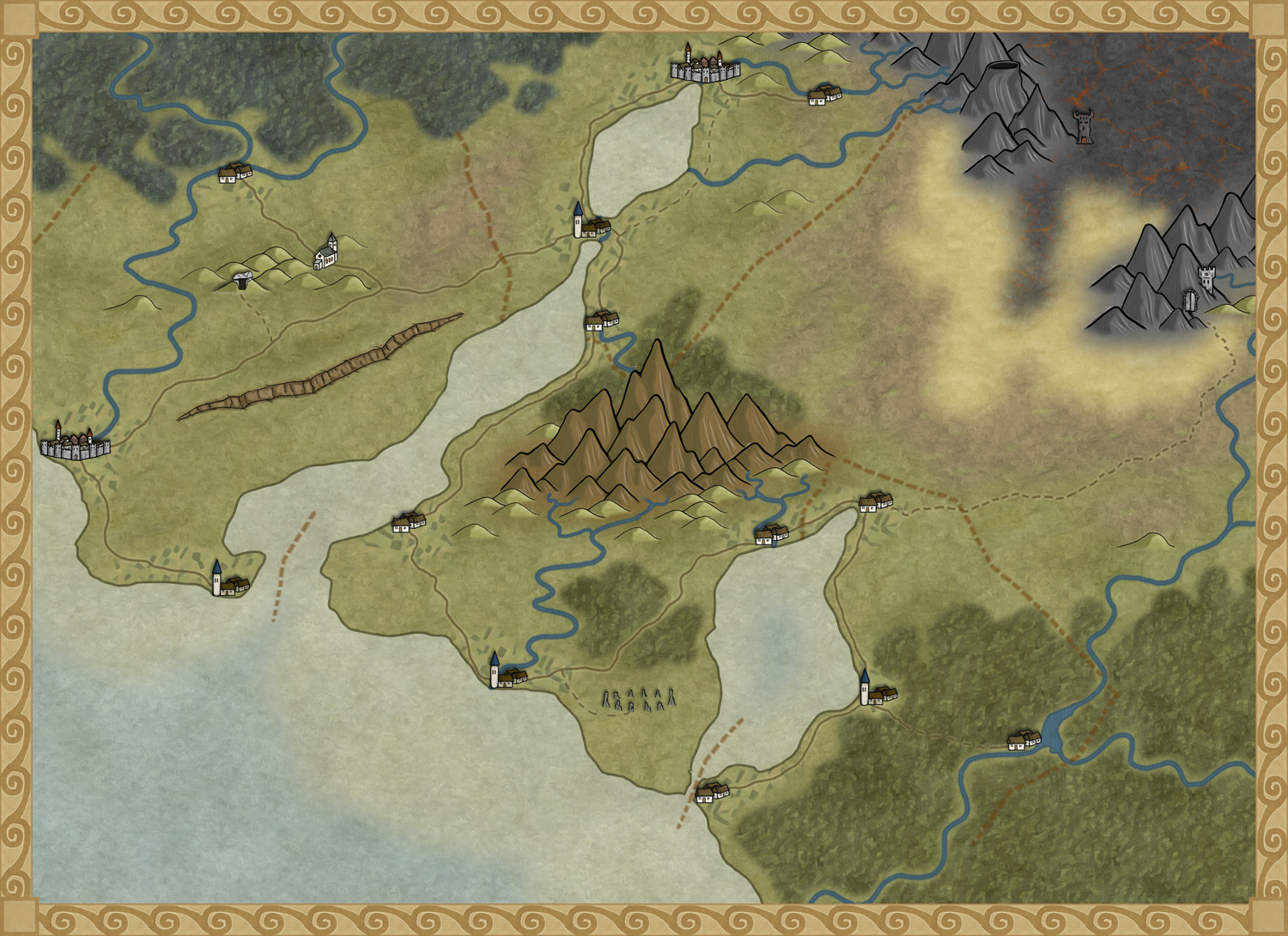
I’ve been asked by Profantasy to turn the map style I used for the Truscian peninsula into a CC3 style (let’s just call it the Truscian style from now on). The thing is that when you sit and draw for your own needs you usually can cope with a lot of mistakes in your maps, maybe the city icons look a bit off or the hills just don’t look exactly as you want them to look. But that doesn’t really matter to someone else then yourself. When you suddenly are doing something that other people might be using those things start to matter and that can be a bit scary. Most of all you want it to be perfect, you don’t want it to just be ok.
Suddenly you also have to make decisions. How many types of terrain do you need? Do you have enough city icons? How many city icons are enough? The questions can very easily become quite many. The best thing to do here is to actually sit down take a piece of paper and start writing down what types of terrain you already have, what types are missing, what icons do you want, do you need some terrain features that you have to make. Do you have a compass rose and a scalebar? Get it all down and try to make a plan on when things shall be done.
When I started to put it all on paper I soon realized that I was missing a desert, some wasteland and volcanic terrain. I needed some new city icons, a volcano or two, maybe some graves, hills and so on. But now when everything is on paper and there is a plan, it is much easier to start working.
The map below is a test map of the style that I’ve made in Photoshop. It consists mostly of seamless tiles that I use as patterns. Every terrain type is on its own layer and I’m using layer masks to make the terrain visible where it shall be seen. The mountains and city icons are drawn objects that I’ve pasted in on top of the terrain layers. There is still no compass or scale bar, but I have a fairly good idea on how I will do them.
Well in December you will see the finished result, if you subscribe to the yearly annual. Hopefully some of you will find it useful.
Originally posted on mappingworlds.wordpress.com
3 Comments
ralf | October 9, 2012 | Annual, overland, regional
We’ve got previews up for the two remaining Annual issues of 2012.
In November we have an extensions to the fan-favorite overland style by Herwin Wielink from April. Orcs, Elves and Dwarves get symbols for their cities, castles, etc, together with lots more symbols and textures to choose from. It basically doubles the resources included in the original style.
We close the Annual 2012 subscription in December with a new style by Pär Lindström. This one is specifically designed for creating regional campaign maps, ie smaller areas than your typical continental or world campaign map.
More images in the Annual gallery.
2 Comments
ralf | October 1, 2012 | Annual, starships, storyweaver, textures
We’ve just released the October issue of the Cartographer’s Annual 2012. It contains a huge amount of gorgeous bitmap artwork which focuses on alien starships and landscapes. It was created by Storyweaver (Joseph Sweeney’s rpg company) in conjunction with their High Space setting.

This is the second part of the immense collection of bitmap art, the first part having been released in July. The October issue also integrates all the bitmap artwork and drawing tools into new template wizards based on Cosmographer 3’s Deckplan Bitmap A style.
1 Comment
Clercon | September 18, 2012 |

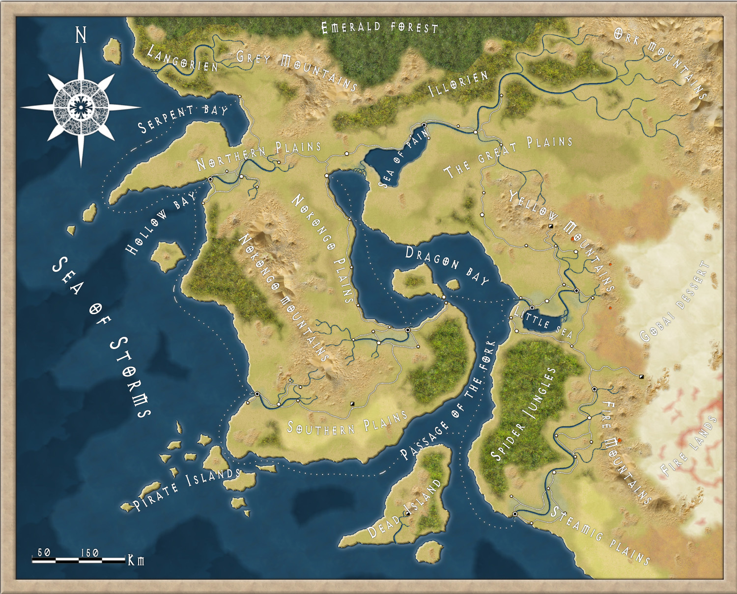
This month’s annual (September ’12) for Campaign cartographer 3 from Profantasy offered a very good looking style based on the world map of the upcoming role-playing game the “13th Age” by Rob Heinsoo and Jonathan Tweet.
I always like to try out new styles so I thought I should give this one a try too. Usually when I make maps I try to make a story around it. If you let the map visualize your story it is often easier to make it more unique and the details will kind of come more naturally. The drawback of working in that way is that it takes much more energy from you making a map, so this time I decided to just make a map without weaving a story around it.
The style itself was very easy and quick to work with. Most of the terrain is made up from seamless bitmap files so making mountains and other types of terrain goes really quick. The mountains however gave me some problems. Sometimes it was hard to get the high peaks in the places where you wanted them. But luckily enough the style also includes single mountains you can add to the mountain texture, which made the process easier.
If you look at the map included in this post I guess it took around three hours to do it, and then I probably spent as much time on labeling as I did on the actual map.
One thing I didn’t like though was that when you added the sheet effects to the map the seas didn’t get any effect added to them. When I made the map I had two larger seas, the sea of pain and little sea, that where close to the oceans. When those seas didn’t get any effect they looked strange compared to the nearby oceans. I tried to add some effects to the sea layer but because the ocean layer lies below the land layer and the seas are on top of the land layer it was hard to get an effect that looked exactly the same.
Apart from that I liked the style and if you want a map in a more stylish satellite style I can really recommend it.
Originally posted on mappingworlds.wordpress.com
2 Comments