ralf | November 21, 2014 | user maps
It’s been a while since we posted a round up of user maps, mostly because we are very busy with CC3+ and had the summer’s convention schedule to take care of. But that doesn’t mean there haven’t been great maps posted to the forum – quite to the contrary as you can see below.
You can always rely on Grimur to take everyone’s breath away with his gorgeous maps, like this one using the Herwin Wielink overland style.
Continue reading »
2 Comments
ralf | October 21, 2014 | convention, essen, spiel
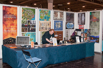
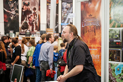
 The “Internationale Spieletage 2014” in Essen (short version: Spiel’14), the second big convention of the year (after GenCon) is over and we had another great and busy show. Many new CC3 users were added to the fold, and I talked to a lot of users, answering specific questions, helping with technical problems and demoing new stuff (yes, including CC3+). Here’s the report I prepared for Simon and Mark on my return.
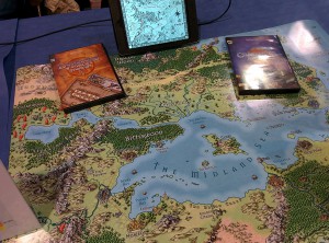
I arrived at Spiel on Wednesday as usual, and picked up Gordon on the way to help me set up. Unfortunately the tables I had ordered from the Messe where not there - apparently some other exhibitor nicked them for their own booth - so we had to leave part for Thursday morning when the replacement furniture was there. Not a big problem, we were quickly done before the show opened.
 I wasn't too thrilled with our booth placement, as we were in the middle of mostly LARP booths, and the big booth across the aisle blocked part of the view unto our place. I'll try to talk to Merz Verlag next year to get us more among the pen & paper rpgs again. Those are pretty scattered around the hall though, with lots of space taken up by food & drink places. The same hall layout as last year was in use, with some moving around.
But my concerns seemed unfounded, as both Thursday and Friday proved pretty busy, both being busier than the respective days in 2013 by a good margin. Saturday was weird. We had a few very early customers and then nothing at all until well into the afternoon, when it suddenly picked up again. Overall it came out to slightly less than last year. Sunday was the quietest day, as is often the case, but we also did quite a bit better than last year. We had a big train drivers' strike on the weekend, which led to a shortage of parking space around the halls on Saturday. This probably had an effect on attendance, but I can't really say how much. Saturday did seem somewhat less crowded than previous years.
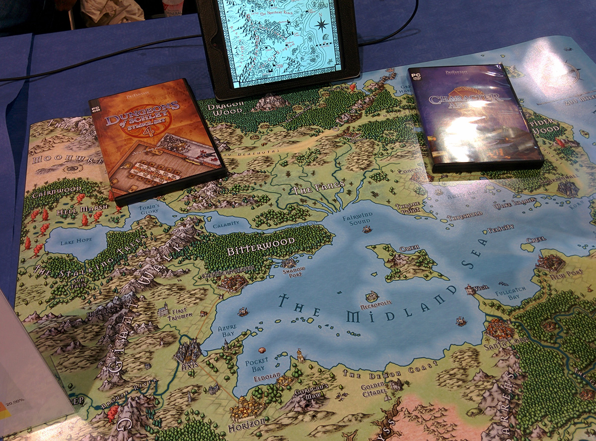
 The vast majority of customers were new to CC3. More than 80% of sales included a CC3, and only very few of those were people upgrading from CC2 Pro. The Mike Schley/13th Age sample map I had on the table drew quite a lot of positive remarks and we told a lot of people about the upcoming CC3+.
The Free Annual with every order certainly provided the impetus for some people to buy at the show. As you can see from the numbers, Annual Vol 6 was a very popular choice - because of the Herwin Wielink isometric dungeon style. The big example map of that on the wall drew a lot of interest and it was nice to be able to tell people "buy CC3 and choose this as your free Annual" and you're set to draw this.
 The Starter Bundle remains very popular, with some people swapping in a Character Artist or Cosmographer for either City or Dungeon Designer. Some people went for the 4 for 3 bundle from there, basically getting another product for a few more Euros.
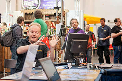
I demoed quite a bit, mostly CC3, DD3, CD3, CC3+, Cosmographer, Character Artist, FT3 and Perspectives, in about this order of demand. Comments from existing users were mostly favourable, with only a very few "it is too difficult" concerns.
Gordon and Carsten were a great help as always. I even had a third helper on Saturday (Michael), but since it was a bit quieter than usual, that wasn't really necessary at all. Take down on Sunday evening was done in lightning speed. As the exhibitor parking was right below the halls, we just carried the stuff to the car. I was out of the halls and away 20 minutes after closing time.
-

-
Gordon is ready for the show.
-

-
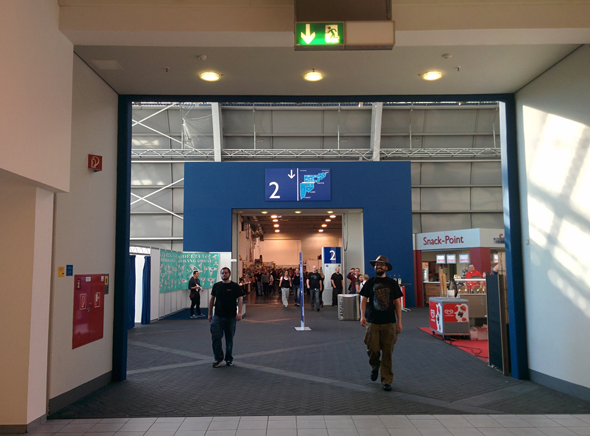
View down the aisle.
-

-
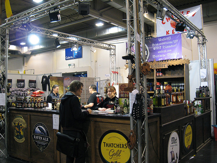
Our neighbours.
-

-
Ghastly.
-

-
A great display at the Dropzone booth.
-

-
Cute visitor to the booth.
-

-
Carsten and Michael wait for customers.
-

-
Our youngest helper takes a nap beneath the tables.
-

-
The Galeria with kids play areas and concessions.
ralf | April 14, 2014 | books, world building
Author Nat Russo posted the following great article on “A Writer’s Journey” and graciously allowed us to repost it here. Enjoy his excellent advice and check out his book “Necromancer Awakening“.
Continue reading »
Comments Off on World Building Primer by Nat Russo
Simon Rogers | April 14, 2014 | Dungeons, Floorplans
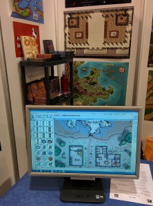
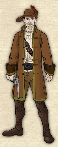
ProFantasy Software offers a large, possibly even bewidering range of dungeon styles from which you can choose. All our add-ons, symbol sets and annual require Campaign Cartographer 3 to draw. Dungeon Designer 3 makes it easier to create dungeons, but isn’t required, except to use its own built-in styles. Here, then, is a selection of the some of the styles we offer and the software you need to use them.
Dungeon Designer 3 built-in style.
Continue reading »
Comments Off on Want to Create a Dungeon?
ralf | April 14, 2014 | Maps of the Month
Here’s the next collection of user maps from our forum. My, these guys have been busy again! Please note that I’m not including the competition entries in this this list, they are listed in a previous blog post.
Clercon posted one of his gorgeous city maps, a combination of work in City Designer 3 and Photoshop.
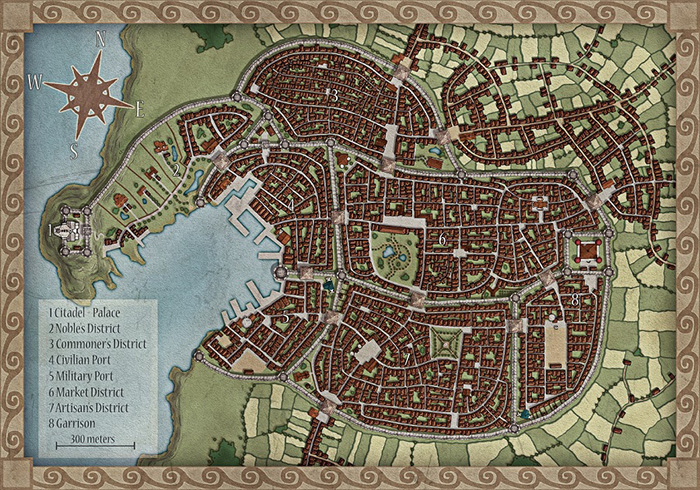
Continue reading »
1 Comment
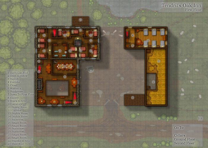
ralf | April 10, 2014 | battle map, Deadlands, dungeons of schley, Floorplan
 A few days ago my gaming group’s Deadlands Reloaded campaign ended, after 18 months and 23 sessions of play. We had great fun, despite – or perhaps because – the game system (Savage Worlds) is more combat-focused than the typical games we play. One thing it does, and it does that really well, is make use of battle maps and miniatures without slowing down combats much. To take advantage of this I decided at the start of the campaign that I would create as many battle maps for the game as possible – of course using the Profantasy software at my disposal to maximum effect.
For my maps I used Dungeon Designer 3 a lot, but also City Designer 3, Symbol Set 2 – Fantasy Floorplans, the Annuals, the free art collection CSUAC, and at the very end the brand-new Symbol Set 4 – Dungeons of Schley. All of these I printed on my inkjet printer at home in A4 tiles, then glued them together for play at the table. I ended up with more than a dozen A1 battle maps, plus a few smaller pieces. I’ve collected them here for your enjoyment and use. Just click one of the images to download the full-size pdf*.
Continue reading »
Comments Off on A Campaign in Battle Maps
ralf | March 19, 2014 | competition, user maps
We’ve asked Christian, the winner of our map-making competition, to share a few words on his map and the competition and he was so kind to oblige. Here’s what he has to say.
* * * * *
A few weeks ago I was searching online for fantasy map-making contests. I wanted an assigned theme and a real deadline—something that would challenge my skills and help me generate another piece of work I could be proud of. That’s when I came across ProFantasy.com. I’d been interested in their software before, but hadn’t had a chance to use it. Now I had a chance to win it in a competition.
Make an island, they said, about three miles across. Something like a medieval treasure map. The contest had been open for months, but was closing in just a few days. I took a look at the submissions that had been sent in thus far, decided I had a shot at winning, and threw myself into it.
I worked feverishly, right up to the deadline, and actually ran out of time to put absolutely everything I wanted into the map. That’s why there’s no border around it, and no compass rose… But what I did manage to produce followed my vision. As a novelist and dungeon master, I knew I could create some storytelling elements that would hook into the drawing. Some secrets and clues that would only be available to those who looked closely, and a narrative that would marry the image to the text. I had an aesthetic that I’d been developing for maps for my novels, inspired by some of the top fantasy cartographers online. I’m passionate about making beautiful illustrations, and I’m excited to be learning new techniques every day.
 * * * * *
As for the hands-on process itself, virtually all of this map was hand-drawn in ProCreate on an iPad 3 using an Adonit Touch stylus. There are a few “pattern brushes” in that app which help with things like the the jungle trees and the ocean waves, but everything else was the result of pushing pixels manually. The shape of the island and mountains isn’t based on anything other than doodling with the idea of a vaguely volcanic tropical island in mind.
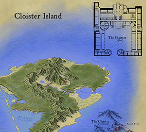
The cloister overhead plan was laid out in Adobe Illustrator. It’s far larger, sharper, and more detailed in the original file, with many upper floors and basement dungeon levels. The “3D” isometric extrusion of the cloister is actually just faux-3D, a technique I use in Illustrator where I take the overhead plan and rotate, squash, duplicate and move by a certain amount, and then blend. I took a screen shot of that and traced over it in ProCreate.
The last step was to bring it all into Adobe Photoshop. I had created a “parchment background” from some rendered clouds and a bunch of filters, so I laid out the various pieces on that background and added the text elements. Then I did save-for-web and picked settings that looked good but kept the resulting file under 2 MB.
The cloister itself is about 300 feet on one axis, making the hypotenuse around 500 feet. Since you can line up 30 of the little cloister images end to end and have them stretch from one side of the island to the other, the island winds up being about 3 miles across.
1 Comment
ralf | March 10, 2014 | competition
As we wanted to be as impartial as possible, we’ve asked fantasy cartographer Mike Schley to be the judge for our January competition. He took his job very seriously and came back to us with the following results:
First, I would like to thank Profantasy for inviting me to serve as judge for this mapping challenge. When approached by Simon to decide the results of this competition I jumped at the chance. Then, upon seeing the work, I realized how difficult the task would be. Assessing each entry in a logical manner and narrowing the field to two pieces would require making tough choices on the narrowest of margins.
My methodology for examining the submissions came directly from my own cartographic practice and relied on the three criteria by which I judge my own work. These measures include aesthetic appeal/creativity, visual readability, and usefulness of the information provided. Given the straightforward parameters set down for the competition, “create a map of an island, less than three miles wide” scoring the entries by these criteria made for a process that, though difficult, was fairly straightforward and analytical.
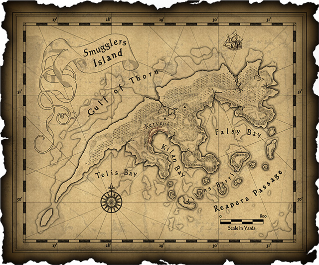
So without further delay, the winner is… entry #17 Cloister Island, followed closely by the runner up, entry #15 Smugglers’ Island.
Of all the submissions, I felt that the Cloister Island map functioned best as both a visual information system and an inspiring illustration of its setting. Even though the cartographer left off a compass rose and scale bar, the overall work felt the most coherent and provided numerous levels of information. Like an onion, the island and story revealed themselves in layers, giving the reader an opportunity to explore deeper and deeper into an immersive world. On top of this, I’m a sucker for hand drawn isometric maps.
Choosing a runner up was probably the hardest part of the job since there were a number of maps that I felt had quite a lot going for them. I selected Smugglers’ Island mainly because it’s design and presentation of information felt more unified than the other entries. The visual details work well together and the cartographer’s choice of font, embellishments, and patterning add up to a striking, if somewhat cluttered, image.
Finally, I would like to thank everyone that contributed work to the competition and encourage them to keep at it. Designing worlds is something dear to my heart and it was a joy to see so many thoughtful approaches to the assignment.
Sincerely,
Mike Schley
So the winner of the competition and the new holder a full ProFantasy Patron License is xianpryde. Congratulations!
The runner-up, dfahr, receives a ProFantasy store voucher worth $100. Also congratulations.
And thanks to everybody for their submissions. Your work was all wonderful!
Comments Off on And the winner is…
ralf | February 19, 2014 | ca3, character artist, guide, Tutorial
 As many symbols as Character Artist 3 contains or how many we may add in the future, the incredible variety of role-playing games, settings and campaigns means there will always be need and room for more.
The obvious – but not always simple – solution to needed symbols is to create them yourselves, either by drawing them from scratch or adapting existing artwork to your own requirements. Because the Character Artist 3 catalogs and symbols have a pretty specific setup, we are offering this guide to their creation. It takes you through the steps of adjusting existing png artwork for use in CA3 and importing it as a symbol.
Download CA3 Symbol Creation Guide mini-installer (contains pdf and support files)
Download CA3 Symbol Creation Guide pdf
1 Comment
ralf | January 14, 2014 | convention, spiel
 So, “Spiel”, you ask, how is it, the biggest games fair in the world? It’s big: more than 150,000 visitors, 828 exhibitors from 39 countries (numbers from 2013), 4 days of gaming madness. You’ll also notice that I’m not using “convention” to describe Spiel, since it differs from events like GenCon or Dragonmeet, in that playing games itself is not the primary focus. Sure, a lot of gaming does happen, but the main activity is presenting, selling and buying games.
 I’ve been working the ProFantasy booth at Spiel since 2000, first helping out, and then from 2002, running it. Its four days from Thursday to Sunday alway go by in a whizz and whir of activity. ProFantasy usually has a booth in the “Role-playing and Import Games” hall, which in recent years also holds a lot of LARP supplies and miniature games. Boardgaming is a much more mainstream activity in Germany than in other countries, and accordingly many visitors to Spiel are families and “casual” gamers.
 Role-playing is much smaller segment of that hobby, and our hall attracts only part of the great Spiel crowd. You notice that in the differences between the weekdays and the weekend. On Thursday on Friday, the hall is much quieter and we have time for detailed chats with individual customers, but on the weekend the aisles are sometimes thronged with people just glancing at the booths and pushing through. The other halls are often dominated by the large publisher’s enormous exhibits where they present the newest releases. But there are also a lot of retailer booths and smaller publishers tucked away between the large booths and in the corners.
 If you want to visit Spiel and have a good chance to play some nice boardgames, come early. The seating for demo games is limited and it can be hard to find an open spot for the more popular games. Coming on Thursday or Friday also helps, as the halls are less busy. On the other hand if you come to buy games the Sunday is the best for you can sometimes find a good deal as the merchants are eager to get rid of their stock. But beware, the most sought after releases tend to sell out quickly on the earlier days.
[Photography by Gordon Gurray]
Oh, and one thing is very different from conventions in the US like GenCon. We have beer booths in the hall!
1 Comment