Clercon | January 30, 2013 | CD3, Par lindstrom, Village
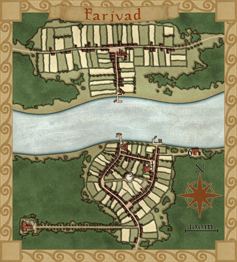
This is my latest map made in City Designer 3 (CD3), plus some effects added in Photoshop. It depicts the village Farjvad in the province Vadsbro and is part of the campaign/adventure I’m working on at the moment, even though I’ve mostly made maps so far.
Farjvad is situated about a day’s trip north east of the main town in the area, Vadsbro. Farjvad won’t actually be of importance for the adventure I’m writing, but it will still be a part of the campaign information. As you might have noticed I like to make maps, and making the adventure/campaign gives me some good reasons to do that. I also figured out that if I only have maps of the villages where the adventure takes place the players will rather quickly figure out what places are of importance and which ones are not. Also this will make the adventure feel much more unscripted if the players can go wherever they pleasein the area and the GM will have a nice map of the place.
So how did I go from a blank page to a finished map? What shall you think about while making a village map? First of all you have to decide where the village is situated, is it in a forest or a desert? The environment gives as well takes away possibilities for the map. In my case I know from the overland map of the province Vadsbro that Fjardinge is a village that is founded on two sides of a river, only connected via a ferry in the middle of a large forest.
I also decided that the south part of the village was the old one and that the north side is the new part where recent expansion of the village has taken place. Because that the village is situated in the middle of the forest there had to be some place for the villagers to go for protection if some kind of crises turned up. In this case I put a keep (nr 5 on the map) where the governor of the village used to live with his soldiers, maybe ten of them at a max. I could have gone with a palisade but in this case it didn’t feel right.
I also added a temple (nr 4), all places must have somewhere to go for religious need. The ruined temple (7) just outside the village was deserted when the new temple was done. What resides there today is up to the GM to decide.
Nowadays most travelers are using the northern road that leads from Vadsbro to the village Klyvholm. For this reason a newer part of Fjardinge has been built on the northern side. To make the sides differ a bit I decided to make the fields more square here, like they’ve been planned a bit. The big house at the square (nr 1) will also house the governor of the village (he decided to move here from his keep on the south side).
What I’ve actually have done here is making a story around the village and letting the story lead the way while mapping. I think I’ve stated this before but having a story in your head while mapping usually makes your maps more interesting, which means a better end result. It is also a lot more fun to map when you have a picture in your head of what the place looks like, it is like seeing your ideas come to life.
Originally posted on mappingworlds.wordpress.com
Comments Off on Farjvad
Clercon | January 22, 2013 | Annual, Campaign Cartographer, overland, Par lindstrom
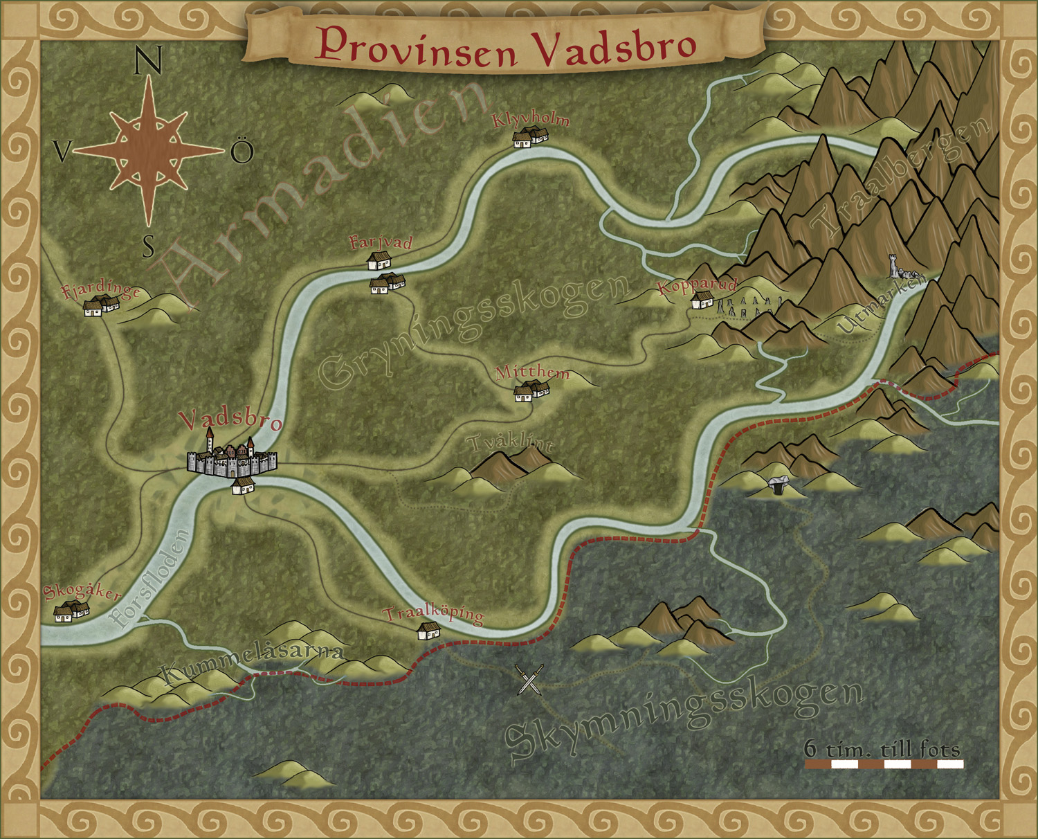
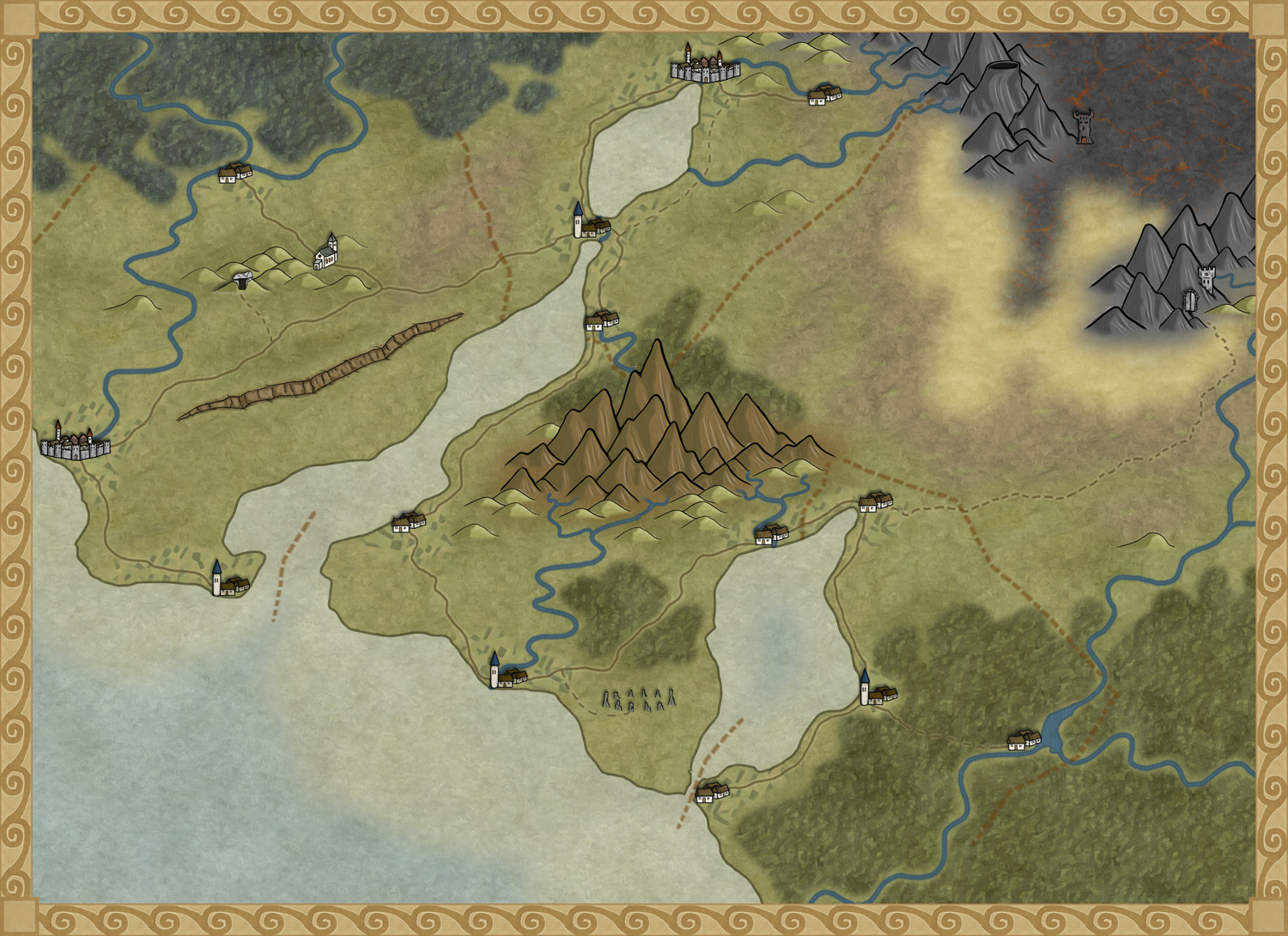
To get more ideas for maps to do I’ve decided to make a fantasy adventure. First of all I need a campaign map of the area where the actual adventure will take place, with that one in place it will be easier to plan the other maps I need to draw.
To make the map I decided to use the style I made for the December issue of the Annuals from Profantasy. The style was made for creating campaign maps for smaller areas, so it will fit very well for this map.
The adventure will take place in the country Armadien, close to a city called Vadsbro (Littlebridge in my Armadien map). Vadsbro is situated close to the Armadien border, next to the Traal infected Skymningsskogen (dusk forest) and the Traal mountains, so there will be a lot of forest in the map.
As soon as I started on the map I realized that I had to improvise a bit with the style. The main feature in the map, except for all the forest, is the river that split up in two rivers closer to the mountains. The rivers in the style aren’t really suited for depicting a main river in this scale, so I decide to use the ocean texture for the rivers. In this way the river will look more like the dominating natural feature in the area.
The river tool however comes in handy to show smaller rivers connecting into the main branches, but I had to change the colour of the rivers to blend in more with the main rivers. When I created the style, which is based on my Truscian map, I wanted the rivers in a darker colour and the ocean in a lighter one. That works very well if you do a more zoomed out map. But if you zoom in closer to an area for a map, and you suddenly want to use the ocean textures as rivers, the colour for the river tools don’t really blend in. So I decided to change them.
It is actually quite funny how a style you’ve created yourself, suddenly needs to be trimmed when you start working with it. But I think you can say that for all styles. At least I always trim the styles so they’ll fit into my way of working.
Now that the map is done it will be easier to decide what more maps I need to do. You can say that I’m making my adventure from the maps, the story I have so far will probably change a bit with every map I make. But that is the fun part of mapping, to weave a story around your maps instead of making maps from your story.
Originally posted on mappingworlds.wordpress.com
1 Comment
Clercon | December 10, 2012 | CD3, city, Par lindstrom

When I grew up I used to play a lot of Role playing games and especially I played a Swedish game called Drakar & Demoner (Dragons &Demons). Most of the adventures they released took place in a campaign world called Ereb Altor. At that time I thought the world was one of the coolest places for an adventure that existed, and I must say that the maps I saw then and the adventures I read really has influenced me a lot.
As I might have mentioned earlier making maps is my hobby, during the days I work as an IT-engineer, so mapping is something I do in my spare time. For that reason I’m very restrictive when it comes to taking up commissions, making maps for someone else means that I can’t make them for myself. But when I realized that the world Ereb Altor still was alive and that people still actually were working on new material I just couldn’t turn it down.
So after a short introduction to the people running the site I was asked to do a map of Kartotum, the capital city of Palinor. Making this city however turned out to a bit of a challenge. So far all of my city maps have been done in City Designer 3 (CD3) from Profantasy, a great program when it comes to make cities. However the program has its weak sides, and one of those is that it works best when it comes to making cities without too much elevation. Of course you can draw some elevation in the program, but not in a way that I wanted to do it.
You see Kartotum is situated on the slopes of a mountain so it is surrounded by great cliffs, and to draw that in CD3 was something way out of my league, if it’s even possible. So I decided to make the city and all the houses in CD3 and then draw the cliffs by using a combination of both Artrage pro and Photoshop. But to do this I first had to mark out the area in CD3 where the cliffs would be. To do this I added a green colour, different from the actual grassland, where I later would add the cliffs, as you can see in the map below. In this way I could place the symbols correctly in CD3.

When the city was done in CD3 I exported the map and opened it up in Photoshop. In Photoshop I added the black lines for the cliffs and saved the image as a .PSD file. The actual shadows around the lines I decided to add in Artrage Pro. The water colour brushes in that program are absolutely fantastic and in this way I could get the shadows exactly as I wanted them. I also added the colour of the cliffs in Artrage before opening the file in Photoshop again to add some finishing shadows and light effects.
Working on this commission has teached me a lot when it comes to adapting to some one else’s ideas and opinion and I must say that in some ways it’s even more relaxing doing maps for someone else than yourself. Suddenly you don’t need to come up with all the story and explanation to all the stuff you make. That is someone else’s headache.
Originally posted on mappingworlds.wordpress.com
Comments Off on Kartotum
Clercon | November 19, 2012 | Annual, CD3, city, Par lindstrom

As you might have noticed I really like to make city maps. I don’t know why but I just love to see how a blank paper slowly turns into crawling streets and vast parks. It makes my imagination really spin.
Most of my city maps I make in the program City designer 3 (CD3) from profantasy. It is a great program with a huge toolbox you can use to make the creation of your cities a much smoother experience. To make the maps more unique I also like to edit them a bit in Photoshop afterwards.
When I bought CD3 my first impression of the program however was quite different. You can easily describe it in one word, overwhelmed. Just the sheer number of tools and objects made me fear for my mental health. The first time I started the program I think I just closed it immediately.
So how did I go from there to where I am now? Well the answer can actually be divided in three parts. First of all practice. I started out quite small with a little village and first after a couple of small practice maps I went for the bigger cities or towns. Secondly I looked up some tutorials, especially Gandwarfs tutorials over at the cartographer’s guild where extremely helpful. Thirdly there was a black and white city style released in the 2010 annual from Profantasy.
So what was so great with the black and white city style? First of all you get a very nice tutorial in every edition of the Annual, this makes it very easy to learn a new style, you can just follow the steps described. For me this meant a lot when it came to learning CD3, because I could in this way quickly pick up the different tools to use.
Secondly the amount of objects decreased quite a lot in the black and white city style compared to the coloured styles that were included in the actual program. This might sound a bit odd but the good thing here was that suddenly the program didn’t feel as overwhelming as before. When the choices in objects decreased, it kind of made it easier to grasp the program and find what you were looking for.
The map included in this post is a map that I made while trying to learn CD3. It was one of my first experiments to make a really large city map. I especially experimented a lot with the random street tool in this one. The random street tool is really a great help when you quickly need to fill and area with many houses.
When I was done in CD3 I opened the file in Photoshop and added some cliffs on the northwest side of the city. I also draw my own arena object to add to the city, I really missed that object in the style. As a finishing touch I made the map sepia coloured and placed the map on a paper background.
Well after that I just continued doing city maps and slowly the interface started to make sense and nowadays I rather feel that the there are too few objects in the program then too many 
Originally posted on mappingworlds.wordpress.com
1 Comment
Clercon | October 23, 2012 | Annual, overland, Par lindstrom
The deadline for my December Annual style is closing in and luckily enough the style is slowly coming to a more or less finished state. A lot of things, small and big have changed since my last blog post about the style. The city icons have been remade and some of the terrain I’ve gone over a second time to make sure they are good enough.
One interesting thing I’ve learned from making this style is that the end result has a tendency to change a bit while you work. The Truscian peninsula map, that is the original map for this style, is a regional map that still is quite zoomed out. The finished style will be suited for a more zoomed in regional map. Not that you won’t be able to do the zoomed out version but I think that it is in the more zoomed in version that the style will really shine.
There are still some things left to do on the style, I might try to add in some more icons and I’m thinking of adding in one or two mountain ranges that you can use as the base while creating your mountains. Just to make it easier for you to make a quick map.
The map below is the latest test map of the style. I hope you like it.
Originally posted on mappingworlds.wordpress.com
4 Comments
Clercon | October 15, 2012 | styles
I’ve been asked by Profantasy to turn the map style I used for the Truscian peninsula into a CC3 style (let’s just call it the Truscian style from now on). The thing is that when you sit and draw for your own needs you usually can cope with a lot of mistakes in your maps, maybe the city icons look a bit off or the hills just don’t look exactly as you want them to look. But that doesn’t really matter to someone else then yourself. When you suddenly are doing something that other people might be using those things start to matter and that can be a bit scary. Most of all you want it to be perfect, you don’t want it to just be ok.
Suddenly you also have to make decisions. How many types of terrain do you need? Do you have enough city icons? How many city icons are enough? The questions can very easily become quite many. The best thing to do here is to actually sit down take a piece of paper and start writing down what types of terrain you already have, what types are missing, what icons do you want, do you need some terrain features that you have to make. Do you have a compass rose and a scalebar? Get it all down and try to make a plan on when things shall be done.
When I started to put it all on paper I soon realized that I was missing a desert, some wasteland and volcanic terrain. I needed some new city icons, a volcano or two, maybe some graves, hills and so on. But now when everything is on paper and there is a plan, it is much easier to start working.
The map below is a test map of the style that I’ve made in Photoshop. It consists mostly of seamless tiles that I use as patterns. Every terrain type is on its own layer and I’m using layer masks to make the terrain visible where it shall be seen. The mountains and city icons are drawn objects that I’ve pasted in on top of the terrain layers. There is still no compass or scale bar, but I have a fairly good idea on how I will do them.
Well in December you will see the finished result, if you subscribe to the yearly annual. Hopefully some of you will find it useful.
Originally posted on mappingworlds.wordpress.com
3 Comments
Clercon | September 18, 2012 |

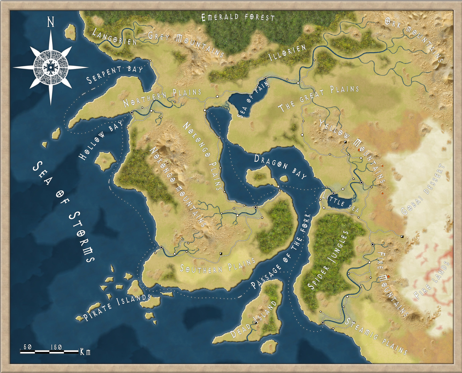
This month’s annual (September ’12) for Campaign cartographer 3 from Profantasy offered a very good looking style based on the world map of the upcoming role-playing game the “13th Age” by Rob Heinsoo and Jonathan Tweet.
I always like to try out new styles so I thought I should give this one a try too. Usually when I make maps I try to make a story around it. If you let the map visualize your story it is often easier to make it more unique and the details will kind of come more naturally. The drawback of working in that way is that it takes much more energy from you making a map, so this time I decided to just make a map without weaving a story around it.
The style itself was very easy and quick to work with. Most of the terrain is made up from seamless bitmap files so making mountains and other types of terrain goes really quick. The mountains however gave me some problems. Sometimes it was hard to get the high peaks in the places where you wanted them. But luckily enough the style also includes single mountains you can add to the mountain texture, which made the process easier.
If you look at the map included in this post I guess it took around three hours to do it, and then I probably spent as much time on labeling as I did on the actual map.
One thing I didn’t like though was that when you added the sheet effects to the map the seas didn’t get any effect added to them. When I made the map I had two larger seas, the sea of pain and little sea, that where close to the oceans. When those seas didn’t get any effect they looked strange compared to the nearby oceans. I tried to add some effects to the sea layer but because the ocean layer lies below the land layer and the seas are on top of the land layer it was hard to get an effect that looked exactly the same.
Apart from that I liked the style and if you want a map in a more stylish satellite style I can really recommend it.
Originally posted on mappingworlds.wordpress.com
2 Comments
Clercon | September 10, 2012 |
I really wish I had more time to do dungeon maps. But for some reason it seems that I always end up doing overland or city maps. Don’t take me wrong, I really love doing those maps but i just wish I had more time for dungeons as well.
Mostly when I make dungeon maps I use Dungeon designer 3 (DD3) from Profantasy. The advantage of the program is that it let you create a map very quickly. You can of course spend millions of hours on details in the maps but if you just need a quick map for an evenings game DD3 will let you make that.
Whenever I make a dungeon I usually try to make a quick sketch on paper. This will make it easier when you start working on the map in DD3. In DD3 I usually start with putting out the floors for the rooms, when those are in place I start to make all the floors for the corridors. If you don’t have a sketch to use as a blueprint this work will be much harder.
When all the floors are in place it is time to place all the walls. You might wonder why I don’t use the room tools in the program, where you place floor and walls at the same time? Well the problem with that approach is that you have to do a lot of cutting in the walls to get all the doors in, or just to open up for the corridors. When I started to use DD3 this was the approach I used but after a couple of maps I changed the working process to first place the floors. And in my opinion that works much better.
When all rooms and floors are done it is time to add in some details. I always start with doors, then I place tabels, traps, torches, blood stains etc. This last step can take everything from an hour to four, five hours. It all depends on what you need the map for, an evenings game with some fiends or to publish in an adventure.
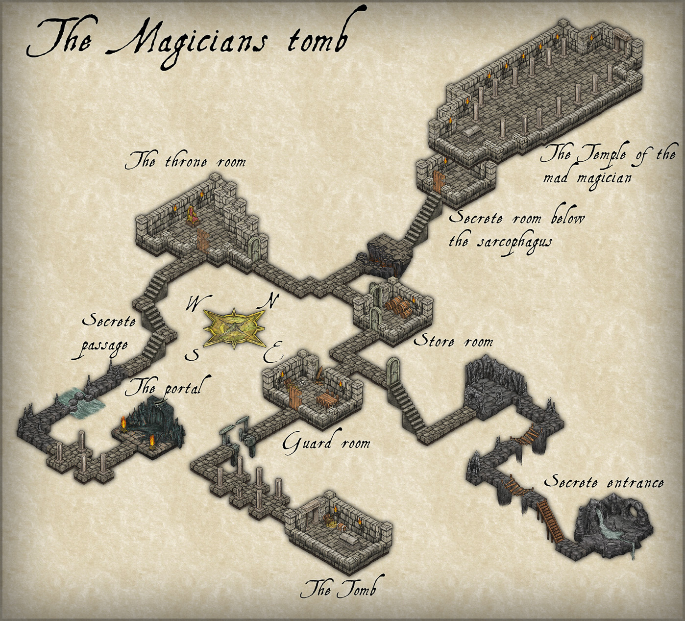
The map below, Catacombs of evil, was a test map I made when I first purchased DD3. It is made in Jon Roberts great style, that is free to download from here. When I made the map i pictured an evil cult hiding in the catacombs under a temple where they worshiped some demon. The adventurers mission would be to find the cult, free the prisoners and kill the demon.
The map is completely made in DD3, apart from labeling and the red light effects in room 8 that are made in Photoshop.

Originally posted on mappingworlds.wordpress.com
1 Comment
Clercon | August 14, 2012 | overland, Par lindstrom, Tutorial
This is the second part in my overland mapping tutorial. If you want to read the first part before continuing you can find it here. As usual this is my view of mapping and you might agree to it all or just parts of it. The important thing to remember is that this is one view of mapping, and not the only one.
Ok back to the map. We have some landmass, islands and seas so what’s next. At this stage I always try to place mountains and hills. If you desire you can try to work out where you would have tectonic plates and from that information decide where to put the mountains. I never do that, I’m more going for the “if it looks good it looks correct” path here.
First of all I often try to use my mountains to divide the landmass into different areas. It is an easy way of making natural borders in the map that you later can use when it is time to decide where to put the borders between different countries.
Secondly I try to make my mountain chains curved. If you make them straight the map will, in my opinion, look a bit stiff, which will give you a less good looking end result. When I say curved I don’t mean that they should look like circles. Curved mountain chains will give more life to the map, it will get more fun to look at.
Also try to break up the mountain chains at some points. It will give you some interesting valleys and passes that can trigger the beholders imagination in a good way. Is there really a more interesting place for a campaign then a mountain valley full of orcs or strange creatures, maybe a deserted watch tower or an old haunted burial ground.

Around the mountains I place some hills to make the transition from mountain to field look more natural. A good idea might also be to put some hills between two mountain areas that are quite close to each other. It will connect them in a nice way.
When you’re done with your mountains it is time to start on the rivers. The basics when it comes to rivers are that they flow from high ground downwards, they don’t split downwards, but they can have more than one starting point. Usually they also try to get to the sea the shortest downhill way. If you try to follow those two rules the rivers will look more naturally.
Another thing to think of is that the straighter the river is the faster the flow of the river will be. Most rivers tend to be straighter and faster in the beginning and closer to the sea they usually will slow down, which means more curves. When I put rivers in my maps I tend to do them quite curvy. It will usually look better, straight rivers just don’t get the right feeling, at least that’s my opinion.
Originally posted on mappingworlds.wordpress.com
1 Comment
Clercon | June 25, 2012 | Annual, dungeon, wielink

I’ve really looked forward to the release of this year’s June Annual that gives you a new drawing style by Herwin Wielink: Isometric Dungeons. The style itself includes some really fantastic graphics and possibilities and it lets you create a new good looking map in no time at all (compared to if you’d do all the graphics by hand).
The style itself was a bit tricky to work with for me. Or if you put it another way, the style really showed me how much I still have to learn to completely master Campaign Cartographer 3. Maybe I have to take a closer look at the Tome of Ultimate mapping to catch up on a thing or two.
Getting all the different objects in the correct order in the map really gave me a slight headache. When you create a map in this style you really have to plan in what order to do things, if you don’t want to move things back and forth on the actual sheet. It took me some restarts of the map to get a hang on it. But once you understand the logic everything runs a lot smoother. The secret of success is to work from one of the top corners to the opposite lower corner. In this way you will naturally get the graphics in the right order and you don’t need to rearrange the order of the rooms and corridors all the time.
When you reach that point everything also gets a lot more fun. I really enjoyed working with the style and the result gets so good that you just want to keep going, it’s just as addictive as playing a good computer game.
However there was one thing I felt was very frustrating with the style, and that was that I want more! The style feels like a small taste of something that could be amazingly fantastic. I want circular rooms, walls with windows, more furniture, different floors, traps, outdoor environments, sewers and I could continue that list for another two posts. This is what Perspectives 3 (if it comes out) should look like.
At the moment when the selection of different graphics isn’t too vast a lot of maps will turn out looking quite similar. So it is quite hard to do something unique with the style, but I’m hoping for a bright future and more isometric add-ons in future Annuals maybe.
Originally posted on mappingworlds.wordpress.com
2 Comments