Clercon | May 31, 2012 | Campaign Cartographer, overland, Par lindstrom, Tutorial, wielink

This time I thought it was time to make a tutorial on how you can make a convincing overland map. This will be more of an overview tutorial on how I think and plan when I make a map, so it won’t be very technical. This means that you can use this tutorial regardless what program you use when you map, even though I in the tutorial will use a map made in CC3 as a reference and example.
The first thing to take into account when you start an overland map is the landmass. How much of the map will be water and how much will be actual land? This is probably the most important step in your map because it will set the boundaries for what the end result will be. So already here I’m having a quite clear view of where I want to go with the map, shall the map be land based, island based or something in between.
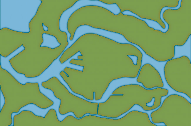
Below you see my map “Sagorike”, that I’m using as an example in this tutorial, with only the landmass viewable. I’ve also written some things on the map that you can have in mind while drawing the coastline.
A good thing to do before starting on your landmass is to look at the real world (Google earth is great for this). If you want a lot of fjords, have a look at Norway, Island based, look at area outside Stockholm for example, and so on. It is always good to find inspiration in the real world. It will make your map look more believable, and believable maps tend to look good.
However when I make maps of worlds the most important thing for me is that they look good and in some part convincing. It doesn’t matter if the world doesn’t work geologically or physically, as long as it looks convincing. To make it look convincing you have to get the things right that the majority of people can spot, like rivers, they will NEVER split downwards, lakes, there is always only ONE outflow, or deserts, make sure that you place them in a way that it looks probable that no rain will get there, and so on. If those small details are correct it is more likely that the viewer will believe in the whole map, regardless if everything in it is possible according to our physical laws or not.
That is all for now, in the next post we will start by placing the mountains in the map.
(Originally posted on mappingworlds.wordpress.com)
3 Comments
Clercon | May 16, 2012 | Annual, Campaign Cartographer, CC3, Overland map, Par lindstrom

I’ve started to play a simple and easy to understand roleplaying game with my two oldest children (this is also the reason that the names in the map are all in Swedish, they don’t read English). And of course no game can be really appreciated without a world map to look at.
So I decided to make one while trying out the April annual style from Profantasy, made by the artist Herwin Wielink.
It is always hard to start working with a new style, it takes a while just to get used to the style itself. What graphics are included, fields, desert, marshes, rivers, forests and so on. A good thing is to just create a couple of test maps to get used to the style, to get the feeling of it. In this case I did that, but not only on purpose. I’ve read on a lot of places that people complain that CC3 can be a bit unstable, that it sometimes crashes a lot.
Well I’ve never experienced that, apart from with one of my more ambitious projects where the actual file grew too large for CC3 to handle. But with this particular style I actually had two crashes where I had to restart the whole project from the start again. That has never happened before and it was probably just a coincidence that it happened now, but I guess that the end result ended up better because of this. You can say that I learned from the mistakes in the two earlier maps, so I didn’t need to repeat them in the final map. [Editor’s notice: If you ever lose your map, look for autosave.fcw in your CC3 folder.]
The graphics in the style are absolutely gorgeous and mountains, forests and other symbols really melt into the background in a great way that kind of hides the fact that the map is made in CC3. The only other CC3 style I can think of that accomplishes this as good as this one is the 2011 March annual overland style by Jonathan Roberts.
I also like the colour palette a lot in the style. Sometimes I think that maps made in CC3 can be bit cartoonish when it comes to colour, this particular style though has a really nice dark feeling about it. I like that.
Overall the style was very easy to use, the selection of textures and symbols are vast so you can really get some great variation into the map. And variation is very good if you want to make a map that is unique and nice to look at.
As usual I’ve done the labeling in Photoshop, I just can’t get it to work satisfactory in CC3, but that is probably because of me and not the program. The font is the same though as the one included in the style.
(Originally posted on mappingworlds.wordpress.com)
5 Comments
Clercon | May 3, 2012 | CD3, city, city planning, Par lindstrom, Tutorial
Originally posted on mappingworlds.wordpress.com
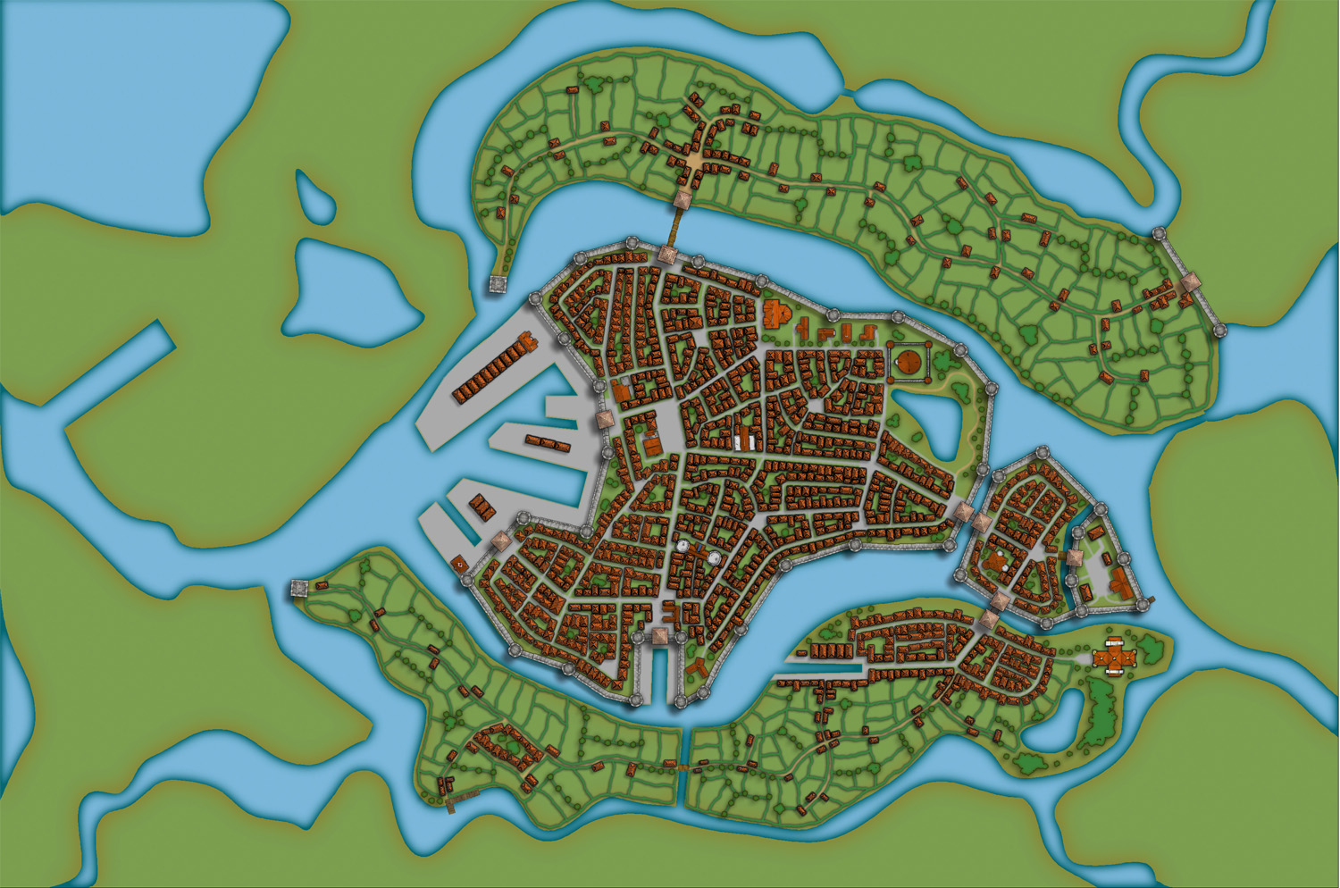
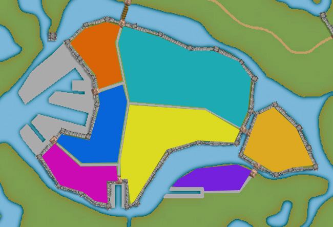
In this post we will create the outskirts of the city, farmlands and the ruins. First of all you have to decide what parts of the city that will be farmland and what part will be ruins. In this map I wanted to create the feeling that the city is situated in the middle of an old ruined city. The two closest islands to the east and west of the city will consist of farmland. Those areas are close to the city and will be easy to protect as well. On the north part of the western island you can also see that a part of the old city wall has been taken into use again, to protect the city from whatever hides outside.
When I create farmland I always start by putting in all the roads and houses. Usually you will have a cluster of houses just outside the city gates, the further away you get from the gates the more space you will have between houses. I then select the city hedge drawing tools and start to mark out the area where the fields will be. I’m actually using the same technique here as I do when I’m making smaller towns. For a more thorough explanation on how I draw the fields see my Mapping a small town part 4 post over at my mappingworlds blog.
When I’m done with all the fields the map looks like the picture below, so still some ruins to place.
To complete the fields in the map I also export a map from CD3 where all the land is yellow. In this way I can combine them in Photoshop and paint in some yellow fields among the green ones. This will give you a more natural look than if the fields are just green. See my Mapping a small town part 6 post for more info on how to do this. The yellow version of the map looks like the picture below.
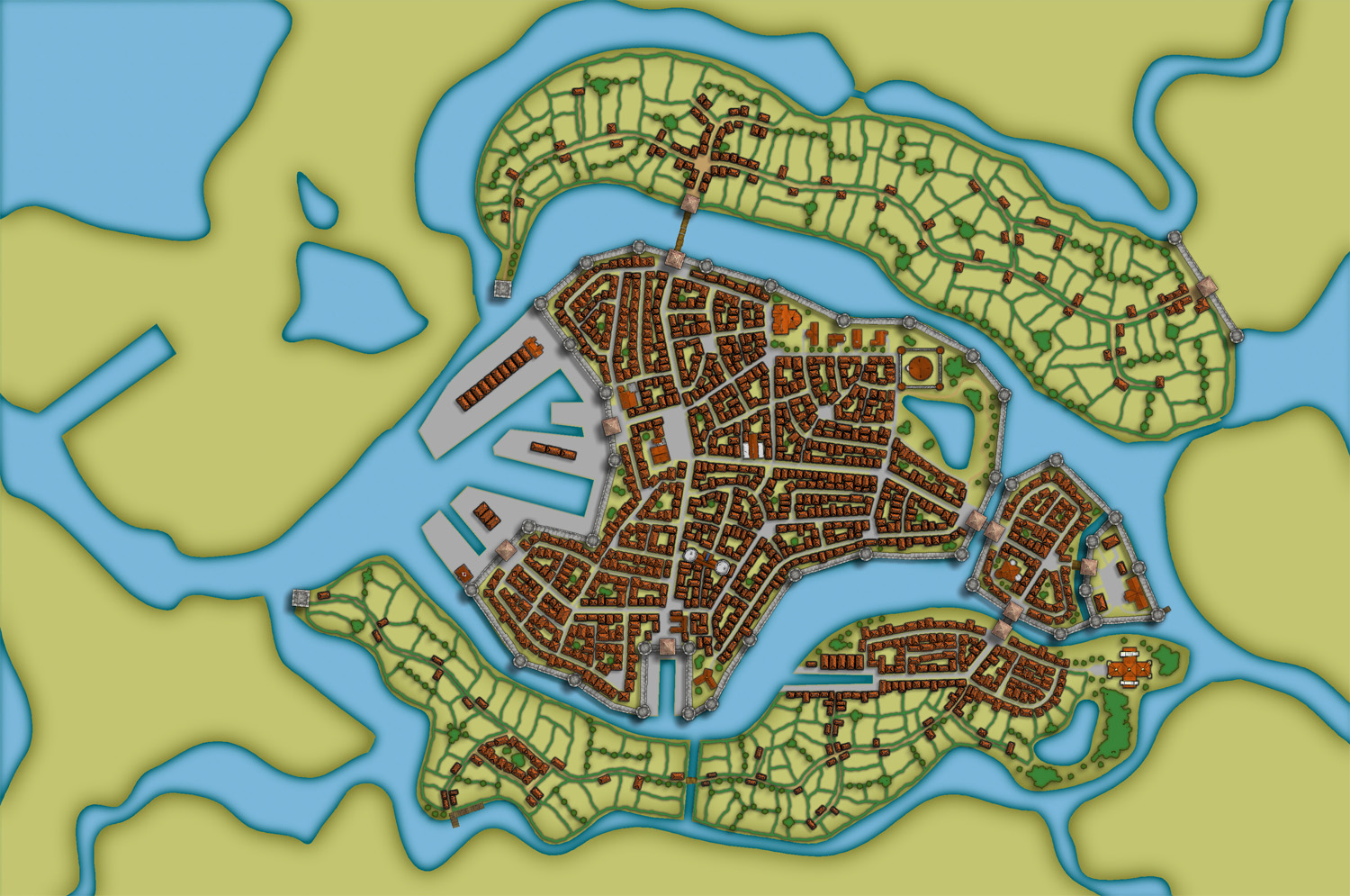
You can of course add in all the yellow fields in CD3, but I’ve found that to be a lot more time consuming then doing it by combining the two pictures above in a third party program. This program doesn’t need to be Photoshop, use the program that you feel comfortable with.
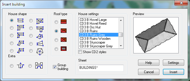
The next step would be to add in some ruins in the picture. Here I must say that CD3 didn’t really have any good styles to work with to get the look I wanted, so I had to make something up myself. Creating a completely new style wasn’t something I felt I had the time or knowledge to do, but I think a good ruined city style would be a great style add on in a future Annual. Sure you have some ruins in the program that you can use, but for me a ruined city mainly consists of the foundations of the houses and maybe some larger, more intact, buildings.
So I decided to draw in some random roads and houses using the CD3 B Ruins Grey buildings. They’re not perfect, but they are a good base symbol to continue working from.
When I’ve put in all the roads and larger buildings in the map I’d export it again from CD3. This means that I now have three different versions of the map, which I’m going to put together in Photoshop, the two different ones with yellow and green fields and this one with a green background and ruins in the outskirts of the city.
At this stage I had to work on the ruins a bit in Photoshop to make them look more like ruins. If you put the map with ruins in one layer and put it on top of a layer consisting of the map with green fields. You can start to erase bits and pieces from the top layer, when you do this the layer below will be visible instead of the top one. In this way I erased all the inner parts of the buildings, which left something that looked more like the foundation of a house. I also erased parts of the larger buildings to make them look more like ruins with broken roofs and missing walls.

In the picture above you can see a part of the map where you have the ruins as they look in CD3 on the left side, and how they turned out after some editing in Photoshop on the right side. In my opinion the right side looks more like ruins then the left side. Or at least more like the ruins I wanted in this particular map.
1 Comment
Clercon | April 16, 2012 | CD3, city, city planning, mapping cities, Par lindstrom
Originally posted on mappingworlds.wordpress.com
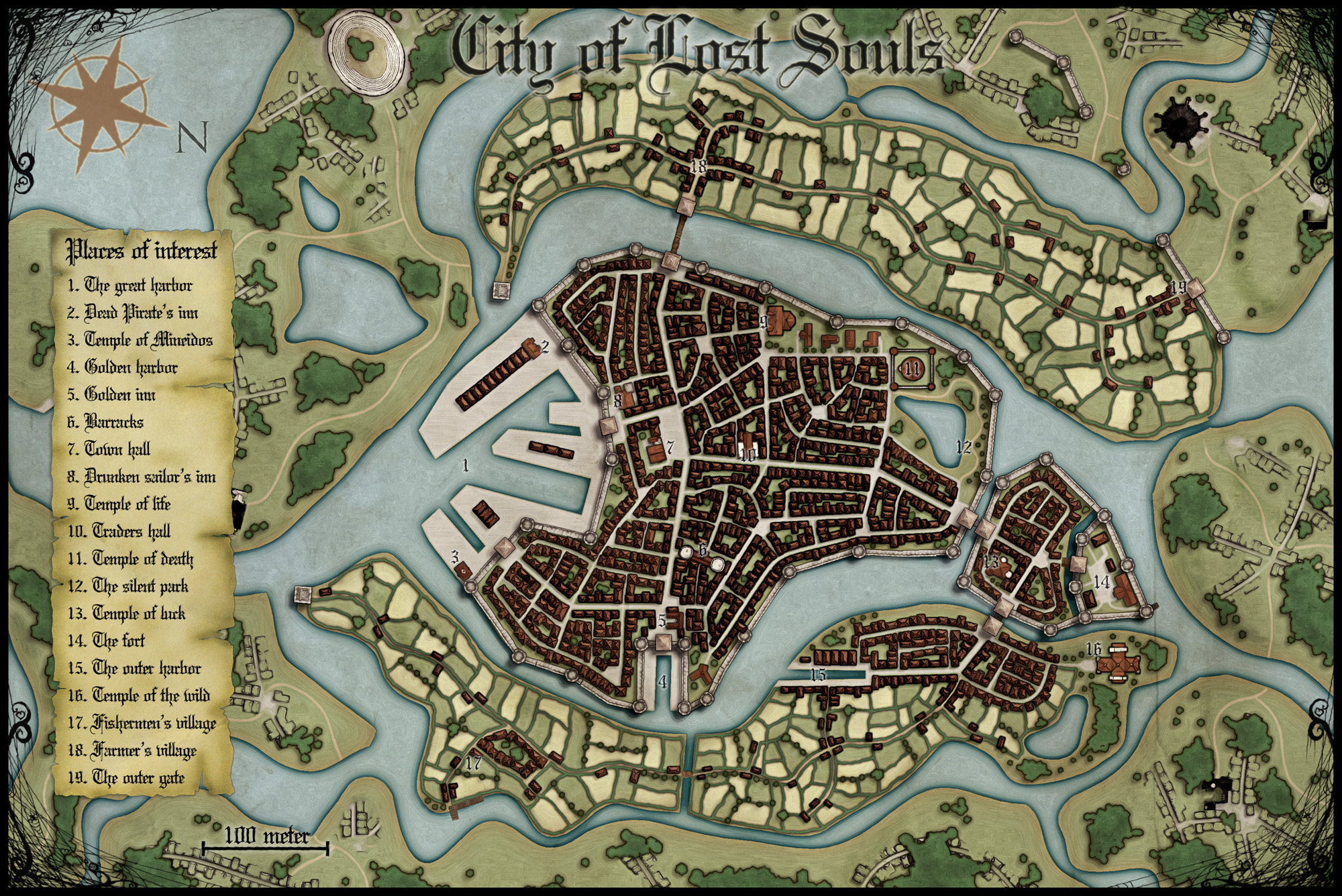
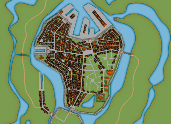
We now have the basic layout of the city. Next step is to put in more roads and try to decide where to place the majority of buildings. Sometimes when you create a large city the process of placing all the houses can be overwhelming. To make this easier I try to divide the city into smaller areas. I then place the houses one area at the time. In this way you divide the work into smaller goals that you can reach quite quick. It will make the whole process much easier. In the picture below you can see how I’ve divided the city of lost souls into seven areas to fill it with houses. Make every area interesting by adding a major house, villa or temple in it. It will add some details to your city and will make the end product more fun to look at.
At this stage I also try to locate where the major squares will be, naturally they will be situated where the large roads meet up. I also like to add some smaller squares in front of the gates, usually this is where people have to wait to get in and out of the city. You also have to decide what density your city will have. Nearly all cities have some sort of park or green area, older cities could actually have quite a lot of farmland inside the walls. In this case how ever the farmlands are outside the city walls.
When I start to place the houses I zoom in and out to quite a lot to check the progress of the area I’m doing to make sure that the network of roads and houses looks natural. A good thing to think about is if the area you’re making is planned or if it has grown over time. To understand the difference in how a planned city looks compared to one that has grown over time you can look at some modern cities in USA (for example New York) and compare it to some older ones in Europe (for example Venice). The planned ones tend to have straight roads in squares and the grown ones usually have roads and city blocks in all kind of versions. At first you can’t really see any logic in the city construction, but after a while you will start to see that roads lead between squares and larger empty areas usually consist of an important building and its surroundings.
When I start to map an area I always start with the roads. First I add in some larger main roads, I then switch to a smaller road to make intersections between the larger roads. In the picture below you can see a nearly finished inner part of the city. I’m working on the last area and have put in the roads and squares. The squares I try to place in areas that feel natural. Also try to have some space between squares, a square is a place to meet and trade, so they will be evenly spread out in the city.
When I add houses to a city or town I always start by using the Random street tool. The ability to quickly add all houses on a street is one of City Designer 3′s best advantages. When you’ve added a lot of streets it isn’t always possible to use the Random street tool everywhere, in those cases I add the houses one by one. Sometimes you also have to go back after adding houses with the Random street tool and delete houses that don’t fit in for one reason or another.
When I use the Ramdom street tool I try to make the houses come as close to each other as possible. To do that you have to change the settings a bit. Right click on the Random street tool icon and in the street option window you click the Street settings button. The settings I used for the map you can see in the picture below.
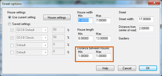
The most important setting is the Distance between houses that I always set to 1, both as Min and Max value. In this way you will get the houses as close as possible togehther. The other values depend on the scale of the map that you’re doing. You have to try some different settings here and see what works out.
When you’ve added houses to all your areas in the town you are done with the central parts of your city. Don’t forget to zoom out once in a while and check that the streets look good. I often have to go back and add some more roads to make the city more crowded. In the next post we will start on the outskirts of the city, farmlands and ruins.
Comments Off on Making a City part 3
Clercon | April 5, 2012 | CD3, city, city planning, mapping cities, Par lindstrom
Okay, so far we have the landscape where the city will be situated. When creating the City of the Lost I combined graphics from three different styles in City designer 3. First of all the actual landscape, which is what we have at the moment, is made in City style A. Later on when I add in houses I mainly use the graphics from City style B. The reason for this is that those houses looks more painted then the one in style A. which look more 3d generated. Which one to prefer is up to you, but in the maps I do the style B graphics are better suited. In this map I’m also using some graphics from the Profantasy March annual, Jon Roberts city style. In that style I’m especially fond of the city walls and towers. However the walls in this style are a bit harder to place due to being built from a static graphic file. So you have to watch the corners because they tend to create some gaps there. A good way to hide this is to place a tower on the “bad” spot.
When I start a new town I usually always start by building the town wall and deciding where the gates will be. In this way you will get a clear view and idea on where the majority of houses will be placed, so you can plan ahead and get a good balance in the map. In this particular map we also have three different docks, one larger and two smaller ones. In older cities the docks were often situated outside the city walls. In this way you could both tax the goods efficiently when they were entering the actual city and you also didn’t need to compromise the security of the town. So I’m placing the two docks on the central island outside the walls. The small third dock, however, is situated in an area where you have no walls. This dock is probably used for more local trading, not taking in ships from abroad. The idea with the docks is also that they are remnants from an earlier city that has been reused. So naturally it is around the docks that the “new” city is built.
Now, when we have the walls and gates of the city I put in the main roads. The logic here is that all main roads in a city usually will take you from gate A to gate B. Somewhere in between you will have some main areas like a square or a city hall etc. In this way you will also create some natural boundaries for different districts in your city. It will make it easier for you to plan the next step, adding more roads and start adding houses.
Comments Off on Making a City part 2
Clercon | March 29, 2012 | CD3, city, city planning, mapping cities, Par lindstrom
Originally posted on mappingworlds.wordpress.com
In my last post I presented the City of Lost Souls. The idea of the city has been in my mind for a long time as a city that originally was created by outcasts from the ordinary society. Outcasts that in the end have created a powerful city, a city made untouchable because of its location in the middle of a maze like river delta.
In this post and the next couple of post I’ll try to describe the process I’ve developed when I create cities. I don’t say that this is the best way to do it but it is one way to do it. To exemplify the process I’m using I will use the map of the City of Lost Souls.
When I decide to make a map it is always easier to start if you can get some inspiration from the real world. One of the best tools you can use is Google earth. You can learn tons of information just by moving around the globe looking at old cities, land formations and following rivers through the landscape. In this particular case I looked a lot at river deltas and cities situated at the end of rivers.
You will never find anything that will look exactly like the part you want to create, but the idea here is to find real world location that can inspire you, and that you can copy bits and pieces from. In this way you can create a map that will look much more convincing than if you just draw something from your head.

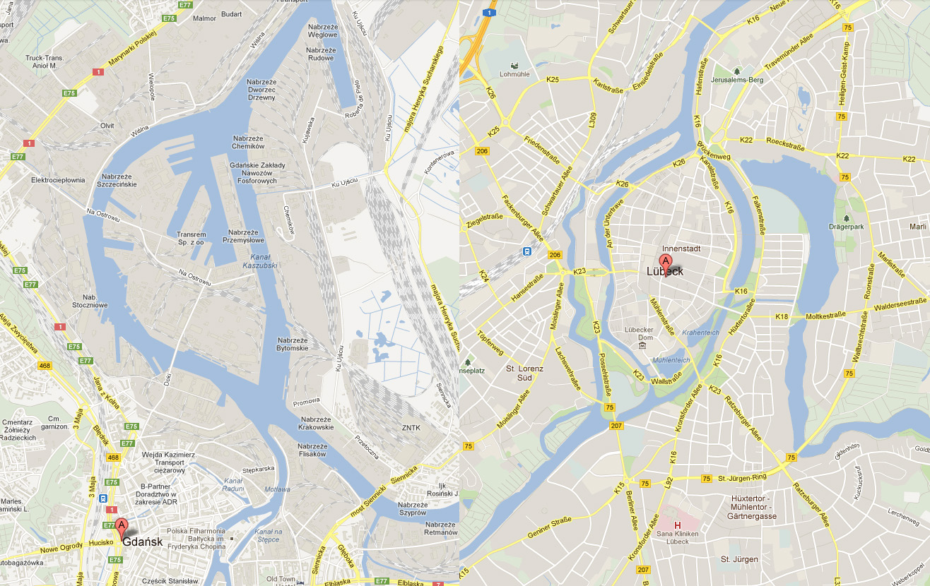
I soon found two cities that gave me the right feeling. These cities were Lübeck in the northern parts of Germany and Gdansk in Poland. None of them was perfect but I liked the flow of the river around the old part of Lübeck (as you can clearly see in the map), but this part missed a harbor. So I picked the harbor from Gdansk for the map. I also added in some more rivers to get the feeling that the city really is situated in a river delta.
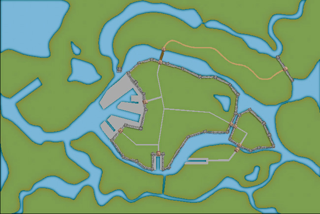
In City Designer 3 (CD3) I then started a new map and started to draw the rivers. During the process I looked at the cities for inspiration but still trying to do something original. While creating the island where the actual town would be I draw the outline of the harbor already at this stage. In this way the shadows between river and land would be right later on. So at this stage I had a quite clear picture on how I would progress with the city. In the picture below you can see the result when all the terrain was done. Next step would be to start on the actual city.
Comments Off on Making a City part 1
Clercon | March 22, 2012 | City Designer 3, mapping cities, Par lindstrom
Originally posted on mappingworlds.wordpress.com

This is a map of the City of Lost Souls. The map is done in City designer 3 (CD3) from Profantasy combining the included styles A and B with the latest annual city style by Jon Roberts. The end result from CD3 has then been quite heavily edited in Photoshop, where the labeling also has been done.
In the next post I will go through the process of creating the city. Until then you can have a guess on which two real world cities that inspired me while making the City.
As always when I make maps I try to add a story to it, this makes it easier to picture what I want and what to put into the map. As for the City of the Lost the story goes something like this:
Continue reading »
2 Comments
Clercon | March 15, 2012 | Annual, Jon Roberts, mapping cities, Par lindstrom, textures
Originally posted on mappingworlds.wordpress.com
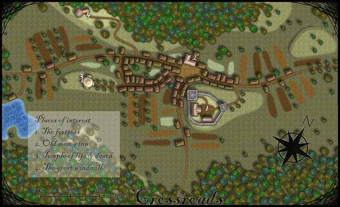
This month’s annual from Profantasy is a new city style designed by the fantasy cartographer Jon Roberts. This is the third time that one of Jon Roberts’ themes are presented as an annual. The two earlier versions have been an overland style and a dungeon style.
I must admit that I’ve really looked forward to the release of this annual. First of all I love city maps and CD3, secondly Jon Roberts is a very skilled cartographer and illustrator so I expected some really nice graphics in this one.
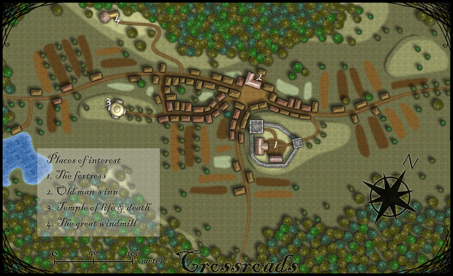
As expected, all the graphics are top notch and I especially like the walls and towers. To test the style I decided to make a rather quick village, called Crossroads, situated in the middle of a forest. The style was easy to work with and if you have done maps in CD3 before there isn’t really any new things to learn here. One little feature I liked however was the ability to make nice shadows on the hills. You can clearly see this on the hill where the temple of life & death (3) is.
After finishing the map there are some things I felt I need to work a bit more on next time I’m using the style. First of all the fields didn’t turn out great in the map; probably I have to try to put some more time on them in the future. When I started doing maps in the included styles in CD3 it took me a lot of trial and error before I got the fields right. So I have some more testing and practice to do here.
Another thing to think of is that in this map I had quite some open space between the forests and in the background texture you can see a pattern. I think the solution here is to add in some more different textures to hide the pattern. If you look at the included map in the annual you don’t see this pattern there.
At last if you look at the trees in the forest you can see that the northern forest has the trees more closely to each other. I actually think they got too close so in the southern forest I put some space between the trees. This made the forest look much better, in my opinion.
Overall I think the style is really strong. I like the darker colours of this one compared to the included styles in CD3 (which means less editing in Photoshop for me) . Still it takes some time to get to know the feeling of a new style, to get all the things in place in a good way. This one surely needs som more practicing for me before I’m there.
As usua,l I added the labeling in Photoshop, and I also selected another font. If you want to use the font I used it’s called Blackadder regular and can be downloaded from dafont.com for free.
1 Comment
Clercon | March 8, 2012 |
Originally posted on mappingworlds.wordpress.com

I’ve always been very fond of Dwarves and their mines as a great location for an adventure. I guess you can blame this on Tolkien and his description of Moria. I still remember how excited I was when I saw the Lord of the rings on TV for the first time (now we’re talking about the old film, not the new ones) and they entered the old mines full of orcs.
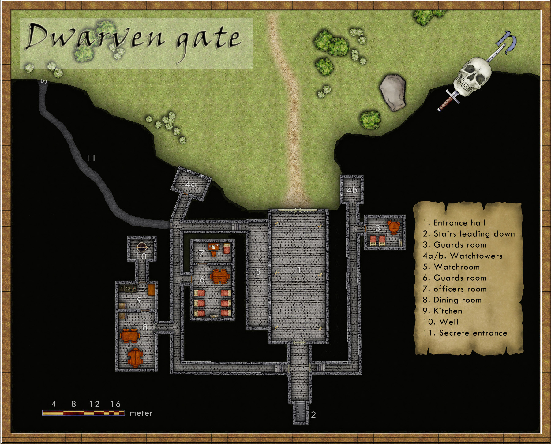
This map however is only of the entrance to a Dwarven kingdom. It is made in the Dungeon Designer 3 add on for Campaign Cartographer 3. The style used is from the 2011 annual, Jon Roberts Dungeon. This particular style is actually free for anyone to download.
When I map some kind of fortification I always try to picture how an attack on the area would be done. How could I defend the area in the best way? Whoever that want to get past the fort has to pass through the entrance hall (1) on the map. So I wanted the entrance hall to be well guarded, I accomplished this through the watchroom (5) next to it. From there the guards can watch who enters and also shoot at them. The inner iron door will hopefully prohibit any hostile intruders from getting any further in.
The two towers facing the outside (4a-b) are also good spotting areas from where you can see who’s approaching as well who’s standing in front of the gates. I try to continue thinking in this way while mapping, other important aspects are where will the guards sleep, eat or relax? Remember this is a place where the guards probably spend a week at a time before they are relived.
In the end I also added the secrete passage (11). This passage shouldn’t really be there because it is a huge security risk. The reason I put it there was that if some adventurers need to sneak in past the guards they need a way to do it. So the passage was added to make the map more fun to use in an adventure.
This was the first map I made in Dungeon Designer 3. The program however I feel is the most complicated one from Profantasy, mainly because there are so many different things you can add and have to take into account. It took me a long time to realize that I in this map actually by mistake used the wrong beds and tables (they are from another style then the one I intended to use). So it was very good to have the pdf from the annual style to use as a guide while exploring the program. This however doesn’t mean that this is a bad program in any way, probably the contrary. But it crave from you as a user that you take the time to learn it.
Comments Off on Dwarven gate