ralf | January 2, 2023 | 13th Age, Annual, Lee Moyer, overland maps

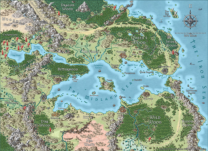
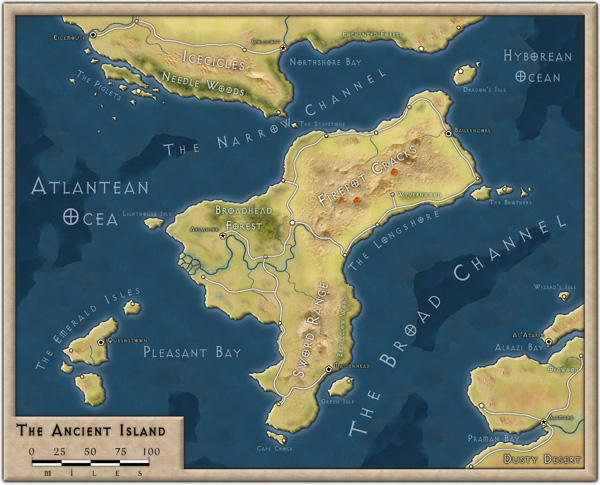
The January issue of the Cartographer’s Annual 2023. We start the year with a refurbished and expanded version of the 13th Age Overland Style by Lee Moyer. Inspired by his Dragon Empire map for the 13th Age role-playing game by Pelgrane Press, it is superbly suited to large scale campaign maps.
It’s symbol and bitmap selection has been expanded and the whole style has been brought up to speed to CC3+s latest effects and tools. The mapping guide has been updated and rewritten to take all of these changes into account.
The January issue is now available for all subscribers from their registration page. If you haven’t subscribed to the Annual 2023 yet, you can still do so here at the early subscriber discount (until January 10th).
Comments Off on January 2023 – 13th Age Revisited
Simon Rogers | August 17, 2021 | 13th Age, offer
ProFantasy’s sister company Pelgrane Press publishes the award-winning 13th Age roleplaying game.
Written by the co-designers of 3e and 4e, it’s the game that that they play at home. 13th Age combines the best parts of traditional d20-rolling fantasy gaming with new story-focused rules, designed so you can run the kind of game you most want to play with your group. Combat is fast and exciting, skills are simple and flexiblew and based on the character’s history, and each character is tied to the setting and the powers of the world – the Icons.
If you play D&D, it won’t take you long to get started.
Free 13th Age Maps and Tools
 ProFantasy worked with Pelgrane to produce some amazing cartography for 13th Age.
We’ve bundled up this CC3+ content for you free to celebrate the 13th Age Humble Bundle. It includes a map-making style, map collections and the 13th Age QuickStart rules.
You can download it here.
The 13th Age Humble Bundle

The 13th Age Humble Bundle includes almost everything for the 13th Age roleplaying game line at a low, low price.
Combining streamlined combat with excellent indie story game design, and packed with a collection of beautifully-crafted books, music, digital maps, and more such as 13th Age, 13 True Ways, and the 13th Age Bestiary, take your character from a plucky adventurer all the way to become an epic hero! Plus, your purchase will support Oceana (supporting the reduction of plastic pollution).
Get the Bundle here.
Comments Off on 13th Age Maps and a Humble Bundle
ralf | June 1, 2016 | 13th Age, characters
Recently we updated Character Artist 3 to be compatible with CC3+, and I jumped at the chance to work with that character builder again, doing some example drawings. I chose the characters from our 13th Age campaign, because they are such a great mix of classic (and not-so-classic) D&D-types.

Meet the heroes of Drakkenhall. Mostly these were easy to do with the basic Character Artist 3 options. The monster option has a lizard man figure that works great as a Dragonborn, and the halfling model doubles as a gnome just fine, if you skip the hairy feet.
 Some player-requested changes were quick and easy to make. “Abigail has red hair, not black!” – simple, just switch out the hair symbol for the correctly colored one. Others turned out a little more complicated. “Calor should have less full lips, but with a friendlier smile” – alright, I had to break out Photoshop for that and edit one of the mouth PNGs to create a new symbol. I drew the flames on the Dragonborn’s scimitar with CC3+’s vector tools and then applied a blur sheet effects.
Overall I spent perhaps 15 minutes on each figure on average, plus another half hour composing the group shot. And while it certainly doesn’t match the players’ image of their own characters 100%, it’s still a nice visual impression of the group. I’m looking forward to their next exploits on the ruined streets of Drakkenhall!
P.S.: There is one special character that I indeed have to skip: P3358, the forgeborn fighter. That’s a character race, that CA3 does not support at the moment.
1 Comment
ralf | July 15, 2015 | 13th Age, battle map, Noteboard, Printing
 For my current 13th Age rpg campaign (a short break from our Ashen Stars game) I recently created several battle maps, because while the game does not use a grid movement, it profits from a good visualization of the combatant’s positions relative to each other. Looking back I realize that I used a variety of different ways to actually bring the maps to the table, as time and resources dictated. I thought it might be useful to look at the different methods.
For the first session, I had a generous time frame and needed to have some professional posters done anyway, so I went for the most luxurious way: I had the two battle maps for the game printed at a poster printing service (Posterjack.com). Click on the image on the right, to see a close up view. The paper quality is great, the colors brilliant and of course everything is in one piece. The scale can be a bit off, if you go for the cheapest poster size/format option, but this map was not meant to be printed at exact miniature scale anyway. The downside: it’s a bit more expensive of course (€10 per 80cm by 60cm poster) and takes time get printed and sent back.
 For the second session I was much more pressed for time, and I also didn’t want to spend that kind of money again. So I went to my trusty home inkjet printer (a Canon Pixma iP4800) and printed the next battle map on nine pages of A4, trimmed and glued them together. You can see the result on the left.
The colors are more muted, and you can see where the pages have been glued together, but it still looks very nice. Of course it uses up a good bit of ink and still requires some time to assemble (I can do these in 10 minutes now though). Generally, this is my go to method, which I have used over the whole Deadlands Reloaded campaign that I finished last year.
 Still, I had a couple more encounters planned for the evening and didn’t want to print even more stuff. So I came up with a new way to use the map at the table. I would display it on the TV screen for all the players to see and have a Noteboard on the table with a quick sketch of the same map. The TV display would provide the flavor and atmosphere for the map, while the Noteboard would allow for the tactical positioning. Click on the image on the right to see the set up.
I used Chromecast and my Android phone to quickly cast images to the screen. This turned out quite well, better than expected on my rather modestly-sized TV set, and I used it for the final two encounters of the adventure. I’m sure I’ll revisit this method in upcoming sessions. While it’s not quite as nice as having the minis on the color map, it definitely saves on money and time.
Note that the Noteboard area is a bit smaller than your A1 poster map, but with 13th Age you don’t mind really. There is no counting of squares or hexes nor any measuring of distance that would need an accurate and consistent scale.
1 Comment
ralf | July 6, 2015 | 13th Age, battle map
 I’ve recently started a new fantasy campaign, using the 13th Age rules and setting. Due to some (unsurprising) insider connections, I was able to acquire a playtest copy of the upcoming “Battle Scenes” collection for the game. It contains a host of fighting encounters for different levels and surroundings. It’s a great resource, especially if you are stuck for inspiration or just need to pull a battle out of your hat.
What it doesn’t have yet, due to its stage of production, are detailed battle maps. The encounters are only sketched out in draft form. But I do have the right tool at hand for this job, don’t I? So I sat down and created a couple of battle maps for a set of connected encounters (a rafting expedition through orc-infested wilderness, isn’t that great?). I used Dungeon Designer 3 and Symbol Set 2, and it looks like the maps may end up as part of the published Battles Scenes in the end.


A neat idea crossed my mind as I was starting the second map: Why not make it combine with the first for one huge battle map? While it wouldn’t be used like that in Battle Scenes, it might come in handy for other occasions. You surely wouldn’t want to use a gorgeous prop like this once and then throw it away?

I printed the maps at an online poster printing service, and while doing it at a “correct” 1″ to 5′ scale would have been a little too expensive, the scaled down, very affordable version at 80cm by 60cm per map was big enough to easily accommodate 13th’s Age loose movement and positioning system. The map certainly gave the game session some great visual “oomph” as the PCs were floating down the whitewater river, fending off orcs on all sides.
You can download print-ready versions of the maps by clicking the images above.
Comments Off on Rafting Razoredge Gorge
ralf | September 24, 2014 | 13th Age, CC3 Plus, Mike Schley, pelgrane press
While we are feverishly working to get CC3+ out to you, here’s another example of Mike Schley‘s overland style that is included in that next version of Campaign Cartographer. We created the map in the process of testing , and while we won’t give a fixed release date, let’s just say we’re getting very close now.
The map is a redo of Lee Moyer‘s gorgeous map for Pelgrane Press’ and Fire Opal Media’s 13th Age game. You can download the original here. The map shows the Dragon Empire, the game’s broadly defined, high-magic fantasy setting of a powerful human empire beset by troubles on all sides.
Click on the map to download a hi-res version suitable for printing.

6 Comments
ralf | September 4, 2012 | 13th Age, Overlans
The September issue of the Cartographer’s Annual 2012 was released last Saturday. It lets you create maps in the beautiful style of the 13th Age world map by Lee Moyer. 13th Age is the upcoming new role-playing game by Pelgrane Press.

To download the September issue, log into the registration area at www.profantasy.com.
1 Comment
ralf | August 2, 2012 | 13th Age, Annual
 The August issue of the Cartographer’s Annual 2012 has been released. It contains a 10-page introduction and tutorial to the Cut menu and its commands, a way to cut out and export a section of a larger map in CC3.
We’ve also added previews to the September and October issues to the Annual website. Check out the September issue and the Gallery page for some previews of the beautiful map included in Pelgrane Press’ upcoming rpg 13th Age (by Rob Heinsoo and Jonathan Tweet).
If you are a subscriber, you will notice that we’ve changed the way the download for the Annual works. For details, please check here for details.
Comments Off on Cartographer’s Annual – August issue and previews


 I’ve recently started a new fantasy campaign, using the 13th Age rules and setting. Due to some (unsurprising) insider connections, I was able to acquire a playtest copy of the upcoming “


