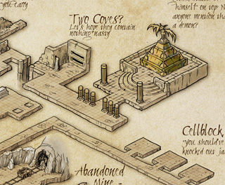
We have another gorgeous new mapping style lined up for the Annual – I’m really excited about the great artists that draw the art for us this year. Take a look at this beautiful isometric dungeon by Herwin Wielink. How would you like being able to build something like this in CC3 from pre-drawn tiles and connecting room and corridor pieces? Well, you’ll be able to come June.
This post discusses business information which will probably not be of interest to most readers. Another article will cover our product development plans for 2012.
The Economy
 It was a tough time for the world economy, including the Eurozone, the UK and the USA, our primary market. My view is that while the economy has a negative effect on sales for many businesses, the effect of the economy on individual businesses is less pronounced than other factors, some of which are under the control of the business owners. Other businesses (Domino’s Pizza for example) positively benefit from downturns. Psychology suggests that we are much more likely to attribute positive results with our own endeavours, and negative results with external factors. So, anything I say here is pretty much speculation. Take the salt provided.
Our Sales
So this year, our UK sales in pounds were within a gnat’s whisker of 2010 and 2009, when adjusted for inflation. This is pretty good. I’d like to say it’s all down to our business choices, despite the downturn, but I think there is an element of the Domino’s Pizza about the roleplaying hobby – it’s one of the best-value pastimes there is. People get hours and hours of use of our of software and their games, and it’s a lot cheaper than going out. I’ve said facetiously that the RPG industry slogan should be “There’s never been a better time to enter a world of fantasy.”
Only a neglible fraction of our sales are through distribution, and this hasn’t changed. However, retail sales are disproportionately CC3, so it’s still worthwhile continuing this. Another interesting phenomenon is that while annual sales of CC3 (our entry product) increased by 6%, the average sale declined slightly as if to compensate.
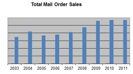
We did release a new product – FT3 – but the upgrade was modestly priced, reducing our potential revenue, and because it’s such a widely accepted product among CC3 users, it was mainly upgrades. 2012 will be different – we’ve got three products in the pipeline.
Ralf says that convention sales are down a bit, but that overall the quality of maps has increased. Ralf and I think that the size of the table top roleplaying game market is stable, or even shrinking, but that the existing participants are older, wealthier and more committed than before. I am hoping that market leader Wizards of the Coasts new version of Dungeons and Dragons will expand the market, as that helps everyone.
The Website
Site visits increased about 30% since 2009, as has the average time on the site, the number of pages per visit. We achieved more than 450,000 unique visitors in 2011. We did a lot of work earlier in the year using Google Analytics to increase our conversion rate; it definitely increased as result, but nonetheless the conversion rate was lower than in 2010. I suspect that has more to do with the nature of the visitors, though I speculate that people are taking longer to decide and are spending their money more carefully. We updated our copy rather carefully, too, and have plans to revamp the website based on our recent poll.

Other RPG Cartography Companies
It remains true that we are the only company producing cartography software for the RPG industry full time.
In our tiny industry, we think of other rpg map-makers as colleagues rather than rivals, so we were sad to see that, according to forum posts, Dundjinni has not been on sale for while. There has been no update since March last year. We’ve tried to reach the owner, Mindy, to no avail. It’s sad particularly because of the excellent community which built up around the software, creating new art which the CC3 community could also use. (This situation may change – I hope it does – so check their website to make sure.)
NBOS continues to produce Fractal Mapper, and Ed Diana released a new version of Astrosynthesis which he made compatible with the latest Fractal Terrains 3.
Miscellany
- There is a definite seasonal sales trend over the years. The spikes for product releases just about even out, though the Annual subscription helps our December sales disproportionately. I’d be very interested to hear if this pattern is repeated in other related companies.

- The relative sales between the UK, USA and the rest of the world have remained unchanged now for at least three years.
- The proportion of download sales has increased from about 25% to 30% from 2010 to 2011
- We’ve sold to 92 countries in the past two years including Cameroon, Albania, and Reunion.
This is a follow-up to Creating a Fractal Terrains world with Terraformer Part 1.
You can download the whole tutorial as a PDF – Steps to doing a barren world in Fractal Terrains.
Moving the drawing to Campaign Cartographer 3 / Cosmographer 3
Step 10 – From here on out, I will be using CC3. This is a great program that I have come to rely on to create all of my maps. I should note that the steps outlined here are taken directly from the “Terraformer for Fractal Terrains Pro Users Manual” created by Bill Roach. It’s an excellent guide, and I would recommend that anyone using Fractal Terrains pick this up as a reference source. The guide is available from the Registered User’s Area.
Mark has been putting a lot of work into improving our users’ experience on the website. We wanted to make things easier to register, to find things, and let you download all your software there, not just upgrades and patches. We also added rewards and offers, and made tech support easier and quicker. Log in here to see more. If you have any problems, let us know.
Here is what’s on offer.
- The new tabbed layout makes it easy to find what you need
- You can register for the first time from any order page, or add an new order to your registration at the click of a button
- You can see exclusive offers for registered users only
- You can download all your registered products, even if they are 10 years old
- You can earn vouchers or cold, hard cash (paypal, actually) through our rewards scheme, with instant totals
- Support is streamlined, with the most common issues covered, a knowledge base and easy access to personal email support if you need it
 First a warning – The .FCW file format is BINARY! If you do not feel comfortable playing with bits and bytes, this may not be for you. But if you do enjoy this type of challenge, the .FCW file format is one of the best ways to output to CC3.
Imagine you have a random maze generator and you want to output it to CC3. You could export a script. It would redraw your maze one line at a time.
But there are also some problems with scripts:
- You have to run them. This may sound obvious but consider that you have to either know the text command to open and run a script file, or you need to know where in the menu system it is.
- Scripts are slow. CC3 will have to take your script and run it line-by-line. Its as if you had set down and typed in the commands directly into CC3.
- Scripts are not exactly fragile, but they are not very robust either. And, if your script fails, your users are the ones that are going to get frustrated.
Where as if you exported a .FCW file, simply the action of opening the file is all that is needed.
So … if you are still with me, here we go!
One last twist – the .FCW file could be compressed.
The .FCW file format is made up of many different “Blocks” of data. The first 4 bytes of each block (except for the first block) contains the number of bytes that the following block contains. It starts with the FileID block. The FileID block is the only block that is guaranteed to be uncompressed. This 128 byte block contains quite a bit of general info on the file. It identifies what type of file it is to other programs, and the version and sub-version number of the file format is was built with. Last, but not least, it informs the reader that bytes after byte 128 are compressed or not. (To save an uncompressed file, after you have clicked “Save As …”, you will be presented with the save file dialog. If you click on the options button, you will be presented with a small dialog box. Uncheck the “File Compression” option)
For this first blog post on the .FCW file format, I will show you how to read a binary file into a byte array and how to display it, byte-by-byte in a textbox similar to all the binary editors display it. Being able to look inside a binary file will come in very handy in the future. Last but not least I will show you FILEID object.
- public byte[] ConvertFileToByteArray(string fileName)
- {
- byte[] buffer;
- using (var fileStream = new FileStream(fileName, FileMode.Open, FileAccess.Read))
- {
- using (var binaryReader = new BinaryReader(fileStream))
- {
- buffer = binaryReader.ReadBytes((int)new FileInfo(fileName).Length);
- binaryReader.Close();
- }
- fileStream.Close();
- }
- return buffer;
- }
Once the file is read into a byte array, I pull the first 128 bytes out of the file byte array, using an extension method to Arrays to create sub-arrays.
- public static class Extensions
- {
- public static T[] SubArray<T>(this T[] data, int index, int length)
- {
- var result = new T[length];
- Array.Copy(data, index, result, 0, length);
- return result;
- }
- }
Then I feed the sub-array to my FILEID object. This object converts the bytes into the fields of the FILEID object. We can then check the Compressed property. If the file is compressed, the rest of the data is meaningless, so if the file is compressed, I set the background color of the textbox to a Rose color.
- using System;
- using System.Text;
- namespace DisplayBinaryFile
- {
- public class FILEID
- {
- #region Fields
- public char[] ProgId = new char[26];
- public char[] VerText = new char[4];
- public char[] VerTextS = new char[14];
- public byte[] DosChars = new byte[3];
- public byte DBVer;
- public bool Compressed;
- public byte[] Filler = new byte[78];
- public byte EndFileID;
- #endregion
- public int Length { get; set; }
- public FILEID(byte[] buffer)
- {
- ProgId = Encoding.ASCII.GetChars(buffer.SubArray(0, 26));
- VerText = Encoding.ASCII.GetChars(buffer.SubArray(26, 4));
- VerTextS = Encoding.ASCII.GetChars(buffer.SubArray(30, 14));
- DosChars = buffer.SubArray(44, 3);
- DBVer = buffer.SubArray(47, 1)[0];
- Compressed = BitConverter.ToBoolean(buffer.SubArray(48, 1), 0);
- Filler = buffer.SubArray(49, 78);
- EndFileID = buffer.SubArray(127, 1)[0];
- Length = 128;
- }
- public byte[] GetBytes()
- {
- var returnValue = new byte[Length];
- Array.Copy(Encoding.ASCII.GetBytes(ProgId), 0, returnValue, 0, 26);
- Array.Copy(Encoding.ASCII.GetBytes(VerText), 0, returnValue, 26, 4);
- Array.Copy(Encoding.ASCII.GetBytes(VerTextS), 0, returnValue, 30, 14);
- Array.Copy(DosChars, 0, returnValue, 44, 3);
- Array.Copy(BitConverter.GetBytes(DBVer), 0, returnValue, 47, 1);
- Array.Copy(BitConverter.GetBytes(Compressed), 0, returnValue, 48, 1);
- Array.Copy(Filler, 0, returnValue, 49, 78);
- Array.Copy(BitConverter.GetBytes(EndFileID), 0, returnValue, 127, 1);
- return returnValue;
- }
- }
- }
This month’s Annual issue on paper modeling is not the first time I’ve messed with Dioramas Pro, paper, glue and a trusty hobby knife.
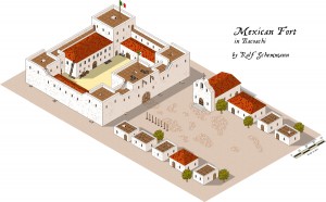
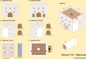
t all started with our Deadlands: Reloaded campaign. Savage Worlds was our first game system that put a really heavy emphasis on miniatures, and I started painting a few Western miniatures for our characters, as well as investing in some fitting paper minis. Then Eric Hotz’s beautiful series of Wild West buildings (Whitewash City) caught my eye and soon enough I was busy building paper models for our game. This was all well and good until our posse ventured south and into Mexico, and the American-style buildings suddenly didn’t fit the mood anymore. When it became clear that our characters would have to free a rebel leader from a fort, I started out by drawing a Mexican fort in Perspectives Pro. This came out very nicely, but it wouldn’t really help out on our gaming table.Dioramas Pro then came to my mind and I asked myself, why I shouldn’t be able to design and build a few mexican-style buildings myself. They’d not come out as marvelous as the Whitewash City models, but probably good enough for ourselves. So I fired up CC3, loaded a Dioramas Pro template for the first time in quite some time and set about designing my own models.
There was a lot of trial and error at first, the project grew and grew, the paper bin overflowed, but I finally managed to create the complete set of buildings as shown in the Perspectives Pro map. I even added some extra goodies like cannons, the village fountain and a graveyard.We had a blast in the two game sessions our posse stormed that fort and successfully freed the captive. The time I spent on building the model is of course way beyond what you’d normally spend on preparing one or two game sessions, but I had a blast and learned lots about paper-modeling (and Dioramas Pro) in the process. The fort even served as a display piece at Spiel’10 in Essen. And here it is on all its glory:
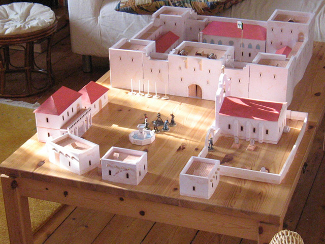
More images of the fort and other props of our Deadlands campaign can be found in my online gallery.
 At least 65% of our CC2 Pro customers have upgraded to CC3. Of those who tell us why they haven’t upgraded, the most common explanation is “CC2 Pro does everything I need. Why do I want this fancy new artwork?”
This unsolicited email from William Toporek, posted with permission, explains better than I ever could the reasons for an upgrade. It also offers Joe Sweeney a well deserved shout-out for his video tutorials.
I must say that I see some excellent improvements in the ease of use department. Many of the old CC1 and CC2 “way of doing things” have been streamlined and many of the “quirky” bits that CC2 had when drawing have been fixed. The cutting symbols work better than ever! I really like the Sheets and Effects and especially want to say thanks to Joseph Sweeney for putting together those superb tutorials. I never would have been able to figure out, let alone use the POWER of the Sheets and Effects. Adding shadows and using all those effects to take one map and turn it into many without having to redraw everything is worth the price of the upgrades. CC3 is such a powerful program with soooo many functions I’m glad your company is using those videos to help show off all that it can do. MORE PLEASE!!! I’m still a firm supporter of all your products. I know this was a bit of a speed bump with all these upgrade problems* but I’m happy I did it. I’ve been a customer for well over a decade and was there with you guys from CC1 and the 3.5″ disks. I have to admit that I was a bit hesitant to upgrade to CC3 with the extra cost and I just figured that I didn’t need any more power than CC2 or that I was just satisfied with the style of CC2 but after using it it was well worth it. So much easier to use than before and my maps are just spectacular!
Thanks for all the help getting me back up and running your customer service has been superfast, especially from across the pond. Tell Nigel thanks again for an excellent product. I’m sure he doesn’t remember me from the Gen Cons, GAMAs, and Origins of the late 90’s and early 2000’s when I used to work for Steve Jackson Games but I want to share my appreciation anyways. Just to show some more “love” I’m off to download the Cosmographer 3 and City Designer 3 upgrades right now from your online store! Thanks so much!
*William had some installation issues which we resolved
In the last post, I introduced Intercom with an old example I wrote using VB6. This post will be a much more modern example using C#.
I’ve also included a “Round Trip” example where the command is initiated via CC3. By adding this small macro, you now have a command that draws a diamond on the screen.
- MACRO DIAMOND
- GP TEMP ^DCenter:
- SENDM 2 TEMP
- ENDM
What this does is as the user to get a point (GP) and then send it via Intercom to the c# application.
Once it gets to the c# code, it takes the string from CC3 (all data sent from CC3 via Intercom is in strings), splits it on the comma and converts the two substrings into doubles. Then it creates a command string and passes it back to CC3.
- var strNumbers = System.Text.Encoding.ASCII.GetString(bytMsg).Split(‘,’);
- var x = double.Parse(strNumbers[0]);
- var y = double.Parse(strNumbers[1]);
- var strDiamond = “LINE \n” +
- (x – 100) + “,” + y + ” \n” +
- x + “,” + (y – 100) + ” \n” +
- (x + 100) + “,” + y + ” \n” +
- x + “,” + (y + 100) + ” \n” +
- (x – 100) + “,” + y + ” \n\n” +
- “ENDM”;
- icSendMsg(20, strDiamond);
Here is a link to the C# portion
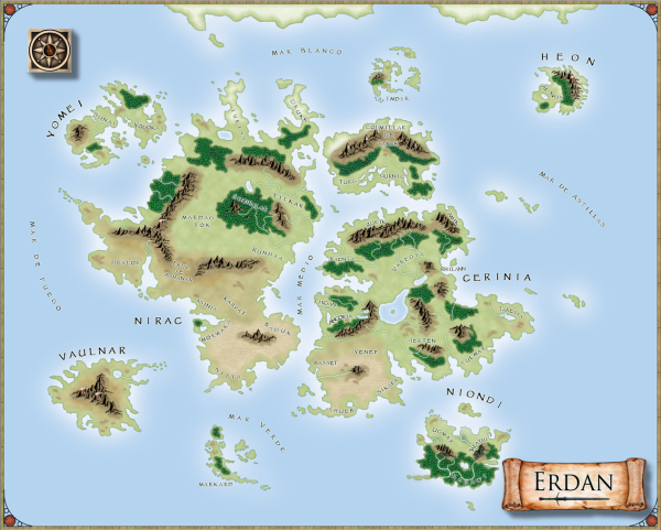
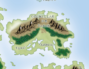
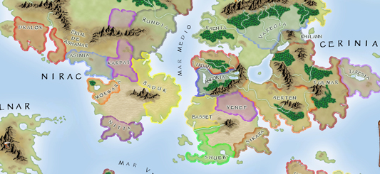
This beautiful map was made using the Cartographer’s Annual Fantasy Map style found here by forum user Medio. You can follow its development on the forum.
Close up:
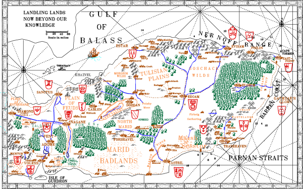
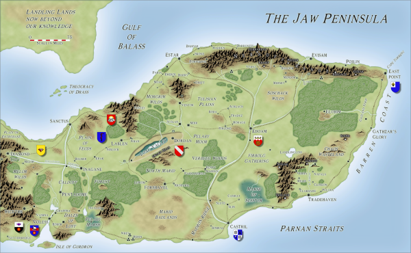
Back in the early 80s, I began my long-running AD&D campaign set in the Jaw Peninsula. I drew a map which slowly disintegrated, and which Mark Fulford (my now business partner) copied it out by hand, adding new details. When we started ProFantasy, this was our target map for the original Campaign Cartographer for DOS. The difficult thing initially was to get trees and mountains looking decent, and the discpline of printing only to a monochrome dot matrix helped here. This was created with line art, using the 16 colours then available:
With CC Pro for DOS we added raster fill styles which enabled us to stretch the 16 colours available into a range of shades:
Then we moved onto the Windows 95 version, which gave us the chance to redo the symbol set with a wider range of solid colours.
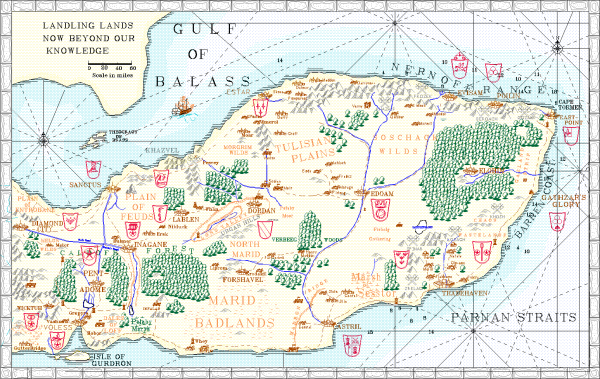
Up to this point, it was me, a non-artist who was doing the cartography. I asked Ralf to redo the map using the Fantasy Worlds style from the Annual 2009.
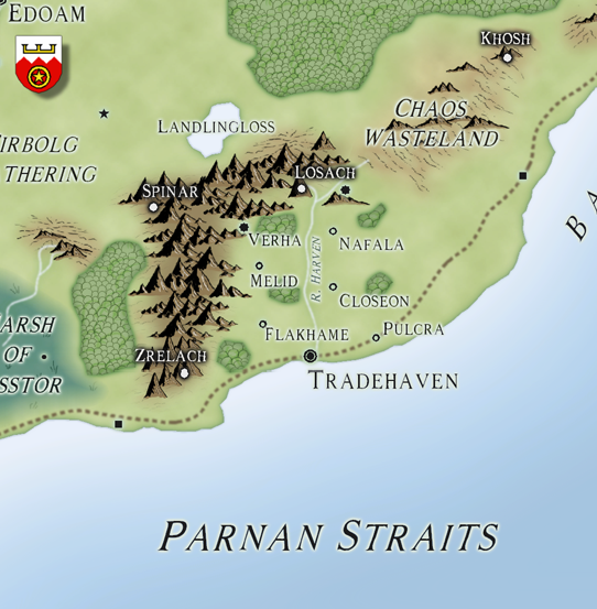
Here is a close up. This map saw service recently in a mammoth weekend session of AD&D, and I have a feeling that CC3 may need some more example maps…
