Community member soldyne created this map of the “World River” as his very first map in CC3.
Henrie61 drew this “quick and dirty” town map to try our the Jon Roberts Cities style and was impressed how quickly you can create a beautiful map this way.
The Jon Roberts Cities style seems very popular as shown by the “Yellowmire” map created by Dargurd. The unusual, swampy location of the city comes acress very well.
In a change of pace Modric created this black and white map of “Avern” and added a great parchment style filter for a great player handout. The style used is from the Cartographer’s Annual Vol 2.
And last but not least, forum member anomiecoalition drew this neat little Al Quadim-flavoured dungeon, using resources from DD3, the CSUAC art collection and Dundjinni forums.
Kudos to all the great maps our users have been creating!
The September issue of the Cartographer’s Annual 2012 was released last Saturday. It lets you create maps in the beautiful style of the 13th Age world map by Lee Moyer. 13th Age is the upcoming new role-playing game by Pelgrane Press.
The August issue of the Cartographer’s Annual 2012 has been released. It contains a 10-page introduction and tutorial to the Cut menu and its commands, a way to cut out and export a section of a larger map in CC3.
We’ve also added previews to the September and October issues to the Annual website. Check out the September issue and the Gallery page for some previews of the beautiful map included in Pelgrane Press’ upcoming rpg 13th Age (by Rob Heinsoo and Jonathan Tweet).
If you are a subscriber, you will notice that we’ve changed the way the download for the Annual works. For details, please check here for details.
Comments Off on Cartographer’s Annual – August issue and previews
The upcoming July Annual contains a host of new bitmap artwork, hundreds of new textures and symbols for your starship floorplans. They will be released on Sunday for the Annual subscribers.
But perhaps best of all, they are accompanied by a series of new video tutorials by the master of CC3 videos, Joseph Sweeney. These videos are freely available to anyone, and you can already view them on Joe’s YouTube channel or download them from the July Annual page.
Comments Off on July Annual comes with free video tutorials by Joseph Sweeney
We are happy that we’ve been able to put out two new products last month. Together with the monthly Annual, I’ve got a triplet to announce.
Symbol Set 3
The long-awaited and much delayed new version of Symbol Set 3 – Modern is now available. It comes with two completely new bitmap drawing styles for floorplans, with about 500 symbols each. One was created by Jon Roberts, the other by Michael Tumey. There is also a snazzy new blueprint-style for realistic looking player handouts, a Modern political overland style, and the old vector style has been updated to work with CC3’s sheet effects and drawing tools.
Tome of Ultimate Mapping
The second product is the Tome of Ultimate Mapping which has been updated by Remy Monsen (the author of the CC3 Full Manual) to cover Campaign Cartographer 3 and all version 3 products up to Fractal Terrains 3 (Dungeon Designer 3, City Designer 3, Symbols Sets 1 and 2, Cosmographer 3 and Fractal Terrains 3). The chapters on the other add-ons will be updated after their new versions are released. Symbol Set 3 is obviously the next on the list. You can see half a dozen example pages of the Tome here.
June Annual Isometric Dungeon Style
Last but not least is this month Annual Issue, an isometric dungeon style created by Herwin Wielink. I’m especially delighted with the lovely artwork in this issue and spent a whole evening just tinkering with the symbols, putting together a large example example map.
Recently a particularly large number of very nice overland maps has appeared on the Profantasy forum – and they were all done in the April’s Annual style by Herwin Wielink. Apparently the style is especially well-suited for creating quick and beautiful maps. Here is a little gallery:
Local Region Map by community member Modric
The tidally-locked world Thraalion by community member Clercon
Map of the Whalebones Islands (Forgotten Realms) by community member Eranthius
Map of the Neverwinter Region (Forgotten Realms) by community member Dargurd
Batazan Map by community member FarsightX3
Sagorike map my community member Clercon
If you – like some members of the Profantasy crew – prefer your seas more blue and balmy, here is a neat little trick to adjust your ocean color: Add an RGB Matrix effect to the BACKGROUND sheet, using the values shown below.
[Editor’s note: Forum member Mateus Buffone posts about his excellent Panorica map]
Some days ago Simon Rogers asked me if he could use my map as “The Map of The Month”. When I read it, I could not believe it. I started the hobby last year and I am still learning the tricks of the trade, so it’s an honor to have a map that I made posted.
This map is named Continent of Panorica and I did the first version of it in less than an hour for a RPG game that I would begin on the next day. The first thing that I neded was a style that would fit well in a continet map and that have a “fantasy” feel, as what I wanted was a fast and “cliché” map for a fast and “cliché” world. So I choosed the CA51 Jon Roberts Overland Style that is part of the 2011 Annual.
I generated landmasses in Fractal Terrians 3 until I saw one that would fit my needs. Than I exported it to CC3 and fractalized a little more. After that I used the Land Default tool from the style and drew the islands, then used Fractalize on them to achieve a nmore natural feel. The next step was to place the mountains ranges. I was not concerned very much with realistic geology but I did not want to explain all my world with “magic!”, so I placed them first near the coast where I thought others continents would exist if I some day did the whole world. Then I placed the central chains as I needed a desert for my game. For the first version I only needed the central region so I placed some of the major rivers of the continent and dotted some settlements near the desert to form a pseudo-Arabian/tuareg region and called it a day.
But at that point I was in love with the project and wanted to transform it in my fixed fantasy map for the kind of game that I was running (a GURPS Dungeon Fantasy campaign). So I needed other regions and more details. So I begin to really think about the whole image: what cultures lived there, their society and political organizations. I decided to made the banners of the diferent kingdoms and others political organizations. For it I used the CA15 “Heraldry” from Annual 2008 and exported then as FCW entities to my continent map. I used some symbols found on the Map & Catalog Library in the ProFantasy home page. First I had a lot of dificults to implement the shields because messing with sheets is not very easy, but when you learned what to put where they are a big time saver! For the desert, florest, farmland and scrubland terrain to work on this map I had to rescale then for just 50% of their original size (this tip was gave to me by Simon himself).
[To rescale a bitmap fill style:
1. Click on the Fill Styles Indicator, the Bitmap Fills tab, and find the texture on the Fill Style Name pulldown.
2. Reduce the Scale Width and Height (maybe to 50%) and OK.
3. Try again until it looks right.]
Another point of interest was the underwater setlements (Forte do Sino inside Terras Alagadas and the whole southeast region). I spend a big time with then and in the final I only neded of an Transparency effect. And I think that this is one of the most import aspects of CC3. When you find good effects and know how to create and manage sheets for each of your maps you can achieve very good results.
I hope that you like my map and if have any suggestion talk with me on the community.
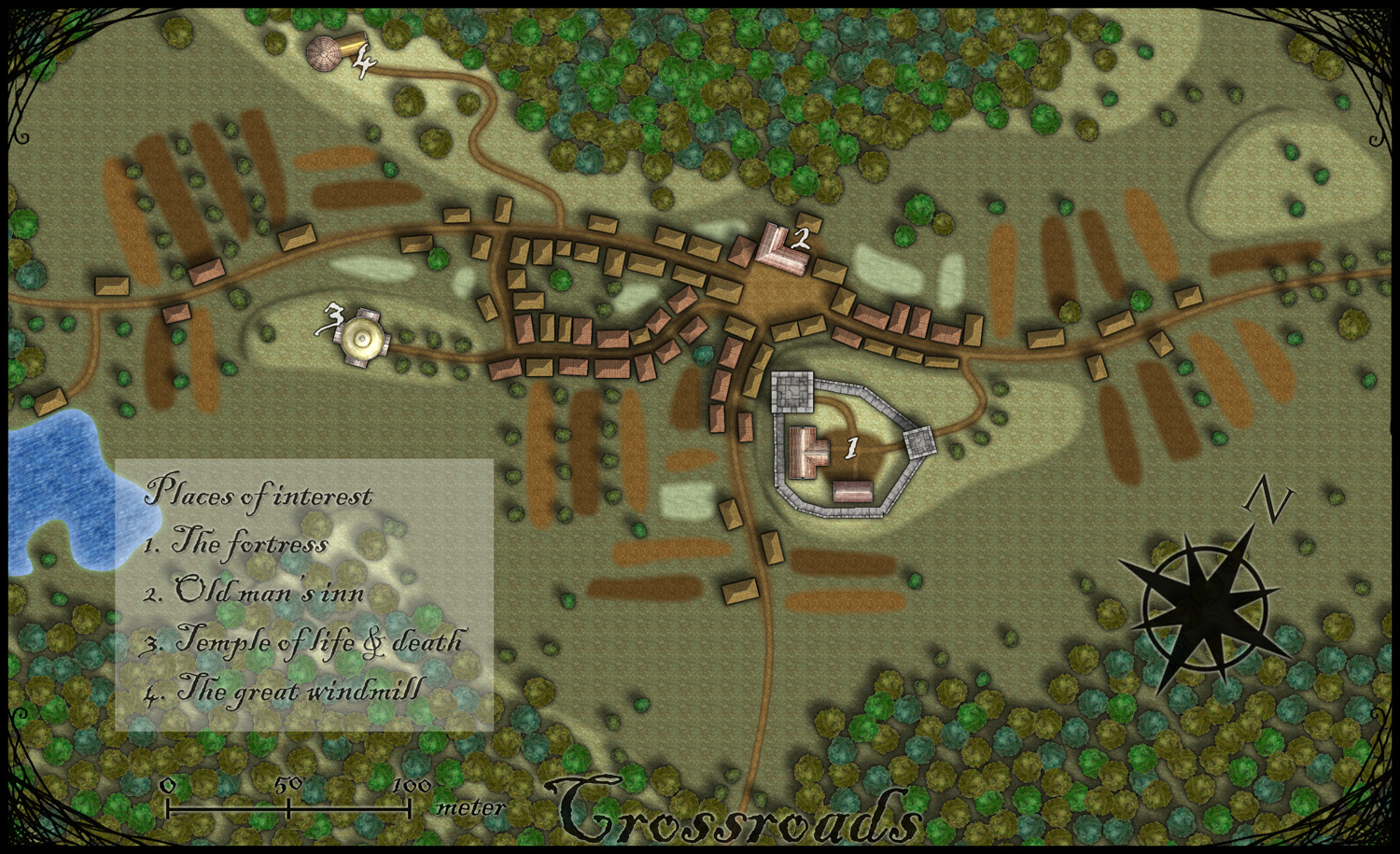
This month’s annual from Profantasy is a new city style designed by the fantasy cartographer Jon Roberts. This is the third time that one of Jon Roberts’ themes are presented as an annual. The two earlier versions have been an overland style and a dungeon style.
I must admit that I’ve really looked forward to the release of this annual. First of all I love city maps and CD3, secondly Jon Roberts is a very skilled cartographer and illustrator so I expected some really nice graphics in this one.
As expected, all the graphics are top notch and I especially like the walls and towers. To test the style I decided to make a rather quick village, called Crossroads, situated in the middle of a forest. The style was easy to work with and if you have done maps in CD3 before there isn’t really any new things to learn here. One little feature I liked however was the ability to make nice shadows on the hills. You can clearly see this on the hill where the temple of life & death (3) is.
After finishing the map there are some things I felt I need to work a bit more on next time I’m using the style. First of all the fields didn’t turn out great in the map; probably I have to try to put some more time on them in the future. When I started doing maps in the included styles in CD3 it took me a lot of trial and error before I got the fields right. So I have some more testing and practice to do here.
Another thing to think of is that in this map I had quite some open space between the forests and in the background texture you can see a pattern. I think the solution here is to add in some more different textures to hide the pattern. If you look at the included map in the annual you don’t see this pattern there.
At last if you look at the trees in the forest you can see that the northern forest has the trees more closely to each other. I actually think they got too close so in the southern forest I put some space between the trees. This made the forest look much better, in my opinion.
Overall I think the style is really strong. I like the darker colours of this one compared to the included styles in CD3 (which means less editing in Photoshop for me) . Still it takes some time to get to know the feeling of a new style, to get all the things in place in a good way. This one surely needs som more practicing for me before I’m there.
As usua,l I added the labeling in Photoshop, and I also selected another font. If you want to use the font I used it’s called Blackadder regular and can be downloaded from dafont.com for free.


")