Campaign Cartographer is not designed to be a tile-based mapper, rather it is designed to be fully free-form where you can shape things as you want. But sometimes, having a set of pre-made tiles available can allow us to throw together a map quickly, or to serve as inspiration.
Last month, we looked at planning the basic structure for our tiles. Planning is always important, especially with something like making tiles, because we need a structured approach if we want them to actually fit nicely together.
In this installment, we’ll get into drawing a few example tiles using the template we created in part 1. Continue reading »
Comments Off on Mapping Tiles with CC3+ – Part 2 – Drawing Tiles
In yesterday’s Live Mapping session I combined tools from Dioramas 3 with assets from Cosmographer 3 to design the paper model of a simple communications tower. You can watch the video here:
As I was quite happy with the results and am currently building some science fiction terrain anyway, I sat down to actually build the model, straight from the print out of the session’s work. Here you see me messing around with paper cutter and glue to build the model:
And finally, here is a picture of the finished model, next to some of my other terrain. Click the image to download the FCW file.
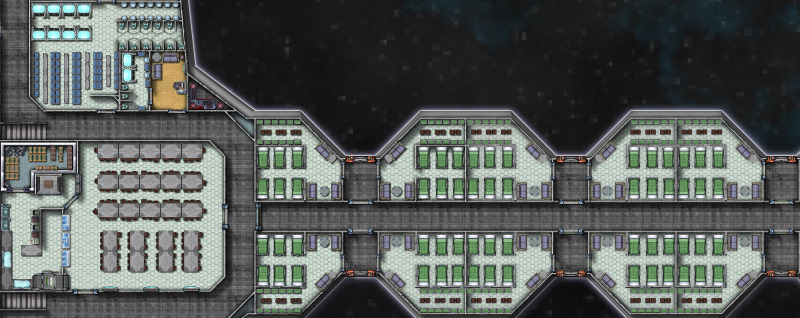
For the second part of starship design, we’ll be focusing on filling out the living, eating and washing facilities on deck 2. This is the largest deck of the ship and once it’s finished, the rest of it should fall into place with relative ease. The “Big Three” locations all ships need for their crew and passengers are: a place to sleep, a place to eat, and a place to,… clean up, after oneself. To begin, we’ll start with the overall look of deck 2, then move into sleeping, eating and restroom areas.
All Aboard
The one thing I noticed right away about my rough sketch from part 1, was its similarity to a boned fish; while this was unintentional, it illustrates how fluid designing a starship can be, and because of that, I decided to change the shape a little.
Deck 2 is the largest and most physically active section of the ship; the focal points on this deck being, the primary ship’s access area and troop living spaces.
I began by selecting the Hull, Sleek Silver mirrored polygon after right clicking on the Draw Hull button, a custom Snap setting of 5 foot, 1 snap square grid was created. Instead of the original, half moon shape, I decided to create a hull that was somewhat triangular in shape, suggesting forward movement. The deck was drawn next, by selecting the Deck, Lattice mirrored polygon. The Snap for it was changed to a custom 5 foot, 5 snap square grid so there would be a one foot gap between the edge of the hull and the deck. The Bulkhead, Default 0.5′ was selected for the exterior and interior bulkheads and it followed the same Snap setting as the deck. In the picture to the right, the Deck Sheet has been hidden, as I found it visually easier to place bulkheads and symbols at this scale.
The custom snap settings were created by right- clicking the Grid button in the lower right part CC3s drawing window and selecting New…, then selecting 2d Rectangular and applying the settings needed.
The first render of the carrier was ridiculously over scaled (it was nearly 700 feet/210 meters long), and the drop ship place holders were the size of a small building (they should be closer to a city bus). Once the ship was rescaled to a more manageable size (pictured above, about 300 feet/91 meters long), it was time to decide on a starting point. Since all crew/troop entry happens at the “nose” on deck 2, I decided to start there, and branch off to the troop living spaces; the main corridor needs to accommodate 150+ people coming and going with the ship docked and the width was set to 10 feet/3 meters.
You want me to sleep where?
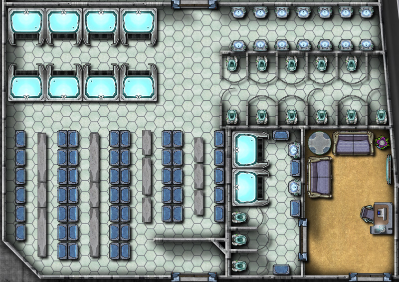
The main corridor and living areas on deck 2 on the working render (above) show a large, dormitory style, bay for troops to sleep in, and the design of the ship called for marginal crew comfort, since they’d be living on board for weeks or months. This meant a modification was needed. I decided to separate the room with a wall; from a narrative standpoint this also adds to passenger safety: If a portion of the hull is breached the loss of life will be lessened. With the basic room layout complete furniture placement was the next step.
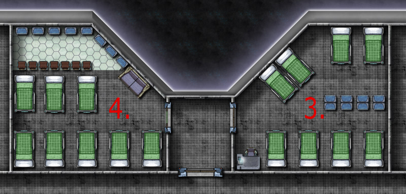
The rooms numbered 1-4 show the progression of furniture placement:
Room 1 (left). This room had 7 single bunks, each with a gear locker, and 2 small chairs along the wall with a large table for a common area. This was a messy, cramped effort with little efficiency and a poor design.
Room 2 (left). 8 single bunks were placed toe to toe and the large table and two chairs were removed, in their place, 2 desks (for writing home) were added and the lockers were set along one wall. Less cramped, but room to improve.
The first two rooms also had the door exiting to the main hall; during an emergency or troop deployments, the hall would fill quickly and confusion would run rampant. The doors for rooms 3 and 4 were moved to the side hall that accesses the drop ship dock area.
Room 3 (right). The single bunks were moved to the outer walls, the lockers split the room and one table and chair for writing home was removed. Getting closer, but still a lot of wasted space.
Room 4 (right). Moved the single bunks to one end of the room and the lockers to the other. A couch for lounging and 8 small chairs for dressing were added. Better yet, the chairs suggest a wall that separates the sleeping/dressing areas. I also placed Deck, Plastic Irreg for a little visual distinction.
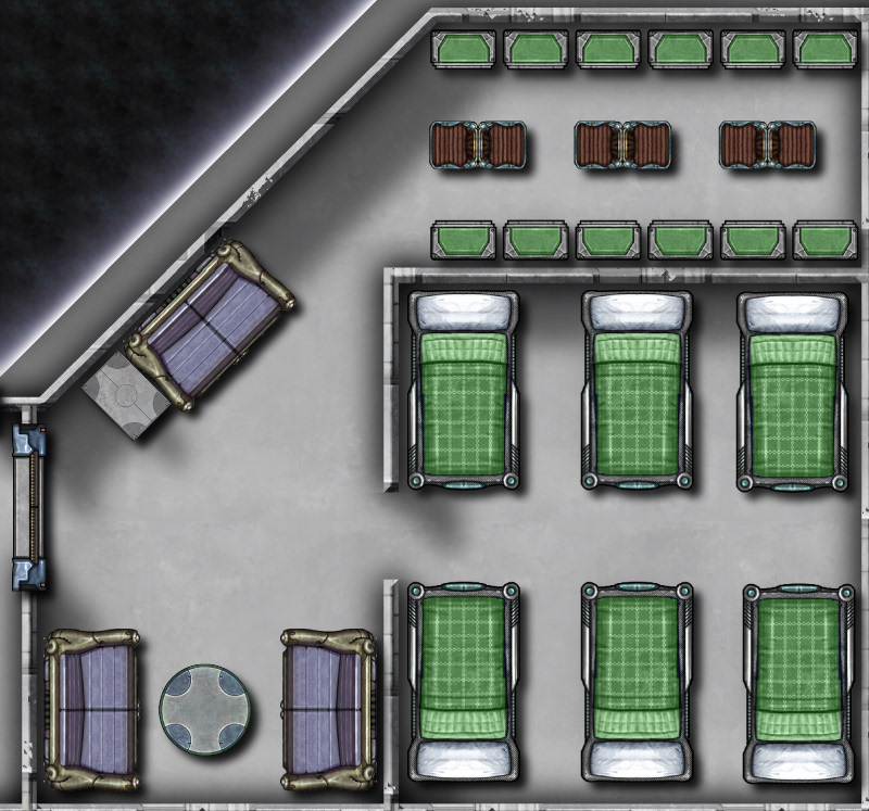
The final room design was broken up into three spaces (below). The sleeping area is separated from the common and dressing area by a wall (inspired by the chairs from room 4) . The single bunks were replaced with double bunks, increasing the occupant count from 8 to 12, and scaled down to 95% of their original size. While this room layout is cramped, it is a military ship after all, I feel that it is much improved from the poorly designed first layout. Once I was satisfied with the room layout I simply used the Mirrored Copies command (accessed by right clicking the Copy button) to quickly duplicate the rooms (Mirrored Copies is a great solution if you have symmetrical ships or buildings with rooms that need to be duplicated across a central point).
Using the method described above: creating a room, placing symbols and rearranging them for best use of space I then created:
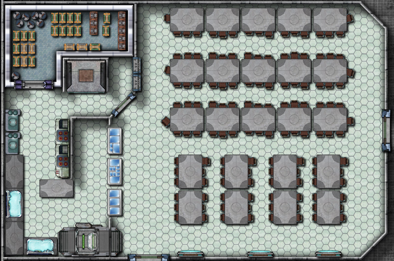
The dining hall, details include (clockwise from tables and chairs) seating for 129 people, steam tables for serving food, a dishwasher, sinks, stove tops and ovens, a walk-in refrigerator and an elevator to travel to the storage area on deck 4 and the crew mess on deck 1.
Shower and toilet facilities for officers and enlisted personnel. The enlisted shower facility details include (clockwise from upper left) 8 showers, sinks and toilets, lockers and benches (created by stretching the rectangular table) The smaller officer’s bathroom and lounge were combined to conserve space. Drawing bathrooms is about as much fun as cleaning them for me, there’s no way to make showers and toilets interesting!
With the “big three” completed for deck 2 (pictured below), Deck, Plastic Irreg was added for all sleeping/common areas, by right clicking the Deck Plan button, to create visual interest and to assist viewers with identifying different areas easily. Next time, we’ll be completing the remainder of deck 2’s amenities, including enlisted lounges, armory and firing range, officer quarters and ships operating systems, creating deck1, reviewing how to mirror copies, and the creative mixing of Cosmographer 3s symbols.
Comments Off on “Ship like this, be with you ‘til the day you die.” Part 2
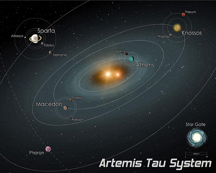
Ashen Stars is a wonderful space opera rpg by Pelgrane Press, based on the GUMSHOE system. I had the pleasure to create the game’s published setting map (a part of the Galaxy called “The Bleed”) based on a sketch by Robin D. Laws.
Lately I got to revisit the setting when, after play-testing the upcoming Terra Nova adventure, Simon asked me to create a simple black and white diagram of the adventure’s featured luxury liner. You can see the result below (the color background was added for web display). While the exact layout of the ship isn’t important for the story, the relative position of the important locations is, and the map shows those.
Joe Sweeney, the avid mapper behind the Battle Maps Tiles from the 2010 Annual, is working on a new sci-fi battle map tiles pack. We will be making this available through the Annual later in the year. The set he is building already contains well over 100 new textures and scores of signage overlays for floors: access zones, radiation danger, chemical areas, shuttle landing zones, overhead automated cranes, etc.
Before he completes all the graphics work and begins developing the battle map tiles, Joe would like to know what sort of signage you’d like to see. How about a “no aliens” floor zone sign? Or perhaps “white, red, green zone” signs for those Paranoia games? Get creative. Get practical. Think of all the signs (and textures) you would love to see in your next sci-fi mapping project and email your ideas to jsweeney@storyweaver.com or post them in the comments below.
The February issue of the Annual 2012 elaborates on a style introduced in Cosmographer 3: The satellite view overland map. This large-scale, straight overhead style evokes the view a satellite might have on the landscape below. Seamlessly-tiling textures are smoothed together through sheet effects to create the image of an unbroken, natural landscape.
The source for the textures is taken from public domain images made available by NASA through their Visible Earth website. The texture are carefully crafted from these originals and made into CC3 bitmap fill styles.
While it served as an inspiration, Cosmographer 3 is not required to make full use of this style. See the Annual 2012 site for more information on this style.
Here is the follow-up to our poll asking which additional Traveller starship deckplans we should do. I was a bit surprised that warships seemed to be the top choices (except for the far trader). I’d have thought that civilian ships would be more important to most Traveller players.
Nevertheless we created deckplans for the three most popular designs:
I’m pleased to say that Cosmographer 3, the science fiction add-on for CC3 is out now.
It’s suffered from feature creep – or to be more precise, we’ve suffered from it, and you’ve benefited! It’s a much bigger and better product that we originally planned, more symbols, more styles and a wide variety of new map-making capabilities.
Existing customers and registered users have been emailed about their upgrade.
We are looking to add some more Traveller Deckplans to the Cosmographer 3 Release and couldn’t decide which ones to do. Can you help us? Which would you like us to do?
The poll is closed. Click “View” to see the results. The three most popular deckplans are now available here.
 Campaign Cartographer is not designed to be a tile-based mapper, rather it is designed to be fully free-form where you can shape things as you want. But sometimes, having a set of pre-made tiles available can allow us to throw together a map quickly, or to serve as inspiration.


 Here is the follow-up to
  I’m pleased to say that Cosmographer 3, the science fiction add-on for CC3 is out now.
