Clercon | June 25, 2012 | Annual, dungeon, wielink

I’ve really looked forward to the release of this year’s June Annual that gives you a new drawing style by Herwin Wielink: Isometric Dungeons. The style itself includes some really fantastic graphics and possibilities and it lets you create a new good looking map in no time at all (compared to if you’d do all the graphics by hand).
The style itself was a bit tricky to work with for me. Or if you put it another way, the style really showed me how much I still have to learn to completely master Campaign Cartographer 3. Maybe I have to take a closer look at the Tome of Ultimate mapping to catch up on a thing or two.
Getting all the different objects in the correct order in the map really gave me a slight headache. When you create a map in this style you really have to plan in what order to do things, if you don’t want to move things back and forth on the actual sheet. It took me some restarts of the map to get a hang on it. But once you understand the logic everything runs a lot smoother. The secret of success is to work from one of the top corners to the opposite lower corner. In this way you will naturally get the graphics in the right order and you don’t need to rearrange the order of the rooms and corridors all the time.
When you reach that point everything also gets a lot more fun. I really enjoyed working with the style and the result gets so good that you just want to keep going, it’s just as addictive as playing a good computer game.
However there was one thing I felt was very frustrating with the style, and that was that I want more! The style feels like a small taste of something that could be amazingly fantastic. I want circular rooms, walls with windows, more furniture, different floors, traps, outdoor environments, sewers and I could continue that list for another two posts. This is what Perspectives 3 (if it comes out) should look like.
At the moment when the selection of different graphics isn’t too vast a lot of maps will turn out looking quite similar. So it is quite hard to do something unique with the style, but I’m hoping for a bright future and more isometric add-ons in future Annuals maybe.
Originally posted on mappingworlds.wordpress.com
2 Comments
Clercon | May 31, 2012 | Campaign Cartographer, overland, Par lindstrom, Tutorial, wielink

This time I thought it was time to make a tutorial on how you can make a convincing overland map. This will be more of an overview tutorial on how I think and plan when I make a map, so it won’t be very technical. This means that you can use this tutorial regardless what program you use when you map, even though I in the tutorial will use a map made in CC3 as a reference and example.
The first thing to take into account when you start an overland map is the landmass. How much of the map will be water and how much will be actual land? This is probably the most important step in your map because it will set the boundaries for what the end result will be. So already here I’m having a quite clear view of where I want to go with the map, shall the map be land based, island based or something in between.
Below you see my map “Sagorike”, that I’m using as an example in this tutorial, with only the landmass viewable. I’ve also written some things on the map that you can have in mind while drawing the coastline.
A good thing to do before starting on your landmass is to look at the real world (Google earth is great for this). If you want a lot of fjords, have a look at Norway, Island based, look at area outside Stockholm for example, and so on. It is always good to find inspiration in the real world. It will make your map look more believable, and believable maps tend to look good.
However when I make maps of worlds the most important thing for me is that they look good and in some part convincing. It doesn’t matter if the world doesn’t work geologically or physically, as long as it looks convincing. To make it look convincing you have to get the things right that the majority of people can spot, like rivers, they will NEVER split downwards, lakes, there is always only ONE outflow, or deserts, make sure that you place them in a way that it looks probable that no rain will get there, and so on. If those small details are correct it is more likely that the viewer will believe in the whole map, regardless if everything in it is possible according to our physical laws or not.
That is all for now, in the next post we will start by placing the mountains in the map.
(Originally posted on mappingworlds.wordpress.com)
3 Comments
ralf | March 30, 2012 | Annual, artists, overland, wielink
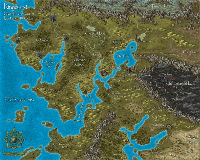
Here’s a preview for Sunday’s upcoming Annual issue. Herwin Wielink‘s beautiful overland style:

2 Comments


