SteveDavies | May 8, 2012 | CD3, city, city design, mapping cities, Tutorial
Up to now we’ve mostly been working inside the city walls, where space is short and buildings necessarily packed

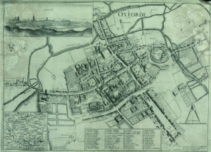
Historic map of Oxford in 1643
closely together. We’re now going to turn to the area outside the walls. In this installment, we’re going to turn back to some theory.
First we need to talk about why businesses decide to set up outside the walls of the city. After all, they are forgoing the protection that walls bring, so there must be some good reasons for it. It turns out the reasons are pretty simple:
- Avoiding authority: This is monetary, avoiding taxes, but also includes regulation, attention of the town watch, even to avoiding the prying eyes of neighbors. The city’s authority ends with the city walls, and some people find their business flourishes where there is less oversight.
- Accessing markets: Gates into the city are notorious choke points for people entering the city. The gates typically only open at certain times, guards ask questions, and just the physical size of the gate all conspire to leave large numbers of people waiting outside to get in. And where there are large numbers of people waiting or stranded, there is money to be made selling goods and services to them.
- Space: In many cities, space is at a premium. So businesses that require lots of space such as cattle markets, or that need space from neighbors, such as tanners, will often set up outside the city walls.
Continue reading »
1 Comment
Clercon | May 3, 2012 | CD3, city, city planning, Par lindstrom, Tutorial
Originally posted on mappingworlds.wordpress.com
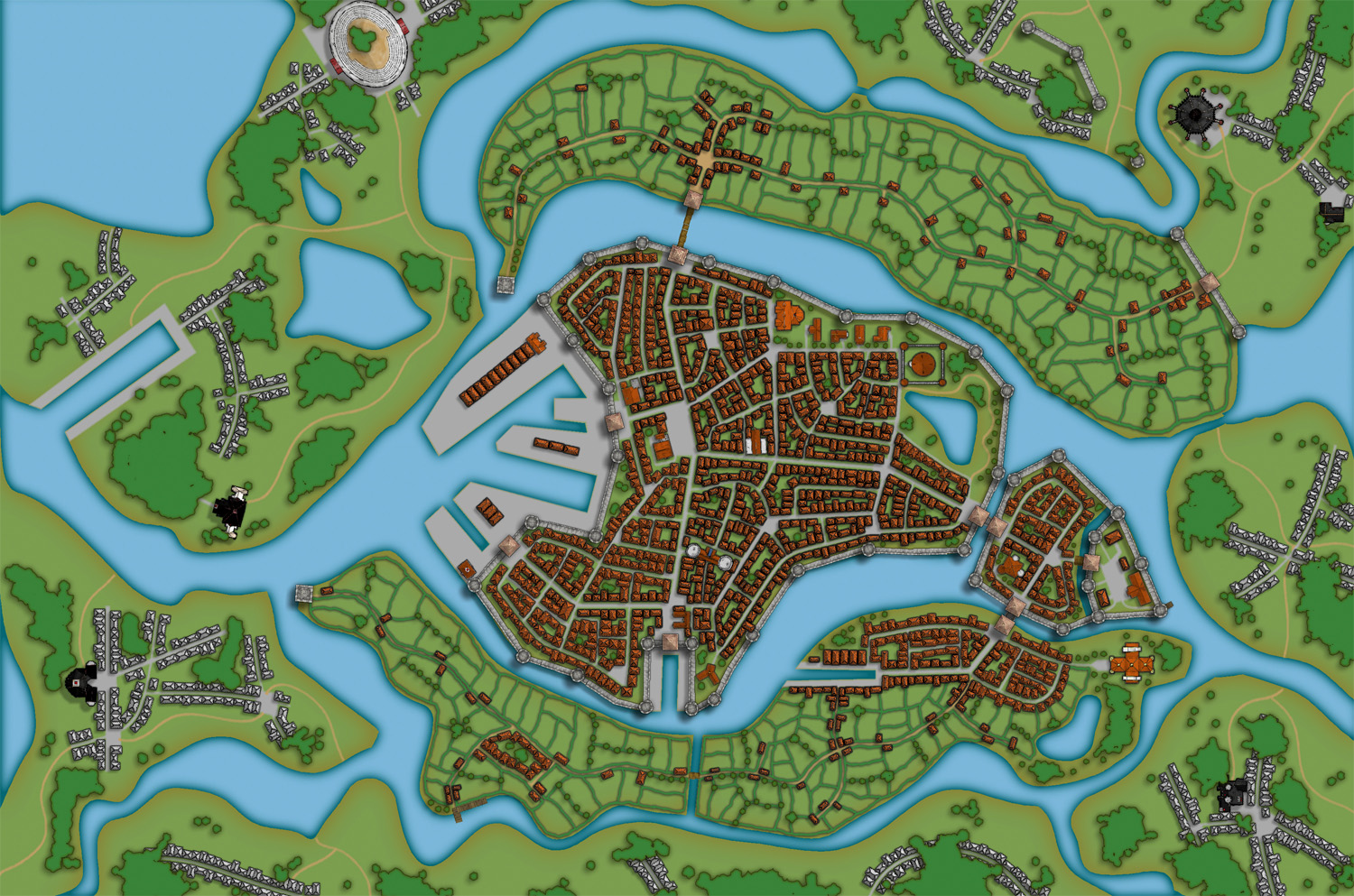
In this post we will create the outskirts of the city, farmlands and the ruins. First of all you have to decide what parts of the city that will be farmland and what part will be ruins. In this map I wanted to create the feeling that the city is situated in the middle of an old ruined city. The two closest islands to the east and west of the city will consist of farmland. Those areas are close to the city and will be easy to protect as well. On the north part of the western island you can also see that a part of the old city wall has been taken into use again, to protect the city from whatever hides outside.
When I create farmland I always start by putting in all the roads and houses. Usually you will have a cluster of houses just outside the city gates, the further away you get from the gates the more space you will have between houses. I then select the city hedge drawing tools and start to mark out the area where the fields will be. I’m actually using the same technique here as I do when I’m making smaller towns. For a more thorough explanation on how I draw the fields see my Mapping a small town part 4 post over at my mappingworlds blog.
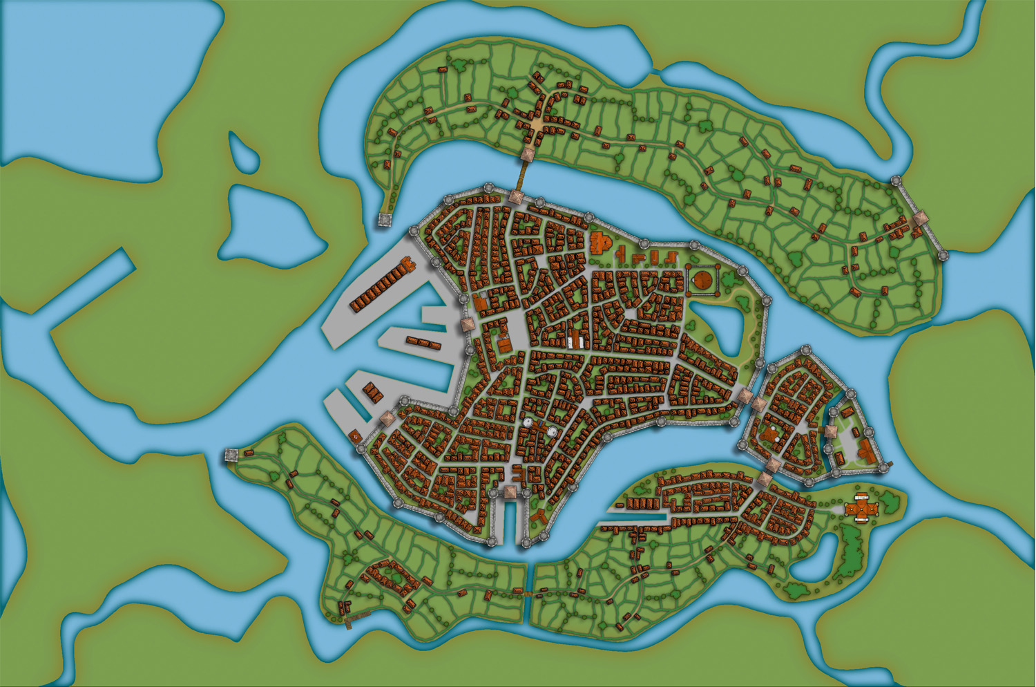
When I’m done with all the fields the map looks like the picture below, so still some ruins to place.

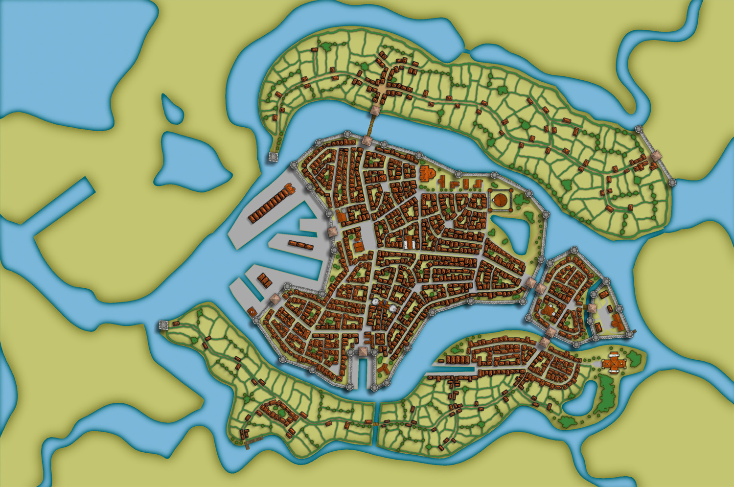
To complete the fields in the map I also export a map from CD3 where all the land is yellow. In this way I can combine them in Photoshop and paint in some yellow fields among the green ones. This will give you a more natural look than if the fields are just green. See my Mapping a small town part 6 post for more info on how to do this. The yellow version of the map looks like the picture below.

You can of course add in all the yellow fields in CD3, but I’ve found that to be a lot more time consuming then doing it by combining the two pictures above in a third party program. This program doesn’t need to be Photoshop, use the program that you feel comfortable with.
The next step would be to add in some ruins in the picture. Here I must say that CD3 didn’t really have any good styles to work with to get the look I wanted, so I had to make something up myself. Creating a completely new style wasn’t something I felt I had the time or knowledge to do, but I think a good ruined city style would be a great style add on in a future Annual. Sure you have some ruins in the program that you can use, but for me a ruined city mainly consists of the foundations of the houses and maybe some larger, more intact, buildings.
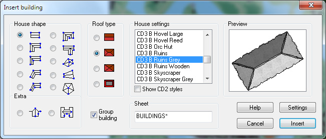
So I decided to draw in some random roads and houses using the CD3 B Ruins Grey buildings. They’re not perfect, but they are a good base symbol to continue working from.

When I’ve put in all the roads and larger buildings in the map I’d export it again from CD3. This means that I now have three different versions of the map, which I’m going to put together in Photoshop, the two different ones with yellow and green fields and this one with a green background and ruins in the outskirts of the city.

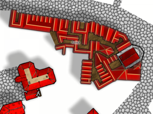
At this stage I had to work on the ruins a bit in Photoshop to make them look more like ruins. If you put the map with ruins in one layer and put it on top of a layer consisting of the map with green fields. You can start to erase bits and pieces from the top layer, when you do this the layer below will be visible instead of the top one. In this way I erased all the inner parts of the buildings, which left something that looked more like the foundation of a house. I also erased parts of the larger buildings to make them look more like ruins with broken roofs and missing walls.

In the picture above you can see a part of the map where you have the ruins as they look in CD3 on the left side, and how they turned out after some editing in Photoshop on the right side. In my opinion the right side looks more like ruins then the left side. Or at least more like the ruins I wanted in this particular map.
Making a City part 1
Making a City part 2
Making a City part 3
Making a City part 4
1 Comment
jonasgreenfeather | May 3, 2012 | Cosmographer, Deckplans, starships, Tutorial
For the second part of starship design, we’ll be focusing on filling out the living, eating and washing facilities on deck 2. This is the largest deck of the ship and once it’s finished, the rest of it should fall into place with relative ease. The “Big Three” locations all ships need for their crew and passengers are: a place to sleep, a place to eat, and a place to,… clean up, after oneself. To begin, we’ll start with the overall look of deck 2, then move into sleeping, eating and restroom areas.
All Aboard
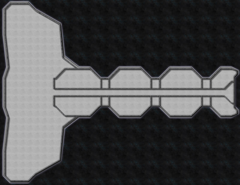
The one thing I noticed right away about my rough sketch from part 1, was its similarity to a boned fish; while this was unintentional, it illustrates how fluid designing a starship can be, and because of that, I decided to change the shape a little.
 Deck 2 is the largest and most physically active section of the ship; the focal points on this deck being, the primary ship’s access area and troop living spaces.
I began by selecting the Hull, Sleek Silver mirrored polygon after right clicking on the Draw Hull button, a custom Snap setting of 5 foot, 1 snap square grid was created. Instead of the original, half moon shape, I decided to create a hull that was somewhat triangular in shape, suggesting forward movement. The deck was drawn next, by selecting the Deck, Lattice mirrored polygon. The Snap for it was changed to a custom 5 foot, 5 snap square grid so there would be a one foot gap between the edge of the hull and the deck. The Bulkhead, Default 0.5′ was selected for the exterior and interior bulkheads and it followed the same Snap setting as the deck. In the picture to the right, the Deck Sheet has been hidden, as I found it visually easier to place bulkheads and symbols at this scale.
The custom snap settings were created by right- clicking the Grid button in the lower right part CC3s drawing window and selecting New…, then selecting 2d Rectangular and applying the settings needed.
The first render of the carrier was ridiculously over scaled (it was nearly 700 feet/210 meters long), and the drop ship place holders were the size of a small building (they should be closer to a city bus). Once the ship was rescaled to a more manageable size (pictured above, about 300 feet/91 meters long), it was time to decide on a starting point. Since all crew/troop entry happens at the “nose” on deck 2, I decided to start there, and branch off to the troop living spaces; the main corridor needs to accommodate 150+ people coming and going with the ship docked and the width was set to 10 feet/3 meters.
You want me to sleep where?
The main corridor and living areas on deck 2 on the working render (above) show a large, dormitory style, bay for troops to sleep in, and the design of the ship called for marginal crew comfort, since they’d be living on board for weeks or months. This meant a modification was needed. I decided to separate the room with a wall; from a narrative standpoint this also adds to passenger safety: If a portion of the hull is breached the loss of life will be lessened. With the basic room layout complete furniture placement was the next step.
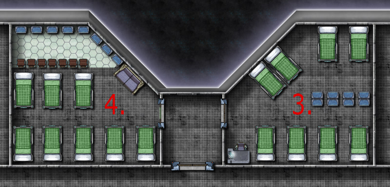
 The rooms numbered 1-4 show the progression of furniture placement:
Room 1 (left). This room had 7 single bunks, each with a gear locker, and 2 small chairs along the wall with a large table for a common area. This was a messy, cramped effort with little efficiency and a poor design.
Room 2 (left). 8 single bunks were placed toe to toe and the large table and two chairs were removed, in their place, 2 desks (for writing home) were added and the lockers were set along one wall. Less cramped, but room to improve.
The first two rooms also had the door exiting to the main hall; during an emergency or troop deployments, the hall would fill quickly and confusion would run rampant. The doors for rooms 3 and 4 were moved to the side hall that accesses the drop ship dock area.
 Room 3 (right). The single bunks were moved to the outer walls, the lockers split the room and one table and chair for writing home was removed. Getting closer, but still a lot of wasted space.
Room 4 (right). Moved the single bunks to one end of the room and the lockers to the other. A couch for lounging and 8 small chairs for dressing were added. Better yet, the chairs suggest a wall that separates the sleeping/dressing areas. I also placed Deck, Plastic Irreg for a little visual distinction.
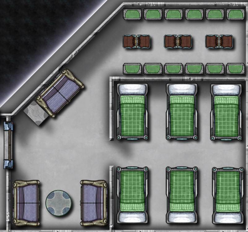
The final room design was broken up into three spaces (below). The sleeping area is separated from the common and dressing area by a wall (inspired by the chairs from room 4) . The single bunks were replaced with double bunks, increasing the occupant count from 8 to 12, and scaled down to 95% of their original size. While this room layout is cramped, it is a military ship after all, I feel that it is much improved from the poorly designed first layout. Once I was satisfied with the room layout I simply used the Mirrored Copies command (accessed by right clicking the Copy button) to quickly duplicate the rooms (Mirrored Copies is a great solution if you have symmetrical ships or buildings with rooms that need to be duplicated across a central point).
Using the method described above: creating a room, placing symbols and rearranging them for best use of space I then created:

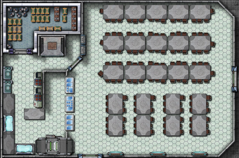
The dining hall, details include (clockwise from tables and chairs) seating for 129 people, steam tables for serving food, a dishwasher, sinks, stove tops and ovens, a walk-in refrigerator and an elevator to travel to the storage area on deck 4 and the crew mess on deck 1.

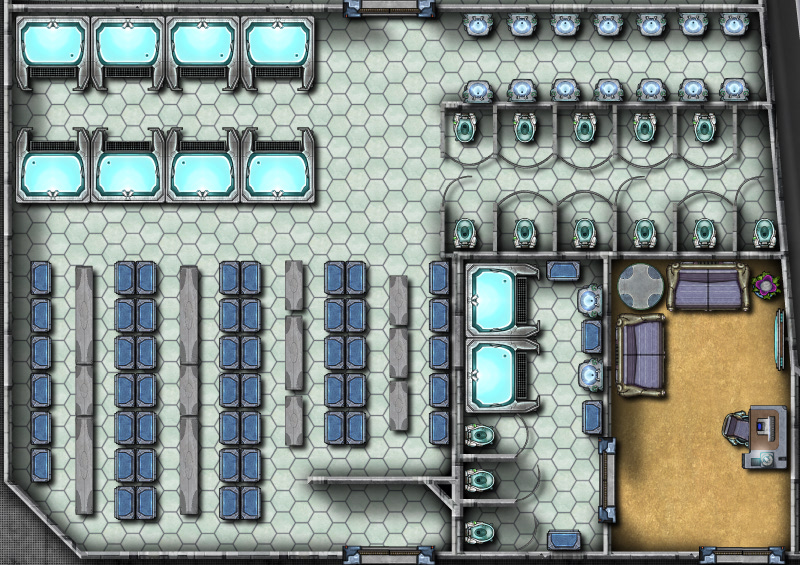
Shower and toilet facilities for officers and enlisted personnel. The enlisted shower facility details include (clockwise from upper left) 8 showers, sinks and toilets, lockers and benches (created by stretching the rectangular table) The smaller officer’s bathroom and lounge were combined to conserve space. Drawing bathrooms is about as much fun as cleaning them for me, there’s no way to make showers and toilets interesting!
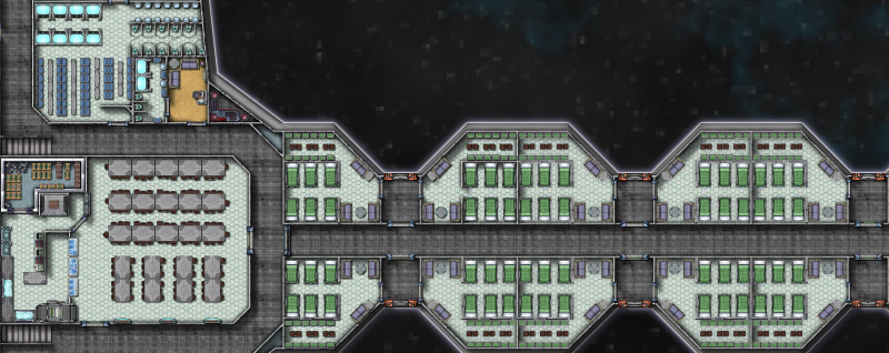
With the “big three” completed for deck 2 (pictured below), Deck, Plastic Irreg was added for all sleeping/common areas, by right clicking the Deck Plan button, to create visual interest and to assist viewers with identifying different areas easily. Next time, we’ll be completing the remainder of deck 2’s amenities, including enlisted lounges, armory and firing range, officer quarters and ships operating systems, creating deck1, reviewing how to mirror copies, and the creative mixing of Cosmographer 3s symbols.
Comments Off on “Ship like this, be with you ‘til the day you die.” Part 2
ralf | October 13, 2011 | Tutorial

This beautiful world has been created in Fractal Terrains and Wilbur and then been tranformed into a true map artifact in Photoshop by Brian Stoll.
Not only has he painstakingly crafted this amazing work, but he also provides an extensive step-by-step explanation how he used Fractal Terrains to make the world as detailed and realistic as possible.

Read up here, how he created the basic world, added rivers and erosion, exported world and regional maps and finally added different styles in Photoshop.
And check out the new release of Fractal Terrains 3 here.
1 Comment
