ralf | March 1, 2019 | city mapping, guest article, houses, roof shading, Sue Daniel, symbols
This is part 2 of the “Making New House Symbols in CC3+” tutorial by Sue Daniel. Read part 1 here.
Download the full tutorial in pdf format here.
Drawing the map file
Show all the sheets, set the snap grid to 10’ grid 2 snap, and copy the whole house to one side, leaving about 30 feet between the original and its duplicate. Zoom in on the duplicate, edit the label to show that it is the map file, hide all the sheets except the two ***Separation shadow sheets and delete the shadows from the map file drawing. Show all the sheets again and delete the chimney pots.
Using the change properties button move the entire map file drawing to the MAP FILE OBJECTS layer, and make the MAP FILE OBJECTS layer the active layer. Right click the hourglass button on the left and choose Move to Sheet, and move all the parts of the house as follows:
IMAGE ROOF – level 1 -> MAP ROOF – level 1
IMAGE RIDGE – level 1 -> MAP RIDGE – level 1
IMAGE ROOF – level 2 -> MAP ROOF – level 2
IMAGE RIDGE – level 2 -> MAP RIDGE – level 2
IMAGE ROOF – level 2 -> MAP ROOF – level 2
IMAGE RIDGE – level 2 -> MAP RIDGE – level 2
CHIMNEY -> MAP CHIMNEY BLANK
You should now have something that looks like this, with a white line defining each section of roof.

Using the change properties tool, change the fill of all the roof ridges and the chimney stacks to solid white.
Back when we aligned the fills and amended the automatic shading for the image file drawing, that amendment only worked for the textures. As soon as you change the properties of these aligned fill polygons to a solid colour the shaded polygons will show again and affect the blue and red values of the map file drawing, so we need to undo the alignment on all the parts of the roof that are aligned.
To do this make each of the 3 ***MAP ROOF sheets active in turn, and explode all the roof parts that are aligned on the active sheet (not the ridges or chimneys) so that the texture falls back to its default state. It is important to be on the right sheet for each roof part or the explosion may have unexpected results.
Open the colour palette and look at the top row of map file colours – the one with four colours in it.

The first map shade (178) is correctly set up for a north facing roof of standard pitch. Select it, and change the properties of the north facing rooftops to solid colour and shade 178. The second map shade (179) is set up for an east facing roof. Change the properties of all the east facing roof parts to this shade. This is how mine looks at this half way stage.

The third and fourth map shades are for the south and west facing roof parts respectively. So when you have finished changing the properties you should have a map file drawing that looks something like this.

And that’s all there is to it. The map file drawing is now complete.
Rendering the files
Create a new folder in the C:\ProgramData\Profantasy\CC3Plus\Symbols\User folder to be the home of your new house symbol. Mine is simply called “My Houses”.
Ensure that you have the 10’ grid 10 snap grid active and set to Snap, then use Save As… from the File menu, and pick Rectangular section PNG as the file type. Click the Options button in the Save As dialog and set the Width and Height dimensions to the dimensions you calculated for the render area rectangle, and which you should be able to read off the map. The filename you want is above the drawing.
Turn OFF the Antialias option.
Click ok and ok again, and when prompted for the first corner of the rectangle by the command line click on the bottom left corner of the rectangle around the map drawing, and then on the top right corner when prompted again for the second corner.
When this is done pan back across the map and do exactly the same thing for the image file drawing.
Making the background of both files transparent
Open the GIMP and go to File/Open and navigate to the My Houses folder where you saved your rendered images from CC3.
Open the image file.
Click the magic wand tool in the toolbox on the left hand side and make sure the Tool Options in the panel below the toolbox are set up so that the Mode is set to add to the selection, none of the boxes are checked, the Threshold is set to 130, and the Select by is set to Composite.

Then zoom in really close to anywhere on the left hand edge of the image by pressing CTRL and scrolling the middle mouse button, and click on the white area away from the house.
You should be able to see a black line down the edge of the image if you have zoomed in close enough. You need to click this with the wand, and also the white line right down the extreme edge until all the area that is not part of the house is selected in an area of ‘crawling ants’.

Go to the little thumbnail of the file on the right hand panel and right click it.

Select Add Alpha Channel from the drop down list, hover the mouse over the image in the main window again and press DELETE on your keyboard. This should entirely clear the background from the image file and leave a chequered pattern in view.

Don’t worry about the fact that the area is still selected. Go to the File menu, find where it says “Overwrite House 01.PNG” and click it.

Close the open file without saving it. You have already overwritten it with the new transparent version of the image file.
Select the wand tool and lower the Threshold setting to 50, then repeat this entire process for the map file, remembering to click the wand tool in all the islands of white in the middle of the map image. Make sure that all the white parts are gone.
Importing the new symbol
Go back to CC3+ and click the little button on the left under the Options button on the catalogue browser. There may already be symbols in there, but just ignore these. I have purged my own map of unused symbols just to make things a bit easier to see.

Open the Symbol Manager (menu item).

Click the Import PNGs button.
In the second dialog Browse to the My Houses folder in the Source folder box and double click on either of the files in the folder. The Highest Resolution should be set to 40 pixels per drawing unit, which is the default resolution for a city map. Check the Create other resolutions option and set the Symbol origin to the bottom right corner. Then click OK and wait for CC3+ to do its thing.
You will receive a short message letting you know that 1 new symbol was imported. Now check the view in the catalogue browser and scroll down to see if you can find your house waiting to be pasted.

And there it is.
Your new symbol has no specific settings, so you will have to manually choose the SYMBOLS sheet before pasting it to get the shadow around it.

You can carry on drawing and adding new house symbols in the same file until you have all that you want.
To make proper use of your new symbols you will need to make a catalogue of them. How to do this, and how to add the full functionality of a regular CD3 house symbol is covered in the Tome of Ultimate Mapping, and in part by a range of tutorials available from the sticky resources thread at the top of the Profantasy forum.
I hope you have enjoyed this tutorial, and that you get at least one new house symbol out of it. If you have any problems creating your new house symbols please drop by the Profantasy Forum and let us know. Have fun 🙂
About the author: Sue Daniel is active as a cartographer and artist both on the ProFantasy community forum and the Cartographer’s Guild. There, she has won 1 Lite Challenge and 3 Main Challenges, and just recently one of the annual Atlas Awards for most creative map in 2017. She has produced many beautiful art assets for CC3+ (such as the “Sue’s Parchments” Annual issue) and mapping in general that are free to use for anyone.
6 Comments
ralf | February 21, 2019 | city mapping, guest article, houses, roof shading, Sue Daniel, symbols
 Software required:
Campaign Cartographer 3 Plus (CC3+) with the City Designer 3 (CD3) add-on
A bitmap editor (The GIMP v 2.10 is used in this tutorial, but any editor will suffice)
You can download a zip folder of the three files that comprise the template for this tutorial called
“House Builder (basic)” used in this tutorial from here.
Download part 1 of “Making New Houses in CC3+” in pdf-format.
How CD3 house symbols work
Whenever we paste a house symbol into a map what we are actually pasting is a very flat image that probably looks a lot like this one.

CD3 symbols do not have roof shading. There are no ‘dark sides’ or ‘light sides’ in these flat-packed roof images, yet they appear on the map fully shaded the instant the symbol is pasted in the CC3 environment. So how is this happening?
CC3+ obtains information about the pitch and facing direction for each part of the roof by reading the colour coded message in a second file stored in the same location as the image, but which is never shown in the CC3+ environment. This second file has the same name as the image file, but with a “_map” suffix.
We need to make both types of file for our new house symbol, so to distinguish between them I will call them the image file and the map file respectively.

And here (below) is the symbol House 01 arranged in CC3 to show how the shading changes with the rotation of the building – all calculated by CC3 using the information contained in the map file, and adjusted to take account of the global sun setting and the rotation of the symbol.

Continue reading »
8 Comments
ralf | February 14, 2019 | Monsters, symbols, Token Treasury, Tokens, VVT
 We are happy to announce the full release of the “Token Treasury: Monsters“, our first release in a line supporting virtual tabletop software with ready-to-use artwork.
The Token Treasury line gives you a huge selection of creatures and characters to populate your maps, with frames and varicolor backgrounds to customise your virtual tabletop tokens. The art is available as CC3+ symbols and as PNG files for any graphics package such as Photoshop and GIMP. The Token Treasury is designed for use with any virtual table top software such as roll20, Battlegrounds, d20pro and Fantasy grounds.
The first release, Token Treasury: Monsters contains 118 creatures drawn by fantasy artist Rich Longmore, in rectangular and circular forms, as well as a set of token frames for depicting the creatures role in combat for your fantasy maps.

Token Treasury: Monsters can now be ordered from the ProFantasy store. If you purchased Token Treasury Monster as a pre-release, the full setup files are now available from your registration page.
 The full feature list includes:
- More than 750 tokens, consisting of 118 creatures and 24 frames in various configurations, for immediate use in any graphics software such as Photoshop or GIMP.
- Ready for use in virtual table top (VTT) application such as roll20, d20pro, Battlegrounds and Fantasy Grounds.
- Frames for melee, ranged, magic and bosses to denote the creature’s role in combat.
- A guide introducing you to the Token Treasury both within CC3+ and in other applications.
- More than 500 symbols for use in CC3+ including the 118 creatures and 24 frames in 4 symbol catalogs, and templates and drawing styles for creating more token combinations.
- If you own CC3+, TT:M also installs symbol catalogs, templates and drawing tools. Create custom tokens with varicolour backgrounds and add your own frames. Mirror the symbols to add variations.
 This is the full list of creatures. Normal creatures are 300 x 300 pixels, large creatures are 600 x 600 pixels, and huge creatures are 600 x 900 pixels.

1 Comment
ralf | September 19, 2018 | Celtic, City Designer 3, city mapping, Scott Aniolowski, symbols
Scott created this wonderful little symbol catalog of celtic dwellings which fits perfectly in with the symbols of City Designer 3, so we decided to make it available as a mini-add on. The download is available from your registration page if you have City Designer 3 registered. Here is Scott’s introduction to the catalog:
 The Celtic symbol set started quite by accident. I was building a set of texture fills in Genetica and decided to include a thatch. That was achieved by layering dried grass patterns in Genetica and then using GIMP to hand-drawn in individual strands before finishing it back in Genetica by softening and blurring the image and making it seamlessly tileable. Once finished, I wanted to test it out on a typical round Celtic house and was mostly pleased with the way it looked. That just happened to coincide with something I was reading about the Iron Age, so I delved deeper into the details of Celtic villages. The variety of building styles intrigued me. While the majority of the structures were round, they did raise the more traditional square buildings, as well, for barns and storehouses and eventually as houses.
Typical Celtic villages were set up around a large common structure where the village could meet. Security was in the form of either an earth and stone berm, or a stockade fence built from sharpened logs, sometimes with an elevated walkway used as a lookout and for defensive purposes. Buildings started with a stone base; log supports were added and covered in thick bound thatch, overlapping bottom to top to keep out rain. Trenches were often dug around buildings to move rainwater away from the structures.
The lack of chimneys is not an oversight. Celtic structures had no chimneys. Holes in the roofing caused updrafts which threatened to set fire to the thatch, so fires were built in the center of the structures and the smoke simply rose and seeped out through the thatching. The smoke was also a deterrent to mold and fungal growth in the damp thatch.
The final set of symbols is quite different from the originals, with ragged edging and steeper pitches to the roofs. Numerous color shades from greens to yellows to browns were tested on the thatch texture until I decided on the hue. The various symbols represent different types of Celtic structures, from small grain silos to houses and barns to large meetinghouses. Still others existed. The initial symbols were created in CC3+ and then modified in GIMP.
The map was made in CD3, Bitmap A style, with a few fills imported from the Overland catalog. It is just a quick example. I’m very excited that ProFantasy deemed my little collection of symbols worthy enough to offer to CC3+ users, and hope people enjoy and can use them. Besides thanks to the ProFantasy staff, a thanks needs to go out to mapping maestra, Sue Daniels, who was instrumental in helping me get the symbols to their final finished stage!
8 Comments
ralf | March 7, 2018 | guest article, Jon C Munson II, Mike Schley, Symbol Set 4, symbols, Tutorial
Jon C. Munson II
Background
 The mapping style of Mike Schley is, simply put, beautiful. It is no wonder that Wizards of the Coast sought him out for many of the maps used in their products. His use of line, shading, and slightly muted color do a fantastic job of creating the illusion of a truly hand drawn map with dimensional objects. And, well, for the most part that is exactly what they are – hand drawn, albeit done using programs like Adobe Photoshop and/or others. If you haven’t seen his maps, you really owe it to yourself to take a look at them.
I had always liked Schley’s maps, and wanted to produce a few maps for a module I had in mind for the Dungeons & Dragons group that I run. Knowing how many hours it would take to hand-draw the maps, I looked for a way to cut down some of the time required. Enter ProFantasy’s Campaign Cartographer 3+ (“CC3+”). The program uses a number of Schley’s symbol packs (for example Symbol Set 4 – Dungeons of Schley), and that was perfect for me. Well, almost – I needed further symbols to suit my module. Now I had to figure out how to both create symbols and emulate Schley’s style to produce the symbols I needed. And, I also had to figure out how to get those into CC3+. It turns out it isn’t a hard job, but, it is a bit tricky, and most of the effort is in creating the symbols themselves. Schley’s style seems to be fairly involved, and that complexity is what makes them so appealing.
Personally, I have no idea how Mike Schley goes about making his symbols or drawing his maps. I have, however, studied his symbols and maps to try and figure out how he makes his creations. Despite many hours, I’m still uncertain of his exact process, but I think I have at least a little idea. I discerned enough to be able to put together symbols that are “close enough” to Schley’s style to be good compliments (at least I think so). Frankly, my goal in trying to figure out his methods wasn’t to be a forger, but, rather, to emulate – I had no desire to be “Mike Schley,” though he is an excellent talent to learn from!
Equipment Needed
Though it is entirely possible to use a mouse to create symbols, I strongly suggest obtaining a graphics tablet. I use a Wacom myself, and highly recommend their tablets. I know of others who use Asian variants with success (depends upon which ones though), so you might be able to get a less-expensive tablet to start.
You’ll also need both raster & vector editing software. While I have Adobe CC, there are other alternatives out there such as Gimp and Inkscape. I have briefly used those in the past, however, as I use Photoshop and Illustrator, I’ll be discussing things from the point of those tools. Most of that discussion should translate to another tool, and you may have to improvise with those other tools.
One thing I cannot get into in this article are the components that make up each symbol – you’ll have to experiment and decide what elements make up your objects. A bit of mechanical drawing is quite helpful, and understanding perspective will come in very handy too. Everything is made up of either, or any number of, rectangles, circles, lines, arcs, etc. Do experiment, and use the Internet to find samples, etc.
Image Sizing
CC3+ symbols have four sizes – Very High, High, Low and Very Low. You want to create symbols at the Very High resolution, and CC3+ will take care of the other sizes when you import them. See the CC3+ documentation for details. In fact, reading through the CC3+ documentation, and consulting the forum, concerning creating symbols is definitely in your interest as well.
Analysis
Let’s take a look at a simple chair:

There are several things to note about its construction. First, note that the linework of the object forms the description of the object, and the value variations within the object gives a 3D impression. Many of Schley’s symbols don’t include the value, thus producing the “ink” symbols. Second, note the border around the object, and sometimes an inner border around other objects (like a book on a table), is a little thicker than the detail linework. Third, note that the detail linework, when there is value applied, is usually surrounded by a slightly darker value of the “main” value of the object.
Fourth, note that the object itself has variations in value (mimicking “wood” in this case), as well as descriptive value to indicate 3D depth. Finally, note the color – intentionally set to mimic watercolor, the colors are a bit desaturated (wood also has a desaturated tone by virtue). This does not, however, detract from the richness of the symbols, but rather forms a complimentary feel to the heavier linework. The effect is, in essence, a watercolor wash, and is an important element in Schley’s style.
The linework here is really something to be admired – quite a lot of variation in thickness and style. This gives the hand-drawn look to the symbols and is important in order to be able to produce symbols that would compliment Schley’s style.
Now that we have an idea of how Schley creates his symbols in terms of components, we can proceed with creating our own.
Making Our Own
Creating symbols that emulate Schley is actually not a trivial task. There is quite a lot involved, depending upon the complexity of the object, and does require a little artistic flair – not that one must be an artist to create symbols of course. With a bit of effort, you can get pretty close! The real trick is rendering a 3D feel – perspective is something that really “sells” these symbols. The beauty of working on the computer is you can simply delete or undo as much as you like and try again. You may also find that sketching on a piece of paper to be useful practice too. I did just that with a few symbols I made as I found that easier.
The first thing to do is to on the object to be drawn. I will start with an object I created for my symbol set – a cabinet. This symbol doesn’t involve perspective, so is much easier to create.

After a few experiments with creating these symbols (remember, I’m not attempting to “be” Schley), I decided that I would start with vector outlines for my symbols, and that was more easily accomplished in Illustrator (or a vector program of your choice). Illustrator also has a method by which variation in line can be achieved (through a little deformation) that does a good-enough job of giving us a hand-drawn result.
Now, as with any object, we have to draw out the components. If you look at the cabinet carefully, you can see that it can be broken down into a few rectangles, some circles, and some lines. Draw out the components of the cabinet, don’t worry about making it “look like” the symbol I’ve created – just concentrate on the basic shapes. For the sake of learning, you could just create a simple rectangle for now. Be mindful of the width of the stroke – you don’t want anything too wide, nor anything too narrow. The size of your object will dictate the width of the border strokes. Use Schley’s symbol as a guide for border line thickness ratio.
Once you have the shape(s) defined, the next step is to change the line shape from obviously vector to something a little more hand-drawn in appearance. For that, we’ll use the Effect->Distort & Transform->Roughen. In the next dialog, you’ll first want to check the Preview box so you can see what effect changing the command’s parameters has on your object. The Size slider dictates the amount of “wobble” in the line – go ahead, play with it, can’t hurt anything right now. I use a value between 2 and 4 pixels. The Detail slider dictates the frequency that the Size slider occurs. Again, experimentation is key here. The last option, Points, needs to be set to Smooth. You might, on occasion, use the Corner option, but in this case we want Smooth.
As you can see from the preview, your object looks a lot more hand-drawn. If you like your changes, click OK, and move on to the next step.
Once you’ve gotten your basic outlines created and your object defined, export that out as a PSD and open the file in Photoshop. You should then have a “Layer 1” group that is your vector artwork (now rasterized). If your line work is not grouped, create a new group from those layers (you can name it anything you like of course).
In the case of the cabinet, I wanted to make it appear to be made from wood – you could choose other materials, like various kinds of stone, or clay, etc. Creating the subtle impression of wood grain could be a daunting task – there’d be lots of hand-painting to do. However, there is an easier route – using a color fill and a texture to produce the illusion. So, I first used a Color Fill, choosing a wood-like value. Be careful here, wood is not highly saturated, so stay on the desaturated side of the color picker – less saturation is more. Set the blend mode to Multiply, and set the layer as a Clipping Mask on top of the linework layer. This color will help re-value the texture and give a little more room for experimentation. Then I used a free wood texture set to Multiply (there are loads of these on the Internet). You might notice this will make your image a little darker, etc. Using both Levels and Hue/Saturation, I adjusted things to taste. You do not have to use a Color Fill as I did, you could just as easily re-color the texture using adjustments. How you follow what I’ve done is completely up to you.
After that, I added a new layer on which to create the interior linework. Using the standard round brush, keeping my brush size smaller than my border with (about 1/2 or so, adjust to your needs), I drew in the planks and interior borders of the cabinet. This is where studying Schley’s artwork comes in handy. Notice how he created his lines – where it is long, short, dots, etc. Pay attention to how he demarcates curves, grades, slopes, etc. You want to approach that same style to be in keeping with his overall look. Take your time, and feel free to clear the layer and start over. When you want straight strokes, use the Shift key. Otherwise, feel free to “freehand” the line – we are creating hand-drawn symbols after all.
Once you have your linework completed, add an Outer Glow effect set to Multiply, and choose a color that is close to the wood color you are using. Experiment with how strong you want that by changing the Opacity slider. Use Schley’s symbols as a guide, and, of course, these are your symbols, so make them as you wish.
Your interior linework layer should almost always be your top layer – you don’t want to hide those lines beneath other opaque layers, so most of your work from here will go below that layer in the stack. The reason for this will become apparent as you work, however, what will happen is the painting you do will subtly change the linework appearance in ways that are not desirable. Opaque layers and Screen layers will overwrite/lighten your linework. The linework provides a guide for the shading and highlights, that’s why the layer needs to be near topmost in the stack and the other layers lay below.
If you feel you need more shading in places, create another layer, set its Blend Mode to Multiply, and using a more desaturated color, fill in your shading. You should use the Soft Round brush for this to get a feathering effect.
After that, the next step is to add selective highlights. You want to add subtle “high spots” to various portions of the symbol. Create a new layer and set its Blend Mode to Screen. Using the Soft Round brush again, create those highlights. If you are using a tablet, you may wish to set the brush size to pressure to help create variable line widths.
Now, as the vector linework comes in as a group of vector outputs, you want to make a Copy Merged copy of the vector linework to place on top of the interior linework you completed. This way all of your linework will be topmost – ensuring any painting below does not unduly affect it. If the layer is filled with white, just set the Blend Mode to Multiply (Multiply ignores white).
The last thing I added, and you won’t do this to all symbols, is a little bit of drop shadow. Sometimes this is helpful, but can interfere with CC3+ shading algorithm, so be careful how much you apply. A little drop shadow can help “bed” the symbol in your drawings, so they appear to be a part of the map instead of just a “sticker” upon it.
Once done, you’ll save out your symbol as a PNG file (otherwise you won’t get transparency). The next step from there is to import your symbol into CC3+, and that’s beyond the scope of this article – consult the CC3+ documentation for that, and/or search the forum for assistance.
What I’m Doing With My Maps
The module I’ve created was born from a Wizards of the Coast campaign upon which I started my group. There was a nice hook within for a personal offshoot, so I ran with it and created a 4-map, 80+ page dungeon that my players are still trawling (and thoroughly enjoying). The “Munson’s Mines” symbol set was born from this module.
While I don’t have Fantasy Grounds, or a fancy in-table monitor to display my maps to the players, they do receive a copy of the level once they’ve completed it (and explored enough that I don’t mind if a few areas are “uncovered” as a result). I do rather prefer they do things the old-fashioned way and map their way by hand – provides more immersion factor I think. After they’ve explored everything, I don’t mind handing them a “player copy.” They get to see just where they got confused with directions, and how accurately they rendered the location. They have really enjoyed the module, and really like the maps. I should probably print them larger, as much of the details I’ve put in get lost on an 8.5×11 (A4) sheet.
CC3+ is a fantastic CAD program for mapping our fantasy worlds as it is feature- and, most importantly, symbol-rich, and I hope this article inspires you to create your own symbols to add to it.
4 Comments
ralf | January 12, 2016 | city, symbols, Vintyri
 The Vintyri Project released their enormous content collection for City Designer. Here is the announcement from Mark Oliva.
We now have completed release of the entire Vintyri (TM) Cartographic Collection for ProFantasy’s Campaign Cartographer 3+ and 3. This is a collection 974 CC3+ and CC3 raster symbols in the VH, HI, LO and VL resolutions and 122 fill styles along with templates and drawing tools, also in the VH, HI, LO and VL resolutions. Additional templates and drawing tools can be downloaded and installed by users of City Designer 3 and Dungeon Designer 3 with CC3+ or CC3.
The cartographic collection can be used with CC3+ or CC3 alone, but it is of full benefit only to users who also have ProFantasy’s City Designer 3. The collection is fully integrated into CD3. It uses CD3 roof shading, street alignment, demographic building coloring, automatic layer assignments, etc.
The Vintyri Cartographic Collection is released for private and commercial use under the Open Game License 1.0a. It is a free program. The Vintyri Project is a non-profit, non-commercial organization. We sell nothing. We neither solicit nor accept donations. We do no kickstarters. We’re strong supporters of open source gaming.
We have prepared a 30-page, free bookmarked PDF Vintyri Cartographic Collection Installation Guide that will show you step-by-step with screen illustrations exactly how to do things right. PLEASE use the installation guide. A number of users didn’t when installing the preliminary releases. We got to read their tales of woe by private E-mail. Think of the old acronym from the early days of PCs: RTFM! (which meant “Read the @!&* Manual!). Save yourself hours of work unmangling a mutilated CC3+ or CC3 installation. It’s easy to install the collection, but you have to do it right. You can get the free installation guide here:
https://www.vintyri.org/downloads/vccp_install_guide.pdf (11 MB)
The PNG graphics that make up the symbols and fill styles have a total download size of 4.4 GB. Because several users have reported problems downloading huge files, we have split the symbol and fill style downloads up into 13 smaller ZIP files. We know that this is irritating for users with very stable high-speed Internet connections, but it’s necessary to make the cartographic collection to all users.
After downloading and installing the collection, the \Data Folder\Documentation folder will contain a 202-page bookmarked PDF book entitled Vintyri Cartographic Collection Guide for CC3+ and CC3. We released an earlier edition of this book several years ago for Fractal Mapper (TM) 8 and Dundjinni (TM), and we received a lot of feedback from users who found it to be extremely useful. This new edition is filled with brand new content and is tailor made for users of CC3+, CC3, CD3 and DD3. Even if you’re not particularly interested in most of its content, we STRONGLY urge users to read the back sections regarding known issues and restoring the CD3 integration!
During our test phase, both we and our testers found issues in both CC3+ and CC3. These issues have been reported to ProFantasy, and we’ll let ProFantasy decide whether they’re bugs. Regardless, these are issues where CC3+ and CC3 did not perform in the manner we thought that they should and where they created some genuine problems while mapping. We managed to duplicate these problems on a new PC upon which the Vintyri products never have been installed, so we’re rather convinced that these issues are with CC3+, CC3 or CD3 and not our software. Be that as it may, the collection guide explains these problems and how to solve them or work around them, if possible. If not, the book tells you how to avoid them.
The topic of restoration also is important. It’s possible that reinstallations, the installation of CD3 or DD3 after the Vintyri installation and/or future ProFantasy products might overwrite Vintyri files. The section on restoration tells you what to do in such a case to have both the ProFantasy and Vintyri products working properly.
To go directly to the download site, go here:
http://www.vintyri.org/vintyri/vccindex_cc.htm
Mark Oliva
Webmaster, the Vintyri Project (TM)
Internet: http://www.vintyri.org
E-Mail: info@vintyri.org
The Vintyri Project is a non-commercial service
Comments Off on Vintyri Cartographic Collection for CC3 and CC3+
ralf | January 1, 2016 | Annual, overland maps, symbols
 Another year has passed, another Annual subscription is complete and we are seamlessly moving into the next year. A Happy New Year to you all. 2016 here we come!
Pär Lindström starts the new year with his large-scale overland style Here Be Monsters. All manner of weird and amazing sea creatures are now ready to populate the edges and corners of your maps, and show the terror the uncharted open ocean would hold for early mariners. Here Be Monsters, indeed!
The January issue is now available for CC3+ from the registration page for all subscribers. If you haven’t subscribed to the Annual 2016 yet, you can do so here.
Comments Off on Cartographer’s Annual 2016: January
ralf | November 2, 2015 | overland, symbols
 As promised this month we are expanding last month’s Ancient Realms style by TJ Vandel with a whole bunch of additional location sybmols.
Several dozen gorgeous little vignettes show places like exotic cities, mystic stone circles and fobidden caves. They will pique the interest of your players and send them off to many places of adventure. Click the sample map on the right to see some of these symbols in use.
The November issue is available both for CC3 and CC3+. You can download both setups from your registration page on the Subscriptions tab. If you haven’t subscribed to the Annual 2015 yet, you can do so here.
Comments Off on Cartographer’s Annual: November issue
ralf | May 1, 2013 | Annual, symbols
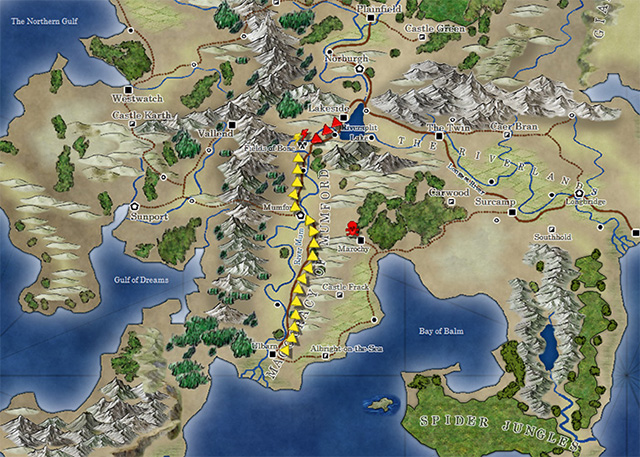
The May issue of the Cartographer’s Annual 2013 is now available. It contains a set of symbols to highlight actions, points of interest or reference material on your maps, as well as a series of tutorials on how to create more vector symbols yourself.
Here is last month’s example map, with some of the this month’s symbols highlighting a military campaign.
Comments Off on Cartographer’s Annual: Map Marker Symbols
ralf | August 2, 2012 | bitmaps, CSUAC, symbols
 Several years ago user-created bitmap artwork from around the web (specifically the Dundjinni forums) was collected into one awesome resource package – called the CSUAC – and made available for the users of several graphics programs, among them CC3. Unfortunately this resource was lost to CC3 users a while ago, and license restrictions did not allow us to make it available again.
But fortunately we’ve now found a way to make the resource available to CC3 users while honoring the license, and Gerri Broman (Shessar on the Profantasy forum) and Mark Oliva from the Vintyri project put it into practice. Here are Gerri’s instructions from the Profantasy forum:
CSUAC for CC3 Installation Instructions
Before I get into the installation procedure for the package, I want to first point out that if you already have the CSUAC there is no need to reinstall since there are no new symbols. However, the directory structure is different from prior versions, so the two are not compatible. What this means is that any maps using symbols from prior versions will show red X’s for the symbols (the reverse is true as well). This is because the new CC3 version of the CSUAC is using the file structure and files from the Fractal Mapper 8 version of the package.
Also, please note that these symbols are not full fledged CC3/DD3/CD3 symbols. That is, they are not smart symbols, nor do they use random transformations, shading, collections, etc. They are simply the PNG files and associated CC3 catalogs.
STEP 1: Downloading all necessary files
1. Download the file CSUAC_for_CC3_v3.zip and save it to your hard drive.
2. Download all of the CSUAC FM8 files from the www.vintyri.org website and save to your hard drive.
 The files needed are:
- BL_FM8_Fills.zip
- BL1_FM8.zip
- BL2_FM8.zip
- BL3_FM8.zip
- BL4_FM8.zip
- BL5Pt1_FM8.zip
- BL5Pt2_FM8.zip
- BL6_FM8.zip
- BL8Pt1_FM8.zip
- BL8Pt2_FM8.zip
NOTE: There is no BL7_FM8.zip file
STEP 2: Extract Files
1. Unzip the CSUAC_forCC3_v3.zip file into your root CC3 Folder (normally C:\Progam Files (x86)\Profantasy\CC3). This will create several new folders:
CC3\Bitmaps\CSUAC Fills
CC3\Symbols\CSUAC
CC3\Menu\csuac_menu
2. Extract the file BL_FM8_Fills.zip into the CC3\Bitmaps\CSUAC Fills folder.
3. Extract the files BL1_FM8.zip through BL8Pt2_FM8.zip into the CC3\Symbols\CSUAC folder.
 STEP 3: Adding Menu Buttons for the CSUAC
1. Navigate to your root CC3 folder
*If you don’t have a fcw32.imn file in this directory
Copy the fcw32.imn file from CC3\Menu\csuac_menu into your root CC3 folder.
* If you do have the file fcw32.imn in the root CC3 directory
Navigate to the folder CC3\Menu\csuac_menu
Open the fcw32.imn file using Notepad.
Append (copy/paste) the contents of this file to your existing fcw32.imn file in the CC3 root directory.
Make sure you don’t leave any empty lines inside the file, but do make sure there is a line break after the last line of content, or CC3 will crash on startup.
2. Start CC3. Click the screen tools button (Hammer icon at the bottom of the screen), and turn on “Custom icon bar 3”. I have mine placed to the left.
3. If the new toolbar shows up blank, just restart CC3 or click on one of the “Add-on” buttons in the toobar. This will reload the menu.
The symbols are now ready for use.
18 Comments


 We are happy to announce the full release of the “


 Several years ago user-created bitmap artwork from around the web (specifically the Dundjinni forums) was collected into one awesome resource package – called the CSUAC – and made available for the users of several graphics programs, among them CC3. Unfortunately this resource was lost to CC3 users a while ago, and license restrictions did not allow us to make it available again.
  The files needed are:
 STEP 3: Adding Menu Buttons for the CSUAC