Clercon | January 22, 2013 | Annual, Campaign Cartographer, overland, Par lindstrom
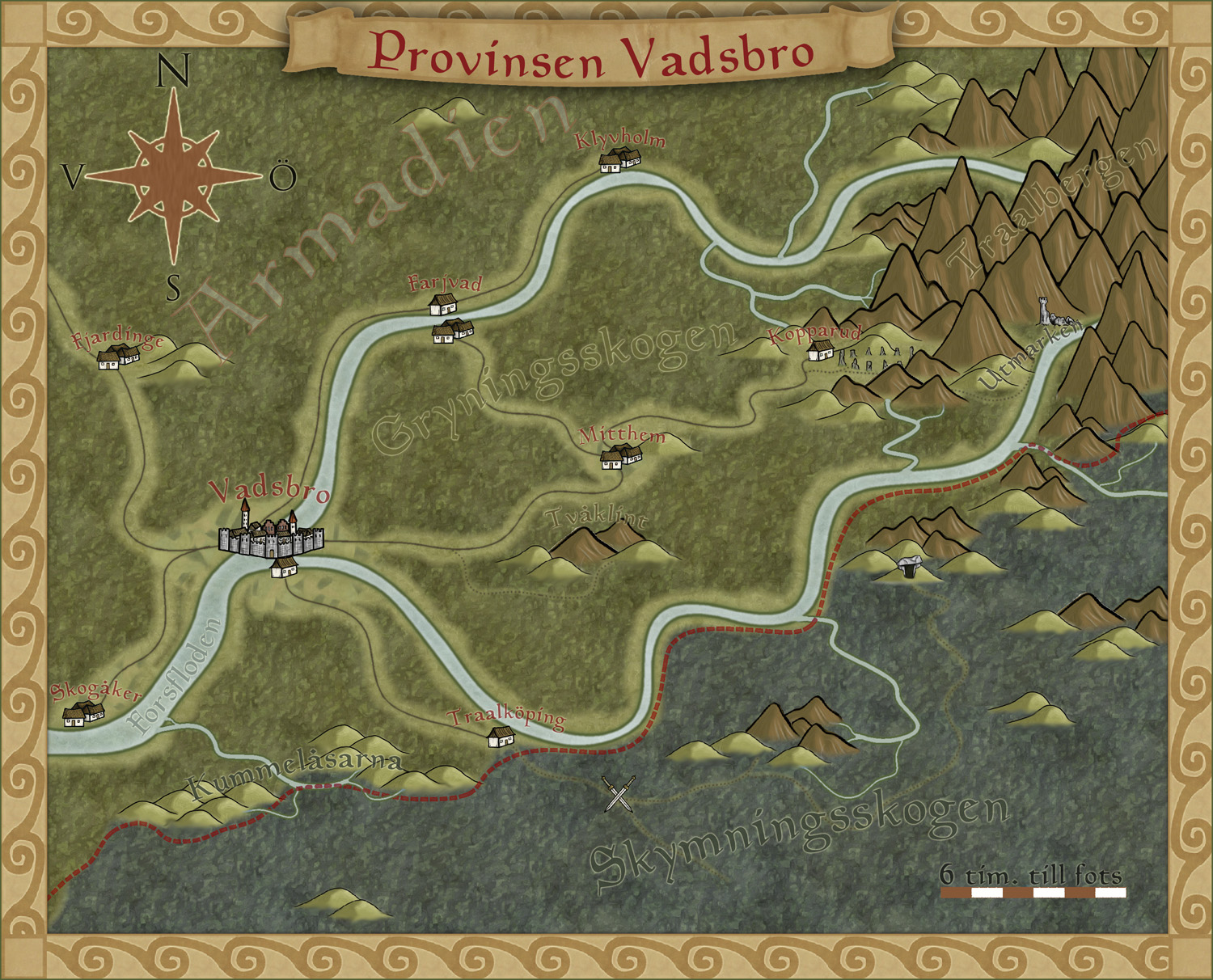
To get more ideas for maps to do I’ve decided to make a fantasy adventure. First of all I need a campaign map of the area where the actual adventure will take place, with that one in place it will be easier to plan the other maps I need to draw.
To make the map I decided to use the style I made for the December issue of the Annuals from Profantasy. The style was made for creating campaign maps for smaller areas, so it will fit very well for this map.
The adventure will take place in the country Armadien, close to a city called Vadsbro (Littlebridge in my Armadien map). Vadsbro is situated close to the Armadien border, next to the Traal infected Skymningsskogen (dusk forest) and the Traal mountains, so there will be a lot of forest in the map.
As soon as I started on the map I realized that I had to improvise a bit with the style. The main feature in the map, except for all the forest, is the river that split up in two rivers closer to the mountains. The rivers in the style aren’t really suited for depicting a main river in this scale, so I decide to use the ocean texture for the rivers. In this way the river will look more like the dominating natural feature in the area.
The river tool however comes in handy to show smaller rivers connecting into the main branches, but I had to change the colour of the rivers to blend in more with the main rivers. When I created the style, which is based on my Truscian map, I wanted the rivers in a darker colour and the ocean in a lighter one. That works very well if you do a more zoomed out map. But if you zoom in closer to an area for a map, and you suddenly want to use the ocean textures as rivers, the colour for the river tools don’t really blend in. So I decided to change them.
It is actually quite funny how a style you’ve created yourself, suddenly needs to be trimmed when you start working with it. But I think you can say that for all styles. At least I always trim the styles so they’ll fit into my way of working.
Now that the map is done it will be easier to decide what more maps I need to do. You can say that I’m making my adventure from the maps, the story I have so far will probably change a bit with every map I make. But that is the fun part of mapping, to weave a story around your maps instead of making maps from your story.
Originally posted on mappingworlds.wordpress.com
1 Comment
Clercon | December 10, 2012 | CD3, city, Par lindstrom

When I grew up I used to play a lot of Role playing games and especially I played a Swedish game called Drakar & Demoner (Dragons &Demons). Most of the adventures they released took place in a campaign world called Ereb Altor. At that time I thought the world was one of the coolest places for an adventure that existed, and I must say that the maps I saw then and the adventures I read really has influenced me a lot.
As I might have mentioned earlier making maps is my hobby, during the days I work as an IT-engineer, so mapping is something I do in my spare time. For that reason I’m very restrictive when it comes to taking up commissions, making maps for someone else means that I can’t make them for myself. But when I realized that the world Ereb Altor still was alive and that people still actually were working on new material I just couldn’t turn it down.
So after a short introduction to the people running the site I was asked to do a map of Kartotum, the capital city of Palinor. Making this city however turned out to a bit of a challenge. So far all of my city maps have been done in City Designer 3 (CD3) from Profantasy, a great program when it comes to make cities. However the program has its weak sides, and one of those is that it works best when it comes to making cities without too much elevation. Of course you can draw some elevation in the program, but not in a way that I wanted to do it.
You see Kartotum is situated on the slopes of a mountain so it is surrounded by great cliffs, and to draw that in CD3 was something way out of my league, if it’s even possible. So I decided to make the city and all the houses in CD3 and then draw the cliffs by using a combination of both Artrage pro and Photoshop. But to do this I first had to mark out the area in CD3 where the cliffs would be. To do this I added a green colour, different from the actual grassland, where I later would add the cliffs, as you can see in the map below. In this way I could place the symbols correctly in CD3.

When the city was done in CD3 I exported the map and opened it up in Photoshop. In Photoshop I added the black lines for the cliffs and saved the image as a .PSD file. The actual shadows around the lines I decided to add in Artrage Pro. The water colour brushes in that program are absolutely fantastic and in this way I could get the shadows exactly as I wanted them. I also added the colour of the cliffs in Artrage before opening the file in Photoshop again to add some finishing shadows and light effects.
Working on this commission has teached me a lot when it comes to adapting to some one else’s ideas and opinion and I must say that in some ways it’s even more relaxing doing maps for someone else than yourself. Suddenly you don’t need to come up with all the story and explanation to all the stuff you make. That is someone else’s headache.
Originally posted on mappingworlds.wordpress.com
Comments Off on Kartotum
ralf | December 2, 2012 | Annual, overland, Par lindstrom
We’ve just released the final issue of the Annual 2012, and a fine one it is! Pär Lindström – creator of our popular Fantasy Worlds style – has created a beautiful mapping style for regional maps.
We’ll be releasing information on next year’s Annual soon!
Comments Off on Cartographer’s Annual – December Issue released
Clercon | November 19, 2012 | Annual, CD3, city, Par lindstrom

As you might have noticed I really like to make city maps. I don’t know why but I just love to see how a blank paper slowly turns into crawling streets and vast parks. It makes my imagination really spin.
Most of my city maps I make in the program City designer 3 (CD3) from profantasy. It is a great program with a huge toolbox you can use to make the creation of your cities a much smoother experience. To make the maps more unique I also like to edit them a bit in Photoshop afterwards.
When I bought CD3 my first impression of the program however was quite different. You can easily describe it in one word, overwhelmed. Just the sheer number of tools and objects made me fear for my mental health. The first time I started the program I think I just closed it immediately.
So how did I go from there to where I am now? Well the answer can actually be divided in three parts. First of all practice. I started out quite small with a little village and first after a couple of small practice maps I went for the bigger cities or towns. Secondly I looked up some tutorials, especially Gandwarfs tutorials over at the cartographer’s guild where extremely helpful. Thirdly there was a black and white city style released in the 2010 annual from Profantasy.
So what was so great with the black and white city style? First of all you get a very nice tutorial in every edition of the Annual, this makes it very easy to learn a new style, you can just follow the steps described. For me this meant a lot when it came to learning CD3, because I could in this way quickly pick up the different tools to use.
Secondly the amount of objects decreased quite a lot in the black and white city style compared to the coloured styles that were included in the actual program. This might sound a bit odd but the good thing here was that suddenly the program didn’t feel as overwhelming as before. When the choices in objects decreased, it kind of made it easier to grasp the program and find what you were looking for.
The map included in this post is a map that I made while trying to learn CD3. It was one of my first experiments to make a really large city map. I especially experimented a lot with the random street tool in this one. The random street tool is really a great help when you quickly need to fill and area with many houses.
When I was done in CD3 I opened the file in Photoshop and added some cliffs on the northwest side of the city. I also draw my own arena object to add to the city, I really missed that object in the style. As a finishing touch I made the map sepia coloured and placed the map on a paper background.
Well after that I just continued doing city maps and slowly the interface started to make sense and nowadays I rather feel that the there are too few objects in the program then too many 
Originally posted on mappingworlds.wordpress.com
1 Comment
Clercon | October 23, 2012 | Annual, overland, Par lindstrom
The deadline for my December Annual style is closing in and luckily enough the style is slowly coming to a more or less finished state. A lot of things, small and big have changed since my last blog post about the style. The city icons have been remade and some of the terrain I’ve gone over a second time to make sure they are good enough.
One interesting thing I’ve learned from making this style is that the end result has a tendency to change a bit while you work. The Truscian peninsula map, that is the original map for this style, is a regional map that still is quite zoomed out. The finished style will be suited for a more zoomed in regional map. Not that you won’t be able to do the zoomed out version but I think that it is in the more zoomed in version that the style will really shine.
There are still some things left to do on the style, I might try to add in some more icons and I’m thinking of adding in one or two mountain ranges that you can use as the base while creating your mountains. Just to make it easier for you to make a quick map.
The map below is the latest test map of the style. I hope you like it.
Originally posted on mappingworlds.wordpress.com
4 Comments
Clercon | August 14, 2012 | overland, Par lindstrom, Tutorial
This is the second part in my overland mapping tutorial. If you want to read the first part before continuing you can find it here. As usual this is my view of mapping and you might agree to it all or just parts of it. The important thing to remember is that this is one view of mapping, and not the only one.
Ok back to the map. We have some landmass, islands and seas so what’s next. At this stage I always try to place mountains and hills. If you desire you can try to work out where you would have tectonic plates and from that information decide where to put the mountains. I never do that, I’m more going for the “if it looks good it looks correct” path here.
First of all I often try to use my mountains to divide the landmass into different areas. It is an easy way of making natural borders in the map that you later can use when it is time to decide where to put the borders between different countries.
Secondly I try to make my mountain chains curved. If you make them straight the map will, in my opinion, look a bit stiff, which will give you a less good looking end result. When I say curved I don’t mean that they should look like circles. Curved mountain chains will give more life to the map, it will get more fun to look at.
Also try to break up the mountain chains at some points. It will give you some interesting valleys and passes that can trigger the beholders imagination in a good way. Is there really a more interesting place for a campaign then a mountain valley full of orcs or strange creatures, maybe a deserted watch tower or an old haunted burial ground.

Around the mountains I place some hills to make the transition from mountain to field look more natural. A good idea might also be to put some hills between two mountain areas that are quite close to each other. It will connect them in a nice way.
When you’re done with your mountains it is time to start on the rivers. The basics when it comes to rivers are that they flow from high ground downwards, they don’t split downwards, but they can have more than one starting point. Usually they also try to get to the sea the shortest downhill way. If you try to follow those two rules the rivers will look more naturally.
Another thing to think of is that the straighter the river is the faster the flow of the river will be. Most rivers tend to be straighter and faster in the beginning and closer to the sea they usually will slow down, which means more curves. When I put rivers in my maps I tend to do them quite curvy. It will usually look better, straight rivers just don’t get the right feeling, at least that’s my opinion.
Originally posted on mappingworlds.wordpress.com
1 Comment
Simon Rogers | July 26, 2012 | Annual, Par lindstrom
I’ve subscribed to the Profantasy Annuals since the beginning and I must say that it has been a great investment. I’ve learned a lot from the included PDF’s that comes with the monthly style and most of the styles are really great. But then sometimes there is a month when you think “when will I ever use that style!”. But you should never say never, suddenly you might have use for a style you thought you’d never touch.
This happened to me when it comes to the 2010 Annual May edition, Abstract maps. When I received it I first thought it was a real waste of space on my hard drive. When would I ever use that, but that was before I went to London with my son.
When my son was eight I took him on a trip to London. They had just started to learn English in school and I thought that going to England would be a great way to motivate him to learn the language. Of course we could also have a great time visiting museums and interesting landmarks like Big Ben and the London eye.
As it turned out he got really hooked on the Underground. We don’t have one where we live and for a child it is fascinating to go on a train far below the surface. We ended up doing a lot of travelling with the underground and we even bought a London underground game that we’ve played while coming home again.
After returning to Sweden my son thought it was fun to play that he was travelling with the underground, pretending that different rooms in the house where stations. I suddenly remembered that I had a style for CC3 where you could make underground maps. Quickly I started the program and made a map for him where all rooms where stations and different lines went to different parts of the house. I even added some lines that continued out in the garden.
So you should never rule out a style, who knows in the end you might have a use for them all.

Republished from Mapping Worlds.
Comments Off on I’m never going to use that style!
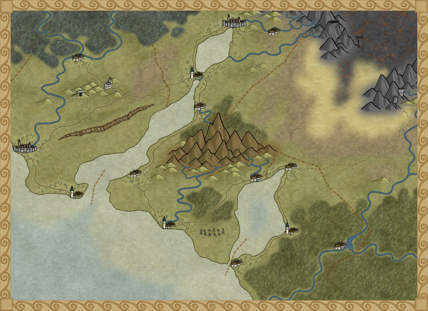
Clercon | May 31, 2012 | Campaign Cartographer, overland, Par lindstrom, Tutorial, wielink

This time I thought it was time to make a tutorial on how you can make a convincing overland map. This will be more of an overview tutorial on how I think and plan when I make a map, so it won’t be very technical. This means that you can use this tutorial regardless what program you use when you map, even though I in the tutorial will use a map made in CC3 as a reference and example.
The first thing to take into account when you start an overland map is the landmass. How much of the map will be water and how much will be actual land? This is probably the most important step in your map because it will set the boundaries for what the end result will be. So already here I’m having a quite clear view of where I want to go with the map, shall the map be land based, island based or something in between.
Below you see my map “Sagorike”, that I’m using as an example in this tutorial, with only the landmass viewable. I’ve also written some things on the map that you can have in mind while drawing the coastline.
A good thing to do before starting on your landmass is to look at the real world (Google earth is great for this). If you want a lot of fjords, have a look at Norway, Island based, look at area outside Stockholm for example, and so on. It is always good to find inspiration in the real world. It will make your map look more believable, and believable maps tend to look good.
However when I make maps of worlds the most important thing for me is that they look good and in some part convincing. It doesn’t matter if the world doesn’t work geologically or physically, as long as it looks convincing. To make it look convincing you have to get the things right that the majority of people can spot, like rivers, they will NEVER split downwards, lakes, there is always only ONE outflow, or deserts, make sure that you place them in a way that it looks probable that no rain will get there, and so on. If those small details are correct it is more likely that the viewer will believe in the whole map, regardless if everything in it is possible according to our physical laws or not.
That is all for now, in the next post we will start by placing the mountains in the map.
(Originally posted on mappingworlds.wordpress.com)
3 Comments
Clercon | May 16, 2012 | Annual, Campaign Cartographer, CC3, Overland map, Par lindstrom

I’ve started to play a simple and easy to understand roleplaying game with my two oldest children (this is also the reason that the names in the map are all in Swedish, they don’t read English). And of course no game can be really appreciated without a world map to look at.
So I decided to make one while trying out the April annual style from Profantasy, made by the artist Herwin Wielink.
It is always hard to start working with a new style, it takes a while just to get used to the style itself. What graphics are included, fields, desert, marshes, rivers, forests and so on. A good thing is to just create a couple of test maps to get used to the style, to get the feeling of it. In this case I did that, but not only on purpose. I’ve read on a lot of places that people complain that CC3 can be a bit unstable, that it sometimes crashes a lot.
Well I’ve never experienced that, apart from with one of my more ambitious projects where the actual file grew too large for CC3 to handle. But with this particular style I actually had two crashes where I had to restart the whole project from the start again. That has never happened before and it was probably just a coincidence that it happened now, but I guess that the end result ended up better because of this. You can say that I learned from the mistakes in the two earlier maps, so I didn’t need to repeat them in the final map. [Editor’s notice: If you ever lose your map, look for autosave.fcw in your CC3 folder.]
The graphics in the style are absolutely gorgeous and mountains, forests and other symbols really melt into the background in a great way that kind of hides the fact that the map is made in CC3. The only other CC3 style I can think of that accomplishes this as good as this one is the 2011 March annual overland style by Jonathan Roberts.
I also like the colour palette a lot in the style. Sometimes I think that maps made in CC3 can be bit cartoonish when it comes to colour, this particular style though has a really nice dark feeling about it. I like that.
Overall the style was very easy to use, the selection of textures and symbols are vast so you can really get some great variation into the map. And variation is very good if you want to make a map that is unique and nice to look at.
As usual I’ve done the labeling in Photoshop, I just can’t get it to work satisfactory in CC3, but that is probably because of me and not the program. The font is the same though as the one included in the style.
(Originally posted on mappingworlds.wordpress.com)
5 Comments
Clercon | May 3, 2012 | CD3, city, city planning, Par lindstrom, Tutorial
Originally posted on mappingworlds.wordpress.com
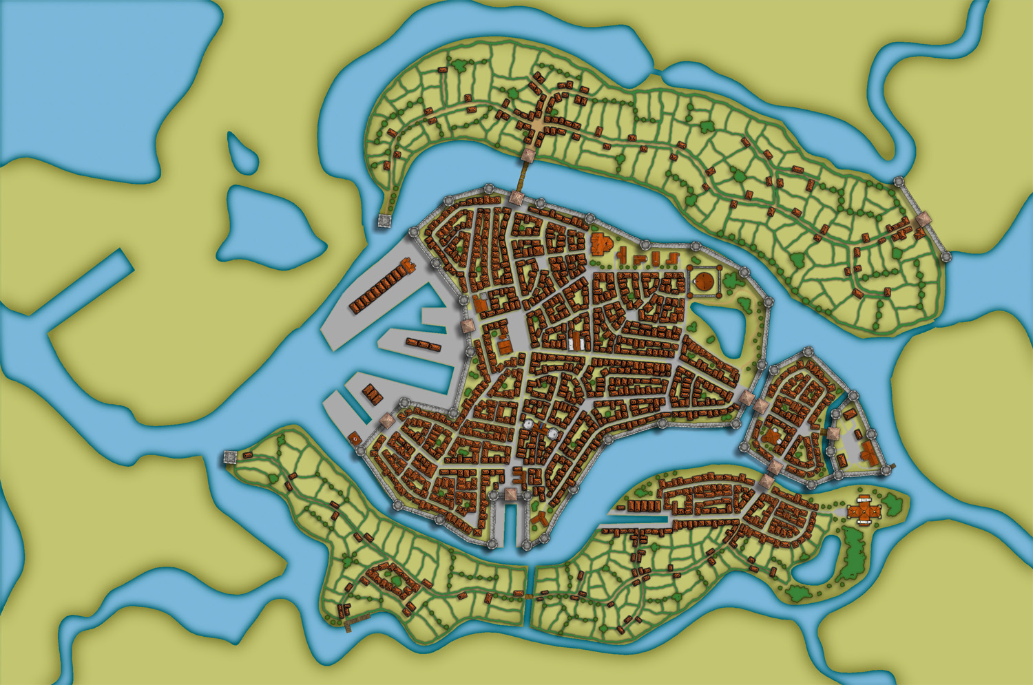
In this post we will create the outskirts of the city, farmlands and the ruins. First of all you have to decide what parts of the city that will be farmland and what part will be ruins. In this map I wanted to create the feeling that the city is situated in the middle of an old ruined city. The two closest islands to the east and west of the city will consist of farmland. Those areas are close to the city and will be easy to protect as well. On the north part of the western island you can also see that a part of the old city wall has been taken into use again, to protect the city from whatever hides outside.
When I create farmland I always start by putting in all the roads and houses. Usually you will have a cluster of houses just outside the city gates, the further away you get from the gates the more space you will have between houses. I then select the city hedge drawing tools and start to mark out the area where the fields will be. I’m actually using the same technique here as I do when I’m making smaller towns. For a more thorough explanation on how I draw the fields see my Mapping a small town part 4 post over at my mappingworlds blog.
When I’m done with all the fields the map looks like the picture below, so still some ruins to place.
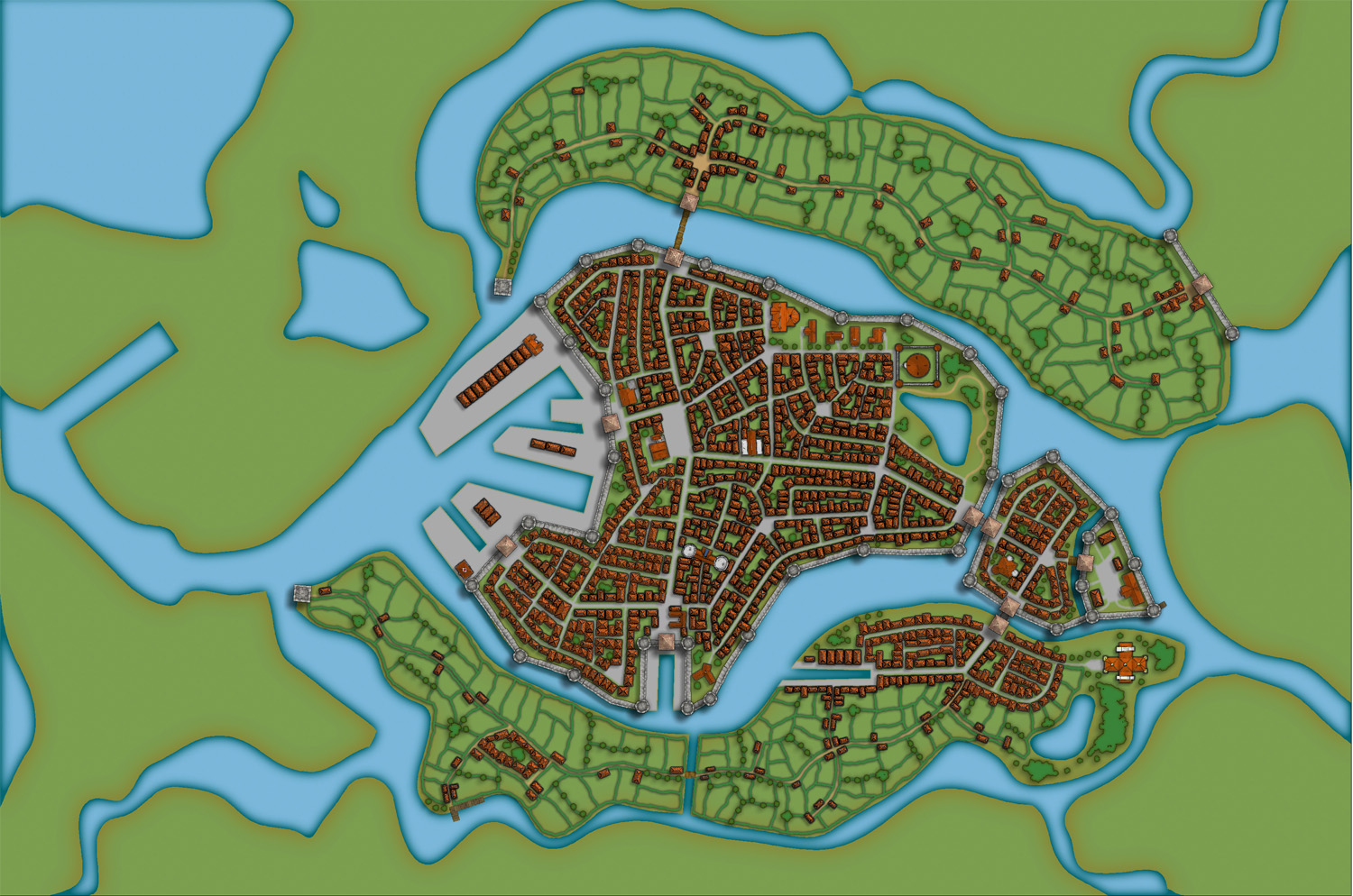
To complete the fields in the map I also export a map from CD3 where all the land is yellow. In this way I can combine them in Photoshop and paint in some yellow fields among the green ones. This will give you a more natural look than if the fields are just green. See my Mapping a small town part 6 post for more info on how to do this. The yellow version of the map looks like the picture below.
You can of course add in all the yellow fields in CD3, but I’ve found that to be a lot more time consuming then doing it by combining the two pictures above in a third party program. This program doesn’t need to be Photoshop, use the program that you feel comfortable with.
The next step would be to add in some ruins in the picture. Here I must say that CD3 didn’t really have any good styles to work with to get the look I wanted, so I had to make something up myself. Creating a completely new style wasn’t something I felt I had the time or knowledge to do, but I think a good ruined city style would be a great style add on in a future Annual. Sure you have some ruins in the program that you can use, but for me a ruined city mainly consists of the foundations of the houses and maybe some larger, more intact, buildings.
So I decided to draw in some random roads and houses using the CD3 B Ruins Grey buildings. They’re not perfect, but they are a good base symbol to continue working from.
When I’ve put in all the roads and larger buildings in the map I’d export it again from CD3. This means that I now have three different versions of the map, which I’m going to put together in Photoshop, the two different ones with yellow and green fields and this one with a green background and ruins in the outskirts of the city.
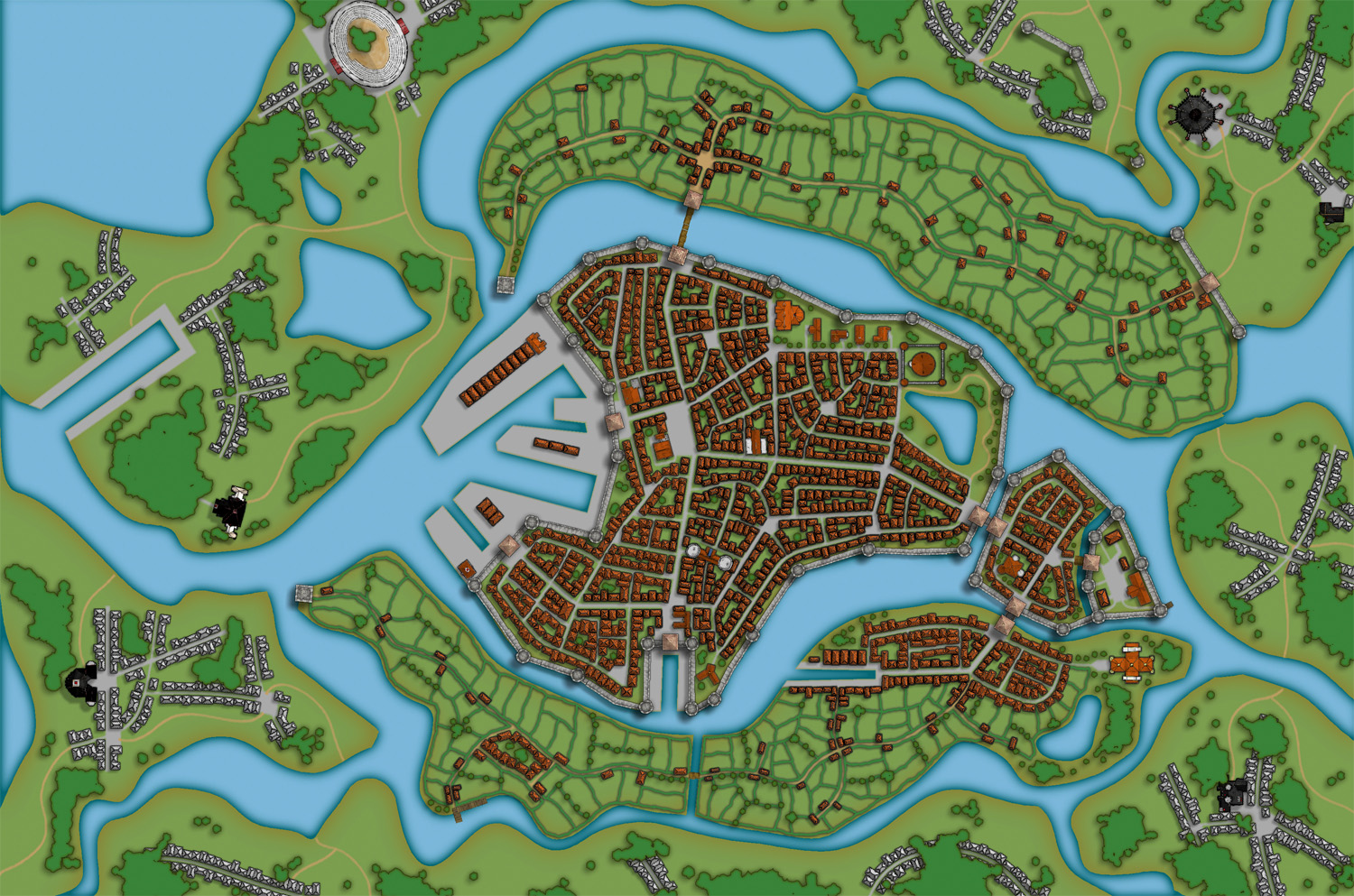
At this stage I had to work on the ruins a bit in Photoshop to make them look more like ruins. If you put the map with ruins in one layer and put it on top of a layer consisting of the map with green fields. You can start to erase bits and pieces from the top layer, when you do this the layer below will be visible instead of the top one. In this way I erased all the inner parts of the buildings, which left something that looked more like the foundation of a house. I also erased parts of the larger buildings to make them look more like ruins with broken roofs and missing walls.

In the picture above you can see a part of the map where you have the ruins as they look in CD3 on the left side, and how they turned out after some editing in Photoshop on the right side. In my opinion the right side looks more like ruins then the left side. Or at least more like the ruins I wanted in this particular map.
Making a City part 1
Making a City part 2
Making a City part 3
Making a City part 4
1 Comment


