Remy Monsen | December 30, 2025 | CC3 Plus, effects
 The cold season is here again, at least in the northern hemisphere, and white stuff is falling down outside my window.
There are a couple of nice styles for making winter maps, such as Winter Trail and Winter Village, but what if you just want to make your overland map look a bit more seasonal?
One of my favorite effects is the RGB Matrix Process. This effects may look a bit complicated if you just look at the dialog, but this is just all about simple mathematical manipulation of the color values. Using this dialog you can strengthen or weaken an individual color component, such as adding more red or less green. You can even completely swap color components around, for example swapping the red and blue components. CC3+ has other ways of manipulating colors too, but none of the other effects can accomplish the same as the RGB Matrix process can.
I’ve already explained the effect in another article a few years back, The RGB Matrix Process Effect, so today I’ll just use it to show you how to give a quick makeover to an existing map, you can read more about the calculations in the linked article.
Continue reading »
Leave a comment
Remy Monsen | January 21, 2023 | CC3 Plus, effects
 In most overland styles, such as the CC3 Mike Schley Overland you’ll find that when you draw a terrain, such as the hills, the edge of your polygon will fade into the land behind it, allowing for a smooth transition between the two. This is of course done by the Edge Fade, Inner effect, and will only be visible as long as effects are enabled.
So, well and fine, but now we want the central part of our hilly area to be mountainous, so we just use the drawing tool and draw us some mountain terrain on top of the hill terrain. But then we notice something, the mountain fill is not fading into the terrain fill beneath it. Now, why would that be? It is on the same sheet as the hill fill (the LAND FEATURES sheet in case of CC3 Mike Schley Overland), and that clearly fades, so what is up here?
The answer to that is simple, effects are per-sheet, not per-entity, so what the Edge Fade, Inner effect is fading the combined outline of all the entities on the sheet, not the outline of each individual entity. In my example case here, the mountain terrain is fully inside the hills terrain, so the outline is here described by the hills terrain alone. If the mountain terrain had been sticking out somewhere, we would have seen that that part of the mountain terrain would have had edge fading applied to it, as would be the case if we delete the hills altogether and just keep our mountains.
So, let us look at how to handle this. Continue reading »
1 Comment
Remy Monsen | May 29, 2021 | cc3plus, effects
 One of the most powerful effects in CC3+ is also the least used one. And that is kind of understandable, because it is also one of the more complicated ones. So in this article, I’m going to give you a bit of an introduction to the Spatial Matrix Process (SMP) effect (Not to be confused with the RGB Matrix Effect).
SMP is a custom filter where you have a lot of control over what the effect will do, it doesn’t have a pre-defined purpose like the other effects, but can be used to create a variety of different effects. Note that some of the results you can accomplish using this effect is already implemented as separate effects, such as blur.
Continue reading »
1 Comment
Remy Monsen | January 30, 2021 | cc3plus, effects
 In my latest live stream, I did use the RGB Matrix Process effect quite a lot for changing the colors of fills ans symbols. I this article, I’ll dive a bit more into this effect and describe it in a bit more detail.
The effect itself is just a basic color-replacement effect, but all those text fields with numbers can look quite a bit daunting when you open it up for the first time, but you can use it to make some nice results. You can see some examples in this older blog article where I also touch briefly on this effect, but today I’m going to explain it in a bit more detail.
Continue reading »
3 Comments
Remy Monsen | July 25, 2020 | Campaign Cartographer, CC3 Plus, effects, Lighting
 So, here you are, having just prepared the main location for tonight’s adventure. But then it dawns on you, you have no idea when players will actually visit this location. They may even drop by multiple times.
Well, today we’ll be having a look into how to set up effects to it is easy to switch between day and night views of the same map. In the day scene, we will be using regular wall shadow effects to have the buildings and symbols cast shadows, while the night seen will use the point light system in CC3+ to have light sources in the scene that causes the symbols to cast shadows. We will be using this to show how symbols around a fire casts shadows away from the fire, and how we can have lights coming from the windows.
Continue reading »
Comments Off on Day & Night
Remy Monsen | May 13, 2019 | CC3, effects
Whenever you add a new effect to a map in Campaign Cartographer, you are presented with a small choice about which effect units to use. In these article, I’d like to talk a little bit about these choices, what they really mean, and which setting to pick in each situation.
In general, the effects units affect how you specify effect sizes, such as the width of an edge fade, the length of a shadow and so on. It does not affect the strength of the effect (although changing the size of an effect, such as a glow, will indirectly make it feel stronger as well).
The three available settings are
- Percent of View Width
This setting makes all effect sizes depend on your current view. This means that effects will actually change as you zoom in and out of the map.
- Map Units
This setting means that all effect sizes are absolute, and expressed in the same units as your map is in. For example, a (non-metric) dungeon map is expressed in feet, so this options means that the sizes of the effects is expressed in feet as well.
- Percent of Drawing Extents Width
With this setting, the size of the effects depends on the size of your actual map. For example, if you set the length of a shadow effect to 1, and your map is 400 map units, than shadows will be 4 units long (1% of 400 is 4). As above, what a unit means is based upon your map type, for example feet in a dungeon or city map.
So, let us look into what the different settings are most appropriate for, along with some examples.
Continue reading »
2 Comments
ralf | April 26, 2019 | effects, overland maps, Sheets, Sue Daniel, user tutorials
The Continent of Dorina

A brief note about this article
The main reason I have never written about the special effects I use in my maps before now is because they have to be applied differently on each new map I draw. Differences in map style and the random variability of the way I chose to warp the colour scheme each time have made it very hard to nail down any particular method to the point of there being a right or a wrong way of doing it, and it’s nearly impossible to make a definitive set of instructions when nothing is set in concrete. I have often used similar combinations of effects on similar sheets in different maps once I discovered a useful result by experimentation, but I don’t think I have ever used exactly the same settings on any two maps. So what follows is more a train of thought and an explanation of my method as I develop two example maps of the same place in two different styles in tandem. However, and having said that, there are a few simple instructions on how to generate and process sea contours in the first of the special effects to be described.
This article focuses on two versions of the continent of Dorina shown above in the Mike Schley style (MS) and the Herwin Weilink style (HW). I have chosen these styles because they are available to all CC3 mappers, and because they are so different in nature that the special effects will have to be applied differently to each one. By describing this process and providing the finished FCW files for reference purposes, I hope that those of you who have requested tutorials about how to get similar special effects to mine in their own maps may at the very least gain some useful information and ideas.
The effects I will be working on in this article are oceanic contours, global colour shifts, contrast adjustments, snowfields and something I’ve called ‘midnight’, which entirely changes the nature of the map in a way that makes it vaguely reminiscent of a view seen under brilliant moonlight.
First off, then, I should probably start with the basic stuff – how much I have already warped the default styles to produce the initial maps before we get started on the special effects. Please note that for some reason I set the scale of these maps completely wrong, but it was too late to go back and start again by the time I got to the finishing touches. I didn’t realise until I was adding the scale bar and it was out by a very large factor.
 Dorina – MS
The MS style is beautiful in its clean and radiant pastel colours. Unfortunately for me it is those very same pastel shades that make doing the kind of special effect I do quite difficult to achieve on an MS map. While I can appreciate the loveliness of many very different styles my personal taste tends more towards richer, darker colours. If you open the Dorina – Mike Schley.FCW file you will see that the sheets have been dramatically altered, so that while I tried very hard not to take it too far away from the intended appearance as to be unrecognisable as an MS map, I have used lots of Adjust Hue/Saturation and RGB Matrix effects. I have also swapped out some of the textures for others in the same set and changed their colours accordingly. I love the grassy texture of the Marsh_MS fill, and so I have abused it by using it for anything that is at all grassy in nature. There are other fills I’ve substituted, but even though I’ve bashed it about quite badly (and I cringe to think of what the purists would say) all the fills are MS fills and part of that style. There is nothing there that doesn’t come from the Mike Schley mapping style.
 Dorina – HW
You might think the HW style is made for me, with my already stated preference for darker, richer colours, but my taste is less subtle and a couple of degrees lighter in tone. I have done exactly the same thing with the HW map as I’ve done with the MS style – lots of colour changing sheet effects aimed at making everything a little brighter than before. I haven’t swapped out so many of the fills, but I do very much like the grassland fill and I’ve used it in several shades on different sheets. There are couple of sheep and cows and a horse that remain from the MS version where there is no HW equivalent.
Continue reading »
Comments Off on Special Effects I: Oceanic Contours, Colour shifts and contrast adjustments, Snowfields, and Midnight (by Sue Daniel)
Remy Monsen | October 9, 2018 | CC3, effects, fills
CC3+ comes with a bunch of fills, and with the official and un-official add-ons out there, you have a large amount of different fills available to you. But no matter how many fills you have, you always find yourself needing something you don’t have (or is that just me?).
In this article, we’ll take a look at some ways to get more out of your existing fills. We’ll look at using effects, layering fills, and manipulating fill scale, all in the name of producing more variety for our maps.
Note that all the techniques here uses the resources already in the map, which means you can still share your map file with others without them getting red X’es due to custom fills.
All images in this article are clickable to see larger versions. This is recommended to see the details properly.
Changing Colors
Both the ‘Adjust Hue/Saturation’ and ‘RGB Matrix Process’ effects are capable of changing the color of a fill style. You can utilize these effects to change the colors to achieve different goals. For example, you can use them to make subtly different shades of grass to break monotony, or you can use them to completely change the color of the grass, for example to make it look more brownish and dried up.
The image below shows how I’ve used the RGB Matrix Process effect to make an autumn version and a dried-up version of the standard Mike Schley style farmlands. A little color change goes a long way to provide a completely different visual look.
 Continue reading »
1 Comment
Simon Rogers | January 30, 2013 | effects, overland, Tutorial
[Ed’s Note: Let us know if you like this style, and with Flavio’s permission, we’ll create an Annual from it]
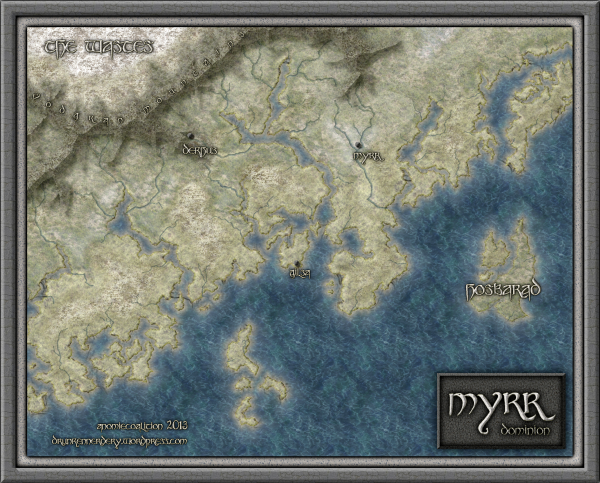
My fiancée recently asked me if it would be OK to make a Viking character for my Al-Qadim campaign. I thought about the role playing possibilities for a moment: Viking gets lost at sea en route to pillage and plunder; Viking gets shipwrecked in hostile desert environment; Viking PC makes for a very interest game indeed. I then thought about where such a Viking would come from in my world and set about creating a map of his home.

Myrr is a semi-arctic region largely inspired by Scandinavia, Iceland, and Alaska. I spent a great deal of time looking over maps of their fjords and river systems in the hope that I could create something similar and believable in my own map. After an hour or two tinkering around with the fractal line tool (adding a river here, indenting land mass there, etc), I finally had a landmass and set of islands I could be happy with.
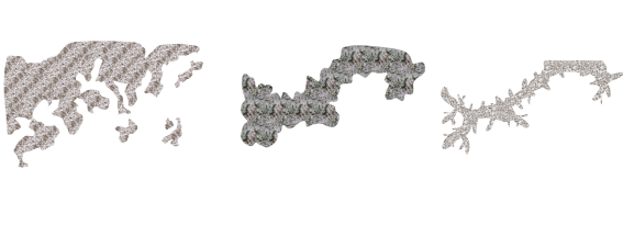
The next step was to create the mountain range. I first drew the main ridge of the mountain and all the little ridges that branch off of it with the smooth poly tool. This is what the looked like without effects on.

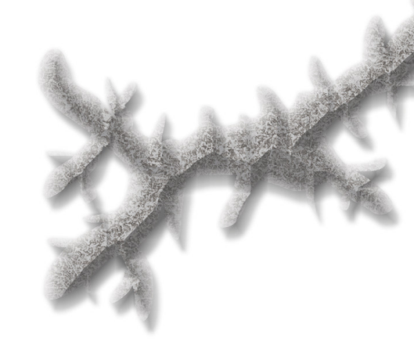
I gave it a rather long and dark wall shadow, a deep edge fade inner (with 75% inner opacity), and a large lighted bevel effect (so that the two sides of the bevel met in the center of the polygon). I then added a Mountain Hills sheet that encircled the range with a smaller edge fade inner and lighted bevel effect. Next, I added a Mountain Base sheet that encircled the Mountain Hills (also with a smaller edge fade inner and lighted bevel effect.) Because I wasn’t thoroughly happy with the colors that were coming out, I finalized it with a Mountain Cover sheet. This shows the details of the effects:

And this is the final mountain range:

As you can see, I also used the Mountain Base sheet to layout my hills. I further added a Hills Base sheet that encircle these hills and had a deep edge fade inner to give the illusion of height. From there I added some forests (very subtle), rivers, text, (about a dozen assorted sheets to get the ocean, landmass and desert looking right) and called it a day. All of the textures came from Herwin Wielink annual and CGtextures.com.
This map was a great deal of fun to make and I learned a new technique for mountains in the process. Of course, the best part is now crafting a history about this region to help fill in the gaps of my fiancée’s character’s back-story. Although I’m far from done, you can check what I have so far (along with a full resolution version of the map) at my blog.
9 Comments
Simon Rogers | July 1, 2011 | Cthulhu, effects, Symbol Set 3
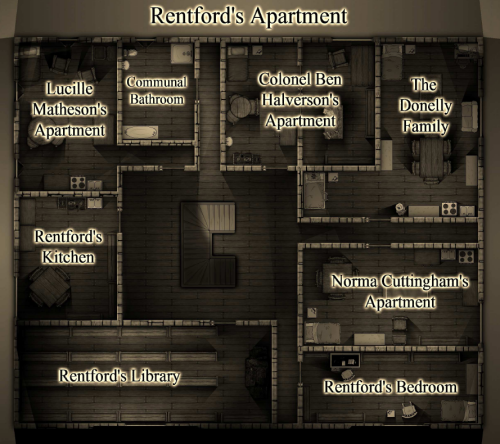
 Forum member Nicholas Hopkins created an atmospheric floorplan for a Call of Cthulhu game. Download the PDF.
He says:
I saw a couple of floorplans in some older mission sourcebooks for Call of Cthulhu and wanted to emulate it as much as possible. I am doing a 1920’s campaign so I wanted it to look a little old fashioned, hence the black and white. It is based on the lighted dungeon template so that the shadows fall the right direction and it gives the rooms a little more texture as there are small, subtle shadows towards the corners of the rooms.
I used the Sepia setting under the RGB Matrix effect and it worked very nicely. Because I didn’t want a background of solid black (never seems to print well) I put in a couple of light sources outside the walls to light things slightly and cast some shadows off the corners of the building. There was some odd effects with the light sources associated with doors and windows so I just made a new sheet called Window Block, made sure that things on it blocked the light sources and was below the Wall sheet so it would disappear, and drew a simple line across the openings. Took care of things nicely. The symbols are a mixture of DD3 symbols and SS3 Modern symbols. They all came out nice looking with the effects turned on.
1 Comment
 The cold season is here again, at least in the northern hemisphere, and white stuff is falling down outside my window.


