Sue Daniel | May 9, 2020 | CD3, city, city design, city mapping, city planning, mapping cities, Sue Daniel
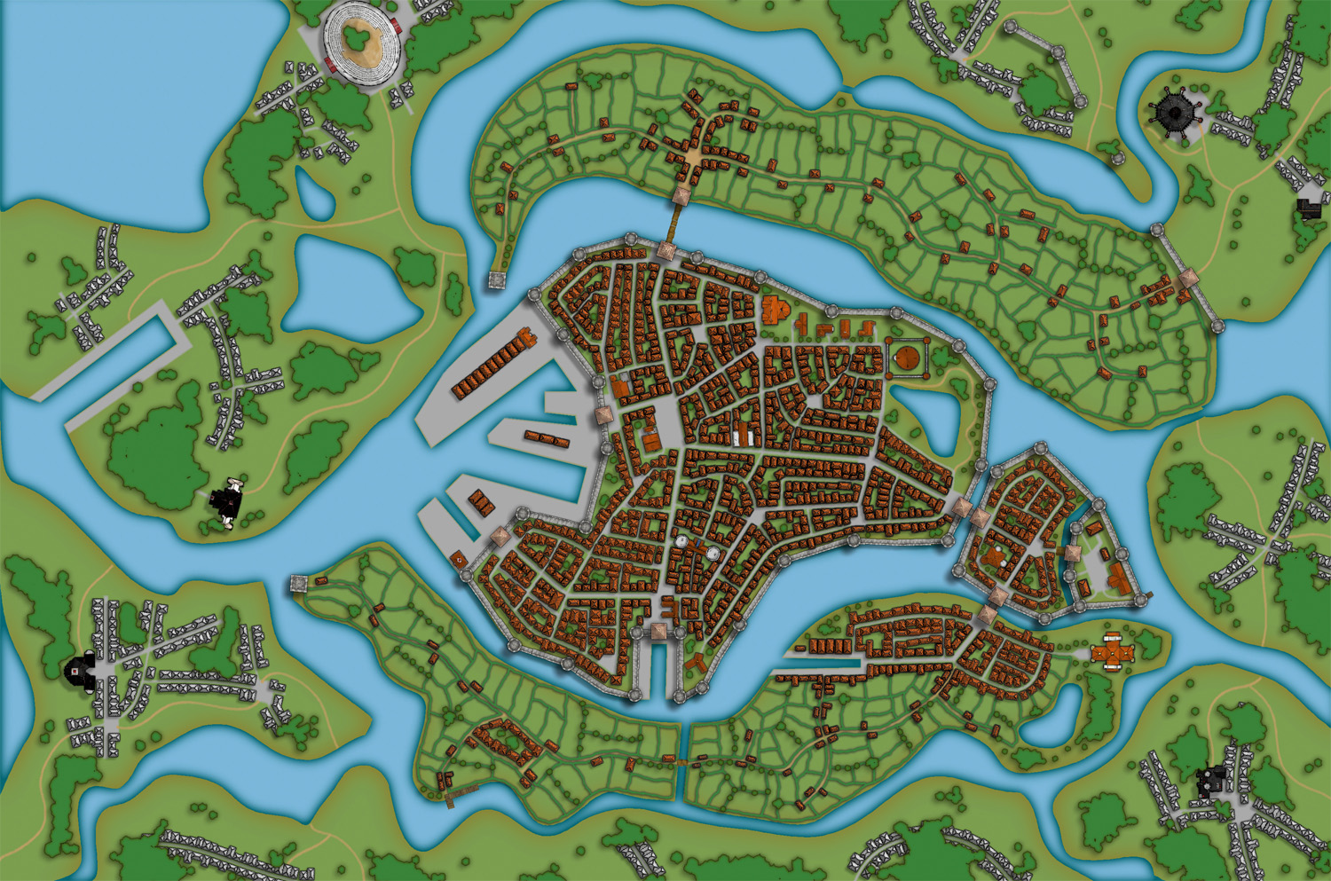
 Welcome to a brief article about the creation of Orde-on-the-Rock (or just Orde for short), in which I will be attempting to answer most of the questions I have been asked about this map since it was first released last year as a new example map for City Designer 3.
Orde was designed as a map to demonstrate what could be done with CD3 without using any additional add-ons or extra art assets.
Over the years I’ve been using CD3 I’ve done lots of cities using only the assets that come with CD3, so to make it more of a challenge for myself this time I decided not to use any of the regular Bitmap A house symbols. In their place I used buildings generated by the Building and Street tools, and added a few shaded polygon constructions for variety. Continue reading »
2 Comments
Clercon | January 30, 2013 | CD3, Par lindstrom, Village

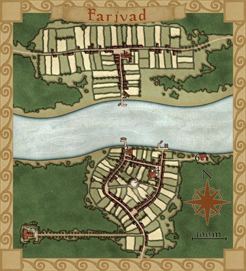
This is my latest map made in City Designer 3 (CD3), plus some effects added in Photoshop. It depicts the village Farjvad in the province Vadsbro and is part of the campaign/adventure I’m working on at the moment, even though I’ve mostly made maps so far.
Farjvad is situated about a day’s trip north east of the main town in the area, Vadsbro. Farjvad won’t actually be of importance for the adventure I’m writing, but it will still be a part of the campaign information. As you might have noticed I like to make maps, and making the adventure/campaign gives me some good reasons to do that. I also figured out that if I only have maps of the villages where the adventure takes place the players will rather quickly figure out what places are of importance and which ones are not. Also this will make the adventure feel much more unscripted if the players can go wherever they pleasein the area and the GM will have a nice map of the place.
So how did I go from a blank page to a finished map? What shall you think about while making a village map? First of all you have to decide where the village is situated, is it in a forest or a desert? The environment gives as well takes away possibilities for the map. In my case I know from the overland map of the province Vadsbro that Fjardinge is a village that is founded on two sides of a river, only connected via a ferry in the middle of a large forest.
I also decided that the south part of the village was the old one and that the north side is the new part where recent expansion of the village has taken place. Because that the village is situated in the middle of the forest there had to be some place for the villagers to go for protection if some kind of crises turned up. In this case I put a keep (nr 5 on the map) where the governor of the village used to live with his soldiers, maybe ten of them at a max. I could have gone with a palisade but in this case it didn’t feel right.
I also added a temple (nr 4), all places must have somewhere to go for religious need. The ruined temple (7) just outside the village was deserted when the new temple was done. What resides there today is up to the GM to decide.
Nowadays most travelers are using the northern road that leads from Vadsbro to the village Klyvholm. For this reason a newer part of Fjardinge has been built on the northern side. To make the sides differ a bit I decided to make the fields more square here, like they’ve been planned a bit. The big house at the square (nr 1) will also house the governor of the village (he decided to move here from his keep on the south side).
What I’ve actually have done here is making a story around the village and letting the story lead the way while mapping. I think I’ve stated this before but having a story in your head while mapping usually makes your maps more interesting, which means a better end result. It is also a lot more fun to map when you have a picture in your head of what the place looks like, it is like seeing your ideas come to life.
Originally posted on mappingworlds.wordpress.com
Comments Off on Farjvad
Clercon | December 10, 2012 | CD3, city, Par lindstrom

When I grew up I used to play a lot of Role playing games and especially I played a Swedish game called Drakar & Demoner (Dragons &Demons). Most of the adventures they released took place in a campaign world called Ereb Altor. At that time I thought the world was one of the coolest places for an adventure that existed, and I must say that the maps I saw then and the adventures I read really has influenced me a lot.
As I might have mentioned earlier making maps is my hobby, during the days I work as an IT-engineer, so mapping is something I do in my spare time. For that reason I’m very restrictive when it comes to taking up commissions, making maps for someone else means that I can’t make them for myself. But when I realized that the world Ereb Altor still was alive and that people still actually were working on new material I just couldn’t turn it down.
So after a short introduction to the people running the site I was asked to do a map of Kartotum, the capital city of Palinor. Making this city however turned out to a bit of a challenge. So far all of my city maps have been done in City Designer 3 (CD3) from Profantasy, a great program when it comes to make cities. However the program has its weak sides, and one of those is that it works best when it comes to making cities without too much elevation. Of course you can draw some elevation in the program, but not in a way that I wanted to do it.
You see Kartotum is situated on the slopes of a mountain so it is surrounded by great cliffs, and to draw that in CD3 was something way out of my league, if it’s even possible. So I decided to make the city and all the houses in CD3 and then draw the cliffs by using a combination of both Artrage pro and Photoshop. But to do this I first had to mark out the area in CD3 where the cliffs would be. To do this I added a green colour, different from the actual grassland, where I later would add the cliffs, as you can see in the map below. In this way I could place the symbols correctly in CD3.

When the city was done in CD3 I exported the map and opened it up in Photoshop. In Photoshop I added the black lines for the cliffs and saved the image as a .PSD file. The actual shadows around the lines I decided to add in Artrage Pro. The water colour brushes in that program are absolutely fantastic and in this way I could get the shadows exactly as I wanted them. I also added the colour of the cliffs in Artrage before opening the file in Photoshop again to add some finishing shadows and light effects.
Working on this commission has teached me a lot when it comes to adapting to some one else’s ideas and opinion and I must say that in some ways it’s even more relaxing doing maps for someone else than yourself. Suddenly you don’t need to come up with all the story and explanation to all the stuff you make. That is someone else’s headache.
Originally posted on mappingworlds.wordpress.com
Comments Off on Kartotum
Clercon | November 19, 2012 | Annual, CD3, city, Par lindstrom

As you might have noticed I really like to make city maps. I don’t know why but I just love to see how a blank paper slowly turns into crawling streets and vast parks. It makes my imagination really spin.
Most of my city maps I make in the program City designer 3 (CD3) from profantasy. It is a great program with a huge toolbox you can use to make the creation of your cities a much smoother experience. To make the maps more unique I also like to edit them a bit in Photoshop afterwards.
When I bought CD3 my first impression of the program however was quite different. You can easily describe it in one word, overwhelmed. Just the sheer number of tools and objects made me fear for my mental health. The first time I started the program I think I just closed it immediately.
So how did I go from there to where I am now? Well the answer can actually be divided in three parts. First of all practice. I started out quite small with a little village and first after a couple of small practice maps I went for the bigger cities or towns. Secondly I looked up some tutorials, especially Gandwarfs tutorials over at the cartographer’s guild where extremely helpful. Thirdly there was a black and white city style released in the 2010 annual from Profantasy.
So what was so great with the black and white city style? First of all you get a very nice tutorial in every edition of the Annual, this makes it very easy to learn a new style, you can just follow the steps described. For me this meant a lot when it came to learning CD3, because I could in this way quickly pick up the different tools to use.
Secondly the amount of objects decreased quite a lot in the black and white city style compared to the coloured styles that were included in the actual program. This might sound a bit odd but the good thing here was that suddenly the program didn’t feel as overwhelming as before. When the choices in objects decreased, it kind of made it easier to grasp the program and find what you were looking for.
The map included in this post is a map that I made while trying to learn CD3. It was one of my first experiments to make a really large city map. I especially experimented a lot with the random street tool in this one. The random street tool is really a great help when you quickly need to fill and area with many houses.
When I was done in CD3 I opened the file in Photoshop and added some cliffs on the northwest side of the city. I also draw my own arena object to add to the city, I really missed that object in the style. As a finishing touch I made the map sepia coloured and placed the map on a paper background.
Well after that I just continued doing city maps and slowly the interface started to make sense and nowadays I rather feel that the there are too few objects in the program then too many 
Originally posted on mappingworlds.wordpress.com
1 Comment
SteveDavies | May 8, 2012 | CD3, city, city design, mapping cities, Tutorial
Up to now we’ve mostly been working inside the city walls, where space is short and buildings necessarily packed

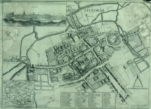
Historic map of Oxford in 1643
closely together. We’re now going to turn to the area outside the walls. In this installment, we’re going to turn back to some theory.
First we need to talk about why businesses decide to set up outside the walls of the city. After all, they are forgoing the protection that walls bring, so there must be some good reasons for it. It turns out the reasons are pretty simple:
- Avoiding authority: This is monetary, avoiding taxes, but also includes regulation, attention of the town watch, even to avoiding the prying eyes of neighbors. The city’s authority ends with the city walls, and some people find their business flourishes where there is less oversight.
- Accessing markets: Gates into the city are notorious choke points for people entering the city. The gates typically only open at certain times, guards ask questions, and just the physical size of the gate all conspire to leave large numbers of people waiting outside to get in. And where there are large numbers of people waiting or stranded, there is money to be made selling goods and services to them.
- Space: In many cities, space is at a premium. So businesses that require lots of space such as cattle markets, or that need space from neighbors, such as tanners, will often set up outside the city walls.
Continue reading »
1 Comment
Clercon | May 3, 2012 | CD3, city, city planning, Par lindstrom, Tutorial
Originally posted on mappingworlds.wordpress.com
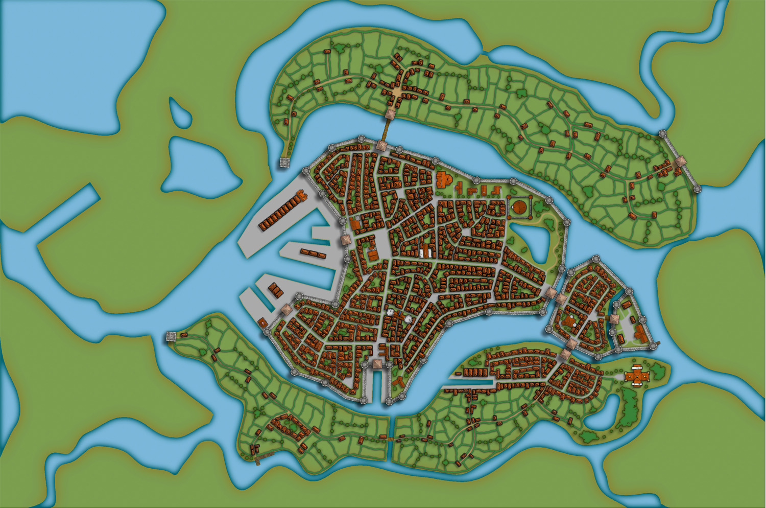
In this post we will create the outskirts of the city, farmlands and the ruins. First of all you have to decide what parts of the city that will be farmland and what part will be ruins. In this map I wanted to create the feeling that the city is situated in the middle of an old ruined city. The two closest islands to the east and west of the city will consist of farmland. Those areas are close to the city and will be easy to protect as well. On the north part of the western island you can also see that a part of the old city wall has been taken into use again, to protect the city from whatever hides outside.
When I create farmland I always start by putting in all the roads and houses. Usually you will have a cluster of houses just outside the city gates, the further away you get from the gates the more space you will have between houses. I then select the city hedge drawing tools and start to mark out the area where the fields will be. I’m actually using the same technique here as I do when I’m making smaller towns. For a more thorough explanation on how I draw the fields see my Mapping a small town part 4 post over at my mappingworlds blog.
When I’m done with all the fields the map looks like the picture below, so still some ruins to place.

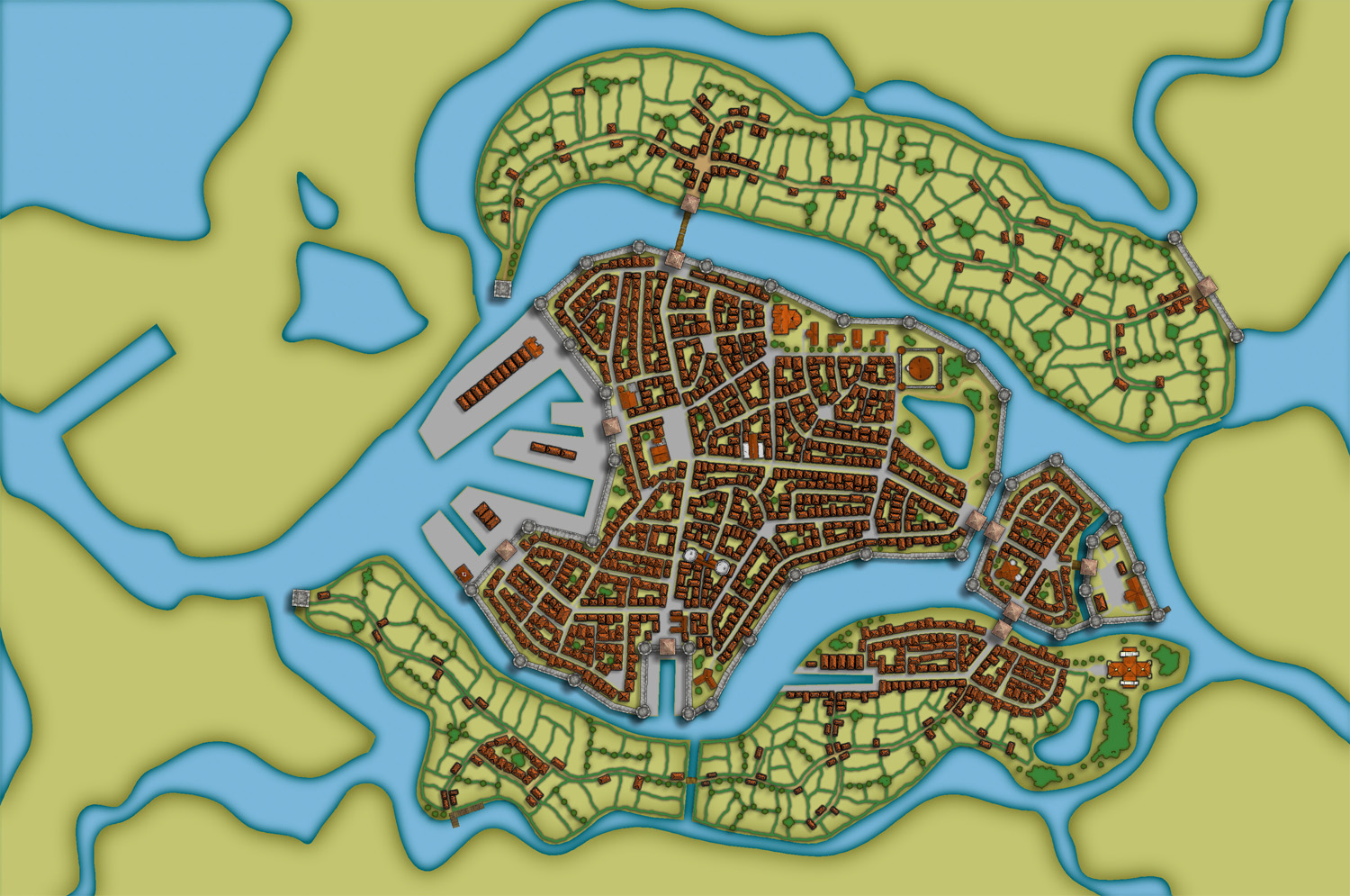
To complete the fields in the map I also export a map from CD3 where all the land is yellow. In this way I can combine them in Photoshop and paint in some yellow fields among the green ones. This will give you a more natural look than if the fields are just green. See my Mapping a small town part 6 post for more info on how to do this. The yellow version of the map looks like the picture below.

You can of course add in all the yellow fields in CD3, but I’ve found that to be a lot more time consuming then doing it by combining the two pictures above in a third party program. This program doesn’t need to be Photoshop, use the program that you feel comfortable with.
The next step would be to add in some ruins in the picture. Here I must say that CD3 didn’t really have any good styles to work with to get the look I wanted, so I had to make something up myself. Creating a completely new style wasn’t something I felt I had the time or knowledge to do, but I think a good ruined city style would be a great style add on in a future Annual. Sure you have some ruins in the program that you can use, but for me a ruined city mainly consists of the foundations of the houses and maybe some larger, more intact, buildings.
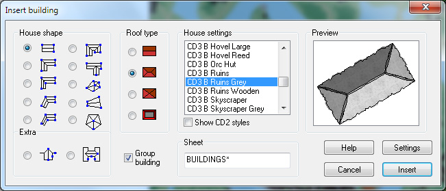
So I decided to draw in some random roads and houses using the CD3 B Ruins Grey buildings. They’re not perfect, but they are a good base symbol to continue working from.

When I’ve put in all the roads and larger buildings in the map I’d export it again from CD3. This means that I now have three different versions of the map, which I’m going to put together in Photoshop, the two different ones with yellow and green fields and this one with a green background and ruins in the outskirts of the city.

At this stage I had to work on the ruins a bit in Photoshop to make them look more like ruins. If you put the map with ruins in one layer and put it on top of a layer consisting of the map with green fields. You can start to erase bits and pieces from the top layer, when you do this the layer below will be visible instead of the top one. In this way I erased all the inner parts of the buildings, which left something that looked more like the foundation of a house. I also erased parts of the larger buildings to make them look more like ruins with broken roofs and missing walls.

In the picture above you can see a part of the map where you have the ruins as they look in CD3 on the left side, and how they turned out after some editing in Photoshop on the right side. In my opinion the right side looks more like ruins then the left side. Or at least more like the ruins I wanted in this particular map.
Making a City part 1
Making a City part 2
Making a City part 3
Making a City part 4
1 Comment
Clercon | April 16, 2012 | CD3, city, city planning, mapping cities, Par lindstrom
Originally posted on mappingworlds.wordpress.com
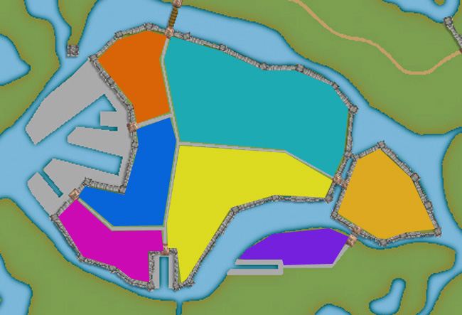
We now have the basic layout of the city. Next step is to put in more roads and try to decide where to place the majority of buildings. Sometimes when you create a large city the process of placing all the houses can be overwhelming. To make this easier I try to divide the city into smaller areas. I then place the houses one area at the time. In this way you divide the work into smaller goals that you can reach quite quick. It will make the whole process much easier. In the picture below you can see how I’ve divided the city of lost souls into seven areas to fill it with houses. Make every area interesting by adding a major house, villa or temple in it. It will add some details to your city and will make the end product more fun to look at.

At this stage I also try to locate where the major squares will be, naturally they will be situated where the large roads meet up. I also like to add some smaller squares in front of the gates, usually this is where people have to wait to get in and out of the city. You also have to decide what density your city will have. Nearly all cities have some sort of park or green area, older cities could actually have quite a lot of farmland inside the walls. In this case how ever the farmlands are outside the city walls.
When I start to place the houses I zoom in and out to quite a lot to check the progress of the area I’m doing to make sure that the network of roads and houses looks natural. A good thing to think about is if the area you’re making is planned or if it has grown over time. To understand the difference in how a planned city looks compared to one that has grown over time you can look at some modern cities in USA (for example New York) and compare it to some older ones in Europe (for example Venice). The planned ones tend to have straight roads in squares and the grown ones usually have roads and city blocks in all kind of versions. At first you can’t really see any logic in the city construction, but after a while you will start to see that roads lead between squares and larger empty areas usually consist of an important building and its surroundings.
When I start to map an area I always start with the roads. First I add in some larger main roads, I then switch to a smaller road to make intersections between the larger roads. In the picture below you can see a nearly finished inner part of the city. I’m working on the last area and have put in the roads and squares. The squares I try to place in areas that feel natural. Also try to have some space between squares, a square is a place to meet and trade, so they will be evenly spread out in the city.

When I add houses to a city or town I always start by using the Random street tool. The ability to quickly add all houses on a street is one of City Designer 3′s best advantages. When you’ve added a lot of streets it isn’t always possible to use the Random street tool everywhere, in those cases I add the houses one by one. Sometimes you also have to go back after adding houses with the Random street tool and delete houses that don’t fit in for one reason or another.
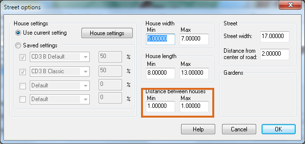
When I use the Ramdom street tool I try to make the houses come as close to each other as possible. To do that you have to change the settings a bit. Right click on the Random street tool icon and in the street option window you click the Street settings button. The settings I used for the map you can see in the picture below.

The most important setting is the Distance between houses that I always set to 1, both as Min and Max value. In this way you will get the houses as close as possible togehther. The other values depend on the scale of the map that you’re doing. You have to try some different settings here and see what works out.
When you’ve added houses to all your areas in the town you are done with the central parts of your city. Don’t forget to zoom out once in a while and check that the streets look good. I often have to go back and add some more roads to make the city more crowded. In the next post we will start on the outskirts of the city, farmlands and ruins.
Making a City part 1
Making a City part 2
Making a City part 3
Making a City part 4
Comments Off on Making a City part 3
Clercon | April 5, 2012 | CD3, city, city planning, mapping cities, Par lindstrom
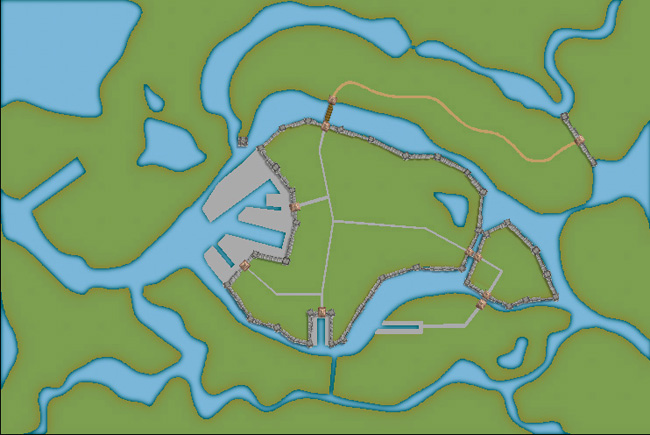
Okay, so far we have the landscape where the city will be situated. When creating the City of the Lost I combined graphics from three different styles in City designer 3. First of all the actual landscape, which is what we have at the moment, is made in City style A. Later on when I add in houses I mainly use the graphics from City style B. The reason for this is that those houses looks more painted then the one in style A. which look more 3d generated. Which one to prefer is up to you, but in the maps I do the style B graphics are better suited. In this map I’m also using some graphics from the Profantasy March annual, Jon Roberts city style. In that style I’m especially fond of the city walls and towers. However the walls in this style are a bit harder to place due to being built from a static graphic file. So you have to watch the corners because they tend to create some gaps there. A good way to hide this is to place a tower on the “bad” spot.
When I start a new town I usually always start by building the town wall and deciding where the gates will be. In this way you will get a clear view and idea on where the majority of houses will be placed, so you can plan ahead and get a good balance in the map. In this particular map we also have three different docks, one larger and two smaller ones. In older cities the docks were often situated outside the city walls. In this way you could both tax the goods efficiently when they were entering the actual city and you also didn’t need to compromise the security of the town. So I’m placing the two docks on the central island outside the walls. The small third dock, however, is situated in an area where you have no walls. This dock is probably used for more local trading, not taking in ships from abroad. The idea with the docks is also that they are remnants from an earlier city that has been reused. So naturally it is around the docks that the “new” city is built.

Now, when we have the walls and gates of the city I put in the main roads. The logic here is that all main roads in a city usually will take you from gate A to gate B. Somewhere in between you will have some main areas like a square or a city hall etc. In this way you will also create some natural boundaries for different districts in your city. It will make it easier for you to plan the next step, adding more roads and start adding houses.
Making a City part 1
Making a City part 2
Making a City part 3
Making a City part 4
Comments Off on Making a City part 2
Clercon | March 29, 2012 | CD3, city, city planning, mapping cities, Par lindstrom
Originally posted on mappingworlds.wordpress.com
In my last post I presented the City of Lost Souls. The idea of the city has been in my mind for a long time as a city that originally was created by outcasts from the ordinary society. Outcasts that in the end have created a powerful city, a city made untouchable because of its location in the middle of a maze like river delta.
In this post and the next couple of post I’ll try to describe the process I’ve developed when I create cities. I don’t say that this is the best way to do it but it is one way to do it. To exemplify the process I’m using I will use the map of the City of Lost Souls.
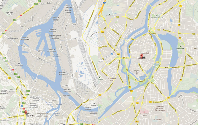
When I decide to make a map it is always easier to start if you can get some inspiration from the real world. One of the best tools you can use is Google earth. You can learn tons of information just by moving around the globe looking at old cities, land formations and following rivers through the landscape. In this particular case I looked a lot at river deltas and cities situated at the end of rivers.
You will never find anything that will look exactly like the part you want to create, but the idea here is to find real world location that can inspire you, and that you can copy bits and pieces from. In this way you can create a map that will look much more convincing than if you just draw something from your head.

I soon found two cities that gave me the right feeling. These cities were Lübeck in the northern parts of Germany and Gdansk in Poland. None of them was perfect but I liked the flow of the river around the old part of Lübeck (as you can clearly see in the map), but this part missed a harbor. So I picked the harbor from Gdansk for the map. I also added in some more rivers to get the feeling that the city really is situated in a river delta.
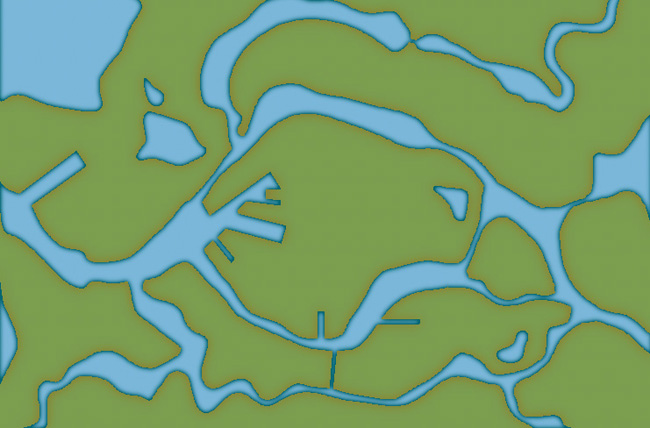
In City Designer 3 (CD3) I then started a new map and started to draw the rivers. During the process I looked at the cities for inspiration but still trying to do something original. While creating the island where the actual town would be I draw the outline of the harbor already at this stage. In this way the shadows between river and land would be right later on. So at this stage I had a quite clear picture on how I would progress with the city. In the picture below you can see the result when all the terrain was done. Next step would be to start on the actual city.

Making a City part 1
Making a City part 2
Making a City part 3
Making a City part 4
Comments Off on Making a City part 1
 Welcome to a brief article about the creation of Orde-on-the-Rock (or just Orde for short), in which I will be attempting to answer most of the questions I have been asked about this map since it was first released last year as a new example map for City Designer 3.