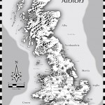
I’ve started to play a simple and easy to understand roleplaying game with my two oldest children (this is also the reason that the names in the map are all in Swedish, they don’t read English). And of course no game can be really appreciated without a world map to look at.
So I decided to make one while trying out the April annual style from Profantasy, made by the artist Herwin Wielink.
It is always hard to start working with a new style, it takes a while just to get used to the style itself. What graphics are included, fields, desert, marshes, rivers, forests and so on. A good thing is to just create a couple of test maps to get used to the style, to get the feeling of it. In this case I did that, but not only on purpose. I’ve read on a lot of places that people complain that CC3 can be a bit unstable, that it sometimes crashes a lot.
Well I’ve never experienced that, apart from with one of my more ambitious projects where the actual file grew too large for CC3 to handle. But with this particular style I actually had two crashes where I had to restart the whole project from the start again. That has never happened before and it was probably just a coincidence that it happened now, but I guess that the end result ended up better because of this. You can say that I learned from the mistakes in the two earlier maps, so I didn’t need to repeat them in the final map. [Editor’s notice: If you ever lose your map, look for autosave.fcw in your CC3 folder.]
The graphics in the style are absolutely gorgeous and mountains, forests and other symbols really melt into the background in a great way that kind of hides the fact that the map is made in CC3. The only other CC3 style I can think of that accomplishes this as good as this one is the 2011 March annual overland style by Jonathan Roberts.
I also like the colour palette a lot in the style. Sometimes I think that maps made in CC3 can be bit cartoonish when it comes to colour, this particular style though has a really nice dark feeling about it. I like that.
Overall the style was very easy to use, the selection of textures and symbols are vast so you can really get some great variation into the map. And variation is very good if you want to make a map that is unique and nice to look at.
As usual I’ve done the labeling in Photoshop, I just can’t get it to work satisfactory in CC3, but that is probably because of me and not the program. The font is the same though as the one included in the style.
(Originally posted on mappingworlds.wordpress.com)


