Remy Monsen | August 30, 2020 | Campaign Cartographer, CC3, collection, symbols
 One of the features for CC3+ symbol catalogs is the ability to arrange these into groups, and then set this group to place random symbols from the group, or apply random transformations to them, like rotations or minor scaling to give variety to otherwise identical symbols.
But, what if you are making a particular map, and you need some other kind of grouping? For example, when placing trees you want to randomly place Decid, Pine and Jungle trees among each other? There are no predefined group like this in most symbol catalogs. Well, for that you can quite easily set up your own personal random collection just for the current map (or you can save it into a symbol catalog if you want it available later).
Continue reading »
Comments Off on Advanced Symbols – Part 3: Custom Symbol Groups
Remy Monsen | May 13, 2019 | CC3, effects
Whenever you add a new effect to a map in Campaign Cartographer, you are presented with a small choice about which effect units to use. In these article, I’d like to talk a little bit about these choices, what they really mean, and which setting to pick in each situation.
In general, the effects units affect how you specify effect sizes, such as the width of an edge fade, the length of a shadow and so on. It does not affect the strength of the effect (although changing the size of an effect, such as a glow, will indirectly make it feel stronger as well).
The three available settings are
- Percent of View Width
This setting makes all effect sizes depend on your current view. This means that effects will actually change as you zoom in and out of the map.
- Map Units
This setting means that all effect sizes are absolute, and expressed in the same units as your map is in. For example, a (non-metric) dungeon map is expressed in feet, so this options means that the sizes of the effects is expressed in feet as well.
- Percent of Drawing Extents Width
With this setting, the size of the effects depends on the size of your actual map. For example, if you set the length of a shadow effect to 1, and your map is 400 map units, than shadows will be 4 units long (1% of 400 is 4). As above, what a unit means is based upon your map type, for example feet in a dungeon or city map.
So, let us look into what the different settings are most appropriate for, along with some examples.
Continue reading »
2 Comments
Remy Monsen | April 4, 2019 | CC3, Tome
 A new update to the Tome of Ultimate Mapping have just been published. If you already own the Tome for Cartographer 3+, just go to your registration page and download the new and updated installer. It can be used both to update a previous install or for a new install. If you don’t own the Tome yet, check it out in the ProFantasy store >>>
The Tome is now 760 pages of descriptions, tutorials, helpful guides and technical information about CC3+, all it’s add-on products as well as Fractal Terrains 3, accompanied by a lot of support files, such as example maps, step-by-step maps for the tutorials, and other helpful files.
What’s New?
The old version already contained a considerable amount of material, but CC3+ and it’s add-ons have evolved since the previous Tome release, so I did find a bunch of new things to add to this version, in addition to some general improvements and issues fixed.
- 50 more pages of content
- Completely revamped the list of commands. It now contains every command in CC3+, both built-in commands as well as the macros shipped with the program. All commands are described, and all commands that can be used in a macro have their full macro syntax The lists in the book itself contains all the commands you will ever use for CC3+, while a spreadsheet found among the support files also contains deprecated and outdated commands. The spreadsheet is of course fully sortable by command name, add-on or category.
- New commands added to CC3+ have been documented, these include; Symbols In Area, Contours, Exclusion Commands, Perspective Scaling, Simplify and more.
- Added a pdf file showing the graphics and names of all toolbar graphics, very useful if you customize the toolbars.
- Annual reference is up to date with the complete 2018 annual.
- The chapter on Dioramas (and the support files) have been updated to Dioramas 3 (From Dioramas Pro in the old version)
- The Source Maps series (Castles, Cities, Temples, World War 2) have been updated to be compatible with CC3+, so the corresponding chapters in the Tome have been updated to match.
- Added a mini-chapter on the new Token Treasury series
- And many more minor additions and fixes….
Comments Off on Tome of Ultimate Mapping Updated
Remy Monsen | January 6, 2019 | Campaign Cartographer, CC3, commands
Did you know that CC3+ (including all addons) contains over 1000 commands in total? And that new ones gets added with just about every update?
Today, we’ll have a quick look at two of the somewhat more recent commands; Select nearby symbols and Delete nearby symbols. Both these commands are intended to help you manipulate symbols that are near another entity. This can for example help you clean up symbols that are too near a river, or help you select all the houses along your main street, for example so you can change their varicolor.
Below is an example of a forest with a river running through it. On the left image, the trees are obstructing the river, while on the left one, Delete nearby symbols have been run to automatically delete the trees near the river.

Continue reading »
1 Comment
Remy Monsen | October 9, 2018 | CC3, effects, fills
CC3+ comes with a bunch of fills, and with the official and un-official add-ons out there, you have a large amount of different fills available to you. But no matter how many fills you have, you always find yourself needing something you don’t have (or is that just me?).
In this article, we’ll take a look at some ways to get more out of your existing fills. We’ll look at using effects, layering fills, and manipulating fill scale, all in the name of producing more variety for our maps.
Note that all the techniques here uses the resources already in the map, which means you can still share your map file with others without them getting red X’es due to custom fills.
All images in this article are clickable to see larger versions. This is recommended to see the details properly.
Changing Colors
Both the ‘Adjust Hue/Saturation’ and ‘RGB Matrix Process’ effects are capable of changing the color of a fill style. You can utilize these effects to change the colors to achieve different goals. For example, you can use them to make subtly different shades of grass to break monotony, or you can use them to completely change the color of the grass, for example to make it look more brownish and dried up.
The image below shows how I’ve used the RGB Matrix Process effect to make an autumn version and a dried-up version of the standard Mike Schley style farmlands. A little color change goes a long way to provide a completely different visual look.
 Continue reading »
1 Comment
Remy Monsen | August 18, 2018 | Campaign Cartographer, CC3, large to small, Tutorial
 One of the more common questions from CC3+ users is about how to extract a region from a large-scale map and develop this region as a more detailed local map.
The basics for doing this is already explained in the User Manual that comes with CC3+, but for this article, I am going to go a bit more into detail and explain the various tools and processes involved in doing this.
The basic principles behind this operation is to create a new map of the desired size, then copy over the entities from the existing map, trim down these entities to fit the new map size, and finally add additional detail to the new local map. Let us explore the tools and procedure for doing this.
The main tools you’ll need for doing this is Clipboard Copy, Trace, Break and Split, as well as some minor Node Editing.
Let us get started. For this article, I’ll use the example map from the User Manual. You’ll find this map in @Tutorials\UserManual\Example.fcw (remember that the @-sign refers to your CC3+ data directory). My goal is to take the area marked with the red rectangle and develop that into a local map of that area. The marked area here is 30 by 20 miles.
Note that all images in this tutorial are clickable to see higher resolution versions to more easily see what the text describes.
If you are new to this, I also highly recommend loading up the same tutorial map I use and try to follow along with this tutorial, exporting the same area, rather than try directly on your own map. Following along on this map lets you more easily see that things happens the way I describe them, and lets you build familiarity with the tools before starting on your own map.
There is also a video accompanying this article, showing me perform the steps described herein. Note that this video is not intended as a stand-alone video tutorial, but rather as a visual aid to help you see how things are supposed to work. You do not need to watch the video to take full advantage of this article, it is completely optional.
Continue reading »
Comments Off on Large to Small – Going from Regional Maps to Local Maps
ralf | August 27, 2015 | battle map, CC3, Floorplans, ss2
 We are happy to announce the next compatibility update: Symbol Set 2 – Fantasy Floorplans is now available for CC3+. SS2 provides four new drawing styles for dungeon and floorplan maps, made up from over 2,500 new symbols, bitmap fills and drawing tools.
Click on the example map on the right created by Ralf Schemmann. It uses one of the new bitmap floorplan styles included in SS2 in conjunction with a few symbols from Dungeon Designer 3 to create a large-scale battle map of a river canyon. The style, created by graphic artist and designer Peter Gifford, uses highly-detailed almost photo-realistic bitmap artwork for high quality maps. Download a large-scale pdf version here.
Check out the two more pdf examples of maps drawn with the styles included in SS2:
 Smuggler’s Shack (using Peter Gifford’s style exclusively)
Temple of the Fire Demon (using the second bitmap style from SS2, created by Michael Tumey).
If you already own SS2, you can simply download the setup for CC3+ from your registration page. If you do not own SS2 yet, you can get a copy here.
2 Comments
ralf | February 2, 2015 | CC3, Tutorial, user tutorials
 CC3+ is only a few days out and we already have the first user tutorial on the community forum. Malmo3000 modified the new Mike Schley Overland style to create his Skalderand map depicted on the right, and explains his process in this tutorial. Here’s what he has to say:
I recently started drawing with CC3/CC3+. Despite other comments I've read in multiple forums the learning curve wasn't a big deal for me as beginner. In my opinion the most challenging part is to find a way of mapping and thus creating a "own" style that suits you the best. As some of you noticed already in my thread called "Skalderand [CC3+]" I've found my personal "style" of mapping. So I wrote a little step-to-step tutorial for myself to produce multiple maps within CC3+ with a consistent look. In here I use mostly basic stuff and nothing fancy so with the help of the manual you shouldn't have any trouble of following. I really hope this will help other beginners to CC3+ when coming up with their personal style.
Download Malmo3000’s Campaign Cartographer 3+ Tutorial
Comments Off on First User Tutorial for CC3+
Simon Rogers | November 21, 2014 | Campaign Cartographer, CC3, development
The next version of Campaign Cartographer, CC3+, is in late beta. We were hoping for a release this year, but that’s looking less likely. You can read about the new version here. 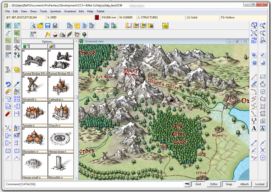
We’ve got two show-stopping bugs to deal with before we release the CC3+ beta to a wider audience.
Who is this audience?
We released Character Artist 3 this time last year, and until 1st January 2014 offered free CC3+ upgrade protection to purchasers. Character Artist 3 users will be able to download the beta version and give us feedback as soon as our two big bugs are dealt with. It’s impossible for us to tell when that will be, but I hope it’s in the next couple of weeks. If you are in this category, we’ll send you an email, and update your registration page with the new version. When the new version is finished, you’ll get a new update.
When this wider beta test is completed, we’ll release the upgrade, but we absolutely don’t want to release it until we are sure it’s solid on all operating systems.
15 Comments
Simon Rogers | January 14, 2014 | cartographers, CC3, CC3 Plus, development, history, Mike Schley
CC3+ incorporates a new complete symbol set from expert cartographer Mike Schley. We’ve worked with a number of professional cartographers to create Campaign Cartographer styles, and the process is now pretty slick. We are either adapting an existing style (as with our recent World War 2 annual issue) or creating one from scratch. This is the process:
1. We take a cartographer’s existing map, or the cartographer develops a new map style, always by creating a small map sample. Here is an early one Mike Schley produced for the new CC3+ overland style.

2. Once we’ve approved this, the cartographer adds more symbols and tools to the example map, and then does more as stand alone files. For a full ad–on or symbol set, this is a very big job. Usually the cartographer works in Photoshop, with layers on, so we can easily extract elements to create CC symbols and drawing tools.
3. Once the map-maker has finished, Ralf duplicates the style in CC, developing the set of drawing tools and adding effects to match the original.


4. Ralf creates the full set of symbol catalogs in all resolutions, with varicolour areas.

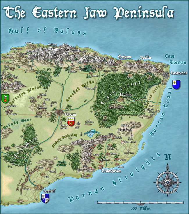
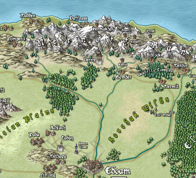
The very first example map we did with Campaign Cartographer was of my campaign setting, the Jaw Peninsula, and we intend to continue this tradition with CC3+. You can see the history of the map here and Ralf has rendered the eastern section of the map in his new style. Click the image for the full high-resolution map.

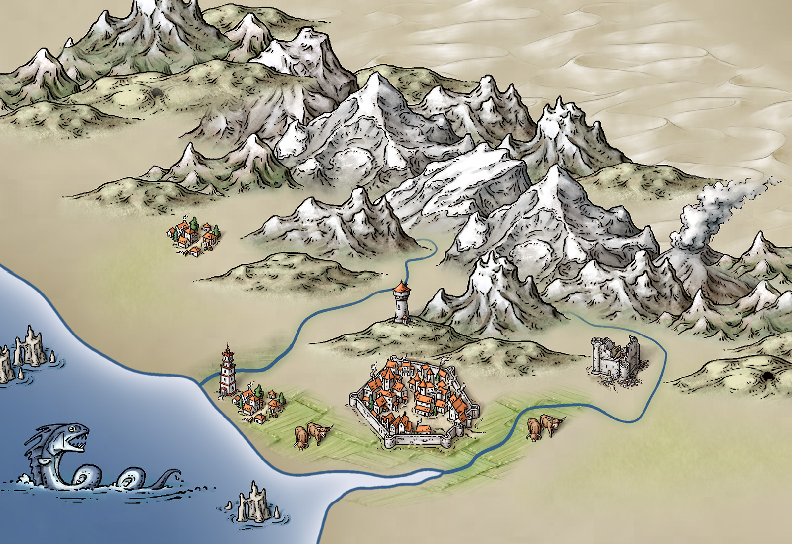
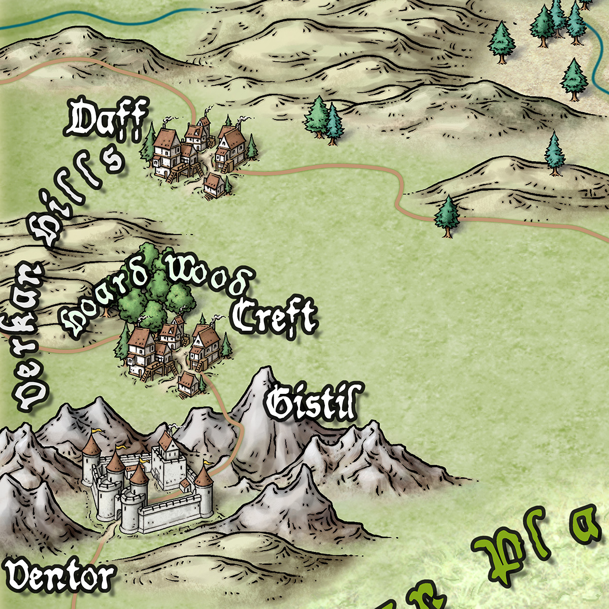
And here is a close up

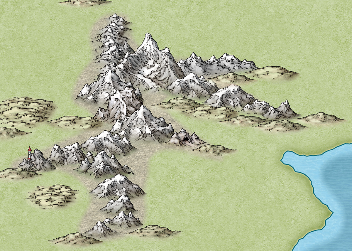
And just to give you an idea of how detailed the symbols are – little works of art – here is a close up. Click for extreme close up.

2 Comments
 One of the features for CC3+ symbol catalogs is the ability to arrange these into groups, and then set this group to place random symbols from the group, or apply random transformations to them, like rotations or minor scaling to give variety to otherwise identical symbols.

 A new update to the Tome of Ultimate Mapping have just been published. If you already own the Tome for Cartographer 3+, just go to your


