ralf | November 1, 2017 | Annual, battle map, city, dungeon, pelgrane press
 Are you looking for some house-to-house fighting with orcs or undead? Yearning to kick in that door or burn down a barn that hides an evil cult? Look no further, the November issue of the Cartographer’s Annual 2017 has you covered. It contains three highly detailed battle maps that combine building floorplans with outdoor locations.
The maps were produced for Pelgrane Press’ upcoming third installment in the Battle Scenes series and highlight the options you get when combining different map types and styles into a larger whole.
The November issue is now available for CC3+ from the registration page for all subscribers. If you haven’t subscribed to the Annual 2017 yet, you can do so here.
Comments Off on Cartographer’s Annual 2017: November issue
ralf | September 1, 2016 | Annual, battle map, cities
 A busy marketplace full of people shouting and haggling. A nimble, but over-confident cutpurse scrambling to escape the clumsy city guard. A dark alley at night with a party of assassins lying in wait for the heroes.
Do you need a map for this kind of scenario? Then the City Streets style created by Alyssa Faden is for you. As the September issue of the Cartographer’s Annual 2016 it provides everything you need to map out a vivid street scene, either as a reference map or a full battlemap to put on the table. And the included mapping guide tells you how to go about drawing it!
The issue is now available for CC3+ from the registration page for all subscribers. If you haven’t subscribed to the Annual 2016 yet, you can do so here.
Comments Off on Cartographer’s Annual 2016: September Issue
ralf | November 27, 2015 | Annual, battle map
 Over at Pelgrane Press and Fire Opal Media, they’ve been working hard on a new supplement for 13th Age code-named Battle Scenes. It is a collection of icon-themed encounters for all levels of play, packed with dangerous hand-picked foes on terrifying terrain, and I’ve been one of the people to help bring this “terrifying terrain” to life, not least because I’ve been using the playtest version of the book for my own games, as seen here.
For me these battle maps required a lot of special terrain effects, for which I had to import new bitmap fills, create lots of new sheets with specialized effects, and generally had to think outside the box of a specific drawing style. Naturally we’d like to make these ideas and tools available to more CC3+ users, so we created the December Annual issue to make that happen.
In addition to a tutorial with chapters on combining assets from different styles, custom artwork, working with water effects, showing elevation and cliff faces, creating multiple layers in one map, and lighting effects, the December Annual also contains 4 highly detailed example maps (2 of them straight out of Battle Scenes). Here is anther scaled-down example out of
High Magic & Low Cunning: Battles Scenes for Five Icons.

Comments Off on Battle Scenes and the December Annual
ralf | August 27, 2015 | battle map, CC3, Floorplans, ss2
 We are happy to announce the next compatibility update: Symbol Set 2 – Fantasy Floorplans is now available for CC3+. SS2 provides four new drawing styles for dungeon and floorplan maps, made up from over 2,500 new symbols, bitmap fills and drawing tools.
Click on the example map on the right created by Ralf Schemmann. It uses one of the new bitmap floorplan styles included in SS2 in conjunction with a few symbols from Dungeon Designer 3 to create a large-scale battle map of a river canyon. The style, created by graphic artist and designer Peter Gifford, uses highly-detailed almost photo-realistic bitmap artwork for high quality maps. Download a large-scale pdf version here.
Check out the two more pdf examples of maps drawn with the styles included in SS2:
 Smuggler’s Shack (using Peter Gifford’s style exclusively)
Temple of the Fire Demon (using the second bitmap style from SS2, created by Michael Tumey).
If you already own SS2, you can simply download the setup for CC3+ from your registration page. If you do not own SS2 yet, you can get a copy here.
2 Comments
ralf | July 15, 2015 | 13th Age, battle map, Noteboard, Printing
 For my current 13th Age rpg campaign (a short break from our Ashen Stars game) I recently created several battle maps, because while the game does not use a grid movement, it profits from a good visualization of the combatant’s positions relative to each other. Looking back I realize that I used a variety of different ways to actually bring the maps to the table, as time and resources dictated. I thought it might be useful to look at the different methods.
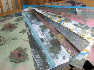
For the first session, I had a generous time frame and needed to have some professional posters done anyway, so I went for the most luxurious way: I had the two battle maps for the game printed at a poster printing service (Posterjack.com). Click on the image on the right, to see a close up view. The paper quality is great, the colors brilliant and of course everything is in one piece. The scale can be a bit off, if you go for the cheapest poster size/format option, but this map was not meant to be printed at exact miniature scale anyway. The downside: it’s a bit more expensive of course (€10 per 80cm by 60cm poster) and takes time get printed and sent back.
 For the second session I was much more pressed for time, and I also didn’t want to spend that kind of money again. So I went to my trusty home inkjet printer (a Canon Pixma iP4800) and printed the next battle map on nine pages of A4, trimmed and glued them together. You can see the result on the left.
The colors are more muted, and you can see where the pages have been glued together, but it still looks very nice. Of course it uses up a good bit of ink and still requires some time to assemble (I can do these in 10 minutes now though). Generally, this is my go to method, which I have used over the whole Deadlands Reloaded campaign that I finished last year.
 Still, I had a couple more encounters planned for the evening and didn’t want to print even more stuff. So I came up with a new way to use the map at the table. I would display it on the TV screen for all the players to see and have a Noteboard on the table with a quick sketch of the same map. The TV display would provide the flavor and atmosphere for the map, while the Noteboard would allow for the tactical positioning. Click on the image on the right to see the set up.
I used Chromecast and my Android phone to quickly cast images to the screen. This turned out quite well, better than expected on my rather modestly-sized TV set, and I used it for the final two encounters of the adventure. I’m sure I’ll revisit this method in upcoming sessions. While it’s not quite as nice as having the minis on the color map, it definitely saves on money and time.
Note that the Noteboard area is a bit smaller than your A1 poster map, but with 13th Age you don’t mind really. There is no counting of squares or hexes nor any measuring of distance that would need an accurate and consistent scale.
1 Comment
ralf | July 6, 2015 | 13th Age, battle map
 I’ve recently started a new fantasy campaign, using the 13th Age rules and setting. Due to some (unsurprising) insider connections, I was able to acquire a playtest copy of the upcoming “Battle Scenes” collection for the game. It contains a host of fighting encounters for different levels and surroundings. It’s a great resource, especially if you are stuck for inspiration or just need to pull a battle out of your hat.
What it doesn’t have yet, due to its stage of production, are detailed battle maps. The encounters are only sketched out in draft form. But I do have the right tool at hand for this job, don’t I? So I sat down and created a couple of battle maps for a set of connected encounters (a rafting expedition through orc-infested wilderness, isn’t that great?). I used Dungeon Designer 3 and Symbol Set 2, and it looks like the maps may end up as part of the published Battles Scenes in the end.


A neat idea crossed my mind as I was starting the second map: Why not make it combine with the first for one huge battle map? While it wouldn’t be used like that in Battle Scenes, it might come in handy for other occasions. You surely wouldn’t want to use a gorgeous prop like this once and then throw it away?

I printed the maps at an online poster printing service, and while doing it at a “correct” 1″ to 5′ scale would have been a little too expensive, the scaled down, very affordable version at 80cm by 60cm per map was big enough to easily accommodate 13th’s Age loose movement and positioning system. The map certainly gave the game session some great visual “oomph” as the PCs were floating down the whitewater river, fending off orcs on all sides.
You can download print-ready versions of the maps by clicking the images above.
Comments Off on Rafting Razoredge Gorge
ralf | June 4, 2014 | Annual, battle map, Par lindstrom
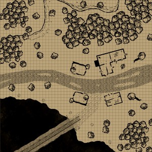
 The June Annual has been designed by Pär Lindström – by now one of our most prolific contributors to the Annual. He came up with the idea of this extremely quick to use black and white style, which lets you whip up a battlemap for the next game in no time at all.
Pre-drawn rooms, buildings and mine parts take care of all of the complicated detail work for you. Be it a stretch of forest, an abandoned mine, a farm, or even a town or section of city, all of this can be created with this style in just a few minutes.
As a subscriber you can download the June Annual issue from your registration page. If you haven’t subscribed to the Annual 2014, you can do so here.
2 Comments
ralf | April 10, 2014 | battle map, Deadlands, dungeons of schley, Floorplan
 A few days ago my gaming group’s Deadlands Reloaded campaign ended, after 18 months and 23 sessions of play. We had great fun, despite – or perhaps because – the game system (Savage Worlds) is more combat-focused than the typical games we play. One thing it does, and it does that really well, is make use of battle maps and miniatures without slowing down combats much. To take advantage of this I decided at the start of the campaign that I would create as many battle maps for the game as possible – of course using the Profantasy software at my disposal to maximum effect.
For my maps I used Dungeon Designer 3 a lot, but also City Designer 3, Symbol Set 2 – Fantasy Floorplans, the Annuals, the free art collection CSUAC, and at the very end the brand-new Symbol Set 4 – Dungeons of Schley. All of these I printed on my inkjet printer at home in A4 tiles, then glued them together for play at the table. I ended up with more than a dozen A1 battle maps, plus a few smaller pieces. I’ve collected them here for your enjoyment and use. Just click one of the images to download the full-size pdf*.
Continue reading »
Comments Off on A Campaign in Battle Maps
ralf | April 21, 2013 | battle map, Deadlands
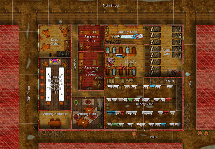
I created another battle map for our ongoing Deadlands Reloaded campaign: A city block from Chinatown in the Weird West’s Portland. The group hasn’t reached this part of the story yet, so no battle has taken place, but I hope it will next session.

For this map I used an area movement setup instead of the traditional gridded layout. Adapted from the FATE rules, this is a user-suggested rule for Savage Worlds that I want to try out. You can download this version as a full-size A1 pdf by clicking the image above. If you prefer the traditional 1″ square grid, click here.
This map uses symbols and textures from Dungeon Designer 3 and Symbol Set 2: Fantasy Floorplans. You can download the original CC3 file here (both add-ons needed to properly view it).
1 Comment
ralf | April 15, 2013 | battle map, community, Maps of the Month, user maps
I always look forward to putting together the month’s collection of user maps from the ProFantasy forum. It’s always a parade of beautiful and interesting maps. Let’s have a look, shall we?
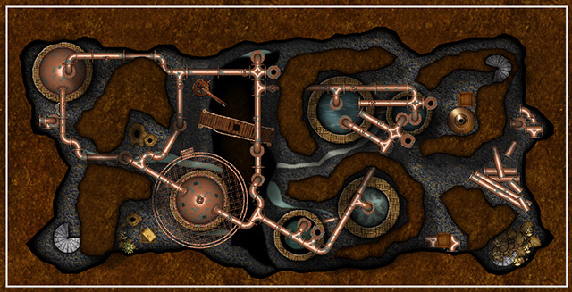
KenG really took my breath way with his Cistern Caves. The pipes and cisterns look extremely lifelike and were something I hadn’t seen done in CC3 yet.

Continue reading »
Comments Off on User Maps – the April round up
 Are you looking for some house-to-house fighting with orcs or undead? Yearning to kick in that door or burn down a barn that hides an evil cult? Look no further, the November issue of the Cartographer’s Annual 2017 has you covered. It contains three highly detailed battle maps that combine building floorplans with outdoor locations.


 I’ve recently started a new fantasy campaign, using the 13th Age rules and setting. Due to some (unsurprising) insider connections, I was able to acquire a playtest copy of the upcoming “


