Simon Rogers | July 26, 2012 | Annual, Par lindstrom
I’ve subscribed to the Profantasy Annuals since the beginning and I must say that it has been a great investment. I’ve learned a lot from the included PDF’s that comes with the monthly style and most of the styles are really great. But then sometimes there is a month when you think “when will I ever use that style!”. But you should never say never, suddenly you might have use for a style you thought you’d never touch.
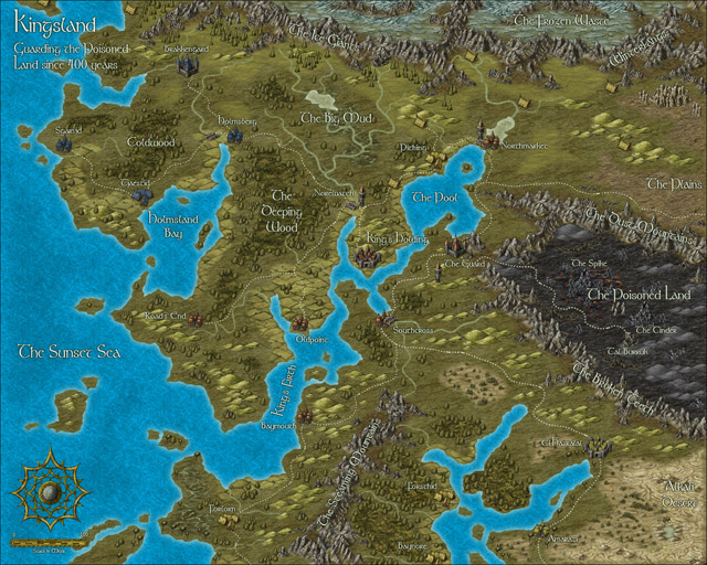
This happened to me when it comes to the 2010 Annual May edition, Abstract maps. When I received it I first thought it was a real waste of space on my hard drive. When would I ever use that, but that was before I went to London with my son.
When my son was eight I took him on a trip to London. They had just started to learn English in school and I thought that going to England would be a great way to motivate him to learn the language. Of course we could also have a great time visiting museums and interesting landmarks like Big Ben and the London eye.
As it turned out he got really hooked on the Underground. We don’t have one where we live and for a child it is fascinating to go on a train far below the surface. We ended up doing a lot of travelling with the underground and we even bought a London underground game that we’ve played while coming home again.
After returning to Sweden my son thought it was fun to play that he was travelling with the underground, pretending that different rooms in the house where stations. I suddenly remembered that I had a style for CC3 where you could make underground maps. Quickly I started the program and made a map for him where all rooms where stations and different lines went to different parts of the house. I even added some lines that continued out in the garden.
So you should never rule out a style, who knows in the end you might have a use for them all.

Republished from Mapping Worlds.
Comments Off on I’m never going to use that style!
Clercon | May 31, 2012 | Campaign Cartographer, overland, Par lindstrom, Tutorial, wielink

This time I thought it was time to make a tutorial on how you can make a convincing overland map. This will be more of an overview tutorial on how I think and plan when I make a map, so it won’t be very technical. This means that you can use this tutorial regardless what program you use when you map, even though I in the tutorial will use a map made in CC3 as a reference and example.
The first thing to take into account when you start an overland map is the landmass. How much of the map will be water and how much will be actual land? This is probably the most important step in your map because it will set the boundaries for what the end result will be. So already here I’m having a quite clear view of where I want to go with the map, shall the map be land based, island based or something in between.
Below you see my map “Sagorike”, that I’m using as an example in this tutorial, with only the landmass viewable. I’ve also written some things on the map that you can have in mind while drawing the coastline.
A good thing to do before starting on your landmass is to look at the real world (Google earth is great for this). If you want a lot of fjords, have a look at Norway, Island based, look at area outside Stockholm for example, and so on. It is always good to find inspiration in the real world. It will make your map look more believable, and believable maps tend to look good.
However when I make maps of worlds the most important thing for me is that they look good and in some part convincing. It doesn’t matter if the world doesn’t work geologically or physically, as long as it looks convincing. To make it look convincing you have to get the things right that the majority of people can spot, like rivers, they will NEVER split downwards, lakes, there is always only ONE outflow, or deserts, make sure that you place them in a way that it looks probable that no rain will get there, and so on. If those small details are correct it is more likely that the viewer will believe in the whole map, regardless if everything in it is possible according to our physical laws or not.
That is all for now, in the next post we will start by placing the mountains in the map.
(Originally posted on mappingworlds.wordpress.com)
3 Comments
SteveDavies | May 8, 2012 | CD3, city, city design, mapping cities, Tutorial
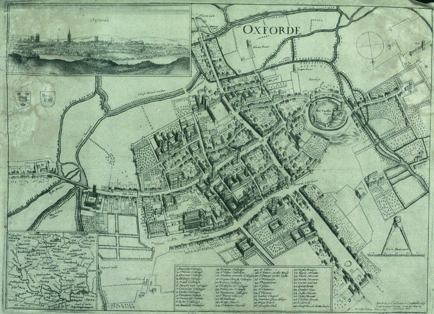
Up to now we’ve mostly been working inside the city walls, where space is short and buildings necessarily packed

Historic map of Oxford in 1643
closely together. We’re now going to turn to the area outside the walls. In this installment, we’re going to turn back to some theory.
First we need to talk about why businesses decide to set up outside the walls of the city. After all, they are forgoing the protection that walls bring, so there must be some good reasons for it. It turns out the reasons are pretty simple:
- Avoiding authority: This is monetary, avoiding taxes, but also includes regulation, attention of the town watch, even to avoiding the prying eyes of neighbors. The city’s authority ends with the city walls, and some people find their business flourishes where there is less oversight.
- Accessing markets: Gates into the city are notorious choke points for people entering the city. The gates typically only open at certain times, guards ask questions, and just the physical size of the gate all conspire to leave large numbers of people waiting outside to get in. And where there are large numbers of people waiting or stranded, there is money to be made selling goods and services to them.
- Space: In many cities, space is at a premium. So businesses that require lots of space such as cattle markets, or that need space from neighbors, such as tanners, will often set up outside the city walls.
Continue reading »
1 Comment
ralf | May 8, 2012 | cologne, convention, rpc
Over the last five years the RPC (Role Play Convention) has grown to be Germany largest roleplaying convention. Spiel in Essen is still much bigger, but where it is mostly a boardgaming affair the RPC is about evenly split between computer gaming, LARP and pen and paper rpgs. As this is much closer to our software’s audience, we decided it was time that we gave the RPC a try. I had visited the show for the past three years and knew roughly what to expect, but you never really know how a show turns out until you try it.
 I was a bit upset, when after registering in January it took the organizers until April to get back to us with confirmation and details – and the Profantasy booth suddenly sat smack in the middle of the computer gaming area. But from there communication with and help from the organizers was excellent. They were very responsive to my questions and concerns and we got moved into the proper pen&paper area very quickly.
Cologne is close enough to my hometown (about 50 mins drive) that I didn’t need to get accommodation near the show. In contrast to Essen, exhibitor parking and set access to the halls is very convenient, and I was able to do the setup in a relaxed manner on Friday night, without driving through heavy traffic and worrying about closing times. All equipment we had ordered was on site, in good condition, and we were able to create a nice and professional looking booth.
 The show had changed halls from last year and while this provided ample space, it had one drawback: Computer gaming was in the same hall as the other exhibitors, and those booths are VERY loud. Luckily we were far enough away so that it didn’t bother us too much, I heard many visitors complain about the noise on Saturday. It seemed like they toned it down a bit on Sunday. Apart from that the atmosphere was more relaxed than in Essen. Everybody was very friendly and one of the highlights of the show are the many costumed people (exhibitors and visitors).
Due to significantly less visitors (organizers claim 30,000 and 120,000 visitors respectively) and large aisles there were never any jams (as there are sometimes in Essen). But questions, sales and demos did keep me busy throughout both days, so that I was glad about the occasional breather when Gordon and Michael (my helpers on Saturday and Sunday respectively) took care of the booth. The only boring stretch was the last two hours on Saturday – the halls were basically dead after 6pm and the show went on to 8pm, unnecessarily in my opinion.
When I started doing shows for Profantasy i tt used to be that current customers used these occasions to buy the new things we had on offer or stock up with add-ons they hadn’t pruchased yet. These types of sales are basically gone – with few exceptions people buy these things online. The Internet and credit cards (or Paypal) have seen to that. Most sales nowadays are to new customers (which is a good thing) who have either never seen Campaign Cartographer before or who have heard about it and want to take a look at it before buying. Of our sales at the show 90% included a CC3 – meaning they were to new customers, or people getting back into it after CC2.
 Responses were good from both old users and the ones who saw it for the first time. I had one guy just walk up and thank me enthusiastically for our software – he was using CC3, Fractal Terrains 3 and Cosmographer 3 for great effect in his Sci-Fi campaign he said. Another customer complained about how hard it had been to use CC2 when he tried it years back, but was happy to purchase CC3 after I showed him the improvements in the user interface.
I unexpectedly met Herwin Wielink (fantasy-maps.com) at the show (he drove over from Amsterdam) and we had a nice talk about mapping and fantasy cartography.
The “Wall of Maps” continues to be the biggest pull for customers walking by the booth – we got many awed comments – but the little dungeon diorama I had on the table also got quite a bit of attention. Many people inquired about how it was done, what materials I used, and so on. As most of the interested people were new to CC3, demoing was mostly limited to CC3, CD3 and DD3, with the occasional bit of Cosmographer and Fractal Terrains thrown in.
Taking the booth down was quick and painless on Saturday evening. Michael was there to help, and we were done and away in 30 minutes. Doing a 2-day show is also a lot less stressful than a 4-day one. The 1-hour drive to and fro is a bit annoying of course, but at least I get to be home each night. Of course I was tired after the show, but overall a lot less exhausted than after Spiel or GenCon. As it looks, I’d be happy to do the RPC next year again.
Photographs by Gordon Gurray
2 Comments
jonasgreenfeather | May 3, 2012 | Cosmographer, Deckplans, starships, Tutorial
For the second part of starship design, we’ll be focusing on filling out the living, eating and washing facilities on deck 2. This is the largest deck of the ship and once it’s finished, the rest of it should fall into place with relative ease. The “Big Three” locations all ships need for their crew and passengers are: a place to sleep, a place to eat, and a place to,… clean up, after oneself. To begin, we’ll start with the overall look of deck 2, then move into sleeping, eating and restroom areas.
All Aboard
The one thing I noticed right away about my rough sketch from part 1, was its similarity to a boned fish; while this was unintentional, it illustrates how fluid designing a starship can be, and because of that, I decided to change the shape a little.
 Deck 2 is the largest and most physically active section of the ship; the focal points on this deck being, the primary ship’s access area and troop living spaces.
I began by selecting the Hull, Sleek Silver mirrored polygon after right clicking on the Draw Hull button, a custom Snap setting of 5 foot, 1 snap square grid was created. Instead of the original, half moon shape, I decided to create a hull that was somewhat triangular in shape, suggesting forward movement. The deck was drawn next, by selecting the Deck, Lattice mirrored polygon. The Snap for it was changed to a custom 5 foot, 5 snap square grid so there would be a one foot gap between the edge of the hull and the deck. The Bulkhead, Default 0.5′ was selected for the exterior and interior bulkheads and it followed the same Snap setting as the deck. In the picture to the right, the Deck Sheet has been hidden, as I found it visually easier to place bulkheads and symbols at this scale.
The custom snap settings were created by right- clicking the Grid button in the lower right part CC3s drawing window and selecting New…, then selecting 2d Rectangular and applying the settings needed.
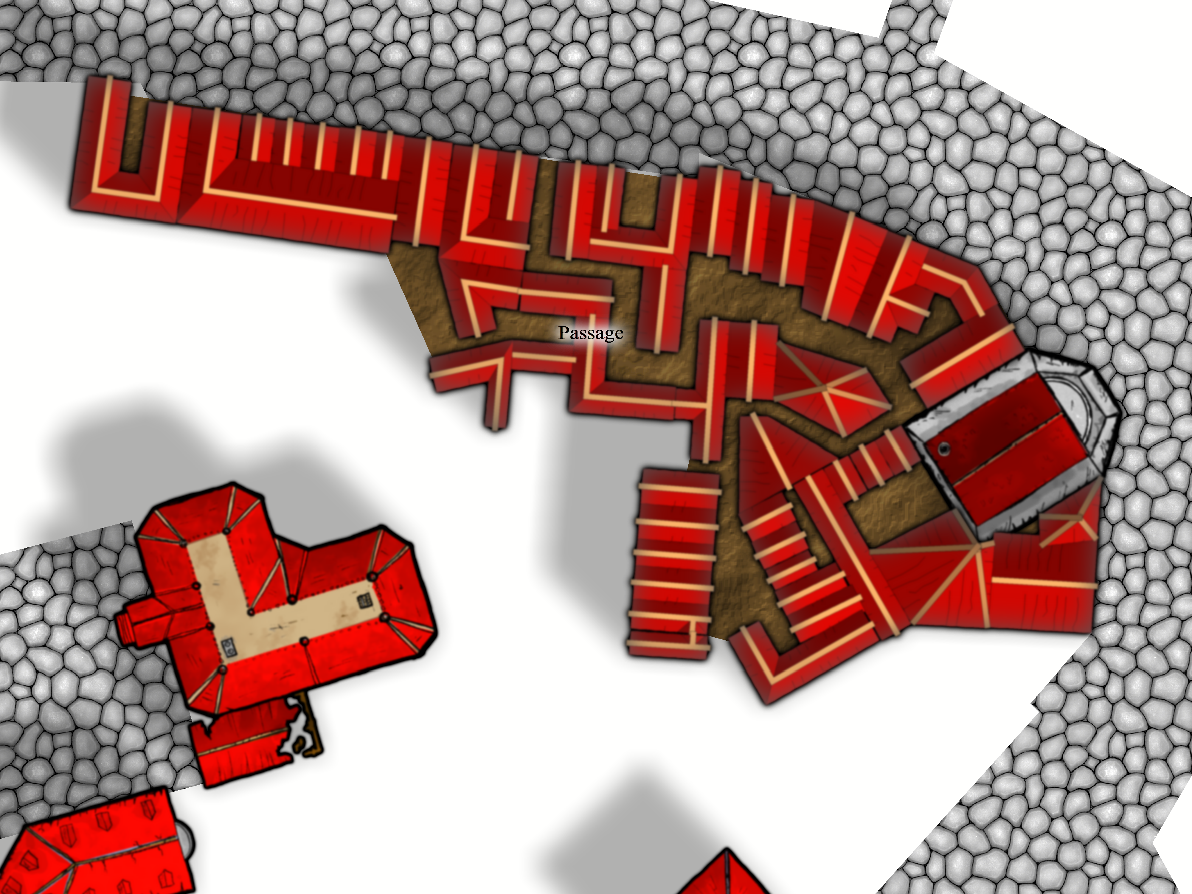
The first render of the carrier was ridiculously over scaled (it was nearly 700 feet/210 meters long), and the drop ship place holders were the size of a small building (they should be closer to a city bus). Once the ship was rescaled to a more manageable size (pictured above, about 300 feet/91 meters long), it was time to decide on a starting point. Since all crew/troop entry happens at the “nose” on deck 2, I decided to start there, and branch off to the troop living spaces; the main corridor needs to accommodate 150+ people coming and going with the ship docked and the width was set to 10 feet/3 meters.
You want me to sleep where?
The main corridor and living areas on deck 2 on the working render (above) show a large, dormitory style, bay for troops to sleep in, and the design of the ship called for marginal crew comfort, since they’d be living on board for weeks or months. This meant a modification was needed. I decided to separate the room with a wall; from a narrative standpoint this also adds to passenger safety: If a portion of the hull is breached the loss of life will be lessened. With the basic room layout complete furniture placement was the next step.
 The rooms numbered 1-4 show the progression of furniture placement:
Room 1 (left). This room had 7 single bunks, each with a gear locker, and 2 small chairs along the wall with a large table for a common area. This was a messy, cramped effort with little efficiency and a poor design.
Room 2 (left). 8 single bunks were placed toe to toe and the large table and two chairs were removed, in their place, 2 desks (for writing home) were added and the lockers were set along one wall. Less cramped, but room to improve.
The first two rooms also had the door exiting to the main hall; during an emergency or troop deployments, the hall would fill quickly and confusion would run rampant. The doors for rooms 3 and 4 were moved to the side hall that accesses the drop ship dock area.
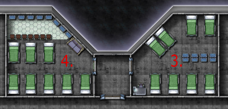 Room 3 (right). The single bunks were moved to the outer walls, the lockers split the room and one table and chair for writing home was removed. Getting closer, but still a lot of wasted space.
Room 4 (right). Moved the single bunks to one end of the room and the lockers to the other. A couch for lounging and 8 small chairs for dressing were added. Better yet, the chairs suggest a wall that separates the sleeping/dressing areas. I also placed Deck, Plastic Irreg for a little visual distinction.
The final room design was broken up into three spaces (below). The sleeping area is separated from the common and dressing area by a wall (inspired by the chairs from room 4) . The single bunks were replaced with double bunks, increasing the occupant count from 8 to 12, and scaled down to 95% of their original size. While this room layout is cramped, it is a military ship after all, I feel that it is much improved from the poorly designed first layout. Once I was satisfied with the room layout I simply used the Mirrored Copies command (accessed by right clicking the Copy button) to quickly duplicate the rooms (Mirrored Copies is a great solution if you have symmetrical ships or buildings with rooms that need to be duplicated across a central point).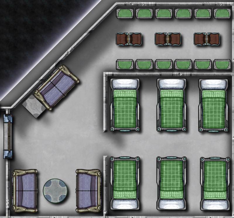
Using the method described above: creating a room, placing symbols and rearranging them for best use of space I then created:
The dining hall, details include (clockwise from tables and chairs) seating for 129 people, steam tables for serving food, a dishwasher, sinks, stove tops and ovens, a walk-in refrigerator and an elevator to travel to the storage area on deck 4 and the crew mess on deck 1.
Shower and toilet facilities for officers and enlisted personnel. The enlisted shower facility details include (clockwise from upper left) 8 showers, sinks and toilets, lockers and benches (created by stretching the rectangular table) The smaller officer’s bathroom and lounge were combined to conserve space. Drawing bathrooms is about as much fun as cleaning them for me, there’s no way to make showers and toilets interesting!
With the “big three” completed for deck 2 (pictured below), Deck, Plastic Irreg was added for all sleeping/common areas, by right clicking the Deck Plan button, to create visual interest and to assist viewers with identifying different areas easily. Next time, we’ll be completing the remainder of deck 2’s amenities, including enlisted lounges, armory and firing range, officer quarters and ships operating systems, creating deck1, reviewing how to mirror copies, and the creative mixing of Cosmographer 3s symbols.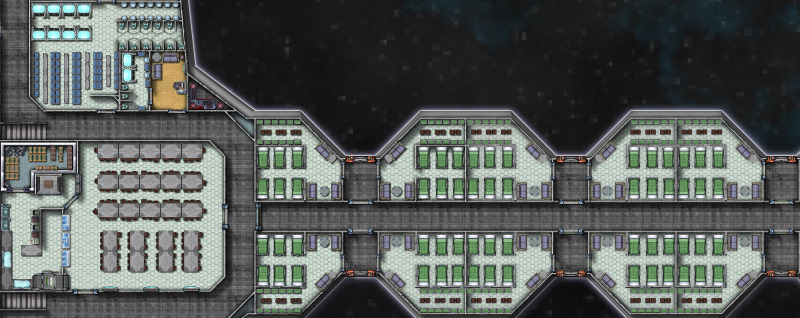
Comments Off on “Ship like this, be with you ‘til the day you die.” Part 2
Simon Rogers | March 26, 2012 |
Created by Jonasgreenfeather on the ProFantasy Forum.
He says of this ship, created with Cosmographer 3:
Like many forum members, I’ve been drawing maps (both fantasy and sci-fi since I was a kid of 9 or 10 years  old). I’ve had CC3 since February-ish of last year, but took a really long break from it while I was looking for work. I think that my tenacity and OCD makes up for my lack of initial planning and can’t keep things well enough alone 🙂 I often only have a faint image of how a landscape, ship or city is going to end up and each often goes through several revisions before I’m satisfied with the result. I find it’s a very organic (and sometimes frustrating) process: the land shapes the features shapes the cities and roads shapes the land…
The ship in this thread grew from the idea of an engine and a bridge connected by a spine, different modules could be plugged into the spine depending on the mission requirements (living spaces, labs, hanger bays, cargo, etc.) BUT… when I started drawing the modules I drew the rooms to small and nothing fit in the “slots”, so I took what I liked (the bridge) and then built the captian’s cabin, first starting with the furniture and then building the walls. Once that was done it was time to think about the “why” of the ship, it made sense to me that the captain and first officer would have cabins on different sides of the ship (in case of attack one hit wouldn’t take them both out). So I coppied the bulkheads of the captain’s room and turned it into the XO’s and NCO’s quarters (as they would have less room than the CO)! the rest of the ship just sort of grew from there.
Well, that was a bit a tangent but gives you an idea of how I Cartograph (is that a word?)! To summarize, I’m playing, learning and expermenting all the time to share what I see in my head with others.

1 Comment