Monitors have increased resolution, and my eyesight has I’m afraid, gone the other way. I find I’m having to squint at our standard 16 x 16 icons.
You can see the problem here. The first is what icons used to look like on 800 x 600, the second the relative size on my 1280 x 1024 monitor.
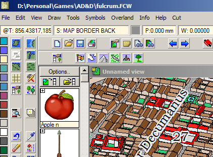
800 x 600
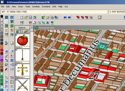
1240 x 1024
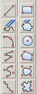
So, for CC3 Plus, I am working on a new, shiny set of toolbar buttons at 24 x 24, and as it’s a new version, I’m redoing them to support alpha transparencies. For consistency and documentation I am redoing them at 16 x 16, as well. Here is a selection. They still need a bit of polish here and there, and feedback is welcome.
I am deliberately saying nothing else about CC3+ at this time. I’ll update you when I can.
New 24 x 24 icons
Update: I darkened up the icons a little for poor Joachim’s eyes.
Those icons are really great and will bring a new youth to CC3. Just looking at them makes me, *wow*.
As it is not a final version, I would however rather have the icons similar to the old ones. For example those red/white dots hurt my eyes me on the line, path, circle etc (they are only red for now) and I find them lacking on the modifier (endpoint, midpoint etc).
On the same topic, the bomb is nice, and I surely would adapt quickly, but I’m sure I’ll look for the dynamite bar quite often too.
@Joachim de Ravenbel, The bomb is a place holder. I like the red dots with the white centres, but we’ll see what other people say.
They look good and are a big improvement. May I make a plea, though, for 36×36 and 48×48 options as well? Although most people won’t need the biggest size, having them available is a big plus for those who do and would also help in adhering to various disability guidelines that have appeared since CC3 was first launched.
Personally, I’m very much looking forward to bigger icons. 🙂
Only a 1280 x 1024 monitor? My monitor’s native resolution is 1920 x 1080, and it’s not a large one. Therefore, as Gavin says, even larger icons would be a good idea…
Thank you for thinking of this. It would be nice to have the options to change sizes to even larger icons, as Gavin suggested. I recently purchased a 27″ monitor to use with CC3, not thinking of how tiny the icons would be. My resolution is set to 2560×1440. Thanks for thinking of this.
Personally, I like the smaller icons. I’ve been a CC user for ages and the small icons take up less screen space, allowing me to maximize the working area of the screen. The larger icons might be nice for newer users and for those others who want them, but please give us an option to switch to the smaller icons.
@Ian Kirby, yes, we’ll still have the small ones.
Oooo, really like the new icons. 🙂
@Simon Rogers, Poor Joachim thankest thee, sir.
The current state of the UI is why I haven’t bought any of your products. I read reviews, look at stuff friends made, get ready to buy, then look at a screen cap and think, “Meh”. Please, get these out the door!
I’m with John on this one…as I also have a 27inch running the same resolution (2560 x 1440)
I have to agree with Kevin. While CC3 looks an absolute dream for creating fantasy worlds(I’d like to use it for creating the world from a book I’m writing) the UI leaves a lot to be desired.
I was hoping for a new look in CC3+ so I could finally get my teeth into it.
Maybe run a competition to design a new layout/style? Then everyone can vote for their favourite and the majority get to choose? 🙂