Simon Rogers | January 2, 2013 | bundles, offers
In December 2012, we released The Festive Three – a bundle of our top three products, Campaign Cartographer 3, Dungeon Designer 3 and City Designer 3.
We’ve often debated the effect of releasing this particular combination of products – the more conservative view point being that they would eat into our other sales, but we decided it was worth a try. It didn’t have that effect at all – in fact our sales in December were unusually good – so we are continuing our bundle under the more prosaic title of the Top Three for another month, at least. It’s a case of the customer is always right.
So why not try this tasty combination to get the full range of overland, urban and floorplan map-making for a 20% discount?
1 Comment
Clercon | November 19, 2012 | Annual, CD3, city, Par lindstrom

As you might have noticed I really like to make city maps. I don’t know why but I just love to see how a blank paper slowly turns into crawling streets and vast parks. It makes my imagination really spin.
Most of my city maps I make in the program City designer 3 (CD3) from profantasy. It is a great program with a huge toolbox you can use to make the creation of your cities a much smoother experience. To make the maps more unique I also like to edit them a bit in Photoshop afterwards.
When I bought CD3 my first impression of the program however was quite different. You can easily describe it in one word, overwhelmed. Just the sheer number of tools and objects made me fear for my mental health. The first time I started the program I think I just closed it immediately.
So how did I go from there to where I am now? Well the answer can actually be divided in three parts. First of all practice. I started out quite small with a little village and first after a couple of small practice maps I went for the bigger cities or towns. Secondly I looked up some tutorials, especially Gandwarfs tutorials over at the cartographer’s guild where extremely helpful. Thirdly there was a black and white city style released in the 2010 annual from Profantasy.
So what was so great with the black and white city style? First of all you get a very nice tutorial in every edition of the Annual, this makes it very easy to learn a new style, you can just follow the steps described. For me this meant a lot when it came to learning CD3, because I could in this way quickly pick up the different tools to use.
Secondly the amount of objects decreased quite a lot in the black and white city style compared to the coloured styles that were included in the actual program. This might sound a bit odd but the good thing here was that suddenly the program didn’t feel as overwhelming as before. When the choices in objects decreased, it kind of made it easier to grasp the program and find what you were looking for.
The map included in this post is a map that I made while trying to learn CD3. It was one of my first experiments to make a really large city map. I especially experimented a lot with the random street tool in this one. The random street tool is really a great help when you quickly need to fill and area with many houses.
When I was done in CD3 I opened the file in Photoshop and added some cliffs on the northwest side of the city. I also draw my own arena object to add to the city, I really missed that object in the style. As a finishing touch I made the map sepia coloured and placed the map on a paper background.
Well after that I just continued doing city maps and slowly the interface started to make sense and nowadays I rather feel that the there are too few objects in the program then too many 
Originally posted on mappingworlds.wordpress.com
1 Comment
SteveDavies | May 8, 2012 | CD3, city, city design, mapping cities, Tutorial
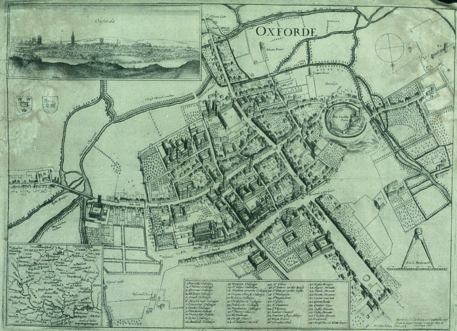
Up to now we’ve mostly been working inside the city walls, where space is short and buildings necessarily packed

Historic map of Oxford in 1643
closely together. We’re now going to turn to the area outside the walls. In this installment, we’re going to turn back to some theory.
First we need to talk about why businesses decide to set up outside the walls of the city. After all, they are forgoing the protection that walls bring, so there must be some good reasons for it. It turns out the reasons are pretty simple:
- Avoiding authority: This is monetary, avoiding taxes, but also includes regulation, attention of the town watch, even to avoiding the prying eyes of neighbors. The city’s authority ends with the city walls, and some people find their business flourishes where there is less oversight.
- Accessing markets: Gates into the city are notorious choke points for people entering the city. The gates typically only open at certain times, guards ask questions, and just the physical size of the gate all conspire to leave large numbers of people waiting outside to get in. And where there are large numbers of people waiting or stranded, there is money to be made selling goods and services to them.
- Space: In many cities, space is at a premium. So businesses that require lots of space such as cattle markets, or that need space from neighbors, such as tanners, will often set up outside the city walls.
Continue reading »
1 Comment
Clercon | April 16, 2012 | CD3, city, city planning, mapping cities, Par lindstrom
Originally posted on mappingworlds.wordpress.com
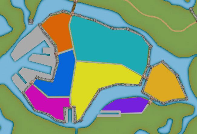
We now have the basic layout of the city. Next step is to put in more roads and try to decide where to place the majority of buildings. Sometimes when you create a large city the process of placing all the houses can be overwhelming. To make this easier I try to divide the city into smaller areas. I then place the houses one area at the time. In this way you divide the work into smaller goals that you can reach quite quick. It will make the whole process much easier. In the picture below you can see how I’ve divided the city of lost souls into seven areas to fill it with houses. Make every area interesting by adding a major house, villa or temple in it. It will add some details to your city and will make the end product more fun to look at.
At this stage I also try to locate where the major squares will be, naturally they will be situated where the large roads meet up. I also like to add some smaller squares in front of the gates, usually this is where people have to wait to get in and out of the city. You also have to decide what density your city will have. Nearly all cities have some sort of park or green area, older cities could actually have quite a lot of farmland inside the walls. In this case how ever the farmlands are outside the city walls.
When I start to place the houses I zoom in and out to quite a lot to check the progress of the area I’m doing to make sure that the network of roads and houses looks natural. A good thing to think about is if the area you’re making is planned or if it has grown over time. To understand the difference in how a planned city looks compared to one that has grown over time you can look at some modern cities in USA (for example New York) and compare it to some older ones in Europe (for example Venice). The planned ones tend to have straight roads in squares and the grown ones usually have roads and city blocks in all kind of versions. At first you can’t really see any logic in the city construction, but after a while you will start to see that roads lead between squares and larger empty areas usually consist of an important building and its surroundings.
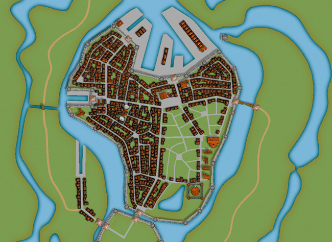
When I start to map an area I always start with the roads. First I add in some larger main roads, I then switch to a smaller road to make intersections between the larger roads. In the picture below you can see a nearly finished inner part of the city. I’m working on the last area and have put in the roads and squares. The squares I try to place in areas that feel natural. Also try to have some space between squares, a square is a place to meet and trade, so they will be evenly spread out in the city.
When I add houses to a city or town I always start by using the Random street tool. The ability to quickly add all houses on a street is one of City Designer 3′s best advantages. When you’ve added a lot of streets it isn’t always possible to use the Random street tool everywhere, in those cases I add the houses one by one. Sometimes you also have to go back after adding houses with the Random street tool and delete houses that don’t fit in for one reason or another.
When I use the Ramdom street tool I try to make the houses come as close to each other as possible. To do that you have to change the settings a bit. Right click on the Random street tool icon and in the street option window you click the Street settings button. The settings I used for the map you can see in the picture below.
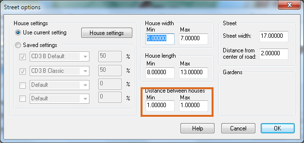
The most important setting is the Distance between houses that I always set to 1, both as Min and Max value. In this way you will get the houses as close as possible togehther. The other values depend on the scale of the map that you’re doing. You have to try some different settings here and see what works out.
When you’ve added houses to all your areas in the town you are done with the central parts of your city. Don’t forget to zoom out once in a while and check that the streets look good. I often have to go back and add some more roads to make the city more crowded. In the next post we will start on the outskirts of the city, farmlands and ruins.
Making a City part 1
Making a City part 2
Making a City part 3
Making a City part 4
Comments Off on Making a City part 3
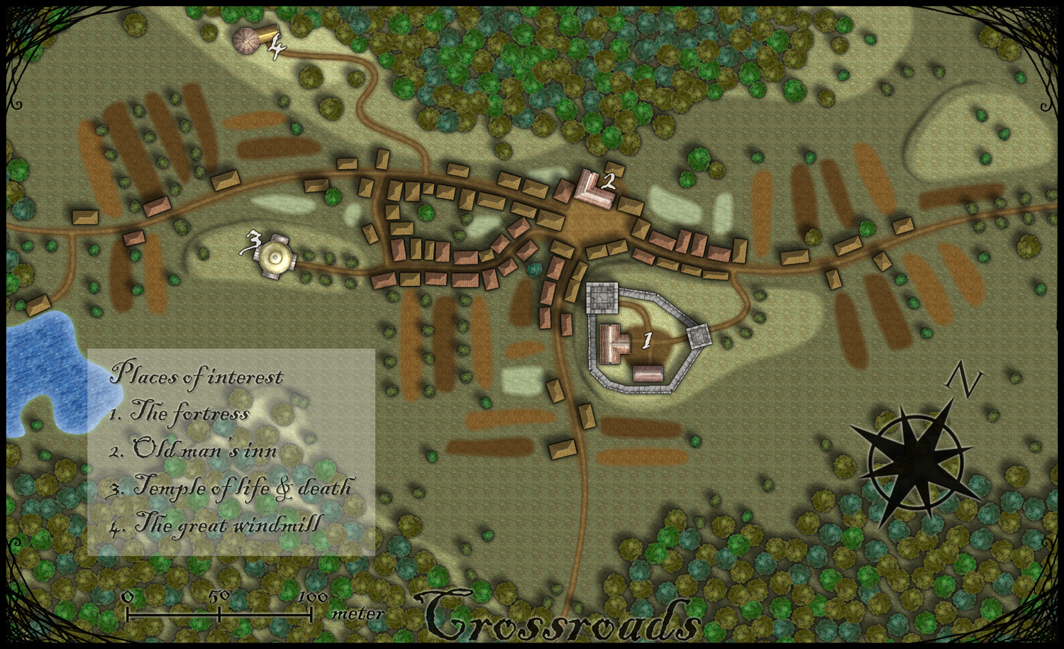
Clercon | March 15, 2012 | Annual, Jon Roberts, mapping cities, Par lindstrom, textures
Originally posted on mappingworlds.wordpress.com
This month’s annual from Profantasy is a new city style designed by the fantasy cartographer Jon Roberts. This is the third time that one of Jon Roberts’ themes are presented as an annual. The two earlier versions have been an overland style and a dungeon style.
I must admit that I’ve really looked forward to the release of this annual. First of all I love city maps and CD3, secondly Jon Roberts is a very skilled cartographer and illustrator so I expected some really nice graphics in this one.
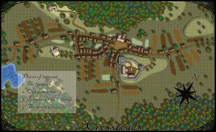
As expected, all the graphics are top notch and I especially like the walls and towers. To test the style I decided to make a rather quick village, called Crossroads, situated in the middle of a forest. The style was easy to work with and if you have done maps in CD3 before there isn’t really any new things to learn here. One little feature I liked however was the ability to make nice shadows on the hills. You can clearly see this on the hill where the temple of life & death (3) is.
After finishing the map there are some things I felt I need to work a bit more on next time I’m using the style. First of all the fields didn’t turn out great in the map; probably I have to try to put some more time on them in the future. When I started doing maps in the included styles in CD3 it took me a lot of trial and error before I got the fields right. So I have some more testing and practice to do here.
Another thing to think of is that in this map I had quite some open space between the forests and in the background texture you can see a pattern. I think the solution here is to add in some more different textures to hide the pattern. If you look at the included map in the annual you don’t see this pattern there.
At last if you look at the trees in the forest you can see that the northern forest has the trees more closely to each other. I actually think they got too close so in the southern forest I put some space between the trees. This made the forest look much better, in my opinion.
Overall I think the style is really strong. I like the darker colours of this one compared to the included styles in CD3 (which means less editing in Photoshop for me) . Still it takes some time to get to know the feeling of a new style, to get all the things in place in a good way. This one surely needs som more practicing for me before I’m there.
As usua,l I added the labeling in Photoshop, and I also selected another font. If you want to use the font I used it’s called Blackadder regular and can be downloaded from dafont.com for free.
1 Comment
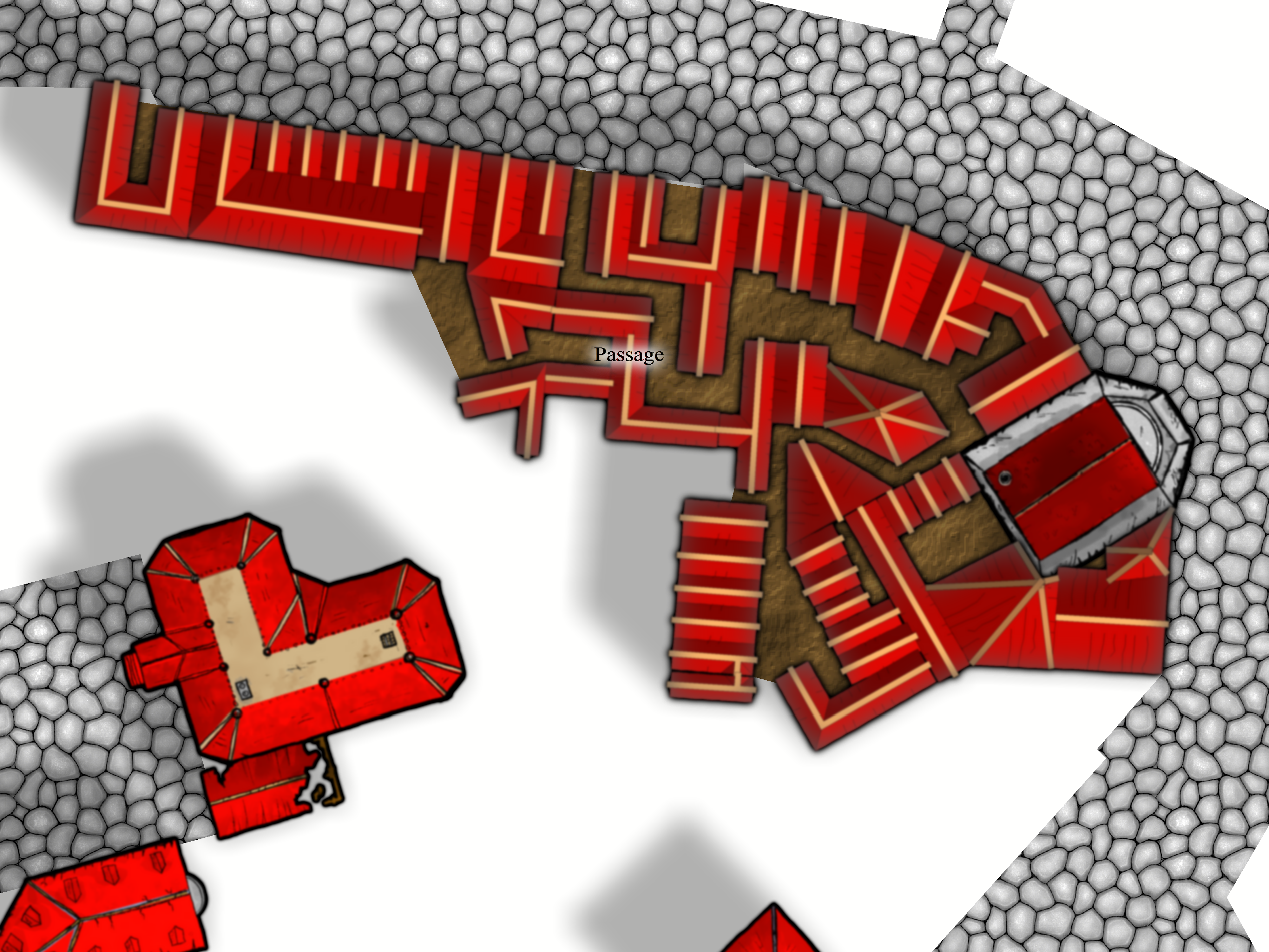
SteveDavies | March 8, 2012 | city, city design, mapping cities, Tutorial

First buildings with effects on
Ok, we’re going to spend time today filling in a block section with houses. We’re going to be using the House command from CD3 extensively, so you should be an expert in it once we’re done.
The house command is in the 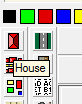 upper left corner of your toolbar and looks like a roof seen from the top – a screen shot is to the right (you can see the “House” tooltip as well):
Continue reading »
2 Comments
ralf | March 1, 2012 | Annual, city, Jon Roberts
We are very happy to release another drawing style by fantasy cartographer Jonathan Roberts – this time it’s a city style, completing the standard trilogy of map types. Jon Roberts’ overland and dungeon styles were released last year in the Annual Vol 5, the latter being a free download. You can subscribe to the current annual here.

There’s also a little preview of the upcoming April issue, created by another extremely talented fantasy cartographer and artist, Herwin Wielink.

Comments Off on Cartographer’s Annual 2012 – March Issue
ralf | February 22, 2012 | Annual, city, overland, sneak peek
A little peek at the work-in-progress on one example map for the March Annual:

Also, a little sneak peek at the April issue:

2 Comments
SteveDavies | February 6, 2012 | city planning, how to, mapping cities
First off, I apologize for the long lag between part 5 and 6 of this series: it was not my intention, but a series of life events conspired to take me away from mapping. But I’m back. Thanks to everyone for the kind words of support along the way.
If you need to refresh your memory about the project, here are links to Mapping Cities part 1, part 2, part 3, part 4, and part 5.
In this session, we’re going to fill in the blocks of our district with buildings, lots and lots of buildings.
We’re starting with the Entertainment district, which I’ve completely filled with block designations:
Continue reading »
Comments Off on Mapping Cities Part 6 – Filling Blocks in CC3
ralf | December 2, 2011 | baedeker, city, Cthulhu, Horror, Modern, Pulp
The December issue of the Annual 2011 is now available. It contains a companion style to April’s “1930s Floorplans”, reproducing the city maps of 1930s Baedeker travel guides. These make perfect handouts for period horror or pulp games.
Despite this being the December issue, the 2011 Annual is not quite done yet. As we released the June issue as a free download, we’ll be adding one more issue later this month.
Comments Off on December Annual – 1930s Street Maps