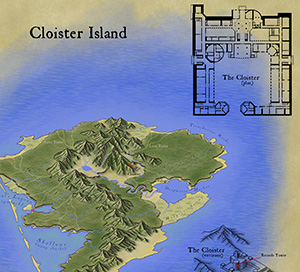
We’ve asked Christian, the winner of our map-making competition, to share a few words on his map and the competition and he was so kind to oblige. Here’s what he has to say.
* * * * *
A few weeks ago I was searching online for fantasy map-making contests. I wanted an assigned theme and a real deadline—something that would challenge my skills and help me generate another piece of work I could be proud of. That’s when I came across ProFantasy.com. I’d been interested in their software before, but hadn’t had a chance to use it. Now I had a chance to win it in a competition.
Make an island, they said, about three miles across. Something like a medieval treasure map. The contest had been open for months, but was closing in just a few days. I took a look at the submissions that had been sent in thus far, decided I had a shot at winning, and threw myself into it.
I worked feverishly, right up to the deadline, and actually ran out of time to put absolutely everything I wanted into the map. That’s why there’s no border around it, and no compass rose… But what I did manage to produce followed my vision. As a novelist and dungeon master, I knew I could create some storytelling elements that would hook into the drawing. Some secrets and clues that would only be available to those who looked closely, and a narrative that would marry the image to the text. I had an aesthetic that I’d been developing for maps for my novels, inspired by some of the top fantasy cartographers online. I’m passionate about making beautiful illustrations, and I’m excited to be learning new techniques every day.
As for the hands-on process itself, virtually all of this map was hand-drawn in ProCreate on an iPad 3 using an Adonit Touch stylus. There are a few “pattern brushes” in that app which help with things like the the jungle trees and the ocean waves, but everything else was the result of pushing pixels manually. The shape of the island and mountains isn’t based on anything other than doodling with the idea of a vaguely volcanic tropical island in mind.
The cloister overhead plan was laid out in Adobe Illustrator. It’s far larger, sharper, and more detailed in the original file, with many upper floors and basement dungeon levels. The “3D” isometric extrusion of the cloister is actually just faux-3D, a technique I use in Illustrator where I take the overhead plan and rotate, squash, duplicate and move by a certain amount, and then blend. I took a screen shot of that and traced over it in ProCreate.
The last step was to bring it all into Adobe Photoshop. I had created a “parchment background” from some rendered clouds and a bunch of filters, so I laid out the various pieces on that background and added the text elements. Then I did save-for-web and picked settings that looked good but kept the resulting file under 2 MB.
The cloister itself is about 300 feet on one axis, making the hypotenuse around 500 feet. Since you can line up 30 of the little cloister images end to end and have them stretch from one side of the island to the other, the island winds up being about 3 miles across.
