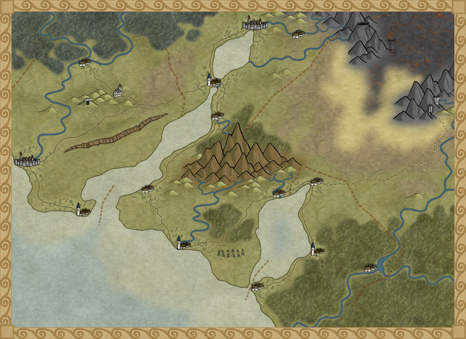
The deadline for my December Annual style is closing in and luckily enough the style is slowly coming to a more or less finished state. A lot of things, small and big have changed since my last blog post about the style. The city icons have been remade and some of the terrain I’ve gone over a second time to make sure they are good enough.
One interesting thing I’ve learned from making this style is that the end result has a tendency to change a bit while you work. The Truscian peninsula map, that is the original map for this style, is a regional map that still is quite zoomed out. The finished style will be suited for a more zoomed in regional map. Not that you won’t be able to do the zoomed out version but I think that it is in the more zoomed in version that the style will really shine.
There are still some things left to do on the style, I might try to add in some more icons and I’m thinking of adding in one or two mountain ranges that you can use as the base while creating your mountains. Just to make it easier for you to make a quick map.
The map below is the latest test map of the style. I hope you like it.
Originally posted on mappingworlds.wordpress.com

I really like how this is coming together and I eagerly await the opportunity to use it.
@Jess, Thanks for you comment. I hope you will get good use of it.
I simple, clean and elegant style. I look forward to trying it out!
I just don’t know how you all keep developing a completely new style each month. Novemeber and December look like real Crackers!
Thanks Bill, I’m glad you like the style.
I can also admit that the style originally wasn’t made for Profantasy. This is a style that I developed for my own maps I make in Photoshop. Profantasy then contacted me and asked if I could make it into a CC3 style for them (even though Ralf handles all the actual CC3 programming, I just draw the pictures). So it is a style that has evolved outside CC3 for a very long time.