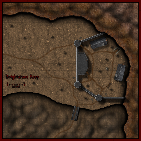
[This map was created by forum user anomiecoalition.]
After a rather lengthy hiatus from the world of fantasy and roleplaying, I recently convinced a few friends to give it a try and set about constructing a world that would keep their interest. Along the way, I stumbled upon Campaign Cartographer 3 and was amazed at the maps that people were producing with it and the possibility that it provides to even the artistically challenged (like myself). After a short couple of week tinkering with the program and learning a great deal from the tutorials available I constructed Brightstone Keep.

The map and its back story are loosely based on a free adventure provided by Wizards of the Coast. The keep protects a mining operation that has been overrun by a variety of nefarious creatures. The symbols utilized can be obtained from the CSUAC.
The first step in creating this map was to establish the basic layout. I depicted a mountain wall running from the top left to bottom right corner for which I used three separate sheets and shapes. Then I added cliff running left to right towards the bottom of the map on another sheet.
Adding the Mountain
I began by drawing a rough outline of the mountain wall and filled it with a dirt texture. I learned that it is a good idea to draw beyond the map border on these shapes to ensure that if I applied any edge-fade effects, they wouldn’t appear on the border side of the map. Using effects I then applied a slight blur and two black outer glow effects – one with strength of 0 above another with strength of 1. I then created two more shapes and sheets to go above this mountain wall and utilized different dirt textures. To these sheets, I applied a slight blur and an edge-fade-inner effect.
Adding the Cliff
Depicting the cliff was a bit simpler – here I just reused the dirt texture from the background but constructed a separate shape on a separate sheet and applied a similar setting as that use on the first mountain wall sheet (but with an inner glow). The final step was to add some hill overlay transparencies to add some character to the terrain. I applied these symbols on a separate sheet and varied the size/orientation to achieve the desired effect.
Adding the Keep
In constructing the walls of the keep, I created four sets of sheets and shapes. I began by drawing some solid gray lines (width of 6 – adjust to scale) to create the outer wall. I then applied a texture sheet effect (stone texture of your choosing, Intensity 1, size 15); on top of that a black outer glow (strength 1, blur 2); a wall shadow (length 15, opacity 65, blur 5); and finally a bevel (length 1.5, strength 35, and fade 1). I next wanted to create a walkway for that wall. I copied the image to a new sheet and reduced the width to 3. I then applied a texture sheet effect (with a different stone texture but same settings) and an inner black glow (strength 1, blur 2). I followed the same procedure to construct the towers/ramp and placed those shapes and sheets on top of the wall. (The ramp actually required that I draw in a black shadow on the right side to give it some dimensionality.)
The Road and the Rest
The last step was to draw in some roads and tracks. I laid down a road (added a texture, blur, and edge-fade-inner sheet effect) and then drew in the tracks according to the instructions provided in the Jon Roberts Special Issue of the Annual. From there it was just a matter of placing some vegetation, rocks, buildings, and text to complete my map.
I had a great time making this map and was amazed at how easy it was once I familiarized myself with the program (the video tutorials and assorted blog entries are invaluable.) I just hope my friends enjoy playing with this map as much as I enjoyed making it.
*I plan on posting more of my maps on my new blog
 CC3+ is only a few days out and we already have the first user tutorial on the community forum. Malmo3000 modified the new Mike Schley Overland style to create his Skalderand map depicted on the right, and explains his process in this tutorial. Here’s what he has to say: