ralf | March 2, 2020 | Annual, Cosmographer 3, Science Fiction, starship
 The March issue of the Cartographer’s Annual 2020 is now available. The map pack “Alexandria-class Starship” contains a fully realized space ship, including an exterior view, multiple decks and a description. In addition the Annual issue comes with 186 science fiction/modern bitmap fills and a tutorial on how to import and use these in any map or style of your choice.
If you have already subscribed to the Annual 2020, you can download the March issue from your registration page. If not, you can subscribe here.
Comments Off on March Annual: Alexandria-class Starship
ralf | March 5, 2019 | Science Fiction, scifi, starmap, starship, Traveller
Traveller by Marc W. Miller was the among the first science-fiction role-playing games ever published and remains a popular game to this day. It’s sector maps and starship deckplans are iconic images of the rpg hobby and of course we had to include compatible material when we produced our science fiction add-on Cosmographer 3. Let’s have a look at what we included.
 The Big Picture
One of the signature styles of Cosmographer 3 is the big “Galaxy Map” style, and you might be tempted to recreate Travller’s huge “Charted Space” map in its beautiful blue, white and black colors. But you’ll find that is not necessary – as were tempted just as much and included this map as an example among the drawings that come with Cosmographer 3. Edit it to your liking and print it as a huge poster map if you like. Of course the matching template is there for you, if you have your own galaxy to map!
 All the Sector Maps You Need
Apart from containing normal templates for Traveller’s sector maps, Cosmographer 3 also contains a very powerful data import feature. It draws the numerical data of a selected sector from the web (www.travellermap.com) and generates a full sector map from it, including x-boat routes and allegiance codes. Watching the import and auto-generation process alone is just pure, unadulterated fun.
 You can create such map in the bitmap style as shown on the left, or in the classical black and white print style of the published Traveller books.
Of course the smaller subsector maps are also available as templates, again both in traditional black and white (as on the left) or Cosmographer’s bitmap style. Wile they can’t be automatically generated like the sector maps, you can easily copy the necessary content of the sector map over into this smaller section.
 Let’s Swing around the Sun Once More
One of the less iconic but no less useful type of maps used in Traveller are the system charts, showing the planetary orbits of a star system. These show the distances of the various planets and other celestial objects from their central star.
As usual the templates are available both in a black and white vector style and a full color bitmap version (depicted here). As they are much less setting-specific than the sector and subsector maps, these are useful for almost any science fiction setting beyond Traveller.
 Zoom in Closer
What would Traveller be without its world maps? Well, at least a lot less iconic. Of course Cosmographer 3 includes templates of the classic icosahedral projection, subdivided into hexes. These come in a variety of sizes, scaled to the standard UWP (Universal World Profile) designations of the Imperial Scout Service.
One of the two versions of the style depicts the world as if shown in a satellite image (while keeping the hex map aspect) and the other as a clear and simple vector abstraction, ideal for planning and hex crawling. The symbols depicting the terrain features in this style were taken directly from the Traveller 5 draft document (Cosmographer 3 was released before T5).
 And How Do We Get There?
Last but not least, Cosmographer 3 has the templates for the most important aspect of the Traveller setting: the starships. The classic black and white style is straightforward to use and shows everything clearly, but of course the Traveller ships can also be mapped in Cosmographer’s own more elaborate bitmap style. We’ve included templates for two of the most used ships in Cosmographer 3, the 100t Scout and the 200t Free Trader. The maps are outlines only, so any custom interior design can be added to the deckplan in minutes.
After Cosmographer 3’s release we ran a poll to see what other ships our users wanted to see and added the three most popular selections as extra downloads for free.
All of these maps and styles and much more non-Traveller specific resources are available as part of the Cosmographer 3 add-on for Campaign Cartographer 3+.
Comments Off on There’s a Traveller in my Cartography!
ralf | March 1, 2019 | Annual, Cosmographer 3, Floorplans, Science Fiction
 The March issue of the Cartographer’s Annual 2019 is available now. Create futuristic bases including exterior views and interior floorplans, with or without Cosmographer 3. The issue also comes with 5 example maps showing two example bases.
The 7-page mapping guide takes you through creating the base’s layout and exterior view, tells you how to easily create floorplans from the exterior view and explains how to link the various maps together with hyperlinks. While it is a self-contained style, it shares some resources with Cosmographer 3 and can therefore easily be combined with it for access to many more floorplan symbols.
If you haven’t done so already, you can subscribe to the Annual 2019 here. If you are already subscribed, the March issue is available for download on your registration page now.
Comments Off on Cartographer’s Annual: March 2019
ralf | March 2, 2015 | Annual, McAlea, Science Fiction, scifi
 It’s time for some futuristic maps with the March Annual issue that has just been released. Steph McAlea created a set of symbols and textures that makes drawing planetary star ports a snap. Grab the style pack “SciFi Downports” from your registration page.
If you haven’t subscribed to the Annual 2015 yet, you can do so here.
Comments Off on Cartographer’s Annual: March issue
jonasgreenfeather | April 27, 2012 | Cosmographer 3, Design Theory, Science Fiction, Space Opera, Starship Design
When I was 7-ish I walked into the living room where dad was watching a show about space ships, guys in primary colors and aliens, “What’s this?” “Star Trek, it’s about space.” he said, between the dialog. I sat down next to him quietly, completely transfixed, I remember, at the time, feeling really special that he’d share this with me. I’ve been pretty lucky with my parents: Mom gave me my love of all things Fantasy and from dad, Science Fiction. Because of him I’ve always loved drawing starships; exteriors, interiors, odd angles, you name it I’ve put it on paper somewhere. I’d like to share with all of you my process of creating a starship deck plan and elevation cross section, from the initial idea of the pen and ink sketch to the final completed render. I’ll be documenting the good and the bad (and the design dead-ends) with the hope that it inspires others to share their designs as well.
A science fiction cornerstone for any grand space opera, is a well-designed and believable vehicle for your PCs. A good ship design should get an emotional reaction from everyone who sees it.  If some minor planning takes place during the early stages of the design, your players will treat it like another character they encounter in their game: love it, hate it, mourn it when it’s gone. If you ignore a setting where your characters will spend a good portion of their campaign you risk the worst reaction of all: indifference.
Like every NPC, a well designed ship should (figuratively and literally) propel the plot forward while serving as a hub and safe haven; a place your players can catch their breaths and decide what action to take next. But, it should also fit into the story as well: Do you have a galaxy spanning mystery and need the best and brightest to solve it? A ship that encompasses human knowledge and understanding and aids its crew in accomplishing the mission at hand, like the Enterprise, fits the need nicely. What if your players discovered some unspeakable evil and a vehicle is needed to intensify the isolation and paranoia as they try and survive? The Ishimura (Dead Space) or Nostromo (Alien) are great examples of a design that works against the goals of its passengers. In the end, creating a good back story for your starship is as equally important as deciding where the engine and bridge belong.
What’s the need?
When it comes to designing a starship there are 3 basic roles that can describe any ship type you’ll need in your campaign:
1. Ships that carry stuff/people/aliens
2. Ships that look for stuff/people/aliens
3. Ships that want to blow-up stuff/people/aliens
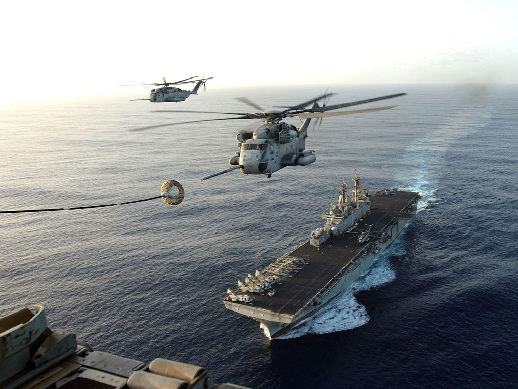
That’s not to say you can’t have a ship that does more than one role (like a spaceship that looks for stuff and blows up stuff) but, by focusing on a single role in the beginning your boat design will be easier to flesh-out. If you look at any modern naval ship, for a contemporary example, you’ll find that these three roles are often mixed; the United States’ Navy’s Wasp class amphibious assault ship performs each of these roles very well:
Move a lot of Marines into battle, quickly (carry people)
It’s a small(ish) aircraft carrier (blow up people/stuff)
Support search and rescue/humanitarian missions (look for stuff)
The original design goal, get Marines on the beach quickly and once there support them so they don’t get killed, defines the need; the secondary roles it.
The first question you should ask yourself is: What will I need this ship to do? I’ve posted some small ships on the forum that already cover the look for stuff / blow up stuff roles and now, for this post I want to try a smaller carry people role troop transport…
What’s the story?
The next step is filling in the back-story of your ship, and this can be as detailed or as sparse as you need and want. Since I know I’ll be designing and building a troop transport, I now have to ask: How will it do that?
The idea of a large box packed full of soldiers slowly de-orbiting and dodging anti-aircraft fire seems to me, representative of a WWI mindset (Just keep charging that trench, boys! Eventually their trigger fingers will cramp, then we got ‘em!). Once again, this is not a bad idea; it’s just not how I want to design this ship. I want a ship that’s more nimble, marginally concerned with passenger comfort and safety, and if some damage is taken, not doom everyone.
I’ll also need to consider how many troops will be carried on board, once I decide this, filling out the remaining ship’s crew will be easier. Since I’ve decided to make this a smaller, company sized, troop carrier (about 140 soldiers) I’ll need to determine how to get them to the battle field.
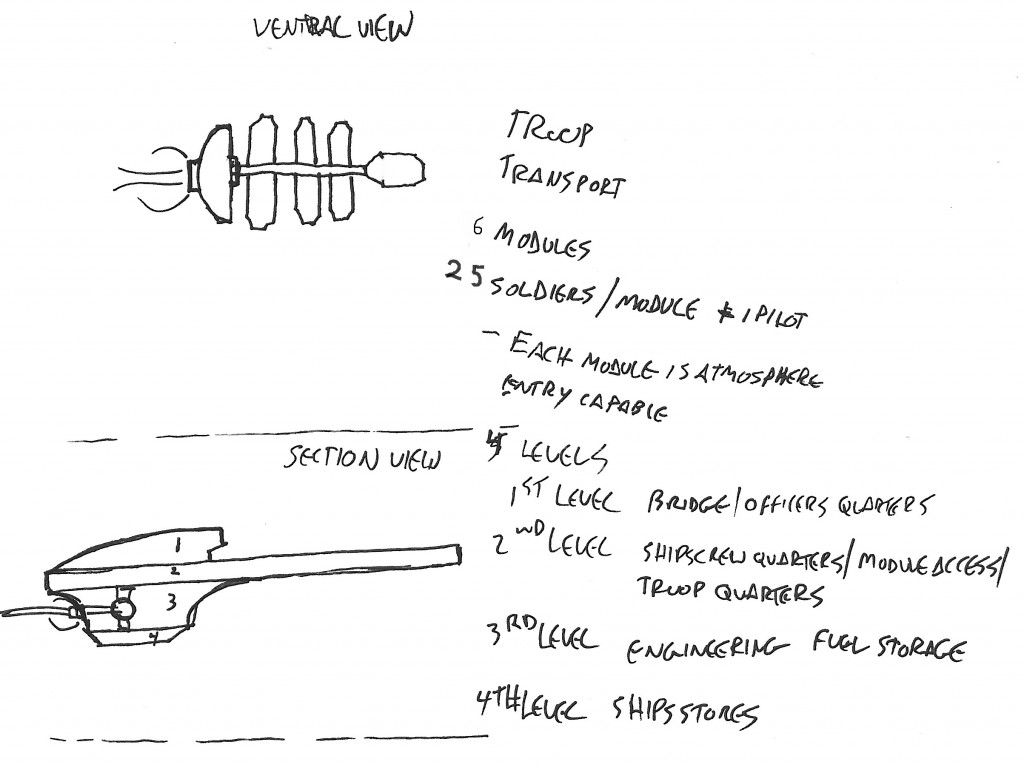
 The final piece of this initial puzzle and the ship I’ll be designing is one that will get the drop ships to where they need to be. The (very rough) sketch to the left shows all the major details of the troop carrier, plus a few detail notes. This drawing shows a four level transport with six drop ships that attach to it along a central corridor.
I like the image of fast entry orbital drop ships leaving trails of super-heated plasma as they tear through the sky, when they get to their LZ, anti-gravity engines kick in slowing their descent, the troops rushing out to meet their fates when they touch down.
I want to avoid the look of a modern aircraft carrier or the BSG, where ships are parked in an enormous internal hanger. If things get bad during an insertion and the hull is breached,… well, all hands lost. Part 2 will have us transfer the drawing into Cosmographer 3 and start to place points of interest like command and control, engineering, and living and work spaces.
Keep Calm
and
Map On
1 Comment
 The March issue of the Cartographer’s Annual 2020 is now available. The map pack “Alexandria-class Starship” contains a fully realized space ship, including an exterior view, multiple decks and a description. In addition the Annual issue comes with 186 science fiction/modern bitmap fills and a tutorial on how to import and use these in any map or style of your choice.


