ralf | October 1, 2022 | Annual, Jon Roberts, overland maps
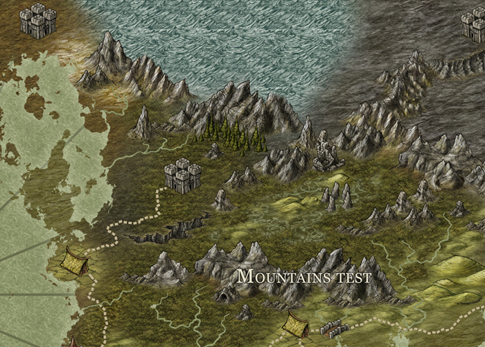
 The October issue of the Cartographer’s Annual is now available. itrevisits an old favorite style: Jon Roberts’ overland entry from the Annual 2011, adding new bitmap fills, drawing tools and settings to take advantage of the newer features of CC3+.
The Jon Roberts Revisited style gives you all the tools and symbols for overland regional, continental or world maps. The 5-page mapping guide takes you through the whole process of creating the map.
The October issue is now available for all subscribers from their registration page. If you haven’t subscribed to the Annual 2022 yet, you can do so here.
Comments Off on October 2022 – Jon Roberts Revisited
ralf | April 15, 2020 | cc3plus, Jon Roberts, Naomi VanDoren
Recently – with Update 25 – we included a few new styles with basic Campaign Cartographer 3 Plus. As these were styles in the Cartographer’s Annual before, they all come with a mapping guide and example maps, and we want to highlight these to get you started using the styles as comfortably as possible. Let’s take a look at each of the in turn.
Jon Roberts Overland
 This overland style created by was created by fantasy cartographer Jonathan Roberts (famed for his Song of Ice and Fire atlas) specifically for Campaign Cartographer. Jonathan’s evocative style comes alive for CC3+ users with a full selection of overland symbols and background textures, organized in an easy-to-use drawing style.
The included mapping guide walks you through the whole process, from setting up the map in the new map wizard through outlining the continent, adding rivers, mountains and settlements, all the way to labeling the map with text. You can download this mapping guide here.
The included example map show the the Bay of Ormal and surrounding lands. Download it as a pdf file or in native CC3+ format.
 Jon Roberts Dungeons
Seeing the popularity of his overland style, it was only natural to follow up with a dungeon style and Jon was happy to oblige us. It includes a set of almost 150 symbols from rocks and stones of a cave floor to furniture to populate the rooms, as well 40 textures to depict walls, floors and terrain.
The mapping guide, which you can download here, teaches you to use the style by going through the process of creating a tavern and inn layout.
The style comes with two beautiful example maps, one showing the Dread Dungeon (pdf) and the other the Crossroads Inn (pdf) featured in the mapping guide. Download them in native CC3+ format here and here.
 Jon Roberts Cities
Having an overland and a dungeon style, we of course needed to complete the classic trinity by adding a city style. Jon was able to produce that for us in 2012, and it remains one of the most beautiful city styles in Campaign Cartographer 3+. 37 textures and more than 70 symbols combine to make up a great resource for city mapping.
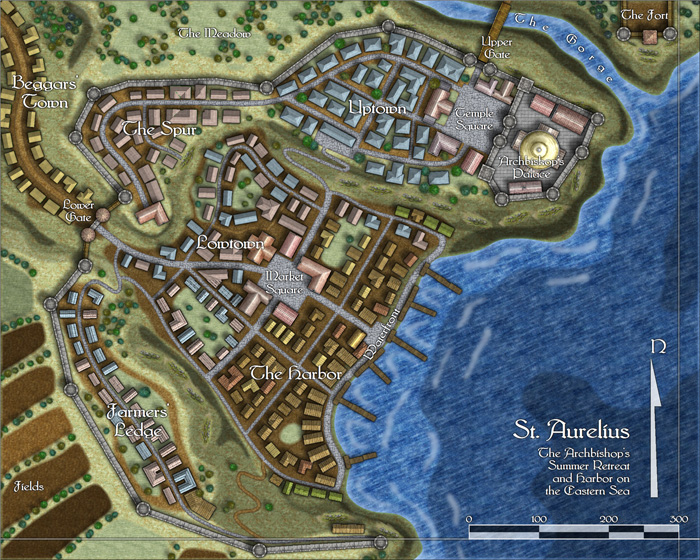
The mapping guide, which you can download here, takes you through the process of creating a city, and as such complements the City Designer 3 Essentials Guide very nicely. The St Aurelius example map is also available as a pdf and in CC3+’s format.
 Naomi Van Doren’s Floorplans
The fourth style included in Update 25 is another floorplan and dungeon style, created by map maker and graphic artist Naomi VanDoren. Her clear style lends itself excellently to illustrations and battle maps, and is featured in the 13th Age battle map products by Pelgrane Press. More than 200 symbols and 20 bitmap textures are included, and the mapping guide that teaches you how to use them is available here.
Two example maps are included: The Broken Shovel Tavern (png) and Owen’s farm (png), of course also available in CC3+ format here and here.
Comments Off on Mapping with the new styles in Update 25
ralf | April 15, 2013 | Annual, Jon Roberts, kobold press, midgard, overland
We have released the April issue of the Cartographer’s Annual 2013: The Midgard World overland style. Created in cooperation with Kobold Press and Jonathan Roberts, this style recreates the maps published in the Midgard fantasy campaign setting and the accompanying iPad atlas. You can now add your own regional maps for this setting, or recreate another world in the same mapping style.

Even better, the Midgard World style is compatible with the Jon Roberts overland style from the Annual Vol 5. They can be combined for a greatly enlarged variety of symbols and fill styles.
Comments Off on Cartographer’s Annual: the Midgard World style
Clercon | March 15, 2012 | Annual, Jon Roberts, mapping cities, Par lindstrom, textures
Originally posted on mappingworlds.wordpress.com

This month’s annual from Profantasy is a new city style designed by the fantasy cartographer Jon Roberts. This is the third time that one of Jon Roberts’ themes are presented as an annual. The two earlier versions have been an overland style and a dungeon style.
I must admit that I’ve really looked forward to the release of this annual. First of all I love city maps and CD3, secondly Jon Roberts is a very skilled cartographer and illustrator so I expected some really nice graphics in this one.
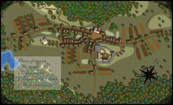
As expected, all the graphics are top notch and I especially like the walls and towers. To test the style I decided to make a rather quick village, called Crossroads, situated in the middle of a forest. The style was easy to work with and if you have done maps in CD3 before there isn’t really any new things to learn here. One little feature I liked however was the ability to make nice shadows on the hills. You can clearly see this on the hill where the temple of life & death (3) is.
After finishing the map there are some things I felt I need to work a bit more on next time I’m using the style. First of all the fields didn’t turn out great in the map; probably I have to try to put some more time on them in the future. When I started doing maps in the included styles in CD3 it took me a lot of trial and error before I got the fields right. So I have some more testing and practice to do here.
Another thing to think of is that in this map I had quite some open space between the forests and in the background texture you can see a pattern. I think the solution here is to add in some more different textures to hide the pattern. If you look at the included map in the annual you don’t see this pattern there.
At last if you look at the trees in the forest you can see that the northern forest has the trees more closely to each other. I actually think they got too close so in the southern forest I put some space between the trees. This made the forest look much better, in my opinion.
Overall I think the style is really strong. I like the darker colours of this one compared to the included styles in CD3 (which means less editing in Photoshop for me) . Still it takes some time to get to know the feeling of a new style, to get all the things in place in a good way. This one surely needs som more practicing for me before I’m there.
As usua,l I added the labeling in Photoshop, and I also selected another font. If you want to use the font I used it’s called Blackadder regular and can be downloaded from dafont.com for free.
1 Comment
ralf | March 1, 2012 | Annual, city, Jon Roberts
We are very happy to release another drawing style by fantasy cartographer Jonathan Roberts – this time it’s a city style, completing the standard trilogy of map types. Jon Roberts’ overland and dungeon styles were released last year in the Annual Vol 5, the latter being a free download. You can subscribe to the current annual here.

There’s also a little preview of the upcoming April issue, created by another extremely talented fantasy cartographer and artist, Herwin Wielink.

Comments Off on Cartographer’s Annual 2012 – March Issue
ralf | February 15, 2012 | Annual, cities, Jon Roberts
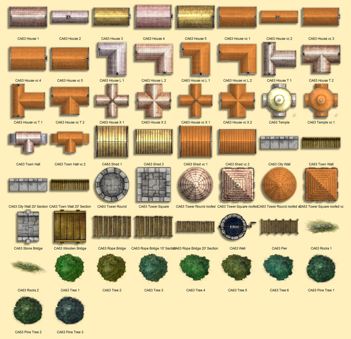
A little sneak peek on the symbols included with the upcoming Jon Roberts’ Cities style (the March issue of the Annual 2012).
2 Comments
ralf | July 30, 2011 | Jon Roberts
Mark Needham created these beautiful castle floorplans for the Time Ref – Medieval History website:

He used the Jon Robert’s Dungeon style released as the June issue of the Cartographer’s Annual 2001. This style is freely available for download and showcases the beauty of Jon Roberts’ artwork, as well as the value of the content of our Annual subscription.
1 Comment
ralf | June 1, 2011 | Annual, dungeon, Jon Roberts
We’ve just released the June issue of the Cartographer’s Annual 2011, and we’re very happy to present another style created by map-making artist Jon Roberts.
This time we went for a dungeon/floorplan style and the result is really gorgeous again. Take a look at these beautiful maps: Continue reading »
2 Comments
 The October issue of the Cartographer’s Annual is now available. itrevisits an old favorite style: Jon Roberts’ overland entry from the Annual 2011, adding new bitmap fills, drawing tools and settings to take advantage of the newer features of CC3+.


