Remy Monsen | September 29, 2024 | CC3 Plus, Cosmographer 3, tiles
 We have reached the final article in the series about making mapping tiles. In previous articles (Part 1 – Part 2 – Part 3 – Part 4) we discussed how to design such tiles, how to print or export them for use in other software, and how to make raster symbols in CC3+ from them so we could use the tiles for assembling maps quickly.
But, as we pointed out in the earlier articles, exporting static bitmap images have some limitations. For example, if you rotate them, you change the direction of shadows and patterns in the fill. One could just call it an acceptable tradeoff and move on, but there is a better way, and that is to turn these tiles into advanced symbols in CC3+. By making symbols that contain the actual entities in the tiles instead of static images, directions of fills and effects are calculated when the tiles are used, not when you originally make them, and it also allow you to actually change the content after placing them. In short, if you are going to make maps using the tiles inside CC3+, this is the best approach, so let us dig into how to achieve this.
Continue reading »
Comments Off on Mapping Tiles with CC3+ – Part 5 – Making Advanced Symbols
ralf | June 5, 2020 | AllTheAnnuals, Annual, Christina Trani, Cosmographer 3, scifi

Download the CC3+ file here. Note that you need the Annual 2019 installed to view it properly.

Download the CC3+ file here. Note that you need the Annual 2019 installed to view it properly.
Mapping with the Sci-Fi Base Annual
Mapping the floorplan of a Sci-Fi Base. Now, THIS was my jam. I finished the exterior map in less than 1.5 hours and then the interior in about 45 minutes or so. I flew through it. Why? Because THIS is what I LOVE about mapping….my mind was flying in 7000 different story arc directions as I was creating this pair of maps 😊
Now….I’d like to first start by saying I just started playing in a Starfinder campaign – although I REALLY wanted to play a Star Trek campaign, I got voted out – but space themed for sure since I can’t get anyone to jump on my Cthulhu bandwagon in my gaming group, but that’s a story for another time (Oooh I sure hope ProFantasy asks me to map the Annual with the Cthulhu city in it..now THAT’S a super fun city map pack). Anyway, I was pretty excited to map this base out.
I started with once again, following the Mapping Guide, since although I’ve had Cosmographer for years, I’ve hardly had a reason to use it, so I felt I needed some guidance with starting out here. Setting up this base was super easy following Ralf’s guide…along the way, as usual, tweaking a few things like adding an RGB Matrix effect to the Whole Drawing just to give everything a little greenish grey look….it IS an alien planet. I also added a sheet SYMBOLS IN DOME – for those symbols I wanted to show under each dome and a LIGHT sheet for the light effect I created for the spotlights.
Other than those simple modifications, and using some symbols in an unorthodox way, I pretty much stuck to the Mapping Guide. I decided to include the Hyperlinks in this map, since the Guide included it, although I usually do not use this for my own maps, though it IS a pretty useful too and quite easy to do.
I’ve said this once and I’ll probably say it like 9 more times before this year of Annuals is up, but read through the provided guides….it can take a bit more time than you planned on putting into a map, but reading through how the creator of the style or program put together their maps is hitting the jackpot of mapping knowledge in my book.
Have some fun experimenting with this Annual. I really had to refrain from using any of the other Cosmographer symbols I have (and for those that KNOW me, know that was VERY difficult, lol) because I really wanted to show this Annual as a standalone, as you do not need Cosmographer to get all these great assets. Now go… create your own Sci-Fi Base and share them on the ProFantasy forums!
About the author: Lorelei was my very first D&D character I created more years back than i’d like to remember. When I decided to venture into creating maps for my and others rpgs, I thought I owed it to her to name myself Lorelei Cartography, since it was her that led me to the wonderful world of tabletop gaming in the first place. Since then I have been honored to have worked with companies such as WizKids, Pelgrane Press, and ProFantasy.
1 Comment
ralf | March 2, 2020 | Annual, Cosmographer 3, Science Fiction, starship
 The March issue of the Cartographer’s Annual 2020 is now available. The map pack “Alexandria-class Starship” contains a fully realized space ship, including an exterior view, multiple decks and a description. In addition the Annual issue comes with 186 science fiction/modern bitmap fills and a tutorial on how to import and use these in any map or style of your choice.
If you have already subscribed to the Annual 2020, you can download the March issue from your registration page. If not, you can subscribe here.
Comments Off on March Annual: Alexandria-class Starship
ralf | March 1, 2019 | Annual, Cosmographer 3, Floorplans, Science Fiction
 The March issue of the Cartographer’s Annual 2019 is available now. Create futuristic bases including exterior views and interior floorplans, with or without Cosmographer 3. The issue also comes with 5 example maps showing two example bases.
The 7-page mapping guide takes you through creating the base’s layout and exterior view, tells you how to easily create floorplans from the exterior view and explains how to link the various maps together with hyperlinks. While it is a self-contained style, it shares some resources with Cosmographer 3 and can therefore easily be combined with it for access to many more floorplan symbols.
If you haven’t done so already, you can subscribe to the Annual 2019 here. If you are already subscribed, the March issue is available for download on your registration page now.
Comments Off on Cartographer’s Annual: March 2019
ralf | December 2, 2018 | Annual, Cosmographer 3, Deckplans, Geomorphs
 For the end of the year we blast off into space and the future with the Deckplan Geomorphs tool pack. Inspired by the work of Robert Pearce on Yet Another Traveller Blog, we’ve created the tools that allow you to create geomorphic deckplan tiles.
Of course we’ve also included a set of examples that you can modify or use straight out of the box to create large starship or space station layouts by simply assembling the tiles into various configurations. It’s as easy as importing a file, rotating it and placing it on the template adjacent to previous tiles. With Cosmographer 3, you can even just continue working on such a constructed deckplan with the normal starship tools.
Keep your eyes open for the upcoming 2018 bonus issue (by Sue Daniel) and the opportunity to resubscribe for the 2019 Cartographer’s Annual in mid-December.
You can subscribe to the Annual 2018 here. If you are already subscribed, the November issue is now available for download on your registration page.
Comments Off on Cartographer’s Annual: December 2018
ralf | June 17, 2015 | ashen stars, Cosmographer 3, scifi, starship
 Dive into the depths of space with the June Annual and the Mandible-class starship. Inspired by the Ashen Stars RPG by Pelgrane press, this set of four deckplans shows a complete starship in high detail. An extensive sheets & effects guide discusses the different sheets and effects used in the drawing, so you can apply the principles to your own designs.
If you haven’t subscribed to the Annual 2015 yet, you can do so here.
Comments Off on Cartographer’s Annual: June Issue
jonasgreenfeather | April 27, 2012 | Cosmographer 3, Design Theory, Science Fiction, Space Opera, Starship Design
When I was 7-ish I walked into the living room where dad was watching a show about space ships, guys in primary colors and aliens, “What’s this?” “Star Trek, it’s about space.” he said, between the dialog. I sat down next to him quietly, completely transfixed, I remember, at the time, feeling really special that he’d share this with me. I’ve been pretty lucky with my parents: Mom gave me my love of all things Fantasy and from dad, Science Fiction. Because of him I’ve always loved drawing starships; exteriors, interiors, odd angles, you name it I’ve put it on paper somewhere. I’d like to share with all of you my process of creating a starship deck plan and elevation cross section, from the initial idea of the pen and ink sketch to the final completed render. I’ll be documenting the good and the bad (and the design dead-ends) with the hope that it inspires others to share their designs as well.
A science fiction cornerstone for any grand space opera, is a well-designed and believable vehicle for your PCs. A good ship design should get an emotional reaction from everyone who sees it.  If some minor planning takes place during the early stages of the design, your players will treat it like another character they encounter in their game: love it, hate it, mourn it when it’s gone. If you ignore a setting where your characters will spend a good portion of their campaign you risk the worst reaction of all: indifference.
Like every NPC, a well designed ship should (figuratively and literally) propel the plot forward while serving as a hub and safe haven; a place your players can catch their breaths and decide what action to take next. But, it should also fit into the story as well: Do you have a galaxy spanning mystery and need the best and brightest to solve it? A ship that encompasses human knowledge and understanding and aids its crew in accomplishing the mission at hand, like the Enterprise, fits the need nicely. What if your players discovered some unspeakable evil and a vehicle is needed to intensify the isolation and paranoia as they try and survive? The Ishimura (Dead Space) or Nostromo (Alien) are great examples of a design that works against the goals of its passengers. In the end, creating a good back story for your starship is as equally important as deciding where the engine and bridge belong.
What’s the need?
When it comes to designing a starship there are 3 basic roles that can describe any ship type you’ll need in your campaign:
1. Ships that carry stuff/people/aliens
2. Ships that look for stuff/people/aliens
3. Ships that want to blow-up stuff/people/aliens
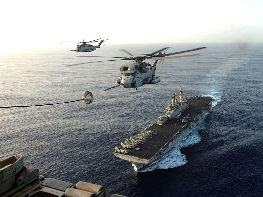
That’s not to say you can’t have a ship that does more than one role (like a spaceship that looks for stuff and blows up stuff) but, by focusing on a single role in the beginning your boat design will be easier to flesh-out. If you look at any modern naval ship, for a contemporary example, you’ll find that these three roles are often mixed; the United States’ Navy’s Wasp class amphibious assault ship performs each of these roles very well:
Move a lot of Marines into battle, quickly (carry people)
It’s a small(ish) aircraft carrier (blow up people/stuff)
Support search and rescue/humanitarian missions (look for stuff)
The original design goal, get Marines on the beach quickly and once there support them so they don’t get killed, defines the need; the secondary roles it.
The first question you should ask yourself is: What will I need this ship to do? I’ve posted some small ships on the forum that already cover the look for stuff / blow up stuff roles and now, for this post I want to try a smaller carry people role troop transport…
What’s the story?
The next step is filling in the back-story of your ship, and this can be as detailed or as sparse as you need and want. Since I know I’ll be designing and building a troop transport, I now have to ask: How will it do that?
The idea of a large box packed full of soldiers slowly de-orbiting and dodging anti-aircraft fire seems to me, representative of a WWI mindset (Just keep charging that trench, boys! Eventually their trigger fingers will cramp, then we got ‘em!). Once again, this is not a bad idea; it’s just not how I want to design this ship. I want a ship that’s more nimble, marginally concerned with passenger comfort and safety, and if some damage is taken, not doom everyone.
I’ll also need to consider how many troops will be carried on board, once I decide this, filling out the remaining ship’s crew will be easier. Since I’ve decided to make this a smaller, company sized, troop carrier (about 140 soldiers) I’ll need to determine how to get them to the battle field.
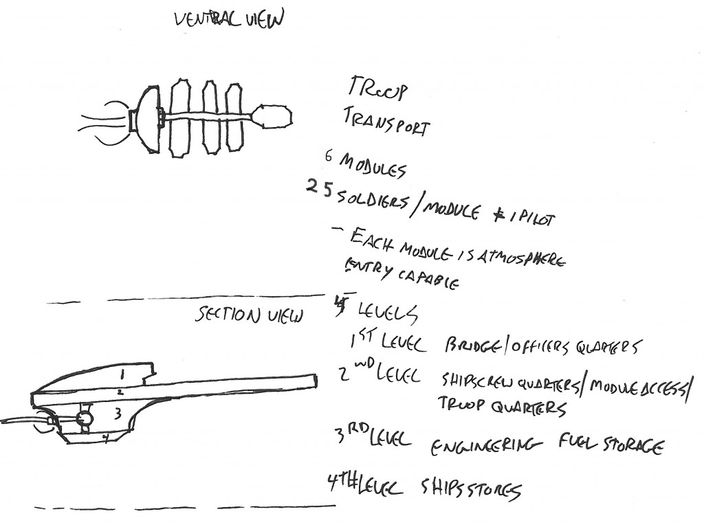
 The final piece of this initial puzzle and the ship I’ll be designing is one that will get the drop ships to where they need to be. The (very rough) sketch to the left shows all the major details of the troop carrier, plus a few detail notes. This drawing shows a four level transport with six drop ships that attach to it along a central corridor.
I like the image of fast entry orbital drop ships leaving trails of super-heated plasma as they tear through the sky, when they get to their LZ, anti-gravity engines kick in slowing their descent, the troops rushing out to meet their fates when they touch down.
I want to avoid the look of a modern aircraft carrier or the BSG, where ships are parked in an enormous internal hanger. If things get bad during an insertion and the hull is breached,… well, all hands lost. Part 2 will have us transfer the drawing into Cosmographer 3 and start to place points of interest like command and control, engineering, and living and work spaces.
Keep Calm
and
Map On
1 Comment
 We have reached the final article in the series about making mapping tiles. In previous articles (Part 1 – Part 2 – Part 3 – Part 4) we discussed how to design such tiles, how to print or export them for use in other software, and how to make raster symbols in CC3+ from them so we could use the tiles for assembling maps quickly.


