From Tolkien’s seminal Lord of the Rings, to Lord Foul’s Bane and Game of Thrones, blockbusting fantasy novels need maps you can flick back to when following the journeys of the protagonists. The Fantasy Reader blog provides an index with wide selection of examples.
Campaign Cartographer has been used to illustrate novels such as Shades of Gray by Lisanne Norman, Le Temple Des Eaux-Mortes by Eric Ferris, and Johannes Cabal the Detective by Jonathan L. Howard, and writer David Brown discusses his experience with CC3 here.
So, which are the best CC3 styles to use to sketch a world for your frontispiece? Most likely it’s black and white line are, though greyscale might work. Here are some suitable suggestions for overland maps.
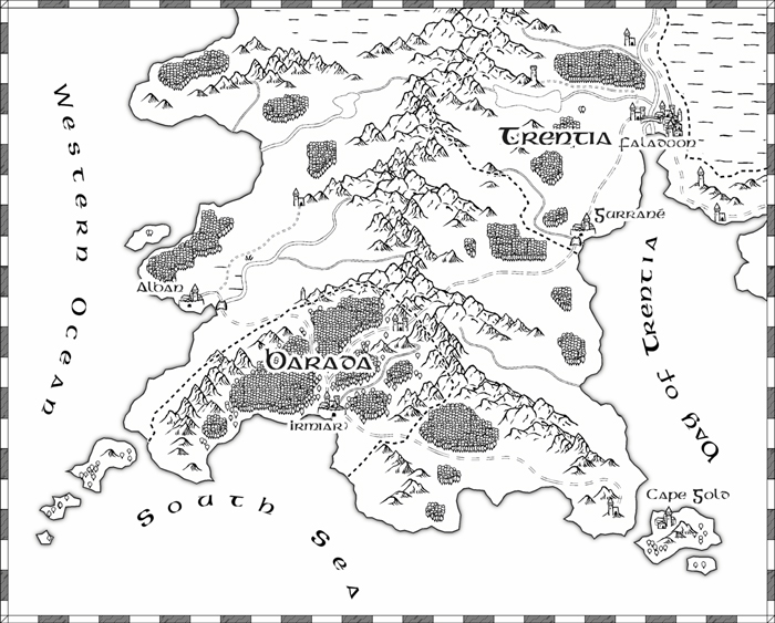
This prosaically named Overland B&W style is a perfect example of a simple style with which you can create a first fantasy map, It’s very straightforward to use.
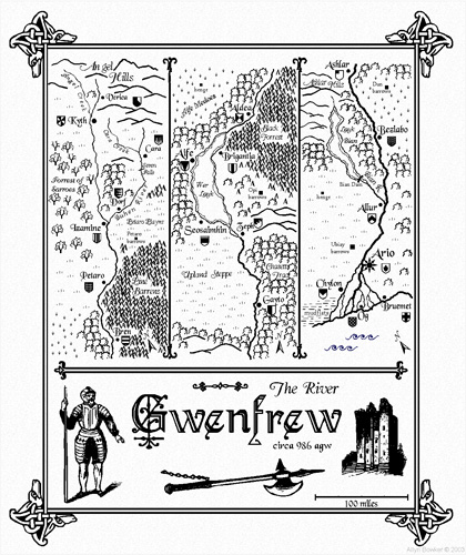
If you are writing a Medieval novel, this authentic stripmap style might suit you.
Continuing with the historical theme, this Mercator style (which comes out nicely in greyscale) would also suit.
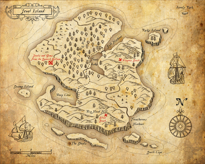
Perfect for tales of Caribbean swashbucklers, use this style to map on a larger scale.
And finally, this Tolkienesque style will suit the traditionalist.
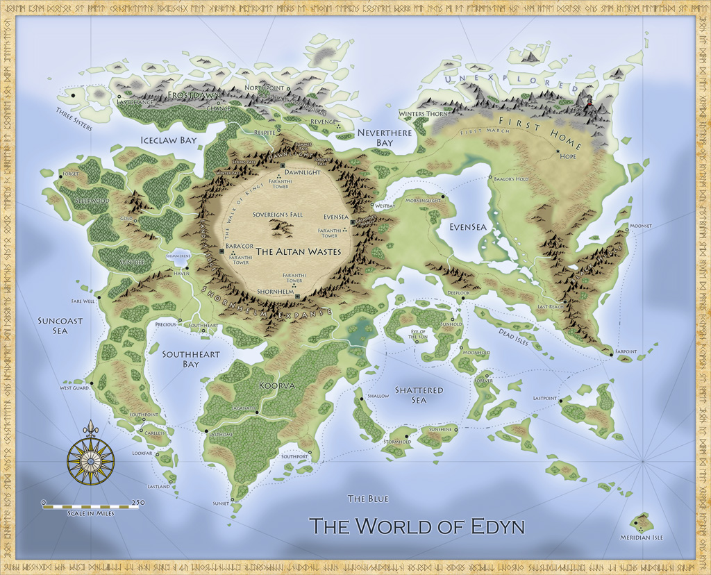
For those who can justify the full colour treatment, here is an example by Ralf Schemmann for
Mythborn: Fate of the Sovereign by Vijay Lakshman. It’s created with Fantasy Worlds style by Pär Lindström.


