First off, I apologize for the long lag between part 5 and 6 of this series: it was not my intention, but a series of life events conspired to take me away from mapping. But I’m back. Thanks to everyone for the kind words of support along the way.
If you need to refresh your memory about the project, here are links to Mapping Cities part 1, part 2, part 3, part 4, and part 5.
In this session, we’re going to fill in the blocks of our district with buildings, lots and lots of buildings.
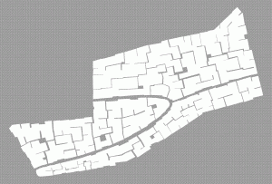
We’re starting with the Entertainment district, which I’ve completely filled with block designations:
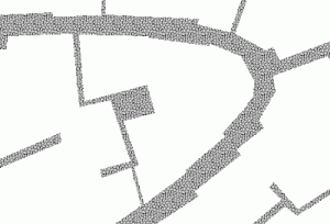
It’s a little hard to see in the overview, but I’m going to work on the block in the middle of the district – just where the bend in one road meets another coming from the right. You can see that the road is defined by the absence of buildings, and I’ve left alleys at random places throughout the block.
I’m purposefully haphazard about how I put these blocks in – for a medieval city, I don’t need a lot of square corners and perfect streets. The blocks become guidelines so that I know where to leave room for streets, squares, and public spaces.
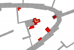
We’ll start by putting in landmark buildings. We’re going to put these in from the CD3 symbol library –Read post 5 for an explanation why. I’m going to start by putting 5-7 landmarks for a block, that usually works out that each street has a few landmarks that make it interesting. Here are a few pointers to keep in mind:
- I’m using variable color symbols, and plan to do the city in mostly red tile roofs. I’m starting with color 167 for the large buildings, and plan to get darker for the other buildings – it will make the landmarks stand out a little more making them easier to find. To me it also looks like more sunlight on bigger buildings as well.
- Enabling smart tracking on the symbols lets me align them with the roads, which is a great help. But after that, sometimes smart tracking can fight you in getting the building in the right place. Just go ahead and get the alignment of the symbol correct, then move it if you need it in a different position.
- Most buildings in a city will have their shorter side facing the street – that reduces taxes and maximizes the value of the limited road space. For these first buildings, it’s a rule worth keeping in mind but also violating freely. After all, these are landmarks, which are supposed to draw attention.
- I like to expand the symbol collections and place specific buildings. But when I run out of imagination for that, I start picking randomly (or quit for a while)
- Take notes as you go! I can’t tell you how many times I’ve had a great idea for one specific building, that I’ve forgotten when I came back to work on the map.
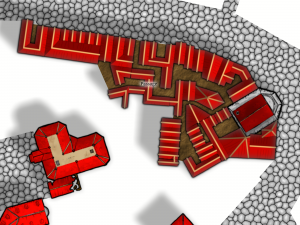
Here are my landmark buildings placed:
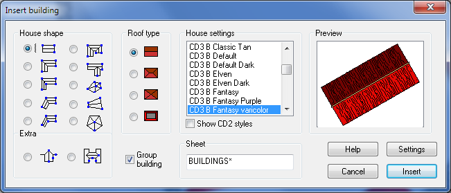
Now we’re going to fill in a bunch of smaller buildings, using the Insert Building Tool (). I’ve darkened the red to 164, and used the following options:
Now, we’ll start putting in the smaller buildings, and next time we’ll give some tips to make everything look great without worrying. Here’s a shot of the block in-progress to show where we are going:
The City Mapping Series
Part 1: Location, Location, Location
Part 2: Urban Planning
Part 3: Laying out Districts
Part 4: Districts in CC3
Part 5: Sizing Buildings
Part 6: Filling Blocks in CC3
Part 7: Houses Galore!
Part 8: Outside the Gates
