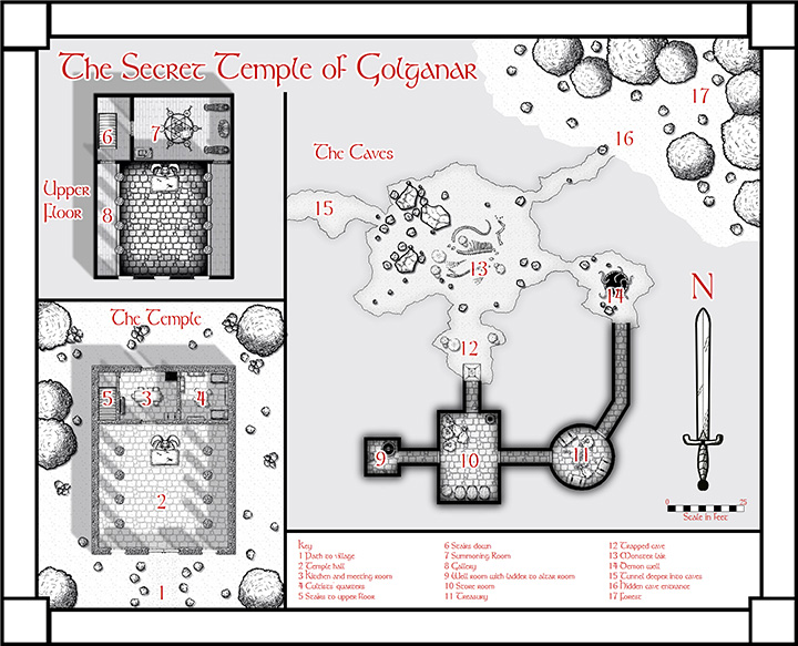
We’ve just released the October issue of the Cartographer’s Annual 2013. Check out another beautiful black and white style by Pär Lindström, this time for floorplans and dungeons. If you haven’t already, you can subscribe to this year’s Annual here. If you have, download the issue from your registration page.

Is it me, or are the 3D plans (Temple and Upper Floor) a bit odd?
Gavin, what do you mean by “odd”?
I may have to send you an email with the plans annotated to make it really clear.
However, the stripes under the 8, the pillars in room 2 have shadows but no apparent light source, the southern wall of the temple has a continuous brick pattern. Room 7 has two non-contiguous shadows, again with no apparent light source. The right-hand side of room 8: I can’t tell if that’s supposed to be shadow or a floor fill.
As I say, it all looks just a bit… odd. 🙂