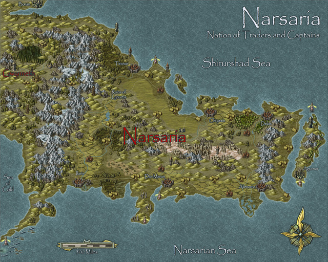
The November issue of the Cartographer’s Annual 2012 is out now. In response to popular demand we’ve expanded upon Herwin Wielink’s extremely popular overland style (released in April), adding 150 new symbols, a dozen new bitmap fills and 30 drawing tools. To bring it all together there’s a 2 page guide listing the new material. Together with the original material from April this makes a 6-page guide to mapping with this wonderfully attractive style.
The new material integrates seamlessly into the existing style, and can be added to both new and existing maps.

I *really* like the Annuals based on Herwin Wielink’s work, and the maps folks have produced with them are fantastic. But, I’ll admit, I prefer your Narsaria map in the other styles that I’ve seen it in (including your original, awesome, vector style).
~Dogtag
In a way, I agree with you. This was an experiment on how converting an existing map to this new style might work. Original maps created with the Herwin Wielink style will probably be better.
On the other hand the Narsaria map has always been a “problem child” for me. I’ve never been 100% satisfied with any version. Still looking for the perfect one.