As we wanted to be as impartial as possible, we’ve asked fantasy cartographer Mike Schley to be the judge for our January competition. He took his job very seriously and came back to us with the following results:
First, I would like to thank Profantasy for inviting me to serve as judge for this mapping challenge. When approached by Simon to decide the results of this competition I jumped at the chance. Then, upon seeing the work, I realized how difficult the task would be. Assessing each entry in a logical manner and narrowing the field to two pieces would require making tough choices on the narrowest of margins.
My methodology for examining the submissions came directly from my own cartographic practice and relied on the three criteria by which I judge my own work. These measures include aesthetic appeal/creativity, visual readability, and usefulness of the information provided. Given the straightforward parameters set down for the competition, “create a map of an island, less than three miles wide” scoring the entries by these criteria made for a process that, though difficult, was fairly straightforward and analytical.
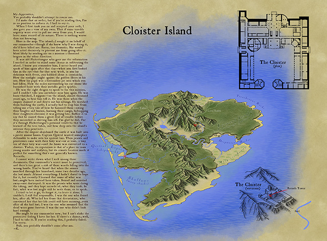
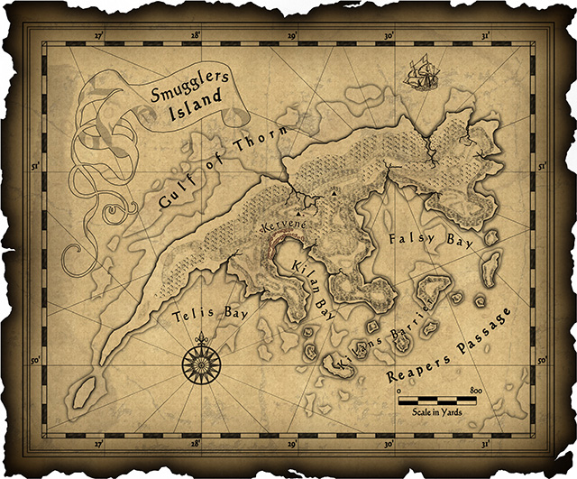
So without further delay, the winner is… entry #17 Cloister Island, followed closely by the runner up, entry #15 Smugglers’ Island.
Of all the submissions, I felt that the Cloister Island map functioned best as both a visual information system and an inspiring illustration of its setting. Even though the cartographer left off a compass rose and scale bar, the overall work felt the most coherent and provided numerous levels of information. Like an onion, the island and story revealed themselves in layers, giving the reader an opportunity to explore deeper and deeper into an immersive world. On top of this, I’m a sucker for hand drawn isometric maps.
Choosing a runner up was probably the hardest part of the job since there were a number of maps that I felt had quite a lot going for them. I selected Smugglers’ Island mainly because it’s design and presentation of information felt more unified than the other entries. The visual details work well together and the cartographer’s choice of font, embellishments, and patterning add up to a striking, if somewhat cluttered, image.
Finally, I would like to thank everyone that contributed work to the competition and encourage them to keep at it. Designing worlds is something dear to my heart and it was a joy to see so many thoughtful approaches to the assignment.
Sincerely,
Mike Schley
So the winner of the competition and the new holder a full ProFantasy Patron License is xianpryde. Congratulations!
The runner-up, dfahr, receives a ProFantasy store voucher worth $100. Also congratulations.
And thanks to everybody for their submissions. Your work was all wonderful!

