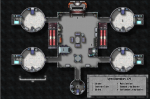
[NLP138 from the ProFantasy forum produced this excellent floorplan using Cosmographer. This is how he did it:]
 Well, I knew I wanted to do a floorplan and so my first thought was to fire up DD3 but I’m really lazy so loading the other textures and symbols sounded like a drag and I knew I wanted to use symbols and textures from Cosmo3. So instead of using Dungeon Designer I started off with a Cosmographer bitmap deckplan. I’d already spoken with my friend who was running the game to get the specifics on the size of the pods and the central hub so picking my dimensions was more or less already done for me.
The first thing I did was I drew out the pod you see in the upper-right. The walls surrounding it are actually two arcs because I was having a hard time trimming the wall to insert the door symbol – at first I drew the walls as a circle (there may be an easier way to do this but I’m still not that savvy). Once the pod was completely built (to include furniture) I copied it once and moved it down. Then I did a mirror copy of the pod to give me the same layout on the other side – originally I was just going to make 3 copies and then rotate them but I didn’t like the way that would end up looking furniture-wise so I was happy to see there was a mirror function (this was a bit of a learning experience for me). The last smaller pod was made in the same fashion but made deliberately more cramped in with a dingier looking floor texture to reflect the lower social and economical status of the inhabitant.
The central node was then drawn – I wanted to use a different deck texture from the pods since according to the gamemaster the pods were modular and could be swapped out and exchanged. I figured the central hub then would be very neutral then regardless of the other occupants wealth level. Adding the symbols was a lot of fun – but slightly tedious at times trying to get them just right and I’m sure I could zoom in to some of the sections and find tiny mistakes.
Once all of the embellishments were in place it was just a matter of tweaking the sheet effects. I used the default ones and then altered them slightly – I think I added a wall shadow to the “bulkheads” sheet and I know I played with the different symbols effects trying to keep them from throwing too many weird shadows. I also created two sheets for the legend plate in the bottom right but I think it looks pretty standard. Just a couple of rectangles with shadow/blur effects and some words on that.
On my website I’ve got the finished image (not as high rez) and a few of the “in production” images that I sent to my play group to show them the process.
