Again, we’ve got a ton of great new user maps to present. The month goes by so quickly and still they continue to pile up. Let’s see what we’ve got…
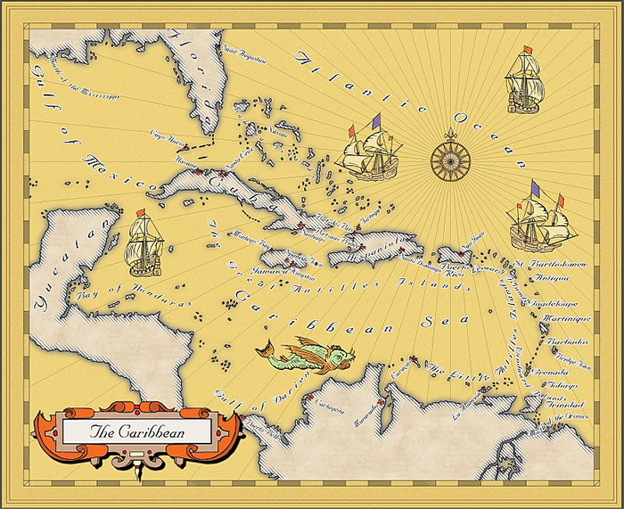
First there is the BlindMapMaker with this gorgeous rendition of the Caribbean Sea in the Mercator Historical style. Way to start this round-up!
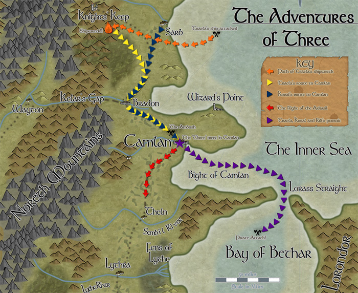
TolrendorDM used the May Annual style on a Pär Lindström Regional style map to depict three journeys on that map. This is exactly how I imagined the style to be used.
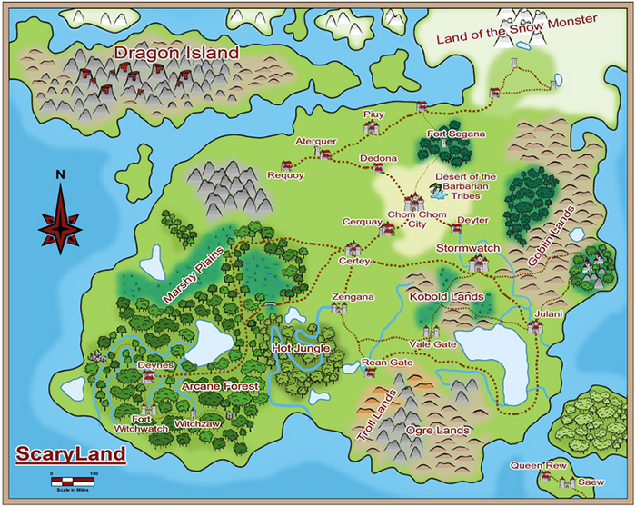
Additionally he also used last month’s “Comic Overland” style to map Scary-Land, his sons very own campaign world.
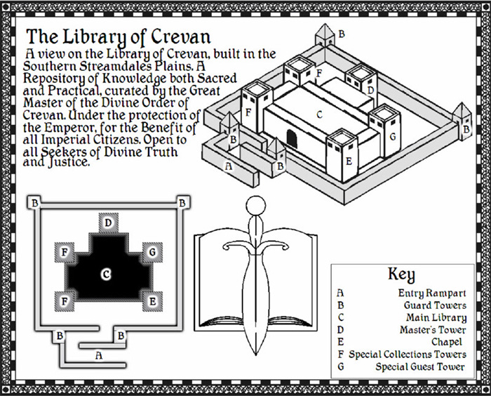
This lovely map of the Library of Crevan was created by Fub with the good old Johnny Speed City style. As you cans ee, it handles individual buildings just as well as cities.
The aptly named Lightcaster is a newcomer to the CC3 community, but has everybody stunned with his amazing lighted floorplans. Here is just a small selection of his work, click the images to see more.
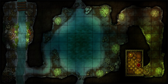
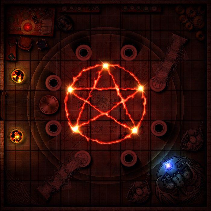
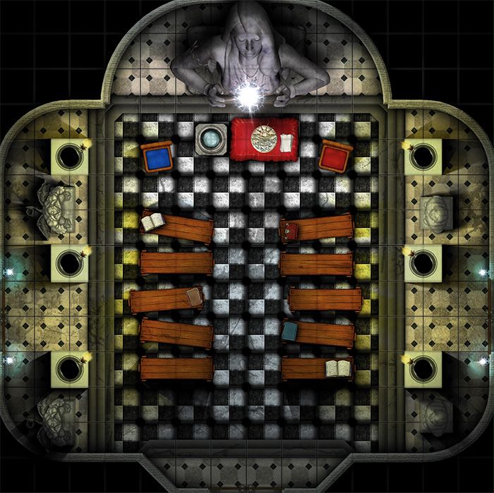
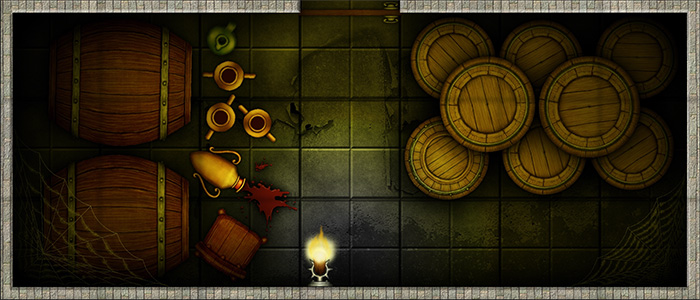
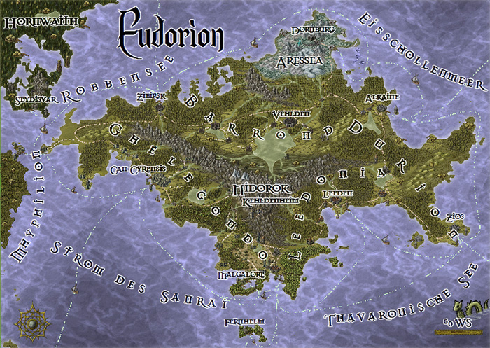
Tilor posted his map of the continent Eudorion (Herwin Wielink Style) and implemented a lot of feedback from the community to finally produce this beautiful piece. A great example of fruitful discussion and useful tips and tricks.
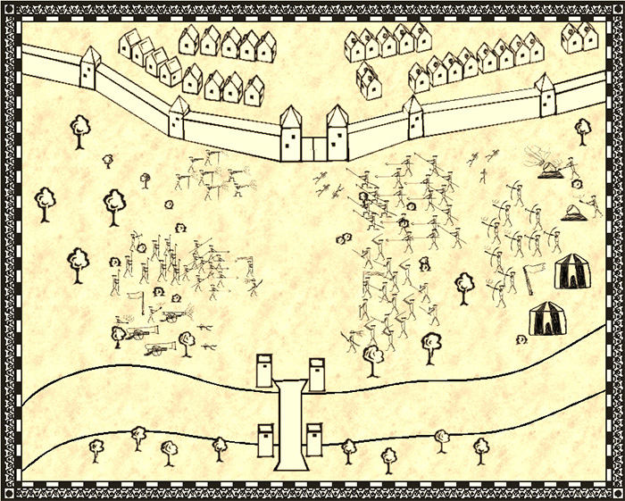
KenG came up with the idea to depict a battle scene in the John Speed city style and created his own symbols for that. Now that he got encouraging feedback from the community about the idea, he’s looking to create a few more detailed symbols. I’m looking forward to that!
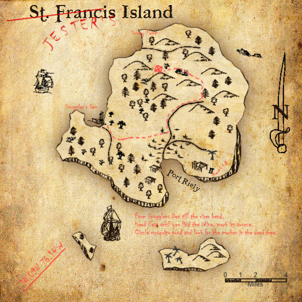
He also created this neat little treasure map using last year’s Annual style.
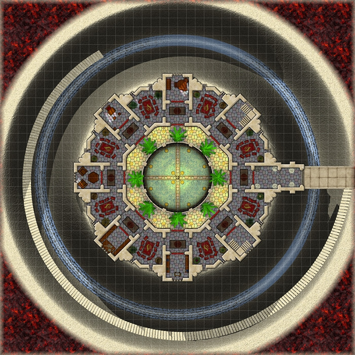
After completing his amazing floorplan tutorial Master Mapper Joachim de Ravenbel is now tackling bitmap fill styles and some special tricks on how to make use of them in CC3. Perhaps he’ll write a tutorial from this map too?
[…] instead, why don’t you check out the June ‘User Maps‘ blog post on the Profantasy web-site. This is a collection of some of the maps posted by the […]