Six years ago we began the Cartographer’s Annual, a monthly series of style, maps, and other cartogrpahic contents for CC3 and we thought it was about time for a little retrospective. The Annual has brought an immense wealth of style options to the ProFantasy community and we have been thrilled by all the beautiful maps our users have created. What better way than to highlight the the full scope of the Annuals than with some of these works of art?
2007 – Volume 1
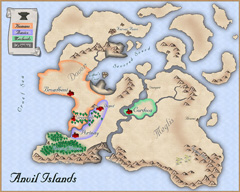 When we set out with the new concept of a subscription for Campaign Cartographer 3 users, we were really feeling our way around for what content was most popular. It quickly became apparent that new overland styles were the most popular type of Annual entry – but far from being the only thing people were looking for. We decided to strike a balance between generally popular topics like overland styles and more specific ones as seen in the “Parchment & Paper” June issue of 2007. The inaugural issue – the Mercator Historical style as shown on the right – represents the type of popular overland style that we strive to include in every volume of the Annual. The depicted map is by forum user Rogdor and was posted as a work-in-progress on the ProFantasy forum in March 2010, and there is another complete one here.
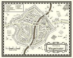 Another very popular and beautiful style from the first Annual is the John Speed City style, a black and white style emulating the city maps of famed British cartographer John Speed. Take a look at the map created by community member Modric.
Other highlights of the Annual 2007 include the multi-level floorplan of the “Tendril’s Oak Inn” complete with description and adventure ideas, an overland style based on the artwork of Sarah Wroot ( a user map here), and a tutorial on how to create your own drawing styles from scratch.
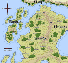
We received very positive feedback on the Annual 2007 – users were enthusiastic – which made the decision to continue the subscription model an easy one. And we were able to start the second year with a real bang as we got permission from one of the rpg industry’s cartography legends to emulate him: Pete Fenlon of Middle-earth roleplaying fame allowed us to recreate the style he used for those beautiful maps of Middle-earth.
The map here was created in the Pete Fenlon style (again by Modric) just recently, proving that the old style from the early days of the Annual are still used to great effect.
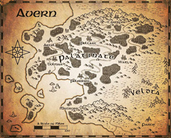 As a second overland style for 2008 we produced a black and white vector style which also proved very popular. So popular in fact, that we added a simiular – but distinct – b&w style to Campaign Cartographer 3 as a free download.
The sample map on the left shows ever-prolific Modric using the style with a parchment filter to create a beautiful in-game artifact.
As a special highlight the 2008 Annual saw the first video tutorials for CC3 produced by Joseph Sweeney. His videos have become a staple of introducing new users to CC3 and by now he has created a whole range of them for various products and add-ons.
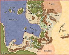
2009 started with a style created by Master Mapper Allyn Bowker. The Fantasy Realms style captures the look used in some Forgotten Realms maps and still produces pangs of sweet nostalgia in many people who see it. Originally the style was produced for CC2, but the lack of drawing tool functionality made it hard to use by anyone a little less meticulous (and may I say “brilliant”) than Allyn. CC3 allowed Allyn to make the look easier to use and, with sheet effects, more attractive. Here you can see forum user Henrie61 applying the style to a custom world.
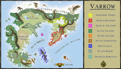 The 2009 Annual also saw another artist contributing his first style to the subscription: Pär Lindström. His beautiful world map caught our eye and although he did not use CC3 at the time, we came up with a way to transfer bitmap-based art into a CC3 drawing style. The artist supplies us with layered Photoshop files of his work and we extract the symbols and textures and convert them to assets in CC3.
The Fantasy Worlds style proved extremely easy to work with, so that first time users of CC3 managed to create very beautiful maps. The example here was done by Neilander as a first map!
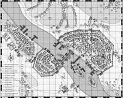
As we had learned from the black and white overland style in 2008, monochrome maps where quite popular (in part certainly because they print easily), so we decided to add dungeon and city styles in b&w to the 2010 Annual. Especially the city style became a fan favorite. The example shown on the right was created by community member bearclaw and shows the beautiful layout of a riverside town.
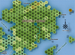 Another option for quick and easy maps that’s popular with role-players is the hex-based map. Back with Cosmographer Pro hex map functionality was introduced to Campaign Cartographer, and with the Annual 2010 we added a new style for old-school fantasy overland maps. Here you can see forum member Skycast using the style to create the map of a wooded peninsula.
2011 was undoubtedly the year of fantasy cartographer Jonathan Roberts. We can across his beautiful work on the web and asked him whether he’d be willing to produce a couple of styles for us. He obliged and the Annual 2011 could boast both an overland and a dungeon style created by him. We even made the dungeon style available for free at the end of the year.
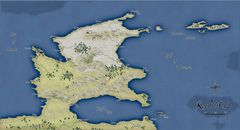
 Community member Koth produced the gorgeous map called Kern’s End shown here, by exporting a coastline he liked from Fractal Terrains 3 and then build upon with the Jon Roberts Overland style.
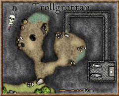
Pär Lindström (who writes on this blog) used the matching dungeon style to create this little encounter map for a role-playing session with his children.
As 2011 was the year of Jon Roberts, 2012 will prove the year of another great fantasy cartographer: Herwin Wielink. His overland style (going by his DeviantArt handle “Djekspek”) was the single most popular style every created for the Annual, measured by the amount of maps shown on the forums. So popular in fact, we will be publishing an extension of the style with more symbols and textures in November. And his isometric dungeon style is just extremely clever and beautiful. We are thrilled that all new artwork from Herwin will also be included in the upcoming Perspectives 3.
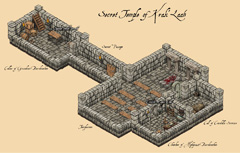 The user map in Djekspek’s Overland style was done by Modric, and the isometric dungeon here by forum member Tommek, who even commissioned custom symbols for his map from another artist. There are other amazing maps in this style.
Conclusion
When we started with the Annual back in 2007 we hardly imagined that we would be able to fill six years of subscription with material and keep everyone’s interest. But now the Annual is still going strong and the new and amazing talent within and without the ProFantasy community means we can rely on a steady influx of new ideas for upcoming issues. We’ll keep it coming.
The Annuals website is here, and you can see the full range of styles and other content on the gallery pages.
