Originally posted on mappingworlds.wordpress.com
This month’s annual from Profantasy is a new city style designed by the fantasy cartographer Jon Roberts. This is the third time that one of Jon Roberts’ themes are presented as an annual. The two earlier versions have been an overland style and a dungeon style.
I must admit that I’ve really looked forward to the release of this annual. First of all I love city maps and CD3, secondly Jon Roberts is a very skilled cartographer and illustrator so I expected some really nice graphics in this one.
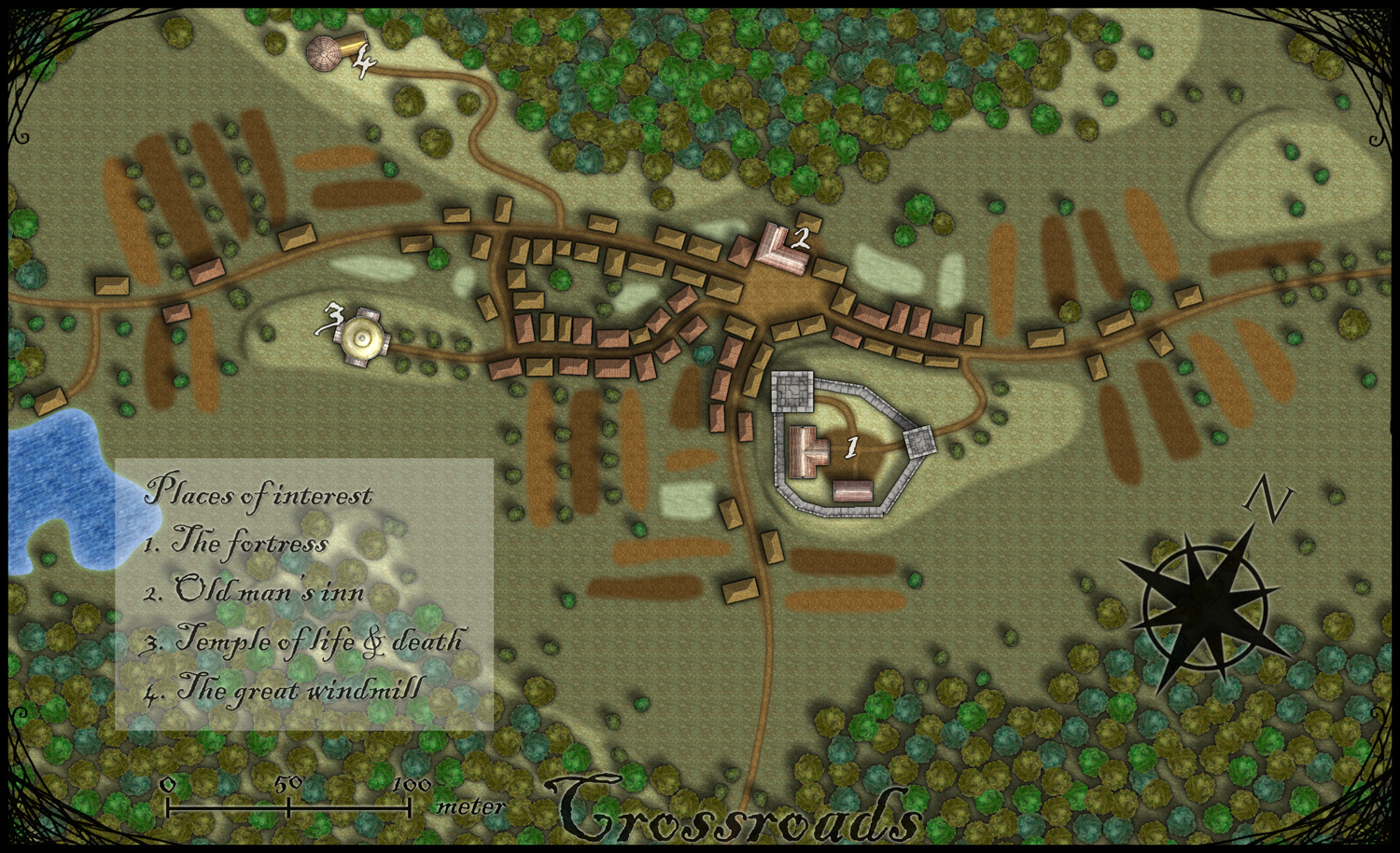
As expected, all the graphics are top notch and I especially like the walls and towers. To test the style I decided to make a rather quick village, called Crossroads, situated in the middle of a forest. The style was easy to work with and if you have done maps in CD3 before there isn’t really any new things to learn here. One little feature I liked however was the ability to make nice shadows on the hills. You can clearly see this on the hill where the temple of life & death (3) is.
After finishing the map there are some things I felt I need to work a bit more on next time I’m using the style. First of all the fields didn’t turn out great in the map; probably I have to try to put some more time on them in the future. When I started doing maps in the included styles in CD3 it took me a lot of trial and error before I got the fields right. So I have some more testing and practice to do here.
Another thing to think of is that in this map I had quite some open space between the forests and in the background texture you can see a pattern. I think the solution here is to add in some more different textures to hide the pattern. If you look at the included map in the annual you don’t see this pattern there.
At last if you look at the trees in the forest you can see that the northern forest has the trees more closely to each other. I actually think they got too close so in the southern forest I put some space between the trees. This made the forest look much better, in my opinion.
Overall I think the style is really strong. I like the darker colours of this one compared to the included styles in CD3 (which means less editing in Photoshop for me) . Still it takes some time to get to know the feeling of a new style, to get all the things in place in a good way. This one surely needs som more practicing for me before I’m there.
As usua,l I added the labeling in Photoshop, and I also selected another font. If you want to use the font I used it’s called Blackadder regular and can be downloaded from dafont.com for free.
[…] As expected, all the graphics are top notch and I especially like the walls and towers. To test the style I decided to make a rather quick village, called Crossroads, situated in the middle of a forest. The style was easy to work with and if you have done maps in CD3 before there isn’t really any new things to learn here. s Map-making Journal » Blog Archive » Crossroads […]